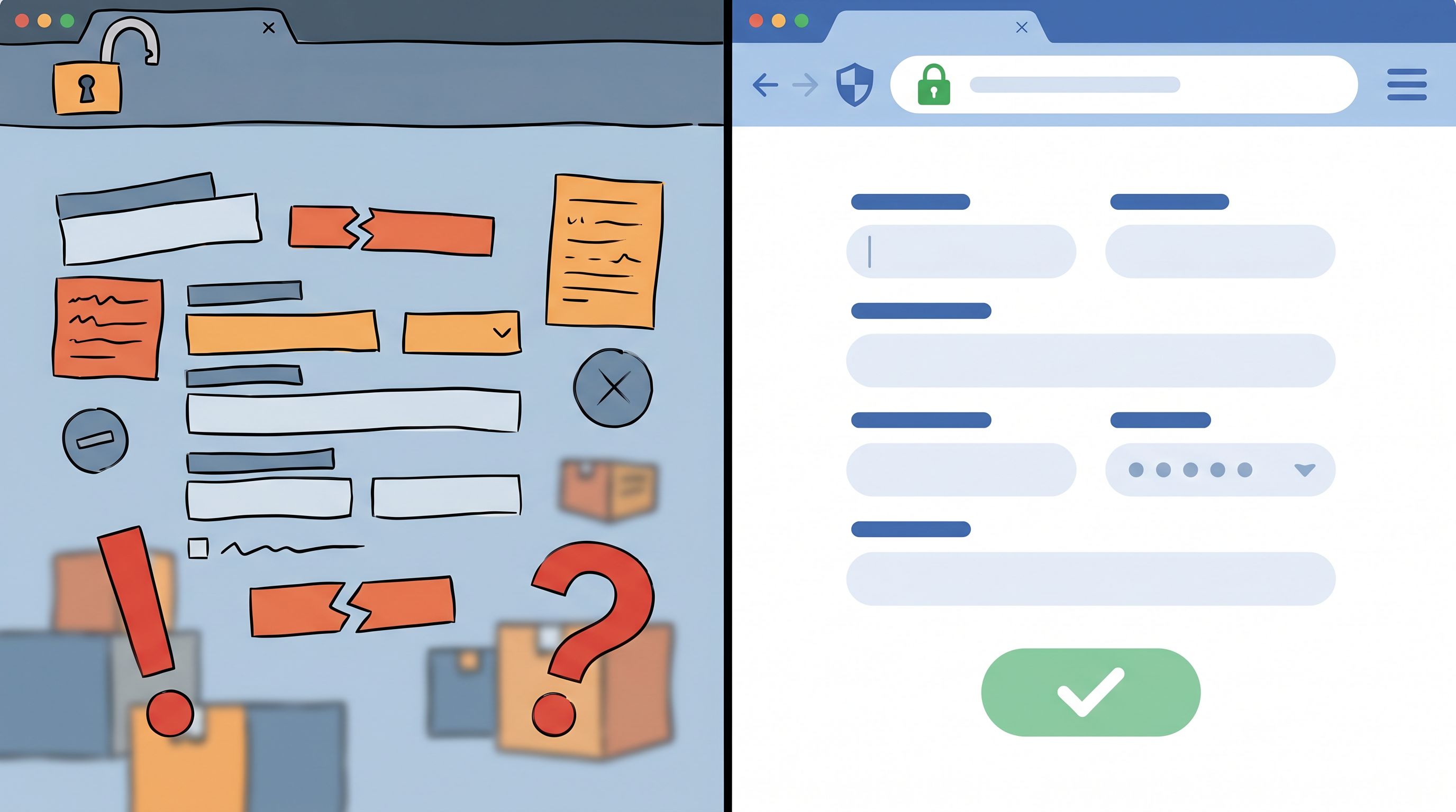
Beyond ‘Looks Good’: A Practical Framework for Scoring Form Themes by Trust, Clarity, and Speed


Most teams still pick form themes the way they pick party outfits: “Does this look good?” If the colors match the brand and the button doesn’t clash, it ships.
That bar is too low.
Your form theme isn’t just decoration. It’s part of the product experience, the sales funnel, and the support journey. It shapes whether people:
- Believe you’re legitimate (or scammy)
- Understand what’s being asked of them
- Feel like finishing the form is worth the effort
This post offers a practical way to score your form themes across three dimensions that actually move the needle:
- Trust – Do I feel safe sharing information here?
- Clarity – Do I instantly understand what to do and what happens next?
- Speed – Can I get this done with minimal friction and second-guessing?
Instead of arguing about “nice” vs “ugly,” you’ll have a shared rubric that product, design, marketing, and ops can use to pick and iterate on themes—especially when you’re building with Ezpa.ge.
Why scoring themes matters more than you think
A form is often the first committed action someone takes with your brand:
- Starting a newsletter subscription
- Requesting a demo
- Submitting an internal request
- Signing up for an event, trial, or membership
If you’ve read posts like “From ‘Submit’ to ‘Subscribed’” or “Forms as First Meetings”, you know these moments are high‑leverage. A small lift in completion rate or data quality can compound into better onboarding, more revenue, and smoother operations.
A theme quietly influences:
- Conversion rate – People bail quickly if something feels off
- Data quality – Confusing layouts lead to half‑filled or incorrect responses
- Perceived brand quality – Sloppy forms signal sloppy service
- Internal efficiency – Clear, fast forms reduce back‑and‑forth and rework
The problem: “Looks good” is subjective. Trust, clarity, and speed are not. You can score them, compare them, and improve them.
The Trust–Clarity–Speed scoring framework
Here’s the framework we’ll use:
- Trust (0–5) – Visual and content signals that say, “This is safe and legitimate.”
- Clarity (0–5) – How quickly someone understands what to do and what they’ll get.
- Speed (0–5) – How quickly a motivated user can complete the form without friction.
Each theme gets a score out of 15. Over time, you’ll build a small library of themes in Ezpa.ge tuned to different jobs: high‑trust intake, high‑speed internal request, high‑clarity onboarding, and so on.
Let’s break each dimension down into specific, observable criteria you can audit.
Scoring for Trust: “Would I give my credit card here?”
Trust is the gut‑level answer to: “Is this real, safe, and aligned with what I expected?”
1. Visual consistency with the parent brand (0–2 points)
Ask:
- Does the theme use recognizable brand colors, logo, and typography?
- Does the custom URL match the domain or naming pattern people saw in the ad, email, or app?
Score it:
- 0 – Generic, off‑brand, or looks like a template from somewhere else.
- 1 – Some brand elements present, but mismatched or inconsistent.
- 2 – Feels like a natural extension of your site/product.
Tip: On Ezpa.ge, pair your theme with a custom URL that matches your campaigns. If someone clicked
brand.com/demo, landing onbrand.ezpa.ge/demo-requestfeels coherent and trustworthy.
2. Perceived security and professionalism (0–2 points)
Trust is also communicated through micro‑signals:
- Clean, modern layout (no broken alignments or cramped fields)
- Clear labels and error states (no red walls of text)
- Subtle affordances like hover states and focus rings that feel intentional
- Optional: badges, privacy notes, or security statements (when appropriate)
Score it:
- 0 – Feels dated, cramped, or visually noisy; error states are harsh or unclear.
- 1 – Generally professional, but with a few rough edges.
- 2 – Feels like a product team sweated the details.
3. Transparency about data use (0–1 point)
People are more privacy‑aware than ever. Themes that create space for privacy messaging (and don’t bury it) earn more trust.
Look for:
- A short line under the primary CTA about what happens next
- A link to a privacy policy
- Clear indication of which fields are required and why
Score it:
- 0 – No visible cues about data use or next steps.
- 1 – Brief, honest explanation and/or visible privacy link.
For a deeper dive into designing forms that collect rich data without feeling invasive, pair this with “Forms in a Post-Cookie World”.
Trust checklist
Give your theme 0–5 for Trust:
- Brand alignment (0–2)
- Professional finish (0–2)
- Data transparency (0–1)
Target: 4–5 for any external‑facing form that asks for personal or payment details.
Scoring for Clarity: “What is this, and what do you want from me?”
Clarity is about instant comprehension. If someone has to stop and think, you’re burning attention.
1. Purpose and outcome are obvious (0–2 points)
Above the fold, can a skimming user answer:
- What is this form for?
- What will I get if I finish it?
Look for:
- A concise headline (e.g., “Request a product demo”)
- A one‑sentence subheading explaining the value or next step
Score it:
- 0 – Vague or missing headline; user has to infer the purpose.
- 1 – The purpose is guessable but not explicit.
- 2 – Crystal clear in one glance.
2. Field labels and grouping (0–2 points)
This is where many themes fall down. Even good copy gets lost in poor layout.
Ask:
- Are related fields visually grouped (e.g., contact info vs project details)?
- Are labels close to their inputs and consistently aligned?
- Do optional vs required fields look distinct but not alarming?
Score it:
- 0 – Fields feel like a random list; grouping is unclear.
- 1 – Some grouping, but inconsistent alignment or spacing.
- 2 – Logical sections, strong visual hierarchy, easy to skim.
If you want to go deeper on layout patterns that make instructions almost unnecessary, check out “Designing Forms for ‘Zero Instruction’ Use”.
3. Microcopy and helper text (0–1 point)
Even the best theme needs words to land.
Look for:
- Brief, specific helper text where users commonly get stuck
- Plain language instead of internal jargon
Score it:
- 0 – Either no helper text where needed, or long, dense explanations.
- 1 – Short, targeted hints that unblock common questions.
If writing microcopy is a bottleneck, tools like Ezpa.ge pair beautifully with AI. You can use ideas from “AI as Your Form Editor” to iterate on labels and hints without rewriting your whole form.
Clarity checklist
Give your theme 0–5 for Clarity:
- Purpose & promise (0–2)
- Grouping & hierarchy (0–2)
- Microcopy support (0–1)
Target: 4–5 for any form where misunderstanding leads to bad data, mis‑qualified leads, or support overhead.
Scoring for Speed: “Can I finish this before my next notification?”
Speed is not just about how many fields you have. It’s about perceived effort.
1. Field count vs perceived complexity (0–2 points)
People don’t count fields; they feel weight.
Ask:
- Does the theme make long forms feel lighter (section breaks, progress indicators)?
- Are low‑effort fields (dropdowns, toggles) used where open text isn’t necessary?
Score it:
- 0 – Feels like a wall of inputs; no sense of progress.
- 1 – Some structure, but still visually dense.
- 2 – Feels manageable, even if there are many fields.
Pair this with the ideas in “The Minimal Field Manifesto” to make sure you’re not just styling bloat.
2. Interaction efficiency (0–2 points)
Speed lives in the details:
- Logical tab order for keyboard users
- Large enough tap targets on mobile
- Smart defaults and prefilled values where possible
- Clear, inline validation instead of surprise errors on submit
Score it:
- 0 – Frequent friction: tiny buttons, awkward scrolling, late error messages.
- 1 – Mostly smooth, with a few small annoyances.
- 2 – Feels fast and forgiving; the form “helps you along.”
On Ezpa.ge, this is where you can lean on:
- Prefilled fields from URLs for known data
- Conditional logic to hide irrelevant sections
- Real-time validation synced to Google Sheets workflows
3. Path to completion (0–1 point)
Ask yourself:
- Is the primary button visually dominant?
- Is the final step obvious (no “Where do I click?” moment)?
Score it:
- 0 – Competing CTAs, unclear end state, or confusing button labels.
- 1 – One clear path to done, with unambiguous language.
Speed checklist
Give your theme 0–5 for Speed:
- Perceived complexity (0–2)
- Interaction quality (0–2)
- Clear completion path (0–1)
Target: 4–5 for anything competing with chat, DMs, or other low‑friction channels.

Turning the framework into a repeatable workflow
A framework is only useful if it fits into how your team already builds.
Here’s a simple way to bake Trust–Clarity–Speed into your Ezpa.ge workflow.
Step 1: Define the job of the form
Before you touch themes, answer:
- Is this external or internal?
- Is the priority max trust, max speed, or balanced?
- What’s the one action we want users to take after submitting (book a call, join a waitlist, trigger a workflow)?
Example jobs:
- High-trust, moderate-speed: Payment update, enterprise intake, security-sensitive requests
- High-speed, moderate-trust: Internal request forms, quick feedback, one-question polls
- Balanced: Demo requests, newsletter signups, event registrations
Step 2: Create 2–3 candidate themes in Ezpa.ge
Instead of hunting for “the perfect theme,” spin up multiple options quickly:
- Start from an existing Ezpa.ge theme you like
- Duplicate it and vary:
- Color contrast and button emphasis
- Field spacing and section breaks
- Typography sizing for labels vs headings
Name them descriptively in your Ezpa.ge library, e.g.:
High-Trust / Long IntakeHigh-Speed / InternalBalanced / Marketing
This approach also plays nicely with the experimentation ideas from “Form-Led Experimentation for Non-Designers”.
Step 3: Score each theme together
Grab 2–3 people who weren’t involved in the initial design—PM, CX, sales, or ops. For each candidate theme, have them:
- Open the form on desktop and mobile.
- Complete it once as a pretend user.
- Score Trust, Clarity, and Speed from 0–5 using the checklists above.
You’ll end up with something like:
- Theme A (Balanced / Marketing)
- Trust: 4
- Clarity: 3
- Speed: 3
- Total: 10/15
- Theme B (High-Trust / Long Intake)
- Trust: 5
- Clarity: 4
- Speed: 2
- Total: 11/15
- Theme C (High-Speed / Internal)
- Trust: 3
- Clarity: 4
- Speed: 5
- Total: 12/15
For an external demo request, you might pick Theme B and then:
- Borrow some spacing and interaction patterns from Theme C to boost Speed
- Tighten headings and helper text to push Clarity from 4 → 5
Step 4: Run a small live test (where it matters)
For high‑impact forms (sales, onboarding, key workflows), don’t stop at internal scoring.
Use Ezpa.ge’s strengths—themes + custom URLs + Google Sheets syncing—to run a simple test:
- Route 50% of traffic to Theme A (
/demo-a) and 50% to Theme B (/demo-b) - Track:
- Completion rate
- Time to complete (if you can)
- Data quality (are fields filled in correctly?)
You don’t need a six‑week experiment. Even a few hundred submissions can show whether your high‑trust theme is actually earning more completions, or if a faster theme wins without hurting quality.
Step 5: Turn winners into reusable templates
Once you have a theme that scores well and performs well, lock in the win:
- Save it as a reusable Ezpa.ge template for that job type
- Document its Trust–Clarity–Speed scores in a short note
- Add usage guidelines: “Use this for any intake that asks for X and Y.”
Over time, you’ll build a small Form OS of themes and templates, each with a clear purpose and a proven track record—rather than a random pile of one‑off forms.
Practical examples: Matching themes to real scenarios
Let’s walk through three common scenarios and how the framework guides theme choice.
1. Newsletter signup from a blog post
Job: Convert a warm reader into an email subscriber.
Priorities:
- Trust: Medium–high (they’re giving you their inbox)
- Clarity: High (what will they get? how often?)
- Speed: Very high (anything more than 2–3 fields feels heavy)
Theme considerations:
- Clean, minimal layout with strong brand alignment
- One or two fields max (email + maybe role/segment)
- A short line under the button about frequency and value
Target scores:
- Trust: 4
- Clarity: 5
- Speed: 5
2. Internal design request form
Job: Capture structured requests from teammates so design can prioritize.
Priorities:
- Trust: Moderate (internal brand trust already exists)
- Clarity: High (so requests don’t need follow‑up)
- Speed: High (or people will go back to Slack pings)
Theme considerations:
- Strong visual grouping (requester info, project context, deadlines)
- Generous spacing and big tap targets for mobile
- Smart defaults (e.g., today’s date, common request types)
Target scores:
- Trust: 3–4
- Clarity: 5
- Speed: 4–5
For more on turning these into real operational tools, see “Form UX for Internal Tools You Don’t Have Yet”.
3. New customer onboarding intake
Job: Collect key information to personalize onboarding and route the account.
Priorities:
- Trust: Very high (this often involves sensitive or strategic information)
- Clarity: Very high (misunderstandings lead to bad onboarding)
- Speed: Moderate (users will tolerate a bit more effort if the value is clear)
Theme considerations:
- Strong brand presence and professional finish
- Sectioned layout with progress indication
- Brief helper text explaining why specific details are needed
Target scores:
- Trust: 5
- Clarity: 5
- Speed: 3–4
This is also where forms connect directly into your onboarding flows—see “From Form to Onboarding Journey” for ideas on what happens after submission.
Quick scoring worksheet you can steal
When you next open an Ezpa.ge form, copy this into a doc or Sheet and score it:
Trust (0–5)
- Brand alignment (0–2): ____
- Professional polish (0–2): ____
- Data transparency (0–1): ____
- Trust total: ____ / 5
Clarity (0–5)
- Purpose & outcome obvious (0–2): ____
- Grouping & hierarchy (0–2): ____
- Microcopy support (0–1): ____
- Clarity total: ____ / 5
Speed (0–5)
- Perceived complexity (0–2): ____
- Interaction efficiency (0–2): ____
- Clear completion path (0–1): ____
- Speed total: ____ / 5
Grand total: ____ / 15
Use that total to:
- Compare themes for the same form
- Decide which theme to start from for a new form type
- Track whether design changes are actually improving the experience
Bringing it all together
When you move beyond “looks good” and start scoring themes by Trust, Clarity, and Speed, a few things happen:
- Design reviews get less subjective and more collaborative.
- Marketing, product, and ops share a common language about form quality.
- You build a library of Ezpa.ge themes that are purpose-built, not just pretty.
- Users feel the difference: more confidence, less confusion, faster completion.
Every form is a small promise: “If you give us your time and information, we’ll make it worth it.” A theme that scores high on trust, clarity, and speed is how you keep that promise.
Your next step: Score one form this week
Don’t try to overhaul every form at once. Pick one Ezpa.ge form that matters:
- Your main demo request
- Your newsletter signup
- Your internal request intake
Then:
- Score its current theme using the worksheet above.
- Create one alternate theme aimed at improving a single weak area (e.g., clarity).
- Run a small test or at least a quick internal review.
Within a week, you’ll have:
- A clearer sense of how your themes really perform
- A shared vocabulary for what “better” means
- A concrete win you can replicate across your form library
Open Ezpa.ge, pick that one form, and give its theme a score. The gap between “looks good” and “works beautifully” is smaller than you think—and you can start closing it today.