From Clicks to Conversations: Designing Forms That Feel Like Guided Chats, Not Questionnaires


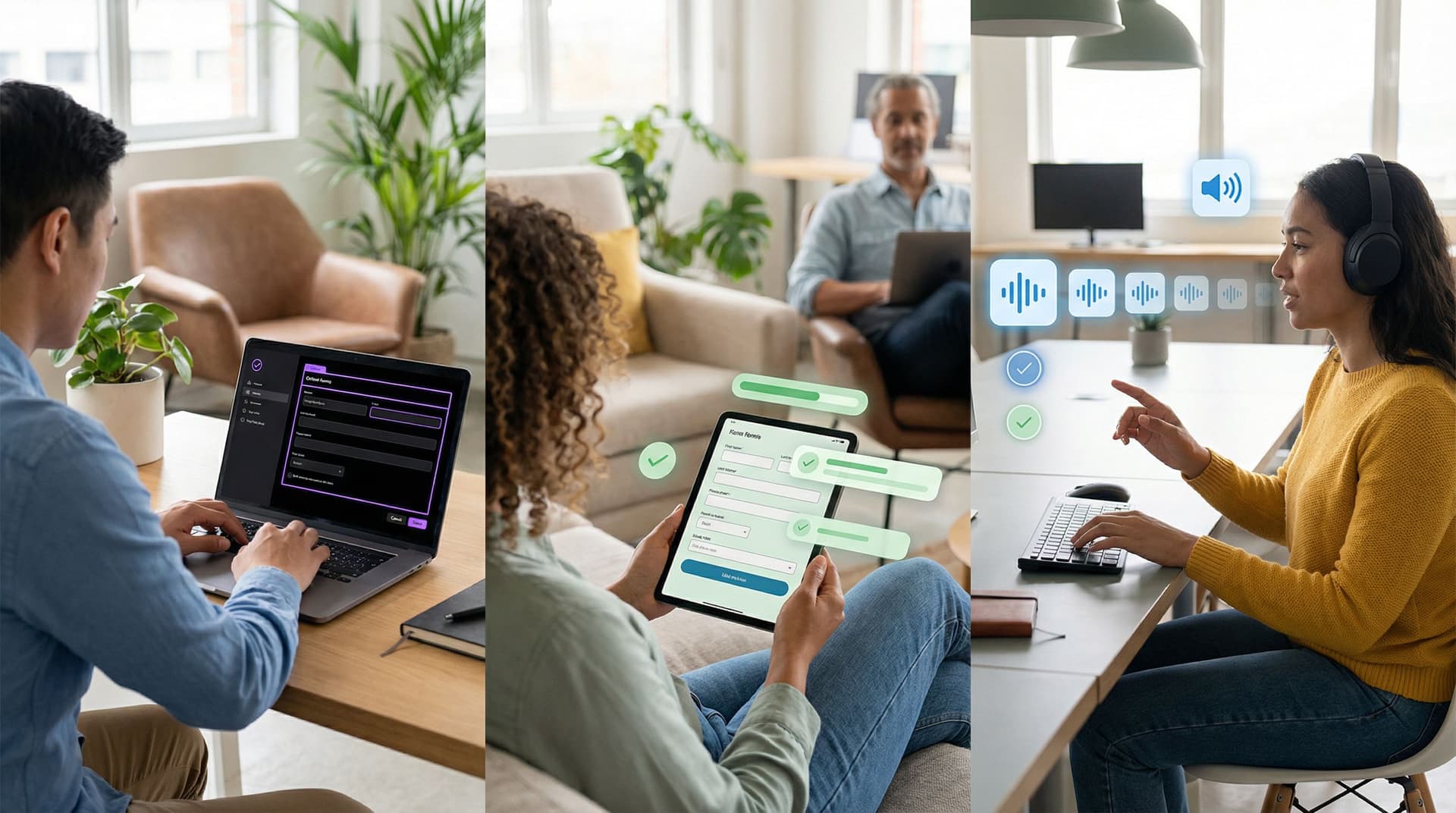
Forms are usually where momentum dies.
Someone clicks your ad, opens your onboarding flow, or taps a support link. They’re curious, maybe even excited. Then they hit a gray wall of fields and dropdowns—and that energy evaporates.
The alternative is subtle but powerful: forms that feel like guided conversations.
Instead of a static questionnaire, you create a back-and-forth. You ask one clear question at a time, respond to what people say, and guide them toward a decision. The interface is still a form, but the experience feels closer to chatting with a thoughtful teammate than filling out paperwork.
That shift—from clicks to conversations—is where higher completion rates, better data, and more trust live.
Why “Conversational Forms” Actually Work
This isn’t just about aesthetics. When you design forms like guided chats, you tap into a few well-understood UX and behavioral principles:
1. Reduced cognitive load
Long, dense forms force people to scan, prioritize, and plan. That’s work. Breaking things into smaller, sequential steps lets people focus on one decision at a time.
2. Perceived progress and momentum
Micro-steps feel easier to start and easier to finish. Progress indicators, subtle animations, and short “chapters” of questions give people the sense that they’re moving forward, not stuck in a bureaucratic loop.
3. Social norms and reciprocity
Humans are used to conversations, not interrogations. When your form mirrors a human tone—acknowledging answers, giving context, explaining why you’re asking—people are more willing to share honest, complete information.
4. Better signal for downstream systems
Conversational flows tend to ask fewer, sharper questions. The result: cleaner data for your CRM, scoring model, or AI workflows. (If you’re thinking about how that data powers recommendations or routing, you’ll want to pair this with patterns from Forms as On-Ramps to AI: Capturing the Right Signals to Power Recommendations, Scoring, and Routing.)
5. Higher completion and lower abandonment
Teams that move from static, single-page forms to guided, multi-step flows consistently see completion lifts—often 10–30%—especially on mobile and for longer journeys like onboarding or applications.
Start With the Conversation, Not the Fields
Most forms are built backwards: you open a form builder, start dropping in fields, and only later think about the story.
To design a guided chat, flip that.
Step 1: Write the script as if you were talking live
Imagine you’re on a call with your ideal respondent. You have five minutes. What would you actually say?
Write it out in a doc:
- How would you open?
- “Hey, I’ll ask a few quick questions so we can match you to the right plan.”
- How would you transition between topics?
- “Got it—thanks. Next, I’ll ask about your team size so we can recommend the right tier.”
- How would you explain sensitive questions?
- “We ask about budget range so we don’t waste your time with options that don’t fit.”
Then map each “turn” of the conversation to a question or micro-step in your form.
Step 2: Ruthlessly prioritize what you ask
Conversational doesn’t mean longer. The point is to be more intentional.
Ask for every field:
- Do we use this within 7 days? If not, cut it or make it optional.
- Can we infer this from something else? (e.g., region from country, company size from domain + enrichment.)
- Does this unlock a different path or better outcome for the user? If not, it’s probably your problem, not theirs.
You can always collect deeper detail later in the journey—especially if you’re already syncing responses into Google Sheets and turning them into playbooks or workflows down the line, as in From Form to Playbook: Turning Google Sheets Responses into Repeatable Ops SOPs.
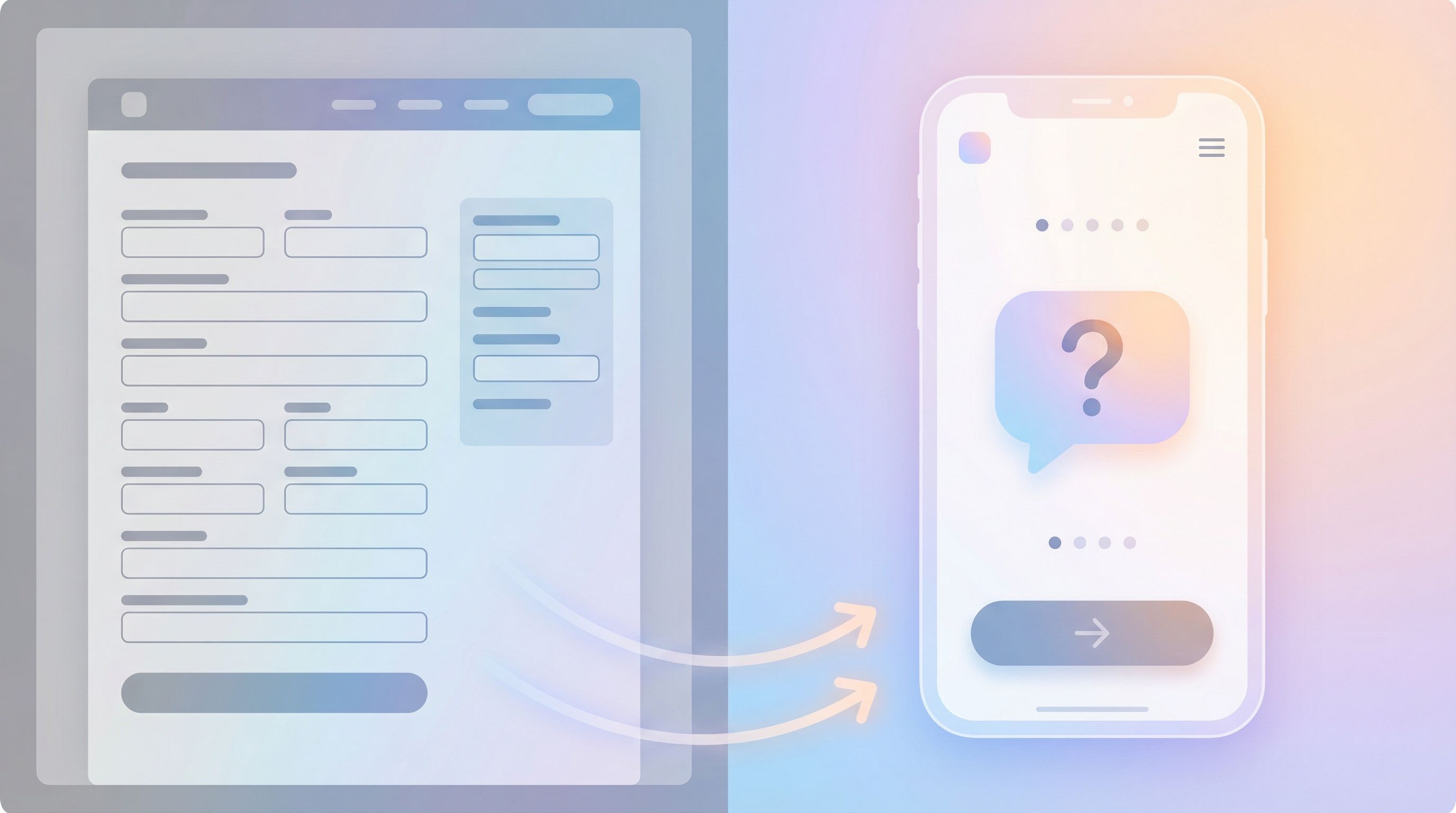
Structure the Flow Like a Story, Not a Spreadsheet
Once you have a script and a trimmed-down field list, you can shape the flow itself.
1. Open with context and payoff
Your first screen sets the tone. Replace generic headings like “Contact Information” with something that answers three questions:
- What is this?
“Let’s get you set up with a tailored onboarding plan.” - How long will it take?
“3–4 quick steps, under 2 minutes.” - What do I get at the end?
“You’ll get a recommended plan and next steps, no email required.”
Even a single sentence of context can dramatically reduce drop-off on step one.
2. Group questions into “chapters”
Instead of one long list, create 3–6 short sections that each tell a mini-story:
- You and your context – Who are you, what are you trying to do?
- Your goals or problems – What does success look like? What’s broken?
- Constraints – Budget, timing, team size, technical limits.
- Logistics – Contact details, permissions, legal.
Each chapter gets its own short intro line, like:
“Next up: a few quick questions about your team so we can recommend the right setup.”
3. Ask one big question per screen
You can have multiple small fields on a step (e.g., first and last name), but avoid “walls” of unrelated inputs.
A good rule of thumb:
- 1 primary decision per step (e.g., “What are you primarily interested in?”)
- 0–2 supporting fields (e.g., a text area for “Tell us more if you’d like.”)
This keeps each step cognitively simple, even if your overall flow has 8–10 steps.
4. Use progressive disclosure
Don’t show everything at once. Reveal questions based on what someone already told you.
Examples:
- If someone selects “I’m an agency,” show questions about client mix and services. Hide B2B SaaS-specific questions.
- If they choose “Just exploring” as a buying timeline, don’t force them into detailed budget fields.
Tools like Ezpa.ge make this kind of conditional logic and theming practical without rebuilding a full app. You can keep one core form, then adapt it with themes and custom URLs for different audiences—similar to the patterns in URL-Driven Ops: How Custom Links Turn One Form into a Dozen Targeted Workflows.
Make the UI Feel Like a Chat (Without Faking a Human)
You don’t need cartoon avatars or fake chat bubbles to feel conversational. In fact, pretending there’s a human on the other side when there isn’t usually backfires.
Instead, focus on a few key interaction patterns.
Microcopy that sounds like a person
Replace robotic labels with natural language:
-
Instead of: “Business Objective”
Try: “What are you hoping to accomplish with this project?” -
Instead of: “Submit”
Try: “Send my details” or “See my recommendations”.
Guidelines for conversational microcopy:
- Write like you talk, then tighten by 20–30%.
- Prefer short, concrete words over jargon.
- Use “you” and “we” to make roles clear.
Inline guidance instead of separate help docs
When people get stuck, they shouldn’t have to leave the form.
Use:
- Short helper text directly under tricky fields.
- “We’ll use this to suggest the right plan—no sales spam.”
- Examples in placeholders.
- “e.g., ‘We’re launching a partner program and need a repeatable intake.’”
- Optional “More detail” toggles for complex concepts.
Smart defaults and gentle nudges
Conversational forms can do some of the thinking for people:
- Pre-select the most common answer but allow easy change.
- Auto-format phone numbers, dates, and currency.
- Use validation messages that assume good intent:
- “That email doesn’t look quite right—mind double-checking?”
Visual rhythm and breathing room
The layout itself should feel like a calm chat, not a tax form.
- Generous spacing between steps.
- Clear hierarchy: one primary question, supporting text in a lighter style.
- Progress indicators that feel like milestones, not a loading bar.
If you’re using Ezpa.ge, this is where themes shine: you can create a form skin that matches the emotional tone of the conversation—reassuring for support, energetic for launches, premium for high-ticket offers—without touching the underlying data model.
Personalization: Respond to What People Say
A real conversation adapts. Your form should, too.
Branching logic based on intent
Let early answers shape the rest of the flow.
Example for a demo request form:
- Step 1: “What best describes why you’re here?”
- “I need help with onboarding.”
- “I’m evaluating tools for my team.”
- “I’m a partner or agency.”
- Based on that choice:
- Show different follow-up questions.
- Swap out examples and helper text.
- Adjust what you promise at the end (e.g., “We’ll match you with a partner manager” vs. “You’ll see a tailored product walkthrough.”)
Dynamic summaries and confirmations
Instead of a generic “Thanks, we’ll be in touch,” recap what you heard—just like a good human counterpart would.
- “You’re a 10-person CS team looking to streamline QBR prep and renewal signals in Google Sheets. Next, we’ll…”
This not only feels respectful, it also helps catch errors before they hit your CRM.
Tie answers to real outcomes
Whenever possible, show how someone’s answer changes what happens next:
- “Because you selected ‘Launch support,’ we’ll send you a template you can use for your next product drop.”
- “Since your team is under 5 people, we’ll skip advanced approval flows for now—you can add them later.”
This is where conversational design intersects with AI and automation. If you’re already thinking about AI-personalized forms or AI-aware question design, conversational flows give you the structured, high-intent data those systems need.
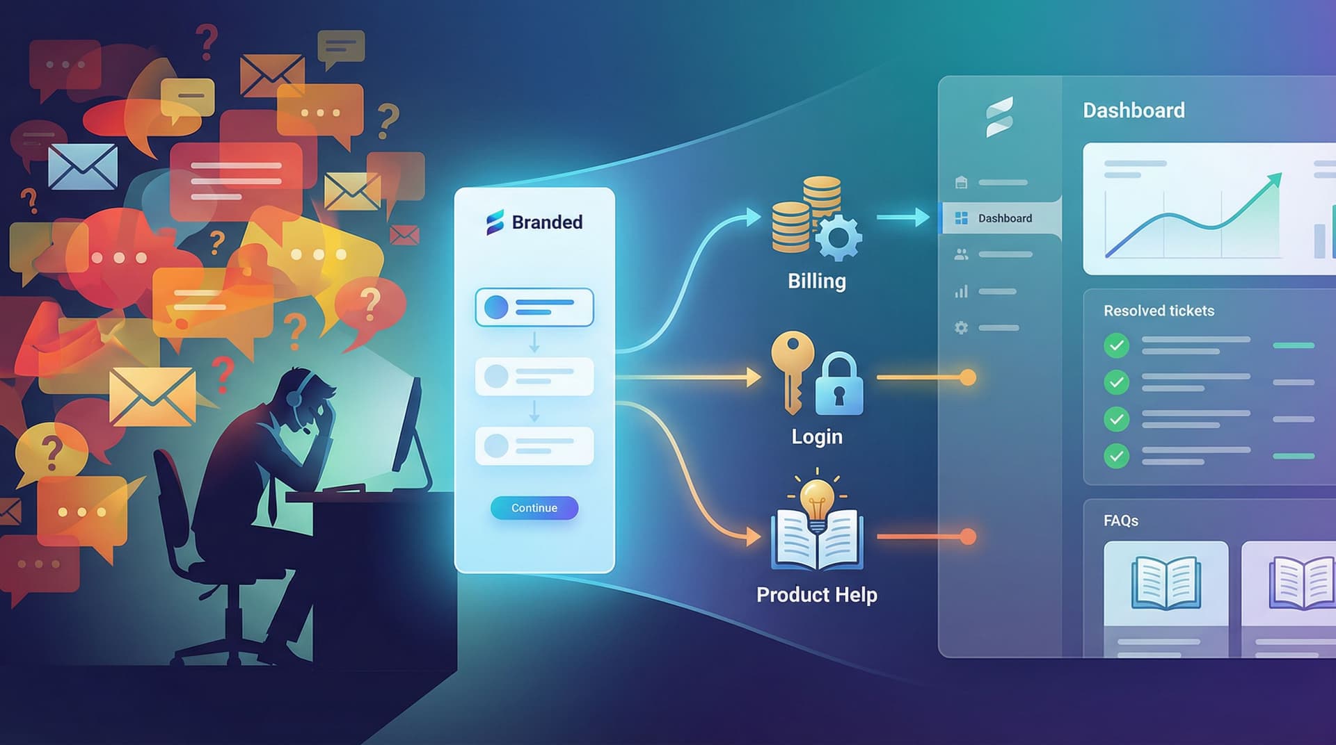
Don’t Forget Accessibility and Inclusion
A guided chat that only works for some people isn’t a great conversation.
Accessible patterns are not just compliance—they’re conversion boosters. They make your forms clearer, more predictable, and less error-prone for everyone.
Key practices:
- Keyboard-first navigation – Every step and control should be reachable without a mouse.
- Clear focus states – People should always know where they are in the flow.
- Descriptive labels – Don’t rely solely on placeholder text.
- Color contrast and motion sensitivity – Subtle animations are great, but never the only way to understand progress.
If you want a deeper dive on patterns that are both inclusive and high-converting, bookmark Inclusive by Default: Accessible Form Patterns That Don’t Sacrifice Conversion.
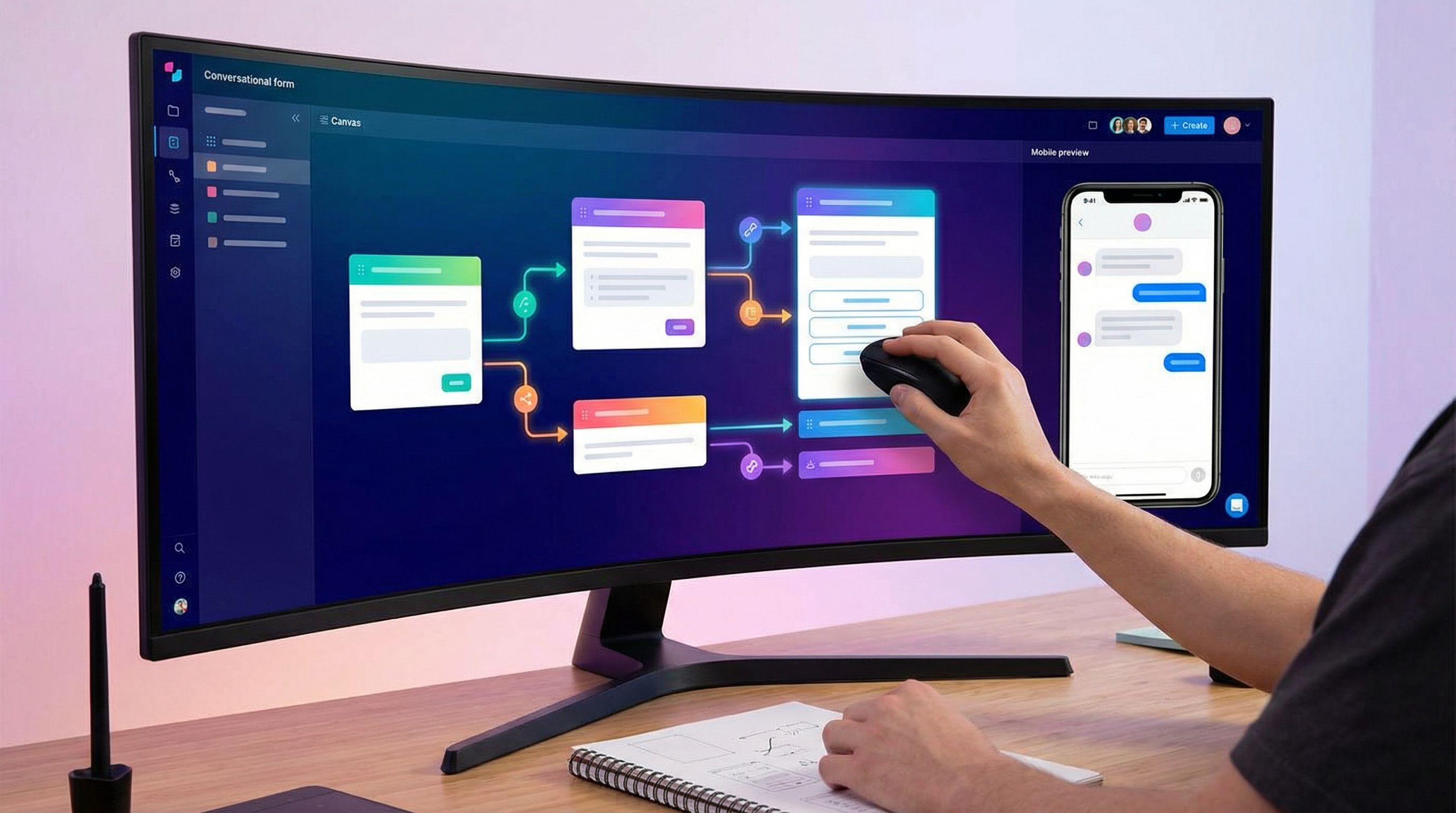
Bringing It All Together With Ezpa.ge
Tools don’t create good conversations, but the right tools make them easier to ship and iterate.
With Ezpa.ge, you can:
- Design multi-step, conversational flows without touching code.
- Use themes to match tone and intent, not just brand colors—e.g., a calm, high-trust theme for support, a bold, energetic one for launches.
- Ship custom URLs for each audience or campaign while keeping a single source of truth behind the scenes.
- Sync responses to Google Sheets in real time, so your sales, CS, or ops teams see conversations turn into structured data instantly.
That combination—guided chat UX on the surface, clean data underneath—is what lets you:
- Route leads intelligently.
- Power AI-driven recommendations and scoring.
- Build live queues and playbooks without heavyweight tools.
Quick Checklist: Does Your Form Feel Like a Conversation?
Use this as a quick gut-check for your next build or redesign:
- [ ] The first screen clearly states what this is, how long it takes, and what someone gets.
- [ ] Questions are grouped into 3–6 short chapters with simple intros.
- [ ] Each step focuses on one primary decision, with minimal supporting fields.
- [ ] Microcopy sounds like a person, not a policy doc.
- [ ] Sensitive or complex questions include a short “why we ask” explanation.
- [ ] Branching logic adapts the flow based on early answers.
- [ ] The confirmation screen summarizes what you heard and what happens next.
- [ ] The form works beautifully with keyboard navigation and screen readers.
- [ ] The visual theme matches the emotional tone of the interaction.
- [ ] Responses land in a system (like Google Sheets) where your team can actually act on them.
If you can’t check most of these boxes yet, you’ve got clear, concrete places to improve.
Summary
Forms don’t have to feel like paperwork.
When you:
- Start from a real conversation instead of a field list,
- Structure your flow like a story with clear chapters,
- Use natural language, progressive disclosure, and smart defaults,
- Adapt questions and outcomes to what people actually say,
- And bake in accessibility and operational rigor from day one,
…you turn a static questionnaire into a guided chat that people are happy to complete.
The payoff shows up everywhere: higher conversion, better data, smoother handoffs to sales and CS, and a stronger sense of trust at the exact moment someone is raising their hand.
Your Next Step
You don’t need a full redesign to start.
Pick one form—your highest-intent surface. Maybe it’s:
- Your primary demo request,
- Your partner application,
- Or your customer success health check.
Then:
- Rewrite it as a five-minute live conversation in a doc.
- Trim the questions to what you’ll actually use within a week.
- Rebuild it as a short, multi-step, conversational flow in Ezpa.ge with a custom URL and a theme that matches the tone you want people to feel.
- Sync responses into Google Sheets so your team can see, in real time, how the conversation is performing.
Ship that one conversational form, watch how people respond, and iterate from there.
If you’re ready to turn more of your clicks into real conversations—and more of those conversations into action—start by redesigning the next form you send out as a guided chat. Ezpa.ge gives you everything you need to make that shift feel natural, fast, and genuinely enjoyable for the people on the other side of the screen.