Invisible Personalization: Using Prefills, Logic, and URLs to Tailor Forms Without Feeling Creepy


Most teams want higher completion rates, richer data, and more relevant experiences. The instinctive answer is “personalization.”
But personalization has a trust problem.
People are tired of forms that seem to know too much, ask too aggressively, or feel like they’re powered by a shadowy profile they never consented to. At the same time, they absolutely appreciate not having to re-type their email, or being shown questions that actually match why they’re there.
The sweet spot is invisible personalization: tailoring forms in ways that feel natural, helpful, and earned—never invasive. With tools like Ezpa.ge, that usually means three levers:
- Prefills – quietly filling what you already know, or what the URL already told you
- Logic – only asking questions that are relevant, based on what someone just did or said
- URLs – using clean, meaningful links and parameters to route people to the right version of a form
Done right, these techniques make your forms feel like a thoughtful host, not a nosy interrogator.
Why “Invisible” Personalization Matters
Personalization isn’t just a marketing buzzword; it’s a response to real behavior:
- People abandon long or irrelevant forms—studies consistently show that each additional field can depress completion rates, especially on mobile.
- People are more willing to share data when they see a clear benefit and feel in control of what’s happening.
- Regulators and browsers are making it harder to rely on opaque tracking. Third‑party cookies are being phased out, and privacy expectations are rising.
That combination creates a design challenge: how do you tailor an experience without creeping people out or relying on brittle tracking hacks?
Invisible personalization solves this by following three principles:
- Use only earned data. If someone clicked a specific ad, answered a prior micro-form, or came from a particular campaign, you’ve earned a small, clear signal. Use that—not a mystery profile.
- Make the benefit obvious. Prefills and logic should feel like they’re there to save time or reduce noise, not extract more data.
- Keep control visible. People should be able to change prefilled values, skip secondary questions, and understand why you’re asking.
When you approach personalization this way, you not only improve conversion—you also build the kind of trust that makes people willing to engage again.
The Building Blocks: Prefills, Logic, and URLs
Invisible personalization is less about new tech and more about how you combine familiar tools.
1. Prefills: Start From What You Know (But Don’t Overstep)
Prefilling fields is one of the simplest ways to make a form feel considerate.
Common, non-creepy prefill sources:
- Campaign parameters – e.g.
?utm_campaign=summer-promocan prefill a hidden “Campaign” field in an Ezpa.ge form and sync straight to Google Sheets. - Known account context – if someone is already logged into your product, you can prefill email, company, or plan type.
- Previous answers – when a user completes a short micro-form, you can carry that answer into a longer flow later.
Patterns that feel safe and helpful:
-
Email prefill with edit enabled
If a user clicks a link from your product, prefill their email—but always let them change it. This feels like continuity, not surveillance. -
Remembering preferences across sessions
If someone previously chose “I’m a freelancer” in a short intake, you can prefill that in a later, more detailed form. Pair this with a small note like: “We remembered your role from last time—change it if it’s wrong.” -
Prefilling hidden metadata
Use hidden fields to capture things likesource=pricing-pageorsegment=enterprise. The user doesn’t see these, but they keep your Sheets and CRM clean.
Red flags that feel creepy:
- Surfacing extremely specific inferred traits (“We see you’re a 51–200 person B2B SaaS company based in Austin”) unless the user explicitly gave you that data.
- Prefilling sensitive or identity-adjacent fields (health info, salary, personal identifiers) from third-party data.
A good rule of thumb: if you’d feel weird explaining how you got the data, don’t prefill it.
2. Logic: Ask Only What’s Relevant
Conditional logic is where forms stop being static questionnaires and start feeling like a conversation.
With Ezpa.ge, you can:
- Show or hide fields based on previous answers
- Branch people to different pages or sections
- Trigger different success messages or redirects based on responses
Used with care, this lets you:
- Shorten forms for simple use cases while still collecting enough data for complex ones
- Avoid asking the same question twice
- Match tone and content to the person’s intent (e.g., “I’m just browsing” vs “I’m ready to buy”)
Example: A demo request that respects intent
Instead of one generic form, imagine:
-
First question: “What best describes why you’re here?”
- "I’m exploring for my team"
- "I’m ready to implement in the next 3 months"
- "I’m comparing vendors for a client"
-
Logic paths:
- If they choose “ready to implement,” show fields about timeline, budget, and stakeholders.
- If they choose “exploring,” keep it lighter—maybe just role, company size, and one open-ended question.
This kind of branching pairs beautifully with ideas from Form UX for B2B Sales Teams. You’re qualifying and routing behind the scenes, but the experience feels like, “You’re asking me the right amount of detail for where I’m at.”
Logic patterns that feel invisible (in a good way):
- Progressive disclosure – only reveal advanced settings when someone clicks “Show advanced options,” a pattern we explore more in Signals in Single Clicks.
- Role-based questions – once someone chooses “I’m in Finance,” you ask about budgets and approvals; if they choose “I’m an IC user,” you ask about workflows and tools.
- Skip logic for sensitive topics – if a question is optional and sensitive, always let people skip and move on.
Logic patterns that break trust:
- Asking a “fun” or vague question up front, then ambushing the user with a huge set of detailed follow-ups that obviously depend on their answer.
- Using logic to gatekeep access in ways that feel arbitrary (“Because you said you’re a small team, you can’t see pricing”).
Logic should feel like a host saying, “Let’s keep this relevant and short for you,” not a bouncer deciding whether you’re worthy.
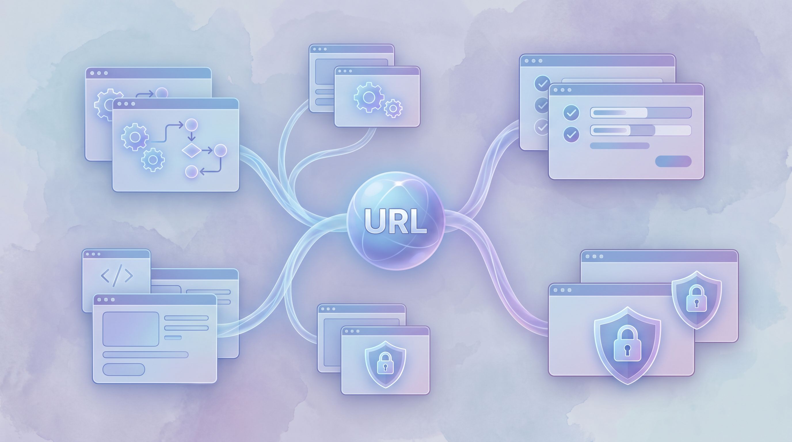
3. URLs: The Quiet Workhorse of Personalization
URLs are one of the most underrated personalization tools. With Ezpa.ge, you can:
- Create clean, memorable custom URLs (e.g.
yourbrand.com/partner-intake) for each request type. - Add query parameters to subtly adjust form behavior or prefill fields.
This unlocks a lot of invisible personalization:
a) One Form, Many Angles
Instead of cloning the same form for every campaign, keep a single canonical form and use URLs to tune it.
.../demo?source=homepage.../demo?source=pricing.../demo?source=linkedin-remarketing
Behind the scenes, you can:
- Prefill a hidden
sourcefield - Adjust headline or helper text based on
source - Route submissions differently (e.g., fast-lane routing for certain campaigns)
This approach pairs well with ideas in Form UX for High-Intent Traffic. You’re matching the form’s tone and follow-up to the promise that got someone to click—without needing a new page every time.
b) Deep Links for Internal Workflows
For internal service catalogs, URLs are even more powerful.
Imagine you’ve followed the pattern from Forms as Internal Service Catalogs: one URL per request type.
Now, you can add parameters like:
?team=marketingto prefill “Requesting team”?priority=urgentfrom a runbook link?project_id=Q3-campaignfrom a project doc
Ops gets structured, consistent data in Sheets; teammates get forms that feel like they’re already halfway filled out.
c) Guardrails for Privacy
URLs also help you avoid creepiness:
- Use short-lived, signed links for sensitive prefilled data.
- Avoid stuffing personally identifiable information directly into query strings; instead, use tokens that your backend resolves to safe, scoped context.
If a link is accidentally shared, you don’t want someone else seeing a stranger’s email or account details.
Putting It Together: Patterns You Can Ship This Week
Let’s turn the concepts into concrete patterns you can implement with Ezpa.ge and a spreadsheet.
Pattern 1: Campaign-Smart Demo Form
Goal: Use one demo form for multiple campaigns, while making each visitor feel like the form matches what they clicked.
How to set it up:
-
Create a single Ezpa.ge demo form with:
- Core fields: name, email, company, role
- A short multi-choice question: “Which best describes what you’re looking for?”
- Optional fields for deeper qualification (timeline, budget, tech stack)
-
Add hidden fields for
source,campaign, andsegment, all synced to Google Sheets. -
Use URL parameters in your ads and CTAs:
?source=linkedin&campaign=enterprise-ops?source=homepage&campaign=pricing
-
Configure logic so that:
- Certain campaigns automatically show a “Concierge onboarding” checkbox.
- High-intent sources see a slightly different confirmation message (e.g., with a scheduling link).
-
Use Sheets to route and prioritize:
- Filter or color-code rows by
sourceandcampaign. - Pipe high-value campaigns into a separate tab or connected workflow.
- Filter or color-code rows by
From the user’s perspective, nothing feels “personalized” in a creepy way. They just see a form that seems to understand why they’re there.
Pattern 2: Micro-Form → Deep Dive, Without Repetition
Goal: Start with a low-friction micro-form, then invite a subset of respondents into a richer intake—without asking them to repeat themselves.
This is especially useful for research, customer interviews, or early adopter programs.
How to set it up:
-
Build a button-only micro-form with Ezpa.ge (e.g., “Yes, I’m interested in being a beta tester”).
This mirrors patterns from Signals in Single Clicks. -
Sync responses to Google Sheets and tag those who click “Yes” with a simple flag.
-
Send a follow-up email to those flagged users with a link to a longer intake form:
- Include URL parameters like
?email={{email}}&cohort=beta1.
- Include URL parameters like
-
On the intake form:
- Prefill email from the URL (editable).
- Use logic to show different questions based on
cohortor their initial choice.
-
Use Sheets to coordinate interview slots, incentives, and follow-ups.
The result: people experience a smooth, progressive flow—from a single click to a thoughtful intake—without ever feeling like you’re tracking them behind their back.
Pattern 3: Role-Aware Internal Request Forms
Goal: For internal forms (IT requests, marketing support, finance approvals), reduce friction by tailoring fields to the requester’s role and context.
How to set it up:
-
Create one Ezpa.ge form per request type (e.g., “New software request”).
-
Share role-specific URLs:
- In your design team’s wiki:
.../software-request?team=design. - In engineering docs:
.../software-request?team=engineering.
- In your design team’s wiki:
-
Use logic to:
- Show different examples or helper text for each team.
- Ask additional governance questions for certain teams (e.g., “Does this store customer data?” for support or success).
-
Prefill non-sensitive fields like “Department” based on
team, but keep them editable. -
Route submissions based on team and urgency in Sheets or via webhooks.
Everyone gets the same core workflow, but the form feels tailored to their reality.
How to Stay on the Right Side of “Creepy”
Invisible personalization is as much about restraint as it is about capability. A few guardrails will keep you honest:
1. Be Explicit About Sensitive Stuff
If you’re using prior answers or account context in a way that might surprise someone, say so.
- Add a short line like: “We prefilled a few details from your account. Edit anything that’s changed.”
- For research or support forms, explain why you’re asking detailed questions: “These help us route you to the right specialist.”
Transparency turns “How do they know this?” into “Nice, they saved me time.”
2. Keep Control in the User’s Hands
Always:
- Let people edit prefilled fields.
- Provide a clear way to skip optional or sensitive questions.
- Avoid auto-submitting or auto-advancing in ways that feel pushy.
If a form ever feels like it’s acting on someone rather than with them, you’ve gone too far.
3. Minimize Data, Maximize Usefulness
Ask yourself:
- “If this field were empty, would we actually do something different?”
If not, don’t ask it. - “Can we infer this from something less sensitive?”
For example, you might not need to ask for “annual revenue” if you already have company size and plan type.
This is also where AI and automation come in. As we explore in posts like Forms as On-Ramps to AI, the value isn’t in collecting more data; it’s in collecting the right data and putting it to work.
4. Test for Emotional Response, Not Just Conversion
When you experiment with prefills, logic, and URLs, don’t only watch completion rate. Also look for:
- Support tickets or feedback mentioning “weird” or “creepy” behavior
- Drop-offs at moments where personalization kicks in
- Qualitative feedback from user interviews or internal dogfooding
A small conversion lift isn’t worth a long-term trust hit.
Bringing Invisible Personalization to Your Forms
You don’t need to rebuild your entire stack to make your forms feel smarter and more considerate. You can start with:
- One high-traffic form (demo request, trial signup, key internal intake).
- One or two prefill opportunities from context you already have.
- One simple logic branch that hides irrelevant questions.
- One or two URL-based variants for major campaigns or teams.
From there, let your Google Sheets data tell you what’s working: shorter completion times, more complete fields, fewer “N/A” answers, and smoother handoffs.
Over time, you’ll end up with a form layer that quietly adapts to each person—without ever crossing the line into surveillance theater.
Summary
Invisible personalization is about using prefills, logic, and URLs to make forms feel:
- Shorter and more relevant for each person
- More trustworthy, because they only use clear, earned signals
- Easier to operate, because your team gets cleaner, richer data in Sheets and downstream tools
By:
- Prefilling only what you can explain
- Using conditional logic to ask fewer, better questions
- Leaning on URLs and parameters instead of cloning forms
…you create experiences that feel like a thoughtful conversation, not a data grab.
Your Next Step
Pick one form that matters this quarter—maybe your main Ezpa.ge lead form, a research intake, or a critical internal request. Then:
- List the signals you already have (campaign, page, role, prior clicks).
- Choose one small prefill and one simple logic rule you can add.
- Create a clean, memorable URL for that form and add parameters for at least one campaign or team.
Ship that version, watch the results in Google Sheets, and iterate.
If you’re using Ezpa.ge already, you have everything you need to start. And if you’re not, this is the perfect moment to experiment with forms that feel personal without ever feeling creepy—forms that balance form and function in the best way.