Form Themes for Product-Led Growth: Matching In-App Prompts to Lifecycle, Not Just Brand

Most teams treat form themes as a brand exercise: pick the primary color, drop in the logo, call it on-brand, ship.
That works for consistency. It doesn’t work for product‑led growth.
If your product is your primary growth engine, every in‑app prompt, survey, upgrade wall, and feedback form is part of the core experience. The way these surfaces look and feel should change as users move from first touch to power usage—not just mirror your style guide.
This post is about using form themes as a lifecycle lever: how to match in‑app prompts to where someone is in their journey so you:
- Shorten time‑to‑value
- Increase activation and expansion
- Reduce friction around upgrades and data collection
- Make your product feel more like a helpful guide than a pushy salesperson
We’ll focus on practical patterns you can implement with tools like Ezpa.ge, where you already have customizable themes, custom URLs, and real‑time Google Sheets syncing.
Why Lifecycle-Themed Forms Matter for Product-Led Growth
Product‑led growth (PLG) is built on a simple idea: the product experience itself should drive acquisition, conversion, and expansion—not just marketing and sales.
In practice, that means your in‑app prompts and forms are doing jobs that used to belong to landing pages and sales decks:
- Explaining value
- Collecting context
- Nudging upgrades
- Triggering collaboration
- Capturing feedback at key moments
Research on PLG companies consistently shows that:
- Activation and early value delivery are the strongest predictors of long‑term retention and expansion.
- Behavior‑triggered prompts at the “moment of need” outperform generic upgrade banners or static help centers.
- Onboarding is no longer a one‑time event; it’s a continuous process across the entire lifecycle.
When you combine those insights, a pattern emerges:
The same form theme will not work equally well for a brand‑new user, an evaluating team, and a power user deciding whether to upgrade.
Brand-Only Theming vs Lifecycle-Aware Theming
Brand-only theming says:
- Every form uses the same colors, typography, and density.
- The upgrade wall looks visually identical to the first‑run setup.
- Feedback prompts feel the same whether someone is confused or delighted.
Lifecycle-aware theming says:
- Early prompts are warm, low‑pressure, and highly guided.
- Evaluation and upgrade prompts feel more analytical and ROI‑focused.
- Power‑user prompts are efficient, minimal, and respectful of expertise.
The product is the same. The way it asks for information and offers next steps is not.
That shift is where form themes become a growth lever instead of a cosmetic layer.
Map Your Lifecycle First, Then Your Themes
Before you redesign a single form, you need a simple lifecycle map. It doesn’t have to be perfect; it just needs to be good enough to theme against.
A practical starting point for most SaaS products:
- New – Signed up, but not activated.
- Activating – On the path to first value (approaching your “aha” moment).
- Adopting – Using core workflows consistently.
- Expanding – Considering more seats, features, or higher tiers.
- At Risk – Usage dropping, key actions missing, or explicit negative signals.
For each stage, define:
- Primary job of in-app prompts/forms
- Emotional state to design for
- Signals you’ll use to detect the stage
Here’s a compact example:
1) New
- Job: Reduce uncertainty, collect enough context to personalize, guide to first success.
- Emotion: Curious but unsure.
- Signals: Just signed up, < 2 sessions, no key action completed.
2) Activating
- Job: Push gently toward the first meaningful outcome.
- Emotion: Motivated but easily overwhelmed.
- Signals: Has explored features, but hasn’t completed your core workflow.
3) Adopting
- Job: Deepen usage, introduce adjacent features, capture structured feedback.
- Emotion: Confident, starting to rely on you.
- Signals: Uses core workflow weekly, invites teammates, connects integrations.
4) Expanding
- Job: Make the business case obvious, reduce friction to upgrade or add seats.
- Emotion: Rational evaluation; weighing cost vs. value.
- Signals: Hitting limits (seats, usage caps), frequent use of premium‑adjacent features.
5) At Risk
- Job: Diagnose friction, offer targeted help, and re‑establish value.
- Emotion: Frustrated, disengaged, or simply distracted.
- Signals: Drop in usage, churn‑correlated behaviors, negative feedback.
Once you have this, you can start designing theme archetypes for each stage.
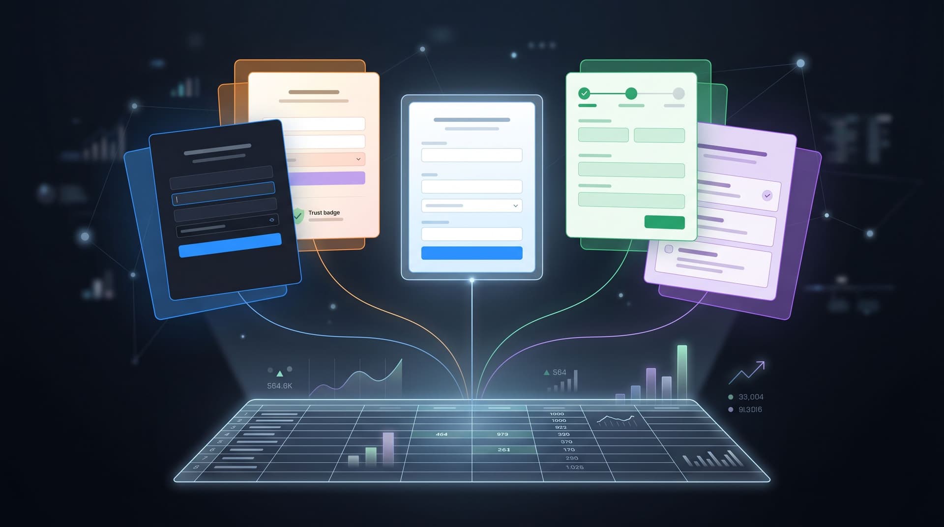
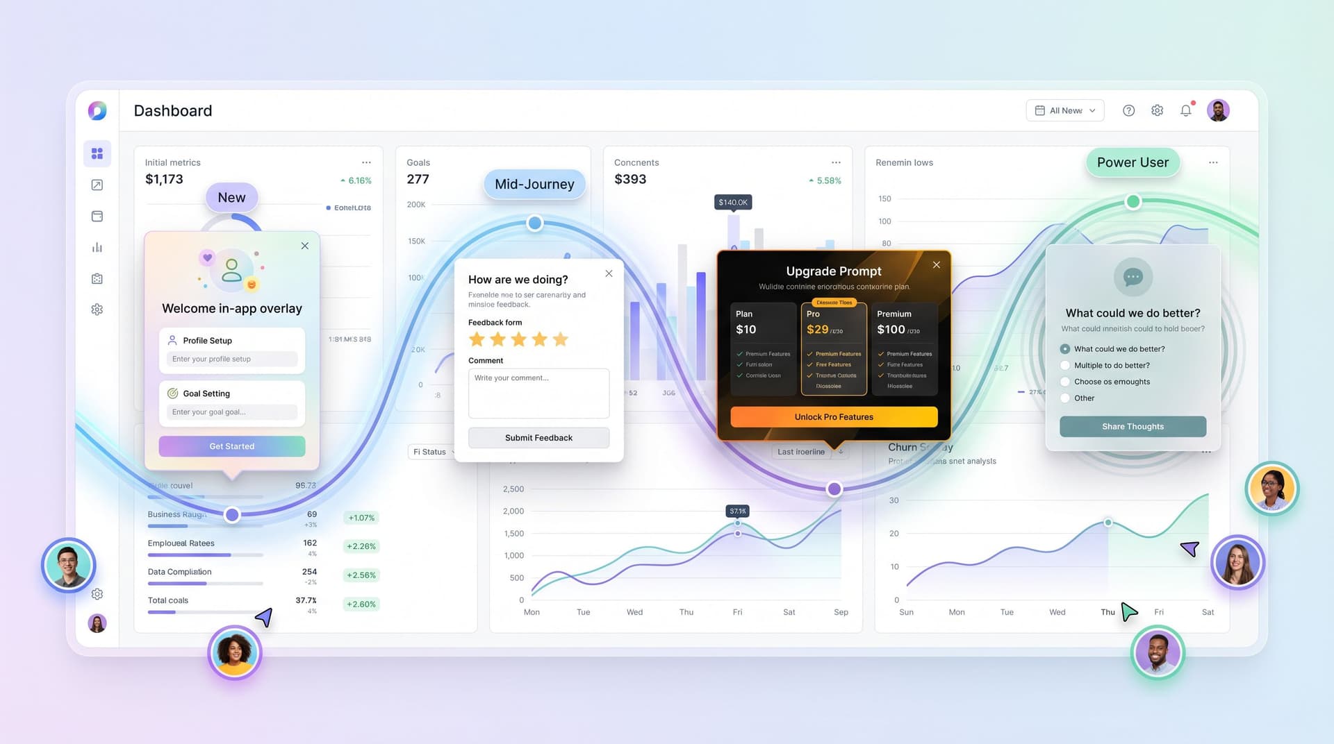
Designing Theme Archetypes by Lifecycle Stage
Instead of one canonical form theme, create a small set of archetypes that map to lifecycle jobs. With Ezpa.ge, this can be as simple as saving multiple themes and applying them to different forms or URLs.
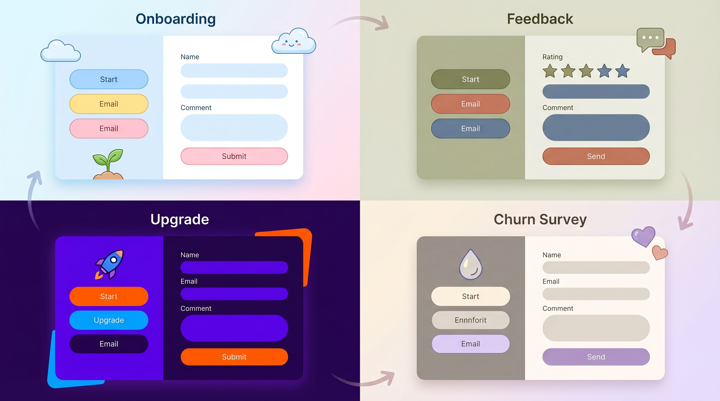
1. New & Activating: “Guide” Theme
Goal: Make the product feel approachable and safe. Help users share just enough context to get a personalized path.
Visual and interaction patterns:
- High contrast for primary actions, but soft, friendly color palette.
- Generous spacing, large labels, and inline helper text.
- One question per step or a very short form (3–5 fields max).
- Progress indicators (“Step 1 of 3”) to reduce anxiety.
- Microcopy that emphasizes benefit, not obligation.
Good use cases for this theme:
- First‑run setup form
- “What are you here to do?” intent survey
- Initial data import or connection prompts
If you’re already thinking about how this connects to acquisition, this is where your post‑click form experience should align tightly with ad promises. For more on that handoff, see how we approach it in Form UX for High-Intent Traffic: Designing Post-Click Flows That Rescue Underperforming Ads.
2. Adopting: “Companion” Theme
Once users are getting value, your prompts should feel like a partner, not a gatekeeper.
Goal: Encourage richer input and new behaviors without breaking flow.
Visual and interaction patterns:
- Slightly denser layout; users are now comfortable.
- Muted but confident colors; less “playful,” more “professional.”
- Inline tooltips instead of long helper paragraphs.
- Contextual prompts anchored to actions (“Tell us more about this workflow?”).
Good use cases for this theme:
- Feedback forms triggered after feature use
- Quick polls about missing capabilities
- “Help us tune this for your team” configuration forms
This is also where AI‑driven, response‑aware prompts shine. Instead of long, static questionnaires, you can use something like AI-Generated Follow-Up Questions: Using Response-Aware Prompts to Go Deeper Without Longer Forms to keep forms lightweight while still gathering deep context.
3. Expanding: “Decision” Theme
When someone is bumping into limits or exploring premium features, the form is doing sales work—even if there’s no salesperson.
Goal: Support clear, rational decisions. Make the upside and tradeoffs obvious.
Visual and interaction patterns:
- Crisp, high‑contrast theme with strong hierarchy.
- Clear separation between “current plan” and “new plan” or “current usage” and “projected usage.”
- Inline summaries (“You’ll unlock X, Y, Z and keep A, B.”).
- Trust signals: security badges, SLAs, or renewal terms near payment fields.
Good use cases for this theme:
- Upgrade forms (seats, tiers, add‑ons)
- “Unlock this feature” paywalls that collect billing details
- Expansion surveys (“What’s blocking you from upgrading?”)
Behavior‑triggered upgrade prompts—shown when a user hits a usage threshold or tries to access a premium feature—consistently outperform generic “Upgrade” banners. They work because they align with intent and timing, not just brand consistency.
4. At Risk: “Rescue” Theme
When someone is drifting away, a generic, on‑brand prompt can feel tone‑deaf. You need a theme that signals we’re here to help, not to sell.
Goal: Diagnose issues and offer a path back to value with minimal friction.
Visual and interaction patterns:
- Softer colors, empathetic microcopy (“Looks like things have been quiet—mind if we ask why?”).
- Very short forms (1–3 questions) with optional detail fields.
- Clear alternatives: “Talk to a human,” “Skip for now,” “Show me a quick win instead.”
- Visible reassurance about data use and effort (“Takes 30 seconds”).
Good use cases for this theme:
- Exit surveys when someone cancels or downgrades
- Re‑engagement prompts when usage drops
- “Is this still the right tool for you?” check‑ins
Matching Prompts and Themes to Events, Not Just Pages
Lifecycle‑aware themes only work if they’re attached to the right moments. Instead of thinking “this form lives on this page,” think:
“This theme + this copy + this form logic should appear when a user does this inside the product.”
Some high‑leverage event–prompt pairs:
-
First project created → Guide Theme
- Prompt: “Want a 2‑minute setup so this project actually ships?”
- Form: asks for project type, team size, and deadline.
-
Usage threshold hit (e.g., 80% of free quota) → Decision Theme
- Prompt: “You’re about to hit your limit. Here’s what upgrading unlocks.”
- Form: concise upgrade flow with plan comparison.
-
New teammate invited → Companion Theme
- Prompt: “Help your teammate ramp faster—what should they focus on first?”
- Form: selects primary use case and permissions.
-
Sharp drop in activity → Rescue Theme
- Prompt: “We noticed you haven’t logged in lately. What’s going on?”
- Form: quick multiple choice with optional text.
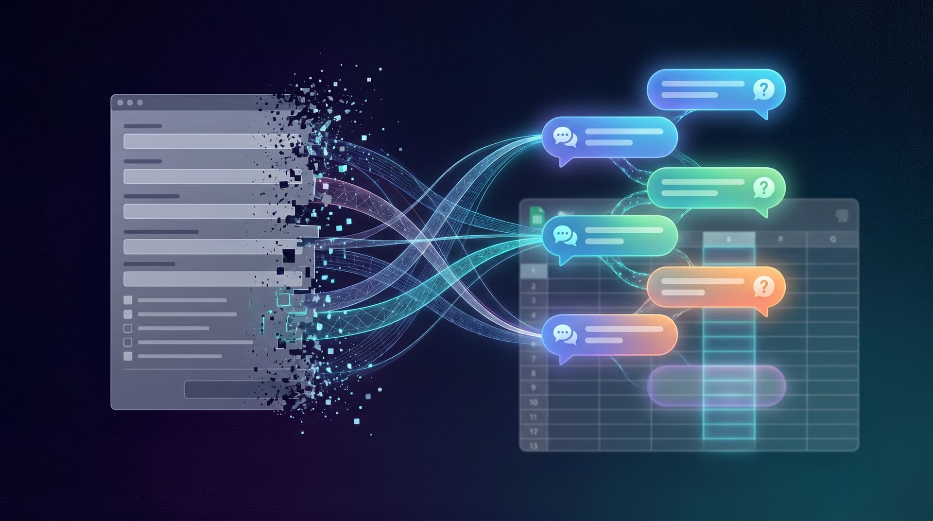
With Ezpa.ge, this can be orchestrated via:
- Custom URLs for each lifecycle‑themed form (e.g.,
/onboarding-intent,/upgrade-usage,/churn-survey). - In‑app links or modals that deep‑link to those URLs.
- Real‑time Google Sheets syncing so lifecycle events and form responses land in the same place your growth and success teams already live.
From there, you can wire forms into your workflows—routing responses, triggering playbooks, and analyzing which theme–prompt combos actually move the needle. If you want a deeper dive on how to turn those responses into real operational systems, From Form to Workflow Engine: Designing Conditional Paths That Replace Internal Tools is a good next read.
Turning Themes into a Reusable System
To keep this maintainable, treat lifecycle‑aware themes as a system, not a series of one‑off experiments.
Step 1: Define 3–5 Canonical Themes
Start with a small set you can actually maintain:
Guide– New & activatingCompanion– AdoptingDecision– ExpandingRescue– At risk
For each theme, document:
- Color tokens (backgrounds, accents, error states)
- Typography rules (sizes, weights for labels and headings)
- Layout density (spacing, field grouping)
- Interaction patterns (progress bars, tooltips, inline validation)
If you already have a form‑focused design system, plug these into it. If not, this is a great moment to start; see Design Systems for Forms: Component Libraries, Tokens, and Guardrails Your Whole Team Can Use for a deeper breakdown.
Step 2: Map Themes to Events and Forms
Create a simple table (even in Google Sheets) with:
- Lifecycle stage
- Event or trigger
- Form name / URL
- Theme
- Owner
Example:
| Stage | Trigger | Form / URL | Theme | Owner |
|-----------|----------------------------------|---------------------------------|-----------|---------|
| New | Account created | /onboarding-intent | Guide | Growth |
| Activating| No project after 24h | /quick-start-project | Guide | Product |
| Adopting | Feature X used 3 times | /feature-feedback-x | Companion | PM |
| Expanding | 80% of quota used | /upgrade-usage | Decision | Revenue |
| At Risk | 14 days with no login | /reengage-checkin | Rescue | CS |
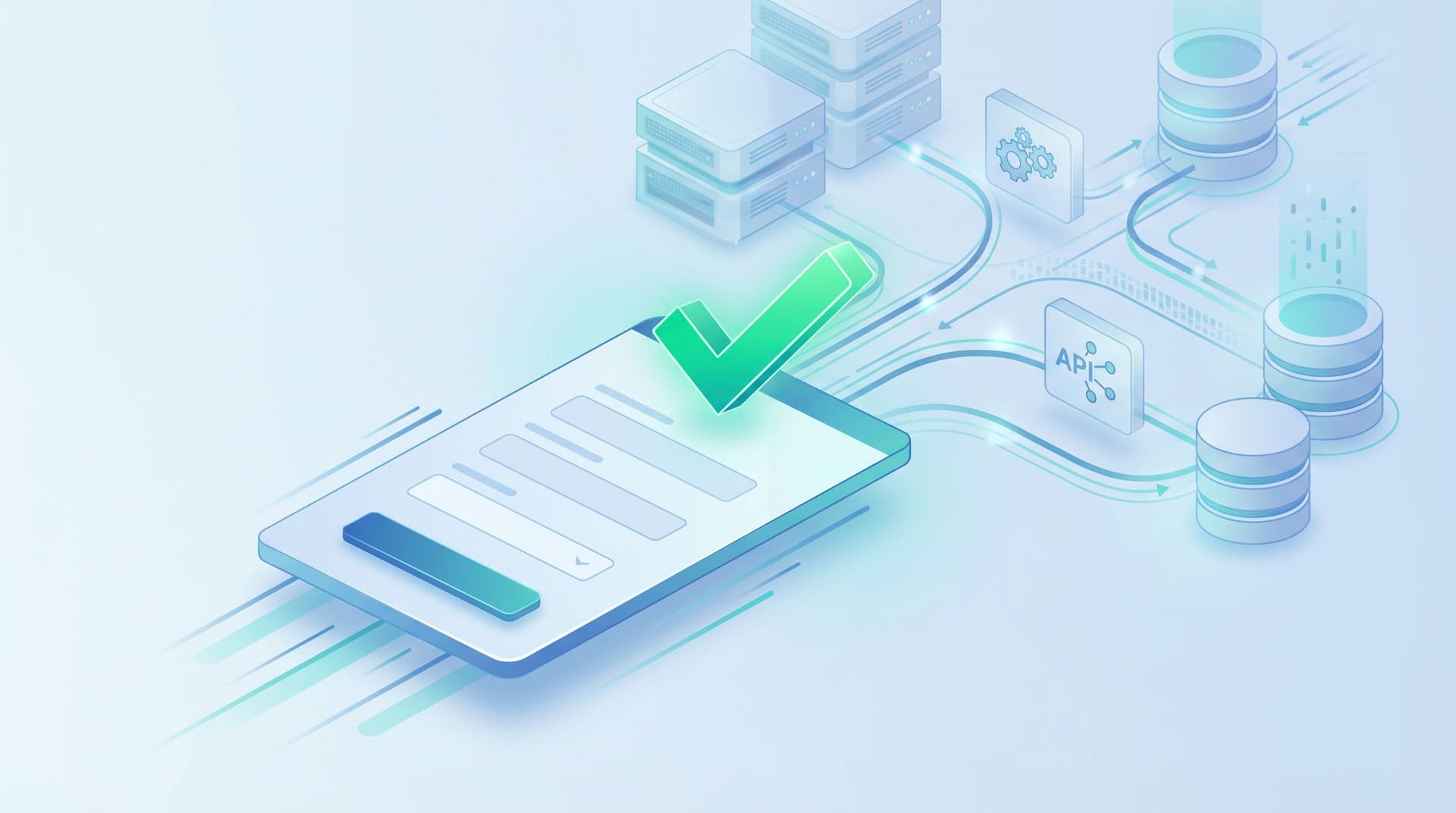
Step 3: Wire Data Back into Your Growth Loop
Themes are only as good as the results they drive. With Ezpa.ge’s real‑time Google Sheets syncing, you can:
- Track completion rates by theme and lifecycle stage.
- Correlate prompts with downstream behaviors (activation, upgrades, retention).
- Run A/B tests on copy or layout inside the same theme.
This doesn’t need a data warehouse to start. A lightweight analytics framework—tracking a few key metrics by form and theme—is enough to identify which lifecycle‑themed prompts are actually moving the numbers.
Practical Tips for Better Lifecycle-Themed Forms
A few patterns we see working consistently across PLG teams:
- Shrink the first ask. Early forms should feel like a handshake, not a contract. Ask for the minimum needed to personalize the experience.
- Use language that matches intent. Upgrade prompts should sound different from feedback prompts. “Unlock more seats” vs. “Help us improve this workflow.”
- Respect momentum. Don’t drop a long form right after someone completes a big task. Use quick, inline prompts or defer to email when appropriate.
- Make state visible. Progress bars, “you’re almost there,” or “this will take 30 seconds” copy can meaningfully improve completion.
- Design for mobile from the start. A significant share of users will hit your forms on phones or small laptops. Layout, tap targets, and error states matter.
- Keep themes stable, iterate inside them. Once you anchor a theme to a lifecycle stage, avoid constant visual churn. Iterate on copy, fields, and logic first.
Bringing It All Together
Product‑led growth isn’t just about more tooltips and checklists. It’s about building a product that communicates effectively at every stage of the journey.
Form themes are one of your sharpest tools for doing that:
- They shape how users feel when you ask for information or propose an upgrade.
- They help your product speak differently to a curious newcomer vs. a skeptical buyer vs. a busy power user.
- They turn generic prompts into lifecycle‑aware conversations that drive activation, adoption, and expansion.
When you:
- Map your lifecycle
- Define a small set of theme archetypes
- Attach those themes to specific in‑app events
- Sync responses into a shared source of truth
…you stop thinking of forms as static surfaces and start using them as growth instruments.
Your Next Step
If you’re using Ezpa.ge already, you have everything you need to start:
- Pick one lifecycle moment where prompts feel off—maybe your upgrade wall or your first‑run setup.
- Design a dedicated theme for that stage (Guide, Companion, Decision, or Rescue).
- Spin up a new Ezpa.ge form with that theme, give it a clear custom URL, and wire it into your product.
- Sync responses into Google Sheets and watch how it impacts activation, upgrades, or retention over the next few weeks.
You don’t need to redesign your entire product to get value here. Start with a single lifecycle‑aware form theme, ship it, measure it, and then expand the pattern.
Your product is already talking to users. Lifecycle‑themed forms make sure it’s saying the right thing, in the right way, at the right moment.