Form UX for High-Intent Traffic: Designing Post-Click Flows That Rescue Underperforming Ads


Performance marketers obsess over click-through rates and CPCs. But the real story starts after the click.
If your ads are attracting high-intent visitors—people ready to buy, book, or talk to sales—but your form experience is generic or confusing, you’re effectively pouring budget into a leaky bucket. The ad did its job. The post-click flow didn’t.
This post is about fixing that: how to design form experiences that match the promise of your ads, respect user intent, and turn expensive clicks into qualified conversations.
Why post-click form UX makes or breaks your paid performance
When an ad is working, you see a few consistent signals:
- High CTR relative to benchmarks
- Good engagement (scroll depth, time on page)
- Low conversion rate on the form itself
That last piece is where money goes to die.
Here’s what’s usually happening:
- The ad speaks to a specific pain or segment; the form looks like a generic, catch-all lead capture.
- The ad promises speed or simplicity; the form feels like paperwork.
- The ad is laser-focused; the form is trying to qualify for every possible use case.
When there’s a mismatch between the pre-click story (ad) and the post-click experience (form), high-intent visitors do one of three things:
- Abandon immediately – “This isn’t what I clicked for.”
- Skim and bounce – “Feels like work. I’ll do this later.”
- Submit low-quality info – “I’ll just put something in to get through this.”
A well-designed post-click form flow does the opposite:
- Confirms they’re in the right place.
- Makes it feel easy to follow through.
- Uses just enough questions to route and prioritize the right people.
If you’re already investing in ads, improving your form UX is often the highest-ROI lever you can pull—because you’re not buying more traffic; you’re converting more of the traffic you already have.
Start with intent, not with fields
Most underperforming forms start from the wrong question:
“What information does our team need?”
For high-intent ad traffic, you need a different starting point:
“What outcome is this clicker expecting, and how fast can we get them there?”
That means:
- Segmenting by entry point – A demo ad, a pricing ad, and a content download ad should not share the exact same form.
- Aligning the form’s first screen with ad promise – If the ad says “Get a live demo,” the first thing they see shouldn’t be a 12-field questionnaire. It should be a clear confirmation that they’re about to schedule or request that demo.
- Designing for one primary job – Every form should have a single, obvious “job to be done”: book a call, get access, request pricing, start a trial.
You can still collect rich data, but the path to the promised outcome must be front and center.
If you want to go deeper on intent-driven form design and how it powers personalization, this piece on using lightweight forms as real-time signal collectors is a helpful companion.
Map the post-click journey like a funnel, not a page
Treating the post-click experience as “the landing page with a form on it” is how you end up with bloated, brittle flows.
Instead, map it as a micro-funnel:
- Reassurance – “Yes, this is exactly what you clicked for.”
- Context – “Here’s what you’ll get if you complete this.”
- Commitment – “Give us one small piece of information to get started.”
- Depth (optional) – “Now that you’ve started, help us tailor this to you.”
- Confirmation – “Here’s what happens next and when.”
For high-intent traffic, the biggest gains often come from:
- Moving from a single intimidating screen to a short multi-step flow.
- Front-loading clarity and value, not fields.
- Asking the most critical routing/prioritization question early, so you can personalize the rest.
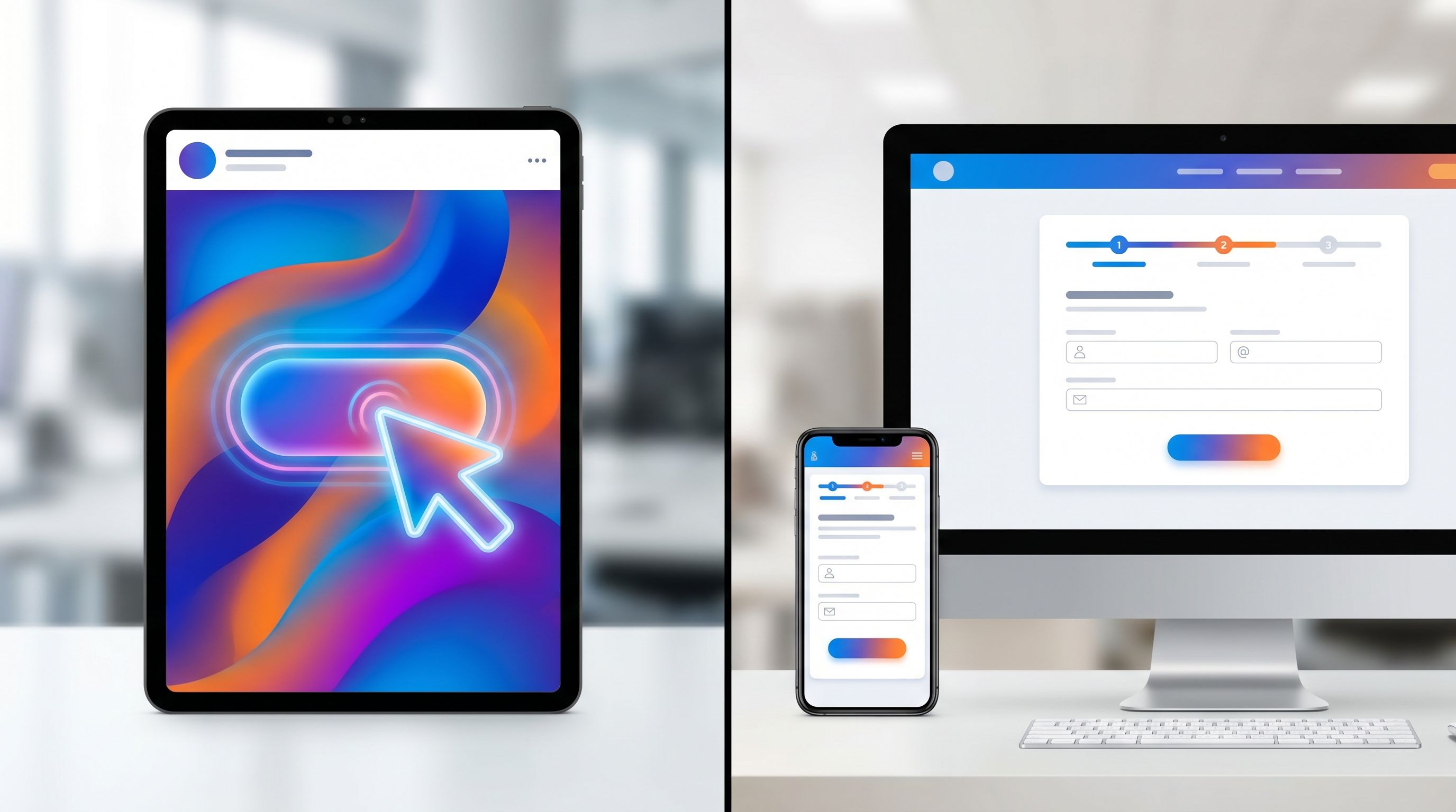
This is exactly where tools like Ezpa.ge shine: you can design multi-step, themeable flows with custom URLs per campaign, and sync everything straight into Google Sheets for routing and scoring—without spinning up new engineering work.
Diagnose: Is it the traffic, the offer, or the form?
Before you redesign anything, you need to be sure you’re fixing the right problem.
Here’s a simple diagnostic framework for underperforming ads:
-
Check click quality
- Are visitors spending more than a few seconds on the page?
- Are they scrolling to the form?
- Do you see branded searches or repeat visits from the same accounts?
If engagement is low and bounce is instant, you may have a traffic or message mismatch problem.
-
Check offer clarity
- Is the primary outcome obvious above the fold? (e.g., “Book a 30-minute strategy call,” “Get instant pricing,” “Start a 14-day trial.”)
- Does the copy echo the ad’s language and promise?
If visitors linger but don’t even start the form, you likely have an offer clarity problem.
-
Check form friction
- Where do people drop off—at the first question, halfway through, at submit?
- Are there specific fields with abnormally high abandonment (phone, budget, company size)?
If people start but don’t finish, you have a form UX and question design problem.
Use your analytics stack (or a lightweight framework like the one described in Baseline to Benchmarks) to instrument:
- Form start rate (views → first interaction)
- Step completion rates (for multi-step flows)
- Overall submit rate
Then prioritize changes where drop-off is highest.
For a detailed walkthrough of building a practical measurement layer your team will actually use, check out this guide on lightweight form analytics.
Match form themes to ad creative and channel
One of the most common post-click killers is visual and tonal whiplash:
- The ad is bold, high-contrast, and energetic.
- The form is a generic white card with default browser fields.
High-intent visitors are scanning for continuity: “Is this the same company, the same offer, the same energy I just said yes to?”
Use form themes as a performance lever, not just a branding checkbox:
-
Mirror the ad’s dominant color and mood
If your LinkedIn ad uses a deep blue, high-trust palette with calm copy, carry that into a clean, confident form theme. If your TikTok creative is playful and bright, a slightly more expressive theme can maintain momentum. -
Align typography and tone
A serious, enterprise-focused ad shouldn’t land on a form with quirky microcopy. Likewise, a playful DTC ad shouldn’t drop people into legalistic language. -
Use custom URLs per campaign or segment
With Ezpa.ge, custom URLs let you keep operations simple while giving each campaign its own tailored surface. That also keeps analytics and routing clean.
For a deeper dive on using themes strategically across campaigns without multiplying your pages, see Form Themes for Performance Marketers.
Design the first screen like a landing page header
The first screen of your form is doing more than collecting data. It’s:
- Reassuring visitors they’re in the right place.
- Explaining what they’ll get by finishing.
- Setting expectations for effort.
For high-intent traffic, optimize that first screen ruthlessly.
Elements of a strong first screen:
-
Echoed headline that matches the ad angle
- Ad: “See how teams like yours cut onboarding time in half.”
- Form: “Get your personalized onboarding time reduction walkthrough.”
-
Subcopy that clarifies outcome and timing
- “Share a few details and we’ll send a custom walkthrough within one business day.”
-
Progress framing
- “Step 1 of 3 · About you (takes < 2 minutes)”
-
One simple, low-friction question to start
- Email, role, or company size—whatever is most natural and highest value.
Once someone answers the first question, they’ve made a micro-commitment. Your job is to keep the momentum.
Ask fewer, smarter questions (and let automation do the rest)
High-intent visitors are willing to share information—if it’s clearly in service of a better outcome.
Where teams go wrong:
- Asking for every possible field they might ever want in the CRM.
- Mixing must-have routing questions with “nice to have” enrichment.
- Using vague, hard-to-answer questions like “What’s your budget?” without context.
Instead, structure your questions around three tiers:
-
Routing & prioritization (non-negotiable)
- Company size, use case, timeline, or role—whatever your team truly needs to route and score.
-
Experience personalization (valuable but flexible)
- “Which best describes you?”
- “What are you hoping to accomplish in the next 90 days?”
-
Enrichment (automate where possible)
- Firmographic data from email domain.
- Tech stack or industry via enrichment tools.
You can often replace entire blocks of fields with:
- A single open-ended question like “What prompted you to reach out today?”
- AI-powered follow-ups that only appear when needed, as described in AI-Generated Follow-Up Questions.
With Ezpa.ge, you can:
- Keep the visible form short and conversational.
- Use response-aware logic to show follow-ups only when they add value.
- Sync everything into Google Sheets in real time, where enrichment, scoring, and routing can happen automatically.
Use multi-step flows to reduce perceived effort
Multi-step forms often convert better than single long forms—not because they’re shorter, but because they feel shorter and more guided.
For high-intent traffic, a good pattern is:
-
Step 1: Identity & intent
- Email, name, company, “What are you looking to do?”
-
Step 2: Fit & routing
- Company size, role, primary use case.
-
Step 3: Logistics & expectations
- Preferred time for a call, region, or any constraints your team needs.
Best practices:
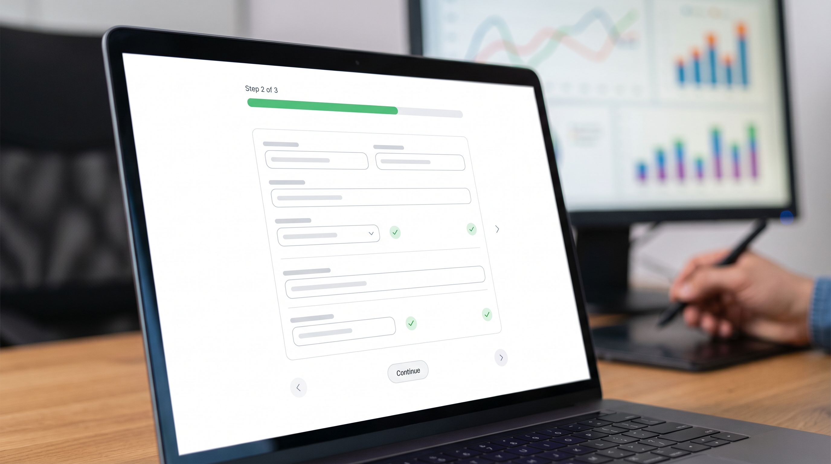
- Show progress clearly – “Step 2 of 3” plus a visual progress bar.
- Group fields by mental model, not by department (e.g., “About your team” vs. “Marketing questions”).
- Reassure at each step – short copy like “This helps us match you with the right specialist.”
If you’re experimenting with different flows (short vs. long, conversational vs. traditional), you don’t need new pages for every variant. With a tool like Ezpa.ge, you can keep a single operational form and use themes, logic, and URLs to run experiments, as explored in Form UX for Experiments.
Respect momentum after submit: confirmations, speed, and SLAs
High-intent traffic doesn’t just care about finishing the form—they care about what happens after.
A weak post-submit experience looks like:
- A generic “Thanks, we’ll be in touch.”
- No indication of timing or next steps.
- No way to confirm that the request actually went somewhere.
A strong post-submit experience does three things:
-
Confirms the outcome clearly
- “You’re booked. Check your email for a calendar invite.”
- “We’ve received your request. A specialist will reach out within one business day.”
-
Sets expectations and reduces anxiety
- “We’ll review your answers and match you with the right person on our team.”
- “If you don’t hear from us by [time], reply to this email and we’ll escalate.”
-
Keeps them engaged while they wait
- Links to a relevant case study, product tour, or FAQ tailored to their segment.
Behind the scenes, this is where routing rules, SLAs, and workflows matter. If you’re using Ezpa.ge with Google Sheets syncing, you can:
- Auto-assign owners based on fields like region, company size, or use case.
- Trigger alerts in Slack or your CRM when high-intent leads submit.
- Track whether response times match the expectations you set.
For a deeper look at how to turn “form submit” into a predictable workflow with owners and SLAs, see From Form Fill to Auto-Routing.
Don’t guess—test deliberately (without drowning in variants)
Once you’ve aligned your post-click flow with high-intent traffic, the next step is optimization—not by gut feel, but by structured experiments.
High-leverage test ideas:
-
First-screen headline
- Variant A: Outcome-focused (“Get a personalized ROI forecast”)
- Variant B: Risk-reduction (“See if we’re a fit before you commit”)
-
Form length perception
- Variant A: Single page with all fields visible.
- Variant B: 3-step flow with progress indicator.
-
Question framing
- Variant A: “What’s your budget?”
- Variant B: “Which range best matches what you’re comfortable investing monthly?”
-
Required vs. optional fields
- Make one high-friction field optional and see if overall conversion lifts more than the loss in data.
The key is to:
- Limit active experiments to what your traffic can meaningfully support.
- Keep your operational backbone simple—one core form, many experiences.
- Measure not just submit rate, but qualified meeting rate or pipeline created.
Bringing it all together
When your ads are working but your results aren’t, it’s tempting to tweak copy, bids, or audiences. Sometimes that’s necessary. But often, the real leverage is in what happens after the click.
To rescue underperforming ads for high-intent traffic:
- Start with intent, not internal data needs. Design the form around the outcome the visitor expects.
- Treat the post-click experience as a micro-funnel. Reassure, contextualize, collect, and confirm.
- Match form themes to ad creative. Avoid visual and tonal whiplash.
- Design the first screen like a landing page header. Echo the ad, clarify value, set expectations.
- Ask fewer, smarter questions. Use automation and AI to fill in the rest.
- Leverage multi-step flows. Reduce perceived effort and guide people through.
- Respect post-submit momentum. Clear confirmations, realistic SLAs, and tight routing.
- Test deliberately. Use experiments to refine, not reinvent, your form UX.
Tools like Ezpa.ge give performance marketers exactly what this approach needs:
- Custom themes and URLs per campaign without new engineering work.
- Multi-step, adaptive flows that can feel like guided conversations.
- Real-time Google Sheets syncing so routing, scoring, and analytics stay simple.
Your next step
If you’re spending real money on ads, your forms are already part of your media plan—whether you’ve designed them that way or not.
Pick one high-intent campaign that’s underperforming on conversion. This week:
- Audit the journey from ad to form submit. Note every moment of mismatch or friction.
- Redesign just the first screen and theme to match the ad’s promise and creative.
- Trim or reframe 2–3 questions that feel like work instead of value.
Then ship it. Watch what happens to form start rate, completion rate, and qualified leads.
If you’re using Ezpa.ge, you can do all of this—new theme, new URL, tweaked question flow—without touching your core stack. And if you’re not, this is still a pattern you can apply with whatever tools you have.
High-intent traffic is the most precious resource in your funnel. Don’t let a generic form waste it.