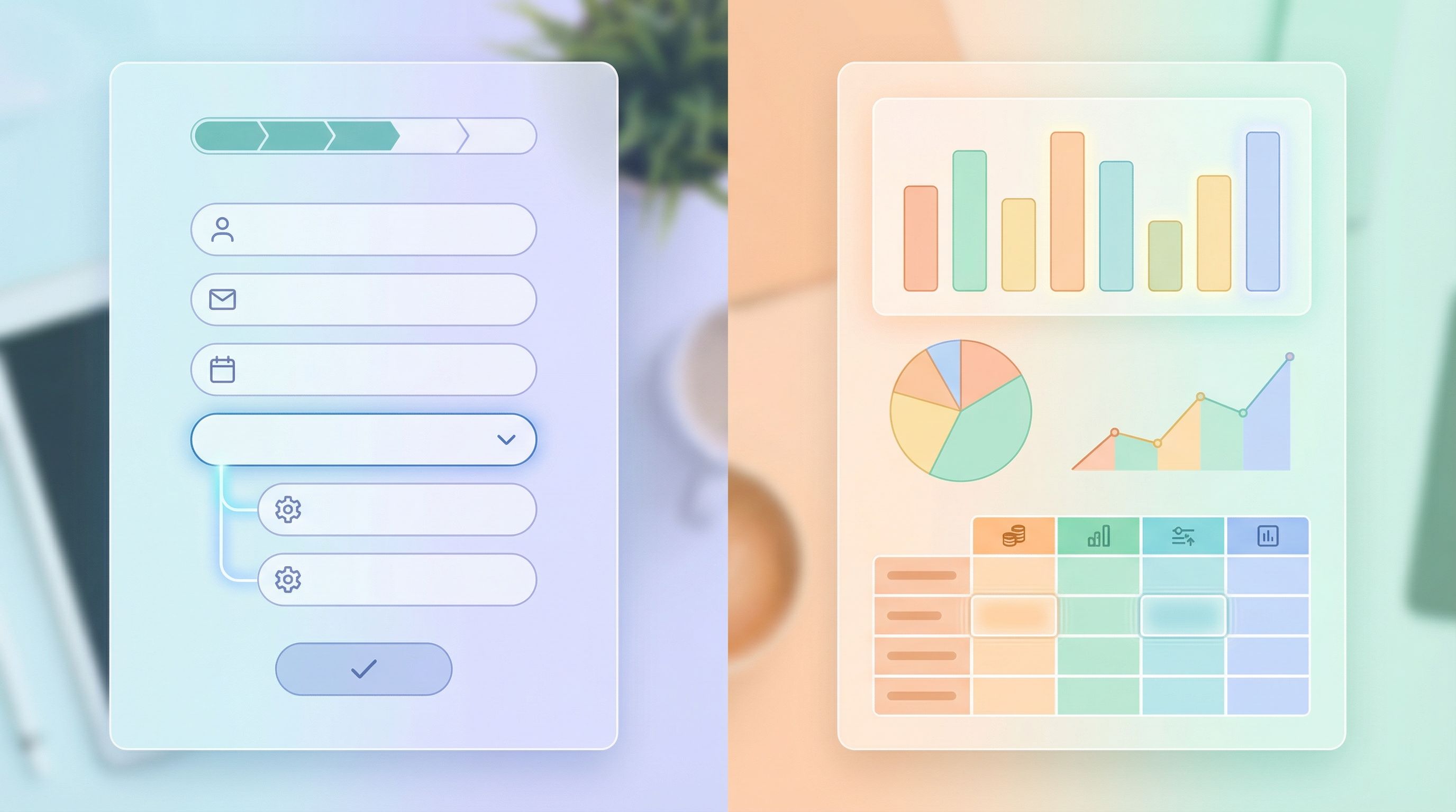
One Form, Many Audiences: Using Conditional Logic to Personalize Paths Without Losing Your Mind


You know the pain: marketing wants one signup form, sales wants qualification questions, product wants NPS, and support wants bug reports. Everyone agrees the form should be “simple” and “personalized” — and somehow you’re supposed to make that happen without spinning up 12 different versions.
That’s where conditional logic earns its keep.
Done well, conditional logic lets you:
- Show different questions to different people
- Shorten the journey for simple cases
- Collect richer data from high-intent users
- Keep one URL, one theme, one analytics setup
All without turning your form into a logic-spaghetti nightmare.
This guide is about building one form that gracefully serves many audiences — using conditional logic in a way that’s powerful, maintainable, and actually shippable. We’ll focus on practical patterns you can apply right away, especially if you’re building with a flexible tool like Ezpa.ge.
Why One Smart Form Beats Ten Static Ones
Multiple forms feel like the obvious solution: one for leads, one for customers, one for partners, one for feedback, and so on. But that approach breaks down fast.
The hidden costs of “just spin up another form”:
- Fragmented data – Your responses live in separate places, making reporting and routing harder.
- Inconsistent UX – Different teams create different experiences, themes, and copy.
- Maintenance overhead – Any global change (like a new privacy notice) has to be updated everywhere.
- Broken links and confusion – Old links keep circulating; no one is sure which form is “the right one.”
A single, well-structured form with smart logic flips that script:
- One canonical URL you can brand, share, and track (especially powerful with Ezpa.ge custom URLs).
- One theme system to maintain, so everything stays on-brand.
- One data pipeline into your CRM, help desk, or Google Sheets.
- Many personalized paths inside that one structure.
If you’re already thinking about cohesive theme systems, you’ll recognize the same scaling logic here. The same way we advocate for reusable design in Theme Systems, Not One-Off Skins, conditional logic is about reusable flows, not one-off hacks.
What Conditional Logic Actually Is (and Isn’t)
At its core, conditional logic is just: “If X, then Y.”
In form terms, that usually means:
- Show or hide fields based on previous answers
- Skip to different steps depending on user choices
- Branch into different endings (thank-you screens, follow-ups) for different segments
Some common examples:
- If someone selects “Existing customer”, show account-related questions and hide basic lead-qualifying fields.
- If someone chooses “Report a bug”, ask for device, browser, and steps to reproduce.
- If someone indicates “High budget”, show extra qualification questions or route them differently after submission.
What conditional logic is not:
- A substitute for clear copy or good layout
- A reason to ask for every possible piece of data
- A magic fix for a confusing value proposition
Logic magnifies whatever is already there. If your base form is messy, logic just hides the mess in more places.
Start With Segments, Not Logic Rules
The easiest way to lose your mind with conditional logic is to start by adding rules field-by-field.
A better approach: design around segments first.
Ask:
-
Who are the distinct groups using this form?
Examples:- New leads
- Existing customers
- Partners or vendors
- Job applicants
- Internal teammates (e.g., submitting requests)
-
What is the primary job-to-be-done for each group?
For instance, on a single “Contact us” form:- Leads want to talk to sales.
- Customers want to get support.
- Press wants a quote or interview.
-
What is the minimum information you need from each group to help them?
Once you have that, you can:
- Define a core set of fields everyone sees.
- Define segment-specific fields that only appear when relevant.
- Map out where each segment should land after submitting.
A simple whiteboard or doc works: list segments down the left, steps across the top, and fill in what each segment needs at each step.
Design the “Trunk” Before You Add Branches
Think of your form like a tree:
- The trunk is what everyone sees.
- The branches are what specific segments see.
Start by designing a great trunk:
-
Intro screen / Step 1
- Clear headline: what this form is for.
- Short explainer: what will happen after submission.
- One key question that determines the path, e.g.:
- “What do you need help with today?”
- “Which best describes you?”
-
Universal basics (only what’s truly universal)
- Name
- Company (if B2B)
- Optional: consent / privacy notice
-
Progress indicator
- Show that there are just a few steps.
- Calm anxiety by making progress visible.
- If you’re curious about how this builds trust, we go deeper in From Click to Confidence.
Only after the trunk feels clean, clear, and short do you start attaching branches.
Map Branches as Stories, Not as Fields
Before you touch your form builder, write a short narrative for each segment:
“If someone selects ‘I’m an existing customer needing support,’ they should…"
- Confirm their account details
- Describe the issue with enough detail for triage
- Indicate urgency level
- See a confirmation screen that tells them when they’ll hear back and how to escalate if needed
Do this for each primary segment. Then translate the story into fields and steps.
For each segment, define:
- Segment trigger – Which answer or combination of answers identifies them?
- Additional fields – What only they need to see?
- Optional shortcuts – Can they skip anything to move faster?
- End state – Which confirmation message or follow-up do they get?
This narrative-first approach keeps you from overcomplicating things. If a field doesn’t clearly support the story you just wrote, it probably doesn’t belong in that branch.
Practical Conditional Logic Patterns You Can Steal
Let’s walk through patterns that work well across many use cases.
1. The “Who Are You?” Splitter
Use when: One form serves clearly different roles (e.g., lead vs. customer vs. partner).
How it works:
-
Ask: “Which best describes you?”
- I’m new here and want to learn more
- I’m an existing customer and need support
- I’m a partner or vendor
-
Based on the answer:
- New lead: Show use-case, company size, timeline, budget.
- Existing customer: Show account ID, product area, issue description.
- Partner: Show company type, region, partnership interest.
-
Keep the basics (name, email) shared.
Why it works:
- Everyone feels like the form is “for them.”
- You avoid asking irrelevant questions (e.g., “What’s your budget?” to a support request).
2. The “Complexity Dial”
Use when: You want richer data from high-intent users without punishing everyone.
How it works:
-
Ask a simple intent or commitment question, like:
- “How ready are you to get started?”
- “What’s your timeline?”
-
If someone indicates high intent (e.g., “This month” or “Ready to buy now”):
- Reveal extra qualification fields (budget range, decision-maker, current tools).
-
If someone indicates low intent (e.g., “Just exploring”):
- Keep it short; maybe only ask for email + one qualifier.
Why it works:
- You respect casual interest while still capturing rich data from hot leads.
- Sales gets what they need without hurting overall completion rates.
3. The “Issue Type” Router
Use when: One form collects multiple kinds of requests (support, feedback, feature ideas, bug reports).
How it works:
-
Ask: “What are you reaching out about?”
- I found a bug
- I have a feature request
- I have a billing or account question
- I want to share general feedback
-
Show tailored fields:
- Bug: device, browser, steps to reproduce, screenshots.
- Feature request: use case, current workaround, potential impact.
- Billing: account owner, invoice number, plan type.
- Feedback: rating scale + open text.
-
Use conditional logic on the post-submission experience too:
- Bugs → show a message about response time and any status page.
- Feature requests → explain how you evaluate ideas.
- Billing → provide contact channels for urgent issues.
For more on designing those after-states, see From Form Field to Follow-Up.

Guardrails That Keep Logic From Getting Out of Hand
Conditional logic is powerful, but it’s also easy to overdo. Here are guardrails to keep complexity in check.
1. Cap Your Branches
Pick a maximum number of primary branches — 3 to 5 is usually plenty.
If you find yourself adding a 7th or 8th “special case” path, ask:
- Is this really a primary audience, or an edge case?
- Could this be handled with a single extra field instead of a whole branch?
- Would a separate, dedicated form actually be simpler here?
2. Reuse Components
Where possible, reuse:
- The same contact info fields
- The same consent / privacy block
- The same rating scales
This reduces maintenance and helps users build familiarity with your patterns.
3. Keep Each Step Focused
Whether your form is one page or multi-step, each screen should answer:
“What is the one thing I’m asking the user to do right now?”
If a step feels like a grab-bag of unrelated fields, consider splitting it for clarity — especially when different branches share some, but not all, questions.
4. Document Your Logic
Even a simple text doc or spreadsheet that lists:
- Each segment
- Its trigger conditions
- Which fields and steps it sees
- Which confirmation screen it gets
…will save you from future confusion when someone asks, “Why does this user see that field?”
If you’re syncing to Google Sheets with Ezpa.ge, you can even add a hidden field like logic_path that records the branch name for every response. That makes it much easier to debug and to optimize later — something we explore more deeply in Real-Time Form Optimization.
Using Ezpa.ge Features to Make Logic Manageable
While the principles here apply broadly, Ezpa.ge gives you a few specific advantages when you’re building multi-audience forms:
1. Themes That Travel With Your Logic
Because your logic lives inside a single form, your theme, typography, and layout stay consistent across all branches. You don’t have to restyle multiple forms every time your brand evolves.
- Set a base theme once.
- Let conditional logic handle who sees what.
- Know that every path still feels like your brand.
If you’re building a whole library of forms, the ideas in Theme Systems, Not One-Off Skins apply directly here — but starting with one smart, multi-audience form is often the best first step.
2. Custom URLs as the Stable Front Door
Instead of sending different audiences to different URLs, you can:
- Use one memorable custom URL for your main entry point.
- Let the first question route people to the right branch.
- Use UTM parameters or query strings if you want to pre-select a branch for certain campaigns.
This keeps your link strategy simple while still giving you highly personalized experiences inside.
3. Real-Time Google Sheets Sync for Debugging and Tuning
When every response syncs live to Google Sheets, you can:
- Add a hidden “path” or “segment” column.
- Watch how different paths perform (completion rates, quality of data, time to submit).
- Spot branches that are underperforming or over-collecting data.
You’re not guessing which branch is causing drop-off — you’re seeing it in near real time and can adjust fields or logic accordingly.
Testing Your Logic Without Breaking Anything
Before you unleash your multi-audience masterpiece, test it like a skeptical user.
1. Walk Each Path Manually
For each segment:
- Start from the same URL.
- Choose the answers that should trigger that path.
- Confirm:
- The right fields appear.
- Irrelevant fields never show.
- Progress feels fair (no path is 3x longer without good reason).
- The confirmation screen matches the story you designed.
2. Try “Wrong” Answers on Purpose
Users will:
- Change their mind mid-form
- Pick “Other” and type surprising things
- Skip optional fields
So you should:
- Change key answers and see if the form updates gracefully.
- Test your “Other” options.
- Make sure required fields are clearly marked and errors are friendly.
If you want deeper guidance on how microcopy and validation shape this experience, you’ll find a lot of practical patterns in Form Microcopy that Converts.
3. Use Live Data to Iterate
After launch, don’t freeze your logic.
- Watch where people drop off.
- Look for branches with unusually long completion times.
- Review open-text answers to see if you’re missing important questions.
Because Ezpa.ge syncs directly to Google Sheets, you can do this quickly:
- Filter by segment/path.
- Compare number of starts vs. number of submissions for each path.
- Tweak fields and logic, then see the impact within a day.
Common Pitfalls (and How to Dodge Them)
Even experienced teams run into the same few issues with conditional logic. Here’s how to avoid them.
-
Over-qualifying early
- Problem: You ask deep qualification questions before someone trusts you.
- Fix: Start with light, low-friction questions and only ask heavier ones when intent is clear.
-
Hiding crucial context
- Problem: Users don’t understand why certain questions appear or disappear.
- Fix: Use helper text to explain, e.g., “We ask this only for enterprise plans.”
-
Creating orphan branches
- Problem: Some logic paths don’t lead to a clear confirmation or follow-up.
- Fix: Ensure every branch ends with a tailored, reassuring message.
-
Forgetting internal users
- Problem: Sales or support teams don’t know what each branch actually collects.
- Fix: Share a short internal doc or Loom walkthrough that explains the logic and shows sample responses.
-
Never pruning
- Problem: You keep adding conditions over months until the form becomes unmanageable.
- Fix: Schedule a quarterly review to remove unused branches and consolidate similar ones.
Bringing It All Together
Conditional logic isn’t about showing off how clever your form builder is. It’s about:
- Respecting people’s time by only asking what’s relevant
- Giving each audience a path that feels designed for them
- Keeping your own systems sane with one canonical form, one theme, and one data pipeline
When you:
- Start with segments and stories
- Design a strong common trunk
- Add a few clear, well-documented branches
- Use real-time data to refine
…you end up with a form that can gracefully serve many audiences without turning into a maintenance nightmare.
Your Next Step: Design One Form That Does More
You don’t need to rebuild everything.
Pick one form that currently has:
- Multiple audiences using it, or
- Multiple separate versions floating around
Then:
- List the 3–5 primary segments.
- Write a short story for each: what they need, and what you need from them.
- Sketch a shared trunk and a few branches.
- Rebuild that flow in Ezpa.ge using conditional logic, a single custom URL, and your existing theme.
- Turn on real-time Google Sheets sync so you can see how each path performs.
The result: one form, many audiences, and a calmer brain.
If you’re ready to start, open Ezpa.ge, choose a form you already have, and give it a new job: become the single, smart entry point for everyone you serve.