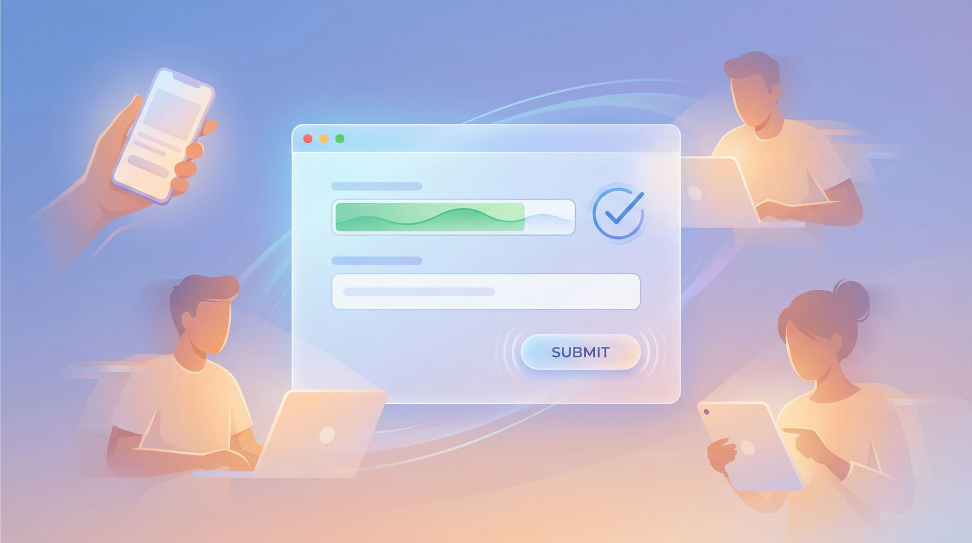
From Form Field to Follow-Up: Designing Post-Submission Experiences That Actually Convert


Most teams obsess over getting someone to click Submit.
Far fewer obsess over what happens in the five minutes after.
That’s a problem, because the moment right after submission is when:
- Motivation is highest
- Trust is fragile
- Expectations are fuzzy
Handled well, that moment turns a casual form fill into a real relationship, a sale, or a loyal advocate. Handled poorly, it becomes yet another dead-end interaction that quietly leaks revenue.
This post is about designing that after—the confirmation screens, emails, routing rules, and feedback loops that turn raw responses into real outcomes.
Why the “After” Matters More Than You Think
You already did the hard work:
- You crafted sharp microcopy.
- You nailed the layout and above-the-fold experience.
- You used a tool like Ezpa.ge to theme everything so it looks on-brand and trustworthy.
But if your post-submission experience is just a generic “Thanks, we’ll be in touch,” you’re leaving value on the table.
Strong post-submission flows pay off in at least four ways:
-
Higher conversion from lead to customer
A form submission is rarely the final step. For most teams, it’s the start of a sales, onboarding, or nurture sequence. A clear, immediate follow-up keeps people moving. -
Reduced support load and confusion
When people know exactly what happens next—and when—they send fewer “Just checking in” emails. -
Better data quality over time
Smart follow-ups can correct or enrich data (e.g., asking a clarifying question or offering a profile-completion step). -
Stronger brand perception
A thoughtful, fast, and personal follow-up feels like you’re organized and reliable—not just collecting information for a spreadsheet.
If you’re already thinking about conversion-first layouts, you’ve probably explored patterns from posts like Conversion-First Form Layouts: Above-the-Fold Patterns That Actually Drive Submissions. This article picks up where those leave off.
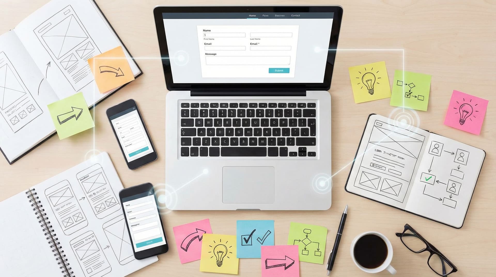
Step 1: Define the Real Job of the Form
Before you design any follow-up, get brutally clear on what a “successful” submission actually means.
Ask:
- What should the user be able to do immediately after submitting?
- What should we be able to do within the next hour? The next day?
- What is the first meaningful commitment we want from them next? (Book a call, confirm an email, join a community, start a trial, complete a profile, etc.)
Translate that into a simple statement:
“When someone finishes this form, they should be able to X right away, and we should be able to Y within Z hours.”
Examples:
-
B2B lead form
“When someone finishes this form, they should be able to book a demo slot right away, and our AE should have all the context they need to run that call within 24 hours.” -
Event registration
“When someone finishes this form, they should receive a calendar invite and know exactly how to join the event, and we should have them correctly tagged in our CRM by the end of the day.” -
Feedback form
“When someone finishes this form, they should feel heard and know how we use their feedback, and we should see their response appear in our live feedback dashboard instantly.”
Once you’ve defined that, the rest of your post-submission design is about making that statement true.
Step 2: Turn the Thank-You Screen into a Launchpad
The confirmation screen is your highest-intent micro-landing page. Someone has just invested effort, shared personal info, and signaled interest. Don’t waste that moment.
The four jobs of a great confirmation screen
-
Confirm success clearly
- Use a bold, unambiguous headline: “You’re booked.”, “Application received.”, “Feedback submitted.”
- Avoid vague lines like “Form submitted successfully.” That’s system language, not human language.
-
Set expectations for what happens next
Answer:- What will happen now?
- Who will do it?
- When will it happen?
- What should the user watch for (email, SMS, calendar invite, portal access)?
Example:
“You’ll get a confirmation email in the next 2–3 minutes. If it doesn’t arrive, check spam or email support@yourcompany.com.” -
Offer a clear next step
Align this with the “job” you defined earlier. Common next steps:- Book a call (via Calendly or similar)
- Join a community (Slack, Discord, etc.)
- Start a product tour
- Download a resource (guide, template, checklist)
- Share the form with teammates or friends
Make this one primary CTA, not a buffet of options.
-
Reinforce trust and value
- Briefly restate the value they’ll get: “Here’s what you can expect from working with us…”
- Add a testimonial, stat, or short proof point.
Example layout for a high-performing confirmation screen
- Headline: “You’re on the list for our Product Strategy Workshop.”
- Subhead: “Next up: add it to your calendar so you don’t miss it.”
- Primary CTA button: “Add to Google Calendar”
- Secondary text: “We’ve also emailed you the Zoom link and resources. If you don’t see it in 5 minutes, check your spam folder or contact events@company.com.”
- Optional proof: A single line like “Over 3,000 product leaders have attended this workshop.”
On Ezpa.ge, you can customize this screen with your theme system, typography, and brand imagery so it feels like a natural continuation of the form—not an afterthought.
Step 3: Design Follow-Up Channels That Work Together
The confirmation screen is the first touch. Your follow-up sequence is where conversion really happens.
Think in terms of channels and timing, not random one-off messages.
Core channels to consider
-
Email
- Best for: confirmations, receipts, detailed instructions, nurture sequences.
- Must-haves: clear subject line, recognizable sender, concise body, and one primary action.
-
Calendar invites
- Best for: demos, webinars, interviews, consultations.
- Reduce no-shows by including: agenda, time zone clarity, links, and what to prepare.
-
SMS or messaging apps
- Best for: reminders, time-sensitive updates.
- Use sparingly and always with explicit consent.
-
In-app or on-site messages
- Best for: product signups, trials, and onboarding flows.
Timing: build a simple follow-up timeline
Map out the first 7 days after submission. For each form type, ask:
- What does the user need to know or do at each point?
- What’s the minimum number of touches that will reliably move them forward?
Example for a B2B demo request:
-
Immediately (0–5 minutes)
- Email: “You’re booked for your demo on [date/time]. Here’s what we’ll cover.”
- Calendar invite: includes agenda and Zoom link.
-
24 hours before
- Email reminder: “Tomorrow’s demo: 20 minutes to see if we can 2x your conversion rate.”
-
1 hour before
- Optional SMS reminder (if opted in).
-
Same day, after the demo
- Email: recap, next steps, and a single decision CTA (“Ready to move forward? Reply to this email or click here to start your trial.”)
For feedback or survey forms, the sequence might be lighter:
- Immediate email: “Thanks—here’s how we use your feedback.”
- Later, when you ship changes: “You told us X. We changed Y. Here’s what’s new.”
That second email is pure retention gold.
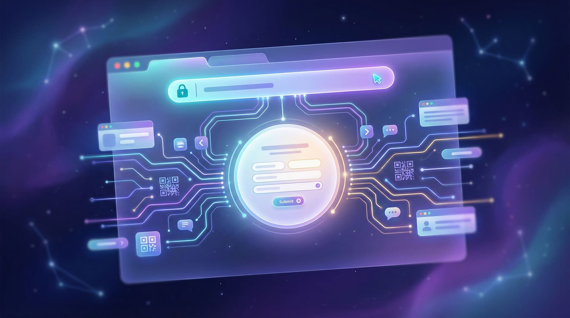
Step 4: Route Responses in Real Time (So You Can Actually Follow Up)
Even the best follow-up plan fails if your team doesn’t see responses until Friday’s export.
This is where real-time syncing and routing rules matter.
Use live data as your routing engine
With Ezpa.ge, responses can sync instantly into Google Sheets. That means you can:
- Trigger automations in tools like Zapier, Make, or n8n based on new rows.
- Assign owners (e.g., based on territory, company size, or topic) using simple formulas.
- Flag priority leads with conditional formatting or helper columns.
If you haven’t yet built this muscle, From Form to Funnel: Turning Raw Responses into a Live Google Sheets Dashboard walks through how to turn a plain spreadsheet into a working funnel view.
Practical routing patterns
-
Lead scoring light
- Add columns like
Company Size Score,Budget Score,Intent Score. - Use simple rules (e.g.,
=IF([Company Size]="500+", 3, 1)). - Sum them into a
Total Scoreand highlight rows above a threshold.
- Add columns like
-
Owner assignment
- Use rules like
=IF([Country]="US", "Alex", "Jordan"). - Your automation tool can then notify that owner in Slack or email.
- Use rules like
-
Priority alerts
- If
Use Case = "Churn risk"orFeedback Type = "Bug", send an immediate alert to the right team.
- If
Once you’re comfortable with this kind of live iteration, you can go deeper with ideas from Real-Time Form Optimization: Using Live Google Sheets Data to Iterate in a Single Day.

Step 5: Match the Follow-Up Experience to the Form’s Tone
Your post-submission experience should feel like the natural continuation of the form, not a context switch.
Keep brand, tone, and expectations aligned
Ask:
- Was the form playful or serious?
- Was it short and casual or long and formal?
- Did we ask for sensitive information or something lightweight?
Then:
- Mirror the tone in your confirmation copy and emails.
- Keep visual continuity by reusing your form’s theme—colors, typography, and logo—in confirmation pages and email templates.
If you already use a theme system for your forms, the ideas in Theme Systems, Not One-Off Skins: Building a Reusable Design Language for Your Forms apply just as much to your post-submission flows.
Calibrate depth and ask
Don’t immediately ask for a huge new commitment.
- After a newsletter signup, asking for a 45-minute call is a jarring leap.
- After a detailed product evaluation form, asking for a quick 15-minute follow-up chat might feel natural.
A useful rule:
The more effort and detail the form required, the more direct your next ask can be.
Step 6: Use Microcopy and Motion to Reduce “What Now?” Anxiety
Even after a form is submitted, uncertainty kills momentum:
- “Did that actually go through?”
- “Did I mess something up?”
- “Will a human ever see this?”
You can answer all of that with microcopy and subtle motion.
Microcopy that reassures and directs
On the confirmation screen and in your first email, answer:
- What we received: “We’ve got your application for the Senior Designer role.”
- What we’ll do: “Our hiring team reviews every application within 5 business days.”
- What you should do: “Keep an eye on your inbox—if we move forward, we’ll email you from hiring@company.com.”
If you’re already investing in strong field labels and error messages, the same principles from Form Microcopy that Converts: Writing Labels, Helpers, and Errors that Users Actually Read apply here too.
Motion that confirms, not distracts
Use subtle animations to:
- Show the submit button transitioning into a success state.
- Fade in a checkmark or success icon.
- Smoothly transition the form into the confirmation message.
The key is feedback, not fireworks. You’re confirming completion and guiding attention to the next step, not celebrating for its own sake.
Step 7: Close the Loop with Feedback and Iteration
Your first version of a post-submission flow is a hypothesis. Treat it like one.
Track the right metrics
For each form, watch:
-
Confirmation CTA click-through rate
- e.g., % of people who click “Book a demo” or “Add to calendar” on the thank-you screen.
-
Email open and click rates
- Especially for the first confirmation and the first “value” email.
-
Time-to-first-response from your team
- How long between submission and first human touch?
-
Downstream conversion
- Demo show-up rate, trial activation rate, event attendance, etc.
Run small experiments
Iterate on:
- Subject lines for confirmation emails (clarity vs. curiosity).
- Primary CTA on the confirmation screen (calendar vs. resource download).
- Expectation copy (“We’ll reply within 24 hours” vs. “We’ll reply within 1 business day”).
Because Ezpa.ge syncs to Google Sheets in real time, you can:
- Add columns to track which variant someone saw.
- Compare metrics side by side.
- Make changes midday and watch results within hours.
Over time, your post-submission flows become less guesswork and more system—a predictable engine that turns form submissions into outcomes.
Putting It All Together: A Quick Checklist
Use this as a working checklist the next time you ship a form with Ezpa.ge:
-
Clarity of purpose
- [ ] I can complete the sentence: “After submitting, users should be able to X, and we should be able to Y within Z hours.”
-
Confirmation screen
- [ ] Clear success message in human language
- [ ] Explicit expectations (what, who, when)
- [ ] One primary CTA that moves the relationship forward
- [ ] Optional proof or reassurance
-
Follow-up sequence
- [ ] Immediate confirmation email
- [ ] Any needed calendar invites or reminders
- [ ] Thoughtful timing over the next 1–7 days
- [ ] Tone and visuals match the form
-
Routing and ownership
- [ ] Responses flow into a live system (e.g., Google Sheets)
- [ ] Clear rules for who owns which submissions
- [ ] Alerts for priority cases
-
Feedback and iteration
- [ ] Metrics defined (CTA clicks, opens, downstream conversion)
- [ ] A simple plan to run at least one experiment this month
If you can check these boxes, you’re well on your way to post-submission experiences that actually convert.
Summary: From Dead Ends to Designed Journeys
Forms are not just boxes to collect data. They’re starting points.
When you:
- Define what success looks like beyond “submission,”
- Turn your confirmation screen into a focused launchpad,
- Orchestrate follow-up channels and timing with intention,
- Route responses in real time to the right people, and
- Iterate based on what users actually do next,
…you transform a simple form into a designed journey that respects people’s time and attention—and pays off in higher conversion, better data, and stronger relationships.
Your Next Step
If you’re using Ezpa.ge, you already have the building blocks: responsive forms, custom themes, custom URLs, and real-time Google Sheets syncing.
Pick one live form and:
- Rewrite its confirmation screen to include a clear next step and explicit expectations.
- Add or refine the immediate follow-up email.
- Set up a simple live view of submissions in Google Sheets so your team can respond faster.
You don’t need a massive overhaul—just a more intentional “after.”
Open your highest-impact form, tweak the post-submission experience, and watch what happens when Submit is no longer the end of the story, but the beginning.