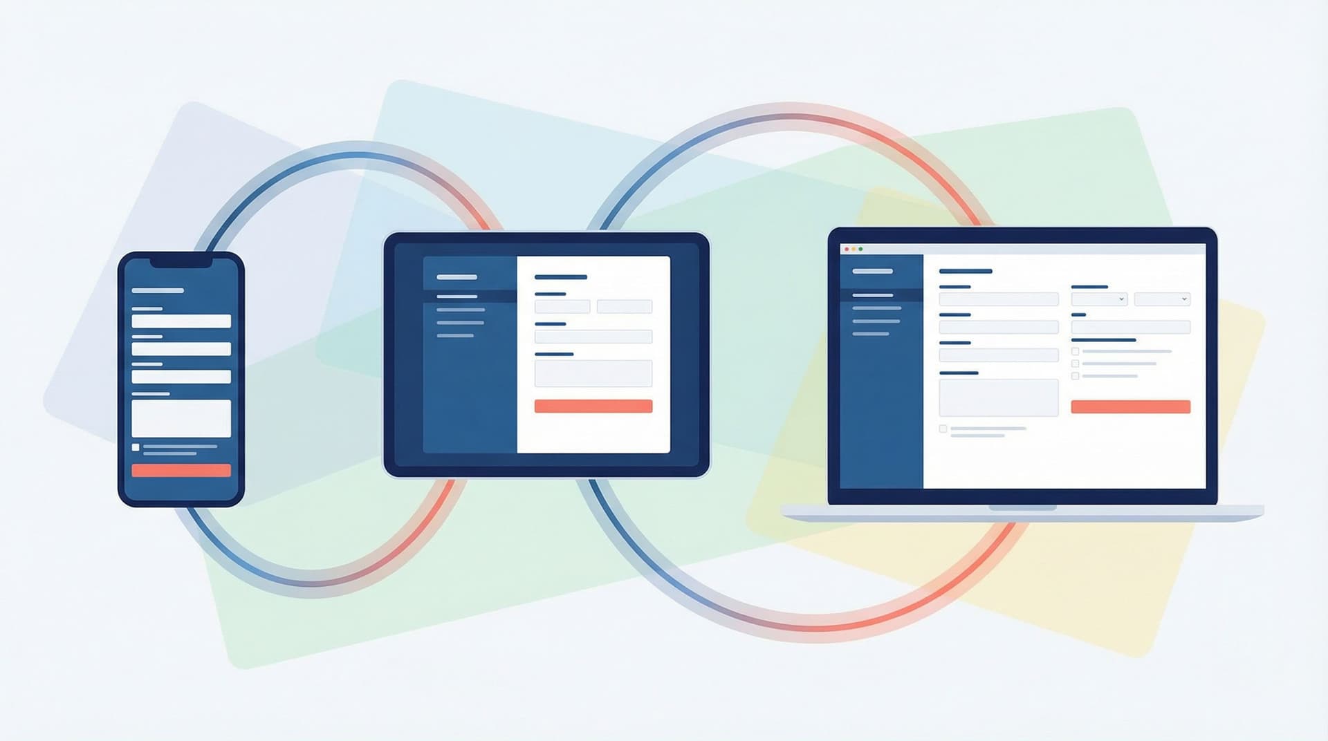
Form UX for High-Stakes Data: Designing Calm, Trustworthy Experiences for Payments, Healthcare, and Hiring


When a form asks for something trivial—like a newsletter signup—users might tolerate a bit of friction.
When a form asks for credit cards, medical history, or employment details, the stakes change completely.
People bring fear, skepticism, and a mental checklist of “Is this safe?” to every field. A single rough edge—an odd error message, a misaligned label, a sketchy URL—can be enough for them to close the tab and never come back.
Designing forms for these high‑stakes moments isn’t just about conversion. It’s about:
- Protecting sensitive data and signaling that protection clearly
- Reducing anxiety so people can answer accurately
- Building trust that carries through to payment, treatment, or hiring decisions
This is where thoughtful UX—and tools like Ezpa.ge with custom themes, custom URLs, and real‑time Google Sheets syncing—can turn a stressful task into a calm, confident interaction.
Why High‑Stakes Forms Need a Different Standard
High‑stakes forms show up in three especially sensitive domains:
- Payments – credit cards, bank accounts, billing addresses
- Healthcare – symptoms, diagnoses, medications, insurance
- Hiring – employment history, salary expectations, identity documents
In all three, users worry about at least three things:
- “Will this leak?” – Fear of fraud, identity theft, or data being sold
- “Will this be used against me?” – Worry about discrimination or misinterpretation
- “Will I get what I’m promised?” – Doubt that the form leads to real outcomes
Because of that, the bar is higher:
- Clarity has to be airtight. Any ambiguity feels risky.
- Errors feel personal. If you mishandle their data, even visually, it feels like you might mishandle it operationally.
- Visual polish isn’t optional. Inconsistent styling or broken layouts don’t just look sloppy—they erode trust.
The good news: you can deliberately design for calm and confidence. Let’s break that down.
Principle 1: Start with Emotional State, Not Just Fields
Before you decide what to ask, understand what the user is likely feeling when they open your form.
- Payments: urgency (“I just want this purchase to go through”), anxiety about fraud, annoyance at extra steps.
- Healthcare: vulnerability, fear of judgment, confusion about terminology.
- Hiring: hope, pressure to impress, fear of rejection or bias.
Design moves that help across all three:
- Set expectations up front.
- What is this form for?
- How long will it take?
- What will happen after submission?
- Use reassuring language.
- “Secure payment” instead of “Pay now.”
- “Your answers are confidential and reviewed by licensed clinicians.”
- “Only the hiring team sees this information.”
- Minimize surprise.
- No sudden mandatory uploads at the end.
- No last‑minute “create an account” walls.
If you want to go deeper on this mindset, pairing this with journey‑first thinking from Flow, Not Fields: Mapping Your User’s Mental Journey Before You Design a Single Input is a powerful combo.
Principle 2: Make Safety Visible (Without Overwhelming People)
Security and privacy are table stakes—but users can’t see your encryption. You have to communicate safety in ways they can immediately recognize.
Show clear, concrete safety signals
-
Reassuring URL and domain
- Use a recognizable domain and clean custom URLs (e.g.,
forms.yourclinic.com/intake), not random strings. - Ezpa.ge’s custom URL support makes this straightforward and reinforces brand trust.
- Use a recognizable domain and clean custom URLs (e.g.,
-
Consistent branding and theme
- Match your main site’s logo, colors, and typography.
- Avoid “generic” or mismatched themes that feel like a third‑party trap.
- Using an adaptive theme system (see Adaptive Form Themes: Designing One Look That Automatically Fits Any Device) helps keep this consistent across devices.
-
Plain‑language privacy copy
- Add a short, skimmable statement near sensitive fields:
- “We only use this information to verify your identity for background checks.”
- “Your health information is encrypted and never shared with advertisers.”
- Link to a longer policy, but don’t hide everything behind legalese.
- Add a short, skimmable statement near sensitive fields:
-
Subtle, familiar security cues
- Lock icons near payment fields
- “Secure checkout” labels
- References to well‑known processors (e.g., “Card details processed by Stripe; we never see your full card number.”)
Avoid fear‑inducing overkill
- Don’t cover the page in red warnings.
- Don’t use all‑caps alerts unless absolutely required.
- Don’t ask for more sensitive data than you clearly need.
You want users to think, “This looks professional and safe,” not “Wow, they’re really trying to convince me this isn’t a scam.”

Principle 3: Ask Only What You Can Justify—and Explain Why
Every extra field is a moment of hesitation: “Why do they need this?”
In high‑stakes contexts, you should be able to answer that question out loud for every field.
Ruthlessly trim your questions
-
Start from the decision, not the database.
- For each field, ask: What decision will we make with this answer?
- If there’s no clear decision, cut it.
-
Defer non‑critical questions.
- For hiring, move optional diversity questions or referral sources to a separate, clearly optional form.
- For healthcare, separate clinical intake from marketing preferences.
-
Use progressive disclosure.
- Only show extra questions when they’re relevant (e.g., show additional insurance fields only if the user indicates they have coverage).
- Tools like Ezpa.ge make conditional logic easy to implement while keeping one clean form URL (see One Form, Many Audiences: Using Conditional Logic to Personalize Paths Without Losing Your Mind).
Explain why you’re asking
For sensitive fields, add a one‑line justification:
- Salary expectations: “Used only to align on role level and avoid wasting your time.”
- Social Security Number (if absolutely required): “Used solely for background checks and identity verification; not used for credit checks.”
- Detailed symptoms: “Helps your clinician prepare before your appointment so you spend less time on paperwork in the waiting room.”
This framing turns a suspicious question into a mutual benefit.
Principle 4: Design for Calm, Not Just Speed
Speed matters, but emotional smoothness matters more when the stakes are high. You want the experience to feel unhurried, clear, and under the user’s control.
Layout and pacing choices that reduce stress
-
Break long flows into clear steps.
- Payments: Contact → Shipping → Payment → Review.
- Healthcare: Personal details → Medical history → Current symptoms.
- Hiring: Basics → Experience → Skills → Optional extras.
- Use a stepper with labels (“Step 2 of 4: Medical History”) instead of a vague progress bar.
-
Keep each screen focused.
- Group related fields visually.
- Avoid walls of text or 20+ fields on a single page.
-
Use whitespace and typography to signal importance.
- Larger labels for key questions.
- Ample spacing between sections to let people breathe.
If long flows are unavoidable, combine these ideas with the techniques from Form Fatigue Is Real: Designing Shorter Flows That Still Capture Rich Data so you can shorten where it counts without losing quality.
Copy and micro‑interactions that keep people grounded
-
Use plain language, not jargon.
- “Job title” instead of “Position held.”
- “Health insurance provider” instead of “Payer organization.”
-
Offer examples inside fields.
- Placeholder: “e.g., Software Engineer, RN, Warehouse Supervisor.”
-
Confirm successful actions gently.
- Checkmarks, subtle color shifts, and short confirmations (“Saved”) reassure without shouting.
-
Avoid countdown timers or artificial urgency in healthcare and hiring. They increase stress and reduce answer quality.
Principle 5: Make Errors Feel Safe, Not Punishing
When someone is entering a card number or listing medications, an error message can feel like a judgment—or a sign that your system is fragile.
Your goal: errors that feel like guidance, not scolding.
Design humane validation
-
Validate in real time where possible.
- Card number format, email syntax, required fields.
- But don’t block typing mid‑flow or auto‑correct in ways that change meaning (especially for names or medications).
-
Place messages where the eye already is.
- Inline, right under the field, not in a banner at the top.
-
Use calm colors and neutral language.
- Soft red or amber, not flashing red.
- “Please enter a 16‑digit card number” instead of “Invalid card!”
-
Offer a clear next step.
- “This doesn’t look like a valid ZIP code. Try 5 digits, e.g., 94103.”
There’s a whole world of nuance here; for deeper patterns, see Error States that Convert: Turning Validation Messages into Micro-Moments of Trust.
Protect data during errors
- Never wipe an entire page of answers because of one error.
- Preserve entered data on refresh where technically feasible.
- If a session must expire for security, warn users ahead of time and give them a chance to save.
Principle 6: Respect Context—Device, Location, and Constraints
High‑stakes forms are often completed on phones, in waiting rooms, on lunch breaks, or between meetings. Context shapes both what people can do and how they feel.
Design for small screens by default
- Single‑column layouts with large tap targets.
- Sticky “Next” buttons on mobile so people don’t have to scroll back up.
- Avoid side‑by‑side fields for critical data (e.g., card number + expiry) that can cause zoom and mis‑taps.
Ezpa.ge’s responsive themes help you get a lot of this “for free,” especially if you’re already thinking along the lines of Conversion-First Form Layouts: Above-the-Fold Patterns That Actually Drive Submissions.
Handle global formats and accessibility
- Support local formats for phone numbers, addresses, and dates.
- Avoid assumptions like “First name / Last name” in cultures where that split doesn’t map.
- Ensure keyboard navigation and screen reader support so users with disabilities can complete the form privately.

Principle 7: Connect the Form to a Reliable System Behind the Scenes
A calm, trustworthy front end is only half the story. If the form is beautiful but the back office is chaos, users will still feel the friction:
- Payments fail or are double‑charged.
- Healthcare intake data doesn’t reach the clinician.
- Job applications vanish into a black hole.
To avoid that, you need clean, real‑time data flows and predictable follow‑up.
Use live syncing as your backbone
With Ezpa.ge, every submission can stream straight into Google Sheets in real time, giving you a single source of truth:
- For payments, you can:
- Trigger follow‑up emails on successful payment.
- Flag high‑value orders for manual review.
- For healthcare, you can:
- Route new intakes to the right clinic or provider.
- Maintain a log of consent and disclosures.
- For hiring, you can:
- Auto‑tag candidates by role and seniority.
- Track funnel metrics from application to offer.
If you’re ready to go deeper here, Ops in the Loop: Using Real-Time Form Data to Trigger Playbooks, Notifications, and Automations and No-Dev Ops: Automating Product Workflows with Ezpa.ge Forms and Google Sheets Triggers walk through how to turn that live data into actual workflows.
Design a trustworthy “after” state
For high‑stakes forms, the moment after submission is just as important as the moment before:
-
Clear confirmation screen
- “Payment received. Your receipt has been emailed to alex@example.com.”
- “Your intake form is complete. You’ll receive appointment details within 1 business day.”
- “Application submitted. We review all candidates and will respond within 5 business days.”
-
Predictable follow‑up
- Automated confirmation email with a summary of what was submitted (minus ultra‑sensitive data like full card numbers).
- Next steps, timelines, and contact information.
-
Status visibility
- For longer processes (background checks, insurance verification), offer a status page or at least periodic updates.
A calm, specific “after” turns a leap of faith into a relationship.
Putting It All Together: A Quick Checklist
When you ship or review a high‑stakes form, run through this list:
-
Clarity & Expectations
- Is it obvious what this form is for and how long it will take?
- Do we explain what happens after submission?
-
Safety Signals
- Is the URL clean and recognizable?
- Does the visual design match our brand consistently?
- Do we briefly explain how sensitive data is protected and used?
-
Scope & Justification
- Can we defend every field with a clear decision it supports?
- Do sensitive questions include a short “why we ask” note?
-
Calm Flow
- Is the form broken into logical, labeled steps?
- Is each screen focused and free of unnecessary clutter?
-
Error Handling
- Are error messages specific, neutral, and placed near the field?
- Do we avoid wiping data or forcing people to start over?
-
Context & Accessibility
- Does the form work beautifully on mobile?
- Do we support global formats and assistive technologies?
-
Operational Backbone
- Does data sync in real time to a reliable system (like Google Sheets)?
- Are follow‑up emails, notifications, and routing rules in place?
If you can honestly check off each of these, you’re well on your way to a form that feels calm, trustworthy, and worthy of the data you’re asking for.
Summary
High‑stakes forms for payments, healthcare, and hiring aren’t just “more serious versions” of your usual lead gen. They operate under a different emotional and ethical standard.
To design experiences people can trust, you need to:
- Start from the user’s emotional state, not your field list
- Make safety and privacy visible in honest, concrete ways
- Ask only what you can justify—and explain why
- Pace the experience for calm, not just speed
- Treat errors as guidance, not punishment
- Respect context: device, location, global formats, and accessibility
- Back everything with a solid operational system so submissions lead to real, timely action
When you combine these principles with a flexible tool like Ezpa.ge—where themes, custom URLs, and real‑time Google Sheets syncing are built in—you can turn your highest‑stakes forms into some of the most trusted experiences in your product.
Ready to Design a Calmer High‑Stakes Form?
If you’re collecting payments, health information, or hiring data, your forms are already high‑stakes. The question is whether they feel as careful and trustworthy as the decisions they support.
Here’s a simple way to start:
- Pick one critical form—a checkout, intake, or application.
- Walk through it as if you were a nervous first‑time user.
- Use the checklist above to note where trust wobbles: confusing copy, missing safety signals, harsh errors, or shaky follow‑up.
- Rebuild or refine it in Ezpa.ge, using:
- A clean, branded theme
- A clear custom URL
- Real‑time syncing into Google Sheets so your team can actually act on the data
You don’t have to redesign your entire system overnight. Start with one form, make it a model of calm, trustworthy UX—and then reuse that pattern everywhere high‑stakes data flows through your product.
Your users—and your future self—will thank you.