High-Stakes, Low Friction: Designing Verification and Consent Flows That Users Actually Finish

When your form is asking for real commitment—identity verification, financial authorization, medical consent, legal agreements—the bar changes.
People are no longer casually “signing up.” They’re:
- Sharing sensitive data
- Accepting risk (real or perceived)
- Trying not to make a mistake they’ll regret
That’s the paradox of high‑stakes flows:
- You need rigor (clear consent, accurate verification, auditability).
- Users need ease (clarity, confidence, and speed).
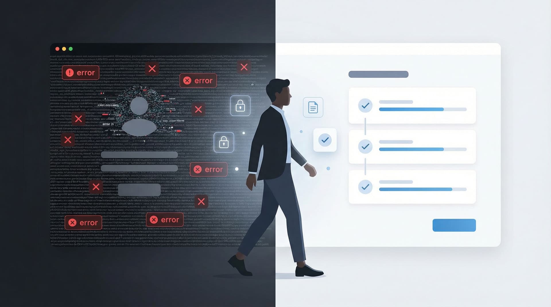
If you lean too hard into rigor, you get abandonment. If you lean too hard into ease, you get compliance problems, bad data, or angry stakeholders.
This post is about designing that middle ground: verification and consent flows that are robust enough for your lawyers and operations teams, but smooth enough that people actually finish them.
Why Verification and Consent Deserve Their Own Design Pass
It’s tempting to treat verification and consent as checkboxes at the end of a form build. Add a couple of fields, paste the legal text, maybe a checkbox or two—and ship.
That’s how you end up with:
- People clicking “I agree” without understanding what they just consented to
- Support tickets from users who can’t complete identity or email verification
- Ops teams manually chasing down missing consents or incomplete KYC steps
- Legal teams unsure whether a particular submission is actually valid
Thoughtful verification and consent design pays off across the organization:
1. Higher completion and fewer drop-offs
Clear steps, predictable flows, and respectful copy reduce the “this is too much” moment that leads to tab-closing.
2. Better data and fewer edge cases
When verification is structured and well-communicated, you get fewer partial submissions, mismatched IDs, or “I thought I did that already” situations.
3. Stronger legal and compliance posture
Explicit, well-logged consent and verification steps are easier to defend, audit, and reason about later.
4. More trust in your brand
The way you ask for consent signals how you’ll treat someone’s data later. A calm, transparent experience builds confidence; a confusing one does the opposite.
If you’re already using Ezpa.ge for forms, you’re halfway there: custom URLs, themes, and real-time syncing into Google Sheets give you the control and observability you need for these flows. The rest is design.
Step 1: Decide What “Verified Enough” Means
Many verification and consent flows become painful because no one agreed upfront on the minimum viable rigor.
Before you drag a single field onto a canvas, answer:
- What risk are we actually mitigating?
- Fraud? Regulatory non-compliance? Chargebacks? Misuse of medical or HR data?
- What’s the worst realistic failure mode?
- A spam signup is not the same as a fraudulent loan application.
- What level of proof do we truly need?
- Email confirmation? Government ID? Two-factor authentication? A signed document? A checkbox with a timestamp?
- What’s our tolerance for false negatives vs. false positives?
- Is it worse to block a legitimate user or to let a risky one through?
Translate those answers into a simple policy:
For [flow type], we require [verification method] and [consent artifact].
Examples:
-
Newsletter with data sharing to partners
- Verification: Email address must be valid (soft check only).
- Consent: Explicit checkbox for partner emails, stored with timestamp and IP.
-
Healthcare intake form
- Verification: Name + DOB + phone or email must match existing record (soft match).
- Consent: Multiple explicit consents (treatment, telehealth, data sharing) each logged as separate fields.
-
Hiring application with background checks
- Verification: Email verification + explicit affirmation that information is accurate.
- Consent: Separate consent for background check, stored with a unique identifier.
If you’re working across multiple products or brands, this is where a shared system helps. A “multi-brand, one form system” lets you reuse verification and consent patterns while still customizing language and theming per brand. If that sounds like your world, it’s worth reading Multi-Brand, One Form System: Managing Themes, URLs, and Logic Across Complex Portfolios.
Step 2: Map the Mental Journey, Not Just the Fields
Verification and consent flows fail when they’re designed as a list of requirements instead of a narrative.
People move through a sequence of questions in their head:
- What are you asking me to do?
- Why are you asking for this?
- What happens if I say yes—or no?
- How long will this take?
- Can I undo this later?
If your flow doesn’t answer those questions, they’ll answer them for themselves—and often decide to bail.
Do a quick pass before you design:
- Write down the key moments of friction: uploading an ID, granting recurring billing, agreeing to data sharing, etc.
- For each moment, note:
- What the user is likely feeling (nervous, rushed, skeptical).
- What reassurance they need (security, control, clarity, proof).
Then structure your flow around that journey. If you want a deeper dive into this mindset, Flow, Not Fields: Mapping Your User’s Mental Journey Before You Design a Single Input is a great companion read.
Step 3: Make the High-Stakes Parts Visibly Special
Not every field is created equal. Asking for a first name is not the same as:
- “I authorize recurring charges to this card.”
- “I consent to share my medical information with third parties.”
- “I confirm that I have read and agree to the terms of this agreement.”
Treat high-stakes steps as distinct, elevated moments in the flow.
Tactics that work well
-
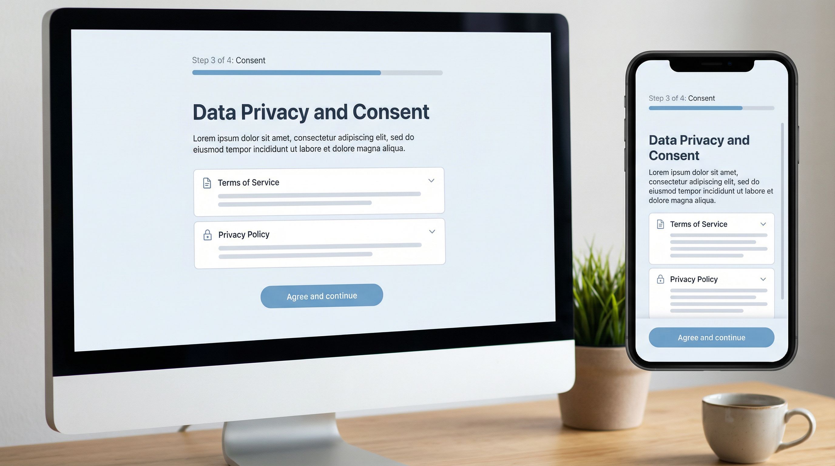
Use a dedicated step for key consents
Don’t bury critical consent checkboxes in a sea of optional preferences. Give them their own page or section with a clear heading. -
Visually differentiate
- Use a subtle background color or card treatment for the consent block.
- Add an icon (e.g., shield, document) to signal importance.
- Keep the layout clean—no clutter, no competing CTAs.
-
Summarize in plain language first
- Short, human-readable summary at the top.
- Legal text available via expandable sections or links (e.g., “View full terms”).
-
Make the primary action unambiguous
- Button labels like “Agree and continue” or “Verify and finish” beat generic “Next.”
Step 4: Reduce Friction Without Reducing Clarity
“Low friction” doesn’t mean “hidden meaning.” Your goal is effortless understanding, not sneaky agreements.
Here are concrete ways to get there.
1. Use progressive disclosure
Don’t dump every clause on the main screen.
- Show a short summary of what the user is agreeing to.
- Provide clear links or accordions to read more: “See full terms,” “Details about data sharing,” etc.
- For especially sensitive items (e.g., data sharing with third parties), keep the key points visible, not hidden.
2. Write checkboxes like decisions, not decorations
Turn vague labels into explicit statements:
- Instead of:
[] I have read and agree to the terms. - Try:
[] I agree to the Terms of Service and understand how my data will be used.
For multiple consents, separate them:
[] I agree to the Terms of Service.[] I agree to receive marketing emails.[] I consent to my data being shared with partners for personalized offers.
This separation is good UX and good compliance.
3. Use defaults ethically
Defaults are powerful in any form, but especially around consent. A pre-checked box can dramatically change opt-in rates—and risk.
- Never pre-check high-stakes consent (e.g., sharing data with third parties, recurring billing) unless your legal team has explicitly approved it for your jurisdiction.
- Consider neutral defaults where possible (e.g., no option pre-selected) and let users make an active choice.
If you want to go deeper on how defaults shape behavior, The Psychology of Defaults: How Pre-Filled Answers Shape Form Completion Rates walks through patterns and pitfalls in detail.
4. Set expectations about time and effort
A tiny line of copy can save a lot of abandonment:
- “This will take about 2 minutes.”
- “You’ll need your ID and a recent utility bill.”
- “We’ll send you a verification code by SMS.”
When people know what’s coming, they’re less likely to bail halfway through.
Step 5: Design Verification Steps as a Conversation, Not a Test
Verification often feels adversarial: the system is trying to catch you out. Flip that mindset. Your job is to help users prove they are who they say they are with as little friction as possible.
Choose the right verification method
Match the method to the risk and context:
- Email verification for most account-level flows
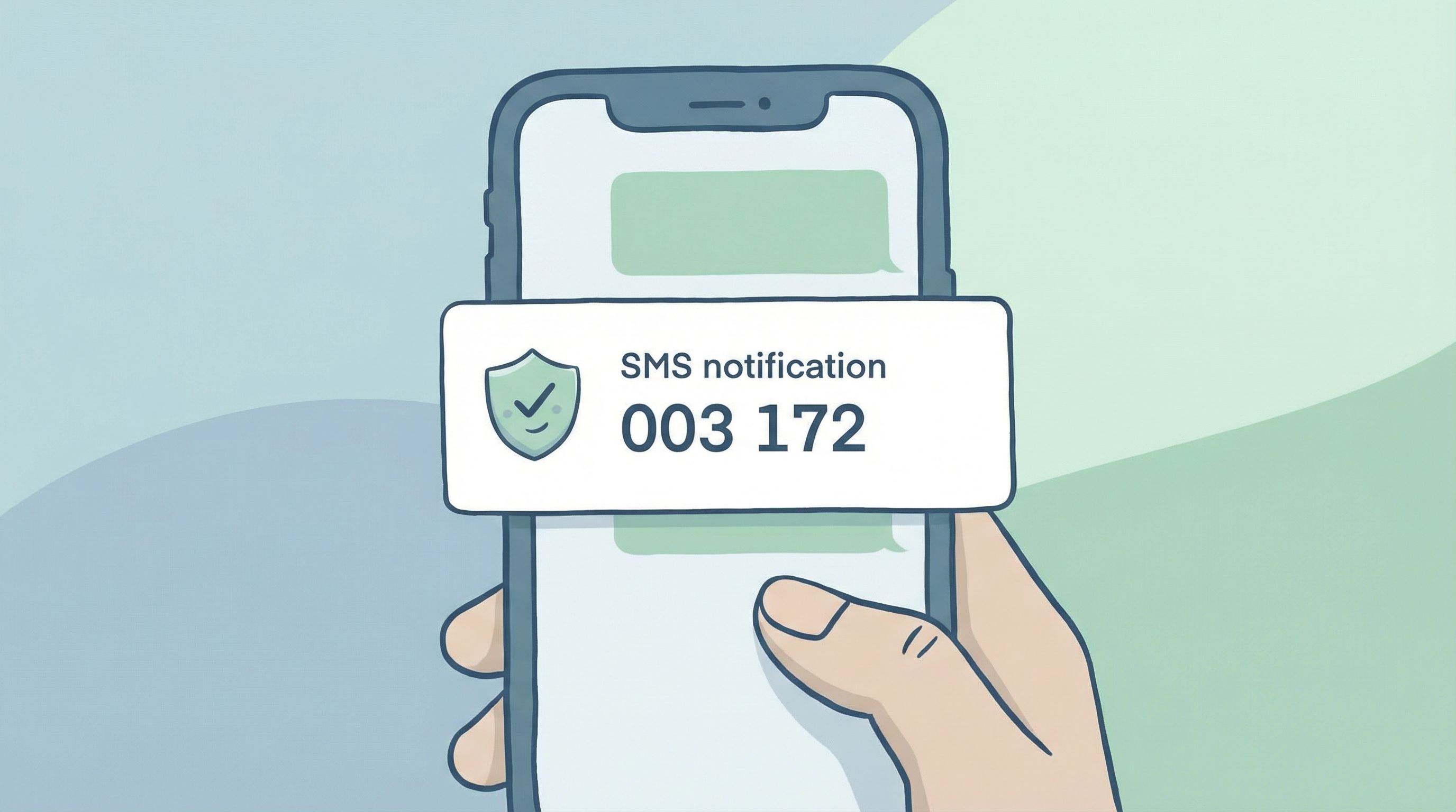
- SMS codes for higher-risk actions (password resets, payouts)
- Document uploads (ID, proof of address) for compliance-heavy flows
- Knowledge-based questions only if you have a very good reason—they’re often confusing and unreliable
Whenever possible, reuse existing verification instead of re-running it. If someone verified their email earlier in the session, don’t ask again.
Make codes and links forgiving
People mistype and mis-tap. Design for it:
- Allow copy-paste from SMS or email without weird formatting errors.
- Support resend with a clear timer and message: “Didn’t get a code? Resend in 30 seconds.”
- Be generous with attempts before locking someone out—but communicate clearly when limits are reached.
Turn errors into guidance
Harsh or vague error messages spike anxiety. Instead of:
- “Verification failed.”
Try:
- “That code has expired. We’ve sent you a new one.”
- “We couldn’t verify this document. Please upload a clear photo where all four corners are visible.”
For more on using error states as trust-building moments, see Error States that Convert: Turning Validation Messages into Micro-Moments of Trust.
Step 6: Log Consent and Verification Like an Auditor Will Read It
A flow that feels great but leaves you with ambiguous records is a liability.
Every high-stakes submission should leave behind a clear, structured trail:
- Which consents were given (each one as its own field, not a blob of text)
- When they were given (timestamp, ideally with timezone)
- From where (IP, device type, or other context if relevant)
- Which version of the terms or policy was in effect
If you’re using Ezpa.ge with Google Sheets syncing, you can:
- Map each consent checkbox to its own column.
- Include hidden fields for terms version, campaign, or jurisdiction.
- Use Sheets formulas or scripts to flag missing or conflicting consents.
This is also where a broader workflow approach helps. Posts like From Form to Workflow: Automating Onboarding, Support, and QA with Ezpa.ge + Google Sheets show how to turn those logs into automated routing and follow-up—so no one has to manually check whether consent is on file.
Step 7: Close the Loop After Submission
The moment after someone finishes a verification or consent-heavy flow is fragile. They’ve just:
- Shared sensitive data
- Agreed to something meaningful
- Invested time and attention
Use that moment to reinforce clarity and trust.
Show a clear, reassuring confirmation
Your confirmation screen should:
- State what just happened in plain language:
- “Your identity is verified.”
- “You’ve authorized recurring payments for Subscription X.”
- Explain what happens next:
- “We’ll email you a copy of the agreement.”
- “Your application will be reviewed within 2 business days.”
- Provide a record or reference:
- Confirmation number
- Downloadable PDF of the agreement
- Link to manage settings or revoke consent
Send a follow-up they can keep
For high-stakes flows, an email (or SMS) confirmation is not just nice—it’s expected.
Include:
- A summary of what they agreed to
- Links to full terms or policies
- Instructions to update or withdraw consent
- Contact info for support
This isn’t just compliance; it’s how you show respect for the commitment they just made.
Step 8: Iterate with Real Data, Not Opinions
You won’t get every detail perfect the first time. The key is to treat verification and consent flows as living systems you can improve.
Track:
- Drop-off rates by step: Where do people abandon? Is it at document upload, SMS verification, or the consent review screen?
- Time to complete: Do people stall on certain steps for longer than expected?
- Support tickets: What do people complain or ask about most often?
If your form is synced to Google Sheets, you can:
- Add hidden fields to log step-level events or variants (e.g., different consent copy versions).
- Use filters and pivot tables to spot patterns quickly.
- Run simple A/B tests on copy or layout with separate tabs or identifiers.
For a practical playbook on using live data to iterate quickly, check out Real-Time Form Optimization: Using Live Google Sheets Data to Iterate in a Single Day.
Bringing It All Together
Designing verification and consent flows that people actually finish is about balancing three forces:
- User clarity and comfort
- Plain language, predictable steps, visible importance.
- Operational and legal rigor
- Structured logging, explicit consents, appropriate verification levels.
- System-level reuse and iteration
- Shared patterns, real-time data, and continuous improvement.
When you:
- Decide upfront what “verified enough” means
- Map the mental journey instead of just listing fields
- Make high-stakes steps visibly special and easy to understand
- Treat verification as a guided conversation, not a test
- Log everything in a way your future self (and your auditor) will thank you for
- Close the loop with clear confirmations and follow-ups
- Iterate based on real behavior, not hunches
…you end up with flows that feel calm and trustworthy on the surface, and robust underneath.
Quick Recap
If you skimmed, here’s the core playbook:
- Clarify risk and rigor first. Decide what level of verification and consent you really need.
- Design the story, not just the screen. Answer the user’s implicit questions at every step.
- Elevate high-stakes moments. Give key consents and verifications their own space, visuals, and copy.
- Reduce friction ethically. Progressive disclosure, clear checkboxes, honest defaults.
- Guide verification like a helper, not a gatekeeper. Friendly microcopy, forgiving flows, helpful errors.
- Log consent like it matters—because it does. Separate fields, timestamps, versions, and context.
- Reassure after submission. Clear confirmations, records, and next steps.
- Use live data to improve. Watch where people struggle and fix those spots first.
Ready to Rethink Your High-Stakes Flows?
If your verification and consent experiences feel clunky, risky, or hard to change, you don’t need a full rebuild. You need a better way to design, ship, and iterate.
Ezpa.ge was built for exactly this kind of work:
- Custom themes and URLs that keep high-stakes flows on-brand and trustworthy
- Real-time Google Sheets syncing so every consent and verification is logged the moment it happens
- Flexible layouts and logic that let you separate high-stakes steps, personalize paths, and test improvements without waiting on engineering
Start with one flow: the signup that always causes headaches, the intake that legal keeps revisiting, or the consent form that support has to explain every week.
Redesign it with the principles above. Ship it with Ezpa.ge. Watch the data. Iterate once.
You’ll be surprised how much calmer—and more complete—your high-stakes flows can become.