Conversion-First Form Layouts: Above-the-Fold Patterns That Actually Drive Submissions


You can have the sharpest copy, the most generous offer, and a beautifully themed Ezpa.ge form—but if the layout above the fold doesn’t pull people into the first field, your conversion rate will quietly stall.
Above the fold is where your form either feels:
- Obvious (“Oh, I just need to drop my email here.”)
- Overwhelming (“Whoa, what is all this?”)
- Optional (“I’ll get to this later… maybe.”)
This post is about making that first screen do one job extremely well: get more people to start—and finish—your form.
We’ll break down practical patterns you can apply immediately, especially if you’re using Ezpa.ge’s responsive layouts, themes, custom URLs, and real-time Google Sheets syncing to ship forms quickly.
Why Above-the-Fold Layouts Matter So Much
Most people decide whether to engage with your form in under 5 seconds. Multiple UX studies show that users form an impression of a page in as little as 50 milliseconds, and spend only a few seconds deciding whether to scroll, click, or bounce.
For forms, that decision often hinges on three questions they’re asking subconsciously:
- “What is this?”
- “What do I get if I do this?”
- “How hard is this going to be?”
Your above-the-fold layout is where you answer those questions—visually and structurally, not just with words.
When you get it right, you:
- Increase the percentage of visitors who start the form.
- Reduce drop-offs from people feeling overwhelmed at first glance.
- Make your later optimizations (copy, targeting, follow-up emails) actually matter.
When you get it wrong, no amount of clever microcopy or nurturing sequences can fully recover the missed opportunities.
If you haven’t yet optimized the journey before someone reaches your form, you may also want to read From Link to Landing: Designing Custom URL Flows That Actually Get Your Forms Opened. It covers everything that happens between the shareable link and the moment your form loads.
The Core Job of Your Above-the-Fold Layout
Above the fold, your layout should focus on one primary conversion event:
Get the user to confidently complete the first meaningful interaction with your form.
Most of the time, that means:
- Typing into the first field, or
- Clicking a primary option (for example, choosing a plan or answering a quick multiple-choice question), or
- Confirming a simple commitment (like ticking a consent checkbox or selecting a time window).
If your layout is trying to do anything more than that—sell your entire product, tell your full story, collect full profiles—it’s probably doing too much.
So the question becomes: How do we design above-the-fold layouts that make that first interaction feel obvious, safe, and quick?
Let’s walk through the patterns that consistently work.
Pattern 1: The “Single Clear Column” Focus
For many high-conversion forms, especially on mobile, the winning pattern is the simplest:
- One column
- One clear headline
- One short explanation
- One obvious starting field
- One primary button
This layout works because it:
- Removes decision fatigue
- Makes the reading order crystal clear
- Keeps everything within thumb reach on phones
How to structure it
-
Headline that states the outcome, not the task
- Weak: “Newsletter Signup”
- Strong: “Get one practical growth tactic in your inbox every Monday”
-
One-line subtext that reduces risk
- Examples:
- “No spam, unsubscribe anytime.”
- “Takes less than 30 seconds.”
- Examples:
-
First field that feels low-commitment
Often this is email or name, not a complex multi-select. The goal is momentum. -
Primary button that reinforces the benefit
- Instead of: “Submit”
- Try: “Send me the playbook”, “Reserve my spot”, or “Get early access”
-
Minimal distractions
- Avoid secondary buttons, social icons, or long paragraphs above the fold.
If you’re using Ezpa.ge, this is where a clean theme system really shines. Consistent spacing, typography, and button styles help your one-column layout feel intentional instead of bare. If you haven’t built a reusable visual language yet, Theme Systems, Not One-Off Skins: Building a Reusable Design Language for Your Forms is a great place to start.
Pattern 2: Split Layout—Value on the Left, Form on the Right
On larger screens, especially for higher-intent actions (like demos, consultations, or event registrations), a split layout can work beautifully:
- Left side: Value proposition, social proof, reassurance.
- Right side: The form itself.
This layout is effective when:
- People need a bit more context before committing.
- You have strong proof (logos, testimonials, stats) that can nudge them over the edge.
What to put on the “value” side
Keep it tight. Think of it as a mini sales pitch, not a brochure.
-
Outcome-focused headline
“See how teams like yours cut onboarding time by 40%.” -
3–4 bullet benefits
- Qualify leads faster without more meetings.
- See all responses in real time with Google Sheets syncing.
- Share forms that look and feel on-brand in minutes.
-
One strong proof element
- Customer logos
- A short testimonial
- A key metric (for example, “Used by 1,200+ product teams.”)
-
Reassurance microcopy
- “No credit card required.”
- “Takes 2 minutes to request.”
What to put on the “form” side
The form side should look shorter than it is.
- Use logical grouping and spacing so it feels scannable.
- Start with one or two easy fields (for example, name + email) before heavier questions.
- Use labels and helper text that clarify effort and expectations. For detailed guidance, check Form Microcopy that Converts: Writing Labels, Helpers, and Errors that Users Actually Read.
Pattern 3: The “First Question First” Teaser
Sometimes the best way to get someone into your form is to start with a question right away—no lengthy pitch, no long intro.
This works especially well for:
- Quizzes and assessments
- Product recommendation flows
- Feedback forms where you want honest, quick responses
How it looks above the fold
- Short headline: “Find your ideal pricing plan in 30 seconds.”
- One line of context: “Answer 3 quick questions and we’ll recommend the best option.”
- First question visible immediately, such as:
- “How many people are on your team?” with 3–4 big, tappable options.
- Primary button: “Next” or “Continue”.
You’re not asking for their email yet—you’re inviting them into a quick, low-risk interaction. Once they’ve invested a couple of clicks, they’re far more likely to share contact details at the end.
If you’re building this in Ezpa.ge, you can combine multi-step logic with real-time Google Sheets syncing so that partial data is still captured and useful for analysis, even when someone drops off.
Pattern 4: Micro-Step Above the Fold
For longer or more complex forms (applications, detailed surveys, multi-step onboarding), the biggest risk is that the first screen looks like a chore.
A powerful alternative is the micro-step: show only a tiny slice of the form above the fold.
Example
Instead of showing:
- 20 fields
- A progress bar stuck at 0%
You show:
- A headline: “Tell us a bit about your project.”
- One micro-step: “What are you looking for help with?” (with 3–5 options)
- A subtle indicator: “Step 1 of 5 · Takes about 3 minutes.”
Once they complete the first step, you reveal the next.
This pattern works because it:
- Shrinks perceived effort
- Builds a sense of progress from the first click
- Lets you personalize later steps based on early answers
To go deeper into diagnosing and fixing drop-off in multi-step flows, you might like The Silent Drop-Off: Diagnosing and Fixing Hidden Friction in Multi-Step Forms.
Critical Above-the-Fold Elements You Can’t Ignore
Regardless of which layout pattern you use, there are a few elements that consistently separate high-converting forms from the rest.
1. A headline that passes the “5-second test”
Ask yourself: If someone glances at this for 5 seconds, do they know what they get and what to do?
Strong headlines usually:
- Start with a verb (“Get”, “Reserve”, “Find”, “Join”).
- Mention a specific benefit or outcome.
- Avoid internal jargon.
Examples:
- “Join 5,000+ founders getting one form-optimization tip every week.”
- “Request your personalized onboarding audit.”
2. Clear, visible primary action
Your primary button should be:
- High contrast with the background
- Placed directly under the first field or question
- Labeled with an outcome (not just “Submit”)
Good button copy acts like a mini contract: “If I click this, I will…”
3. Trust and safety cues
People hesitate to share information when they’re unsure how it will be used.
Add concise, specific reassurance near the fields or button:
- “We’ll only use this to send your report.”
- “No spam. No sharing with third parties.”
- “You can update your preferences anytime.”
For forms collecting sensitive data, this is also where you surface security and privacy practices. If you want to go deeper, see The Role of Security in Form Design: Building User Confidence and Data Integrity.
4. Honest expectation-setting
Set expectations about:
- Time: “Takes about 2 minutes.”
- Steps: “3 short steps, no long answers.”
- Follow-up: “We’ll reply within one business day.”
When people know what’s coming, they’re more willing to start.

Common Above-the-Fold Mistakes (and How to Fix Them)
Even experienced teams fall into a few predictable traps. Here’s what to watch for.
Mistake 1: The “Wall of Fields”
Symptom: The first screen is a dense, unbroken list of inputs.
Why it hurts: It looks time-consuming and stressful, even if the fields are simple.
Fix:
- Group related fields with subtle spacing and headings.
- Move non-essential questions to later steps.
- Use microcopy to clarify why you’re asking for each piece of data.
Mistake 2: Hero image that pushes the form below the fold
Symptom: A big banner or illustration takes up most of the screen on mobile, and the actual form starts only after scrolling.
Why it hurts: People don’t see what they’re supposed to do.
Fix:
- Prioritize the form itself above decorative visuals.
- If you use imagery, keep it compact and aligned with the form (for example, in a split layout on desktop, or as a small icon on mobile).
Mistake 3: Competing primary actions
Symptom: Multiple buttons above the fold with equal visual weight—“Learn more”, “Start trial”, “Contact sales”, “Download PDF”, etc.
Why it hurts: Users hesitate when there’s no clear next step.
Fix:
- Decide on one primary action for the form page.
- Demote or move secondary actions below the fold or into the navigation.
Mistake 4: Overloading on explanation
Symptom: Large paragraphs of text above the form explaining every detail.
Why it hurts: People skim, get bored, and never reach the fields.
Fix:
- Replace paragraphs with short bullets highlighting benefits.
- Move deeper explanations or FAQs lower on the page.
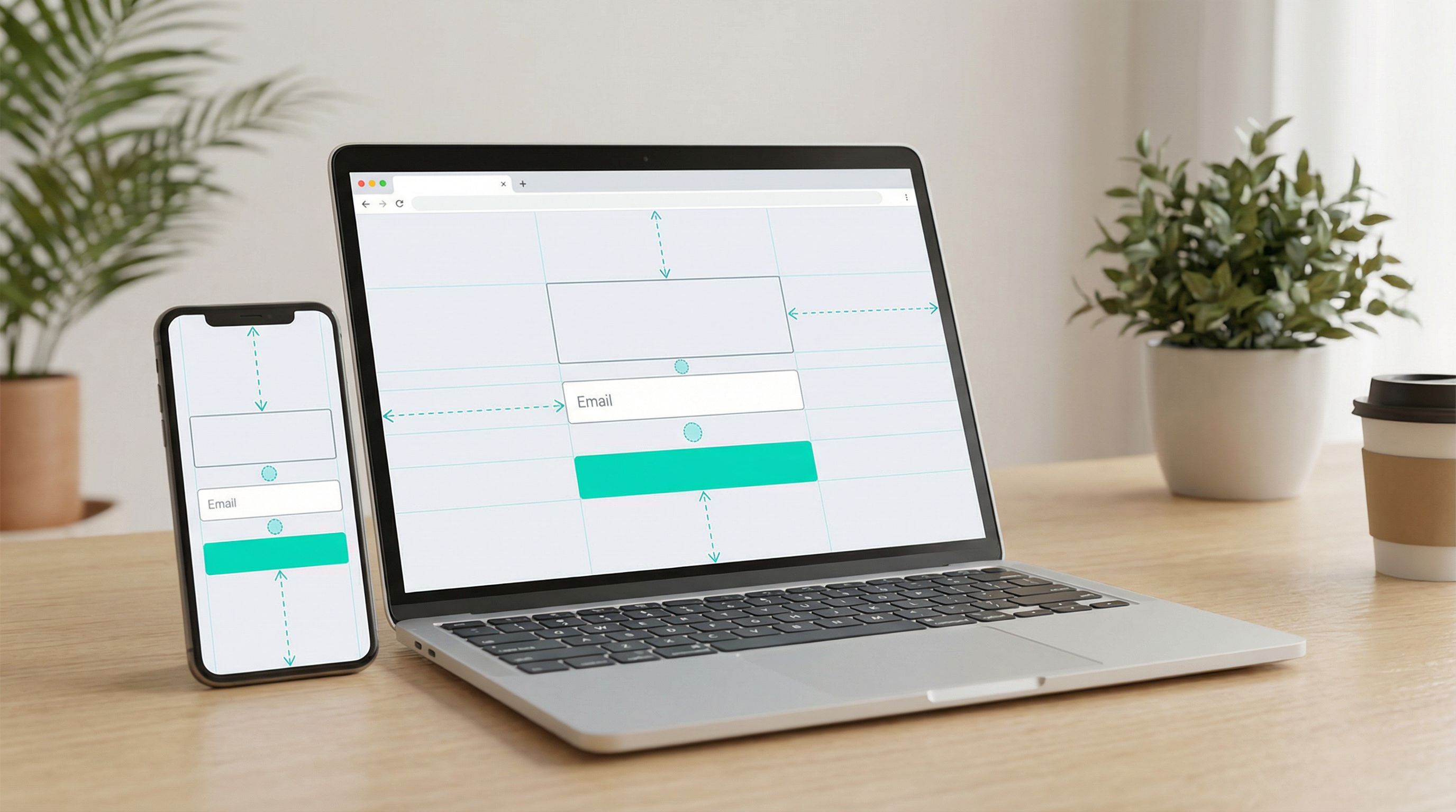
Mistake 5: Ignoring mobile-first behavior
Symptom: Layout looks fine on desktop but cramped or broken on phones.
Why it hurts: A large share of your traffic is on mobile, and they’re the quickest to abandon clunky forms.
Fix:
- Design and test mobile-first, then scale up to desktop.
- Use responsive controls in Ezpa.ge to adjust spacing, font sizes, and breakpoints.
- For more detail on this, see Designing Forms That Feel Native on Any Device: A Practical Guide to Truly Responsive UX.
Turning Patterns into a Repeatable Workflow
A single great layout is nice. A repeatable process for every new form is better.
Here’s a simple workflow you can adopt with your team.
Step 1: Define the primary above-the-fold action
Before you touch a layout builder, answer:
- What is the one thing we want someone to do in the first 10 seconds?
- Is it typing an email, answering a question, choosing an option, or something else?
Write that down. It’s your north star.
Step 2: Pick the right pattern
Based on your goal and audience, choose:
- Single clear column for simple signups and low-friction actions.
- Split layout when you need more context and proof.
- First question first for quizzes, recommendations, or interactive flows.
- Micro-step for longer, multi-step forms.
Step 3: Draft the content in plain text first
Resist the urge to drag-and-drop right away. In a doc or notes app, write:
- Headline
- Subtext
- First field or question
- Button copy
- Any reassurance or trust text
Then drop that into your Ezpa.ge form and style it using your theme system.
Step 4: Test on real devices
Don’t rely solely on your design tool preview.
- Open the form on at least one phone and one laptop.
- Ask 2–3 colleagues or friends to look at it for 5 seconds, then ask:
- “What is this form for?”
- “What would you do next?”
If they hesitate or misinterpret, adjust the layout or copy until the answers are instant.
Step 5: Measure starts, not just completions
Most teams track submissions, but for layout work, you also want to track starts:
- How many people reach the page?
- How many start typing or click the first button?
With Ezpa.ge syncing responses to Google Sheets in real time, you can combine traffic analytics with form data to see how changes to your above-the-fold layout affect both starts and finishes.
Bringing It All Together
Conversion-first form layouts aren’t about being flashy. They’re about being obvious, reassuring, and respectful of people’s time.
Above the fold, your layout should:
- Make the benefit crystal clear.
- Highlight one primary action.
- Reduce perceived effort and risk.
- Guide people into the first meaningful interaction with your form.
Whether you use a single-column layout, a split design, a first-question teaser, or a micro-step approach, the goal is the same: more people starting, more people finishing, and better data flowing into the rest of your systems.
Your Next Step
You don’t need a full redesign to see a lift. Pick one high-traffic form and:
- Identify the primary above-the-fold action.
- Choose a pattern (single column, split, first question, or micro-step).
- Rewrite the headline and button to focus on outcomes.
- Remove or demote anything that competes with that first interaction.
- Ship it, then watch how starts and completions change over the next week.
If you’re using Ezpa.ge, you already have the building blocks: responsive layouts, customizable themes, custom URLs, and real-time Google Sheets syncing. Use them to turn your above-the-fold space into a conversion engine—not just a pretty header.
Open your highest-impact form, tweak the layout, and give your visitors a clearer, faster path to “Submit.”
Your future conversion rate will thank you.