From Click-Through to Conversation: Rethinking Lead Gen When Your ‘Landing Page’ Is a Form

Most performance marketers still picture a classic funnel:
- Ad or outbound touch
- Landing page that “sells” the offer
- Form at the bottom
- Thank-you page, maybe a calendar link
But more and more, that “landing page” is gone. The click goes straight to a form.
- A demo request that lives at a clean, shareable URL
- A waitlist form embedded in product UI
- A consultation intake that sales reps drop directly into DMs
When the form is the landing page, all the old rules about hero sections, long-copy vs. short-copy, and above-the-fold design don’t quite fit. You’re no longer just designing a page that convinces someone to scroll. You’re designing a conversation that convinces them to share enough, trust enough, and commit enough to move to the next step.
This post is about treating that shift as an opportunity, not a constraint.
Why It Matters When the Form Is the First Impression
When someone clicks an ad or email and lands directly on a form, a few things are true:
- Intent is already high. They didn’t stumble in; they clicked with a job-to-be-done in mind.
- Patience is low. They expect to act, not read a mini-website.
- Trust is fragile. One confusing field or vague promise and they’ll close the tab.
That mix is powerful. If you get it right, form-led lead gen can outperform classic landing pages:
- Higher completion rates because there’s less friction between interest and action.
- Cleaner attribution because you’re not juggling multiple page templates and URLs.
- Faster iteration because tools like Ezpa.ge let you change themes, copy, and logic without spinning up new pages.
But you only get those benefits if you stop treating forms as static “gates” and start designing them as guided, one-to-one conversations.
From Page to Conversation: The Mindset Shift
The biggest mistake teams make is copying their old landing page patterns into a form:
- Long paragraphs above the fields
- Generic headlines like “Get in Touch”
- A wall of required inputs that feel like a tax
Instead, ask: “If this were a live chat, what would we say and ask first?”
A conversational form does four jobs:
- Affirms the promise of the click (“Yes, you’re in the right place for X.”)
- Clarifies the next step (“Here’s what happens after you hit submit.”)
- Asks only what’s needed to make that next step valuable.
- Responds in kind with a confirmation that feels like a human reply, not a receipt.
You don’t need paragraphs of copy to do this. You need tight framing, smart sequencing, and visual cues that signal “We’re listening.”
Designing a Form That Sells and Qualifies
Think of your form as a miniature sales conversation. Here’s how to design it so it both converts and qualifies.
1. Start With a Micro-Promise, Not a Tagline
Your headline shouldn’t be your brand slogan. It should finish the sentence: “You clicked because you wanted to…”
Examples:
- “Book a 30-minute strategy call to fix your lead routing.”
- “Get a tailored pricing walkthrough for teams over 20 seats.”
- “Join the waitlist for early access to our AI-powered intake.”
Underneath, a single line of helper text can do a lot of work:
- What they’ll get: “We’ll share a quick Loom with a recommended setup for your stack.”
- When it will happen: “You’ll hear from us within one business day.”
- What you won’t do: “No auto-added newsletters or surprise sales cadences.”
2. Group Fields Around Moments in the Conversation
Instead of a flat list of inputs, group fields into 2–4 “beats” that mirror a real conversation:
- Context – “What brought you here?”
- Fit – “Are we a good match for each other?”
- Logistics – “How do we follow up?”
- Extras – “Anything else we should know?”
In a tool like Ezpa.ge, you can reflect these beats visually with spacing, subheadings, or subtle dividers. On mobile, this is where a responsive form stack really pays off—each “beat” feels like a natural step, not an endless scroll.
3. Ask Fewer, Smarter Questions
When your form is the landing page, every field is doing double duty: it’s both copy and data collection.
Ways to make each question pull its weight:
-
Use answer choices to communicate positioning.
- Instead of: “What’s your role?” (open text)
- Try: “Which best describes you?” with options like “Marketing leader,” “RevOps,” “Founder,” “Sales IC.”
- You’re both qualifying and signaling who you’re built for.
-
Turn objections into fields.
- “What’s your biggest hesitation about switching tools?” with a short text area.
- This tells leads you expect skepticism—and gives sales a head start.
-
Use single-click questions for intent.
- “How ready are you to move on this in the next 90 days?” with a 3–4 option scale.
- This is essentially a built-in button-only micro-form inside your main form.
4. Make the Submit Button a Commitment, Not a Mystery
“Submit” is vague. Your button copy should describe the action they’re taking or the outcome they’re choosing.
- “Request my tailored demo”
- “Send me the migration plan”
- “Join the beta shortlist”
Pair that with a micro-line below the button that sets expectations:
- “We’ll email you within 24 hours with 2–3 time options.”
- “You’ll get a link to book directly on our calendar.”
- “If we’re not a fit, we’ll still share a short Loom with suggestions.”
This is also where forms can quietly filter without feeling harsh. If you only serve teams over a certain size, say so here.
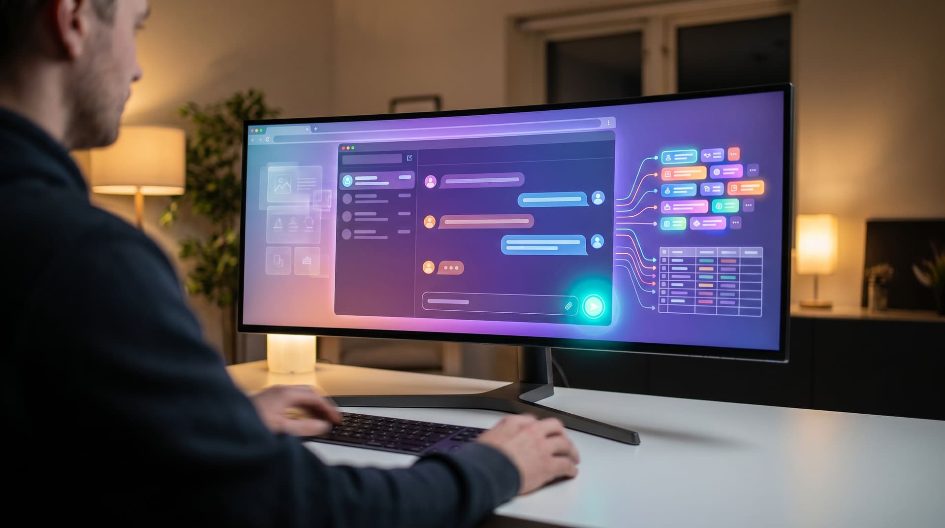
Turning Submissions Into Conversations, Not Dead Ends
A form-led funnel only works if the conversation continues after the click. That means designing:
- The confirmation experience
- The handoff into your systems
- The follow-up motion
1. Confirmation That Feels Human
The confirmation state is the first “reply” someone gets from you. Treat it like a short, personal response—not a receipt.
Instead of:
“Thank you. Your submission has been received.”
Try:
“Got it, thanks for the details about your current stack. We’ll review and send a short Loom with a recommended setup by tomorrow.”
Tactics that work well here:
- Reiterate the next step and time frame in plain language.
- Offer a low-friction next action: a link to a relevant case study, a calendar, or a short video.
- Echo back one key choice they made (“Since you’re on HubSpot + Sheets…”), which you can often surface dynamically using merge fields.
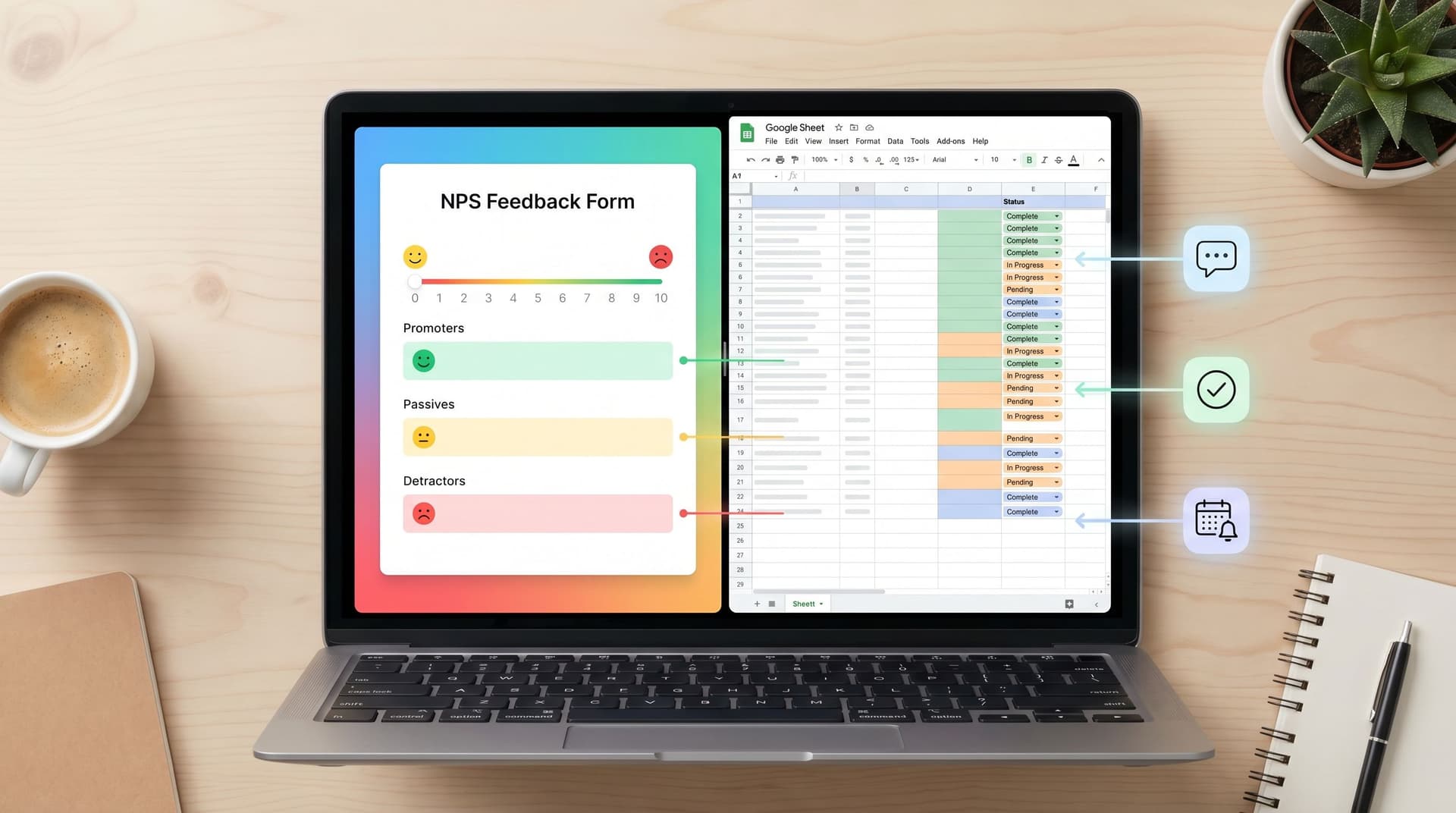
If you’re already syncing form data into Sheets, posts like From NPS to Next Step show how to turn those confirmations into live playbooks—e.g., different confirmation messages or follow-up sequences based on score or segment.
2. Routing Rules That Respect Intent
When your form is the landing page, it’s also the router. Good routing rules answer three questions:
- Who should see this first?
- How quickly should they respond?
- What context do they need at a glance?
Practical patterns:
- Route by segment. Use fields like company size, region, or use case to assign to the right owner.
- Prioritize by signals. If someone selects “Ready to move this quarter” and “Team size 50+,” that should land in a different queue than “Just exploring.”
- Auto-enrich only what you need. If you’re enriching leads via APIs, decide which signals actually change your follow-up, and don’t slow down the form for anything else.
This is where a form-led, Sheet-backed system shines: your Ezpa.ge form syncs to Sheets, and from there, simple filters, lookups, or scripts can triage and route without a heavy CRM project. For a deeper dive on turning those Sheets into durable operations, see From Sheet to System.
3. Follow-Up That Feels Like a Continuation, Not a Reset
The first email or call after a form submission should sound like it’s picking up mid-conversation.
Instead of:
“Hi, I’d love to learn more about your business.”
Try:
“You mentioned you’re on HubSpot and struggling with demo routing across three regions. Here’s a quick Loom showing how teams like yours handle that with Ezpa.ge-powered forms, and three questions to confirm we’re a fit.”
To make this easy for your team:
- Include key fields in the notification (use case, tools, timeframe, role).
- Provide email/snippet templates that reference those fields directly.
- Standardize a first-touch SLA for high-intent signals.
When your forms and Sheets are wired correctly, this starts to feel like a natural extension of your form UX rather than a separate sales process.
Making the Form Feel Native to the Click Source
A form that works beautifully for paid search might flop when dropped into a community Slack or a founder’s X bio. Context matters.
When your form is the landing surface, you can’t rely on the rest of a website to carry the brand or the story. Your theme, layout, and microcopy have to do more work.
Match Theme to Channel and Intent
A few patterns that consistently help:
-
High-intent paid traffic (e.g., “B2B demo software” search ads):
- Clean, high-contrast theme
- Minimal distractions
- Strong, specific headline and button copy
-
Community or referral traffic (e.g., link shared in a Slack group):
- Slightly more personality—subtle color, friendly microcopy
- Light social proof (“Referred by a friend? Mention them and we’ll send them swag.”)
-
In-product prompts (e.g., upgrade or consultation forms):
- Theme that mirrors in-app UI
- Shorter forms, often multi-step or single-question
If you’re already using adaptive themes, a lot of this is just configuration. Posts like Adaptive Themes in the Wild go deeper into matching skins to channels, devices, and even time of day.
Use Micro-Forms to Warm People Up
Not every click needs to land on your “full” intake.
You can:
- Use a button-only micro-form to ask one question (“Are you evaluating tools this quarter?”) and only then show the full form to the “Yes” segment.
- Embed a single-question form in content (e.g., “What’s your biggest headache with lead routing?”) and invite people to a deeper intake after they answer.
This lets you collect high-signal intent data without forcing everyone through the same long flow—and it makes the eventual full form feel like a continuation, not a cold start.
Experimenting Without Spinning Up New Pages
One underrated advantage of form-led lead gen: you can run serious experiments without touching your CMS.
Some high-leverage tests:
- Headline and micro-promise.
- “Book a custom demo” vs. “Get a 3-step plan to fix your routing.”
- Field order.
- Ask use case first vs. company size first.
- Button copy.
- “Submit” vs. “Get my plan” vs. “Talk to a specialist.”
- Multi-step vs. single-step.
- Break your form into 2–3 screens and watch completion by step.
With theme-driven tooling, you can often run these tests at the theme layer—swapping copy, layout, and visual hierarchy—while keeping the same URL and schema. If you want a deeper guide on that approach, see Theme-Driven A/B Testing and Form UX for Experiments.
When your form is the landing page, this kind of experimentation isn’t optional. It’s how you learn which “conversation” actually resonates with each segment.
Putting It All Together: A Simple Blueprint
Here’s a practical blueprint you can adapt for your own lead-gen form that is the landing page.
-
Clarify the job of the form.
- Is it booking time? Qualifying interest? Building a waitlist? Pick one.
-
Write a micro-promise headline and subline.
- Headline: what they get.
- Subline: what happens after submit and when.
-
Define 3–4 conversational beats.
- Context, Fit, Logistics, Extras.
- Map 1–3 fields to each, max.
-
Design fields that signal who you’re for.
- Use multiple-choice where possible.
- Turn objections into questions.
-
Upgrade your submit state.
- Button: action-oriented copy.
- Confirmation: human, specific, with a clear next step.
-
Wire routing and follow-up.
- Sync to Sheets or your CRM.
- Set rules for owner, priority, and SLA.
- Provide templates that reference form answers.
-
Run one experiment at a time.
- Start with headline or field order.
- Keep the URL and schema stable; change the experience.
If you’re using Ezpa.ge, most of this is configuration, not a project. You’re adjusting themes, copy, and logic—then watching how different “conversations” perform with real traffic.
Summary
When your “landing page” is a form, you’re not losing a step in the funnel—you’re gaining a chance to have a clearer, more focused conversation with high-intent visitors.
The shift is simple but profound:
- From pages that explain to forms that commit.
- From generic gates to context-aware conversations.
- From one-size-fits-all templates to theme- and channel-specific experiences.
By treating your form as the first real interaction—not just a data grab—you:
- Increase completion rates and data quality
- Give sales and CS richer context from the first touch
- Learn faster through low-friction experiments
The result is a lead-gen engine where every click is more likely to turn into a real conversation, not just another row in a spreadsheet.
Your Next Step
If your best traffic is still landing on generic forms, this is your cue to change that.
Pick one high-intent flow—your demo request, your consultation intake, your waitlist—and:
- Rewrite the headline and button copy as a clear micro-promise.
- Cut or combine any field that doesn’t change your follow-up.
- Add one question that surfaces intent or hesitation.
- Upgrade your confirmation state so it reads like a human reply.
Then, spin that into a dedicated Ezpa.ge form with a custom URL and real-time Sheet sync. Share that link wherever you’re already driving high-intent clicks, and watch how the conversation—and the conversion—changes.
You don’t need a new site, a new CMS, or a redesign. You just need to treat your form like what it already is: the first, and most important, part of the conversation.