Forms as Brand Safe Rooms: UX Patterns That Protect Sensitive Topics Without Feeling Clinical

When someone hits your form to talk about money stress, burnout, harassment, health, or layoffs, they’re not just “converting.” They’re stepping into a vulnerable moment.
Handled well, your form becomes a brand safe room: a space that feels private, grounded, and human—while still collecting the information your team needs. Handled poorly, it feels like a medical intake clipboard or, worse, a surveillance system.
This post is about how to design forms that hold sensitive topics with care without turning your experience into a sterile questionnaire or a wall of legalese.
Why “Safe Room” Form Design Matters
Sensitive topics show up across more categories than most teams realize:
- Mental health, coaching, and therapy
- HR issues (harassment, discrimination, performance concerns)
- Financial hardship, debt, or pricing exceptions
- Health and wellness programs
- Community moderation and safety reports
- Product feedback about harmful or traumatic experiences
When the subject is loaded, people are scanning for three things the moment your form loads:
-
“Is this actually safe?”
Who will see this? Will it come back to haunt me at work, socially, or financially? -
“Do these people get what I’m going through?”
Does the tone feel empathetic—or robotic and clinical? -
“Is this worth the emotional effort?”
If I open up, will it lead to real help or just another auto‑reply?
If your form doesn’t answer those questions quickly, abandonment goes up, honesty goes down, and your brand takes a hit. The good news: you can address all three through UX patterns, not just policies.
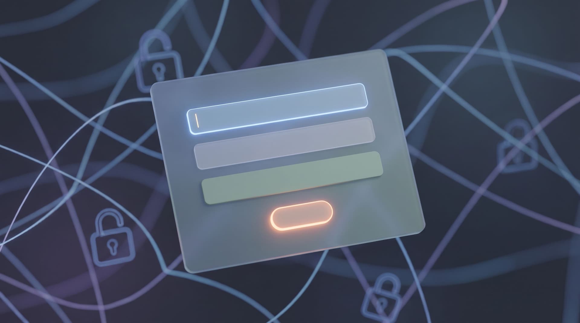
Principle 1: Design the Room Before the Questions
Before you worry about which fields to add, design the feeling of the space.
Use theming to signal safety, not hype
For sensitive flows, your form theme should do quiet work:
- Color palette:
- Soft neutrals, desaturated blues/greens, or your brand colors in their calmer tones.
- Avoid aggressive reds and high‑saturation accents except for truly critical states.
- Typography:
- Use readable, friendly fonts with generous line height.
- Skip all‑caps headlines and salesy display fonts.
- Density and spacing:
- Add more whitespace than you think you need.
- Group related questions into clearly separated sections.
Tools like Ezpa.ge make this easier by letting you create themes tuned to specific use cases—so your “Report a concern” form doesn’t look like your “Get a discount code” form. If you’re already experimenting with theming, you’ll recognize some overlap with what we covered in Adaptive Themes in the Wild.
Lead with a human, grounding intro
The first 2–3 sentences on the page set the emotional tone. Use them to:
- Name the purpose: Why this form exists and when to use it.
- Set expectations: What will happen after submission and on what timeline.
- Affirm agency: Make it clear the person can skip, pause, or choose how much to share.
Example:
“This form is a private way to share concerns about your experience at work. Your responses go directly to our People team, who will review them within two business days. You’re in control of how much you share—answer only what feels comfortable.”
That short paragraph does more for perceived safety than a full page of policy text.

Principle 2: Collect Less, Explain More
For sensitive topics, over‑collection is a trust killer. Every extra field raises the question: “Why do you need that?”
Start from “minimal viable disclosure”
Work backwards from the action you’ll take after submission:
- What must you know to route this correctly?
- What must you know to respond helpfully?
- What must you store long term (if anything)?
Then:
- Mark all other fields as optional or drop them entirely.
- Use free‑text sparingly; structure answers where you can (more on that later).
If you want a deeper dive on designing forms that are secure by structure—not just by encryption—pair this with Security by Structure and Secure by Default.
Narrate why you’re asking
For every field that touches identity or sensitive context, add a short helper line:
-
Name (optional)
We use this only to follow up with you directly, if you’d like us to. -
Department
This helps us route your concern to the right team more quickly. -
Best way to contact you (optional)
If you prefer to stay anonymous, you can leave this blank.
That one‑line explanation often matters more than any trust badge or policy link.
Use progressive depth, not a single cliff
Instead of dropping users into a 30‑field monolith, use progressive disclosure:
-
Start with a small, low‑stakes step
Example: “What would you like to talk about?” with 4–6 high‑level options. -
Reveal relevant follow‑ups only
Use conditional logic to show different questions for “Harassment” vs. “Burnout” vs. “Pay transparency.” -
Offer optional depth
Provide an open text box with clear framing: “Share as much or as little as you’d like. Bullet points are fine.”
This keeps the experience feeling like a guided conversation instead of an intake exam.
Principle 3: Use Question Patterns That Feel Safe
The shape of your questions can either invite honesty or trigger defensiveness.
Prefer ranges and categories over exacts
When you’re dealing with money, health, or identity, people often feel safer giving approximate information first.
Instead of:
- “What is your current salary?” (single text field)
Try:
- “Which range best describes your current salary?” (pre‑defined brackets)
Instead of:
- “How many panic attacks have you had this month?”
Try:
- “How often have you experienced intense anxiety in the past month?” with options like “Not at all / 1–2 times / Weekly / Most days.”
You can always offer a follow‑up free‑text field for nuance.
Normalize experiences in the copy
Micro‑copy can take shame out of the equation:
- “Many people use this form when something doesn’t feel right but they’re not sure how to name it yet.”
- “It’s okay if you’re still figuring this out. Short answers are welcome.”
- “You don’t need to have exact dates or details to use this form.”
These phrases tell people they’re not the first to be in this situation—and they don’t need a perfect story to be taken seriously.
Give people control over anonymity
Where possible, design for three identity modes instead of a binary:
- Fully identified – Name, email, and role.
- Contactable but not named – A private email or phone, no internal identifier.
- Fully anonymous – No contact info at all.
You can implement this with a single choice early on:
“How would you like to share this?
- With my name and contact info
- With contact info only (no name)
- Completely anonymously (no way to contact me) ”
Then conditionally show or hide identity fields based on that choice.
Be honest about trade‑offs: if anonymous reports limit your ability to act, say so in plain language.
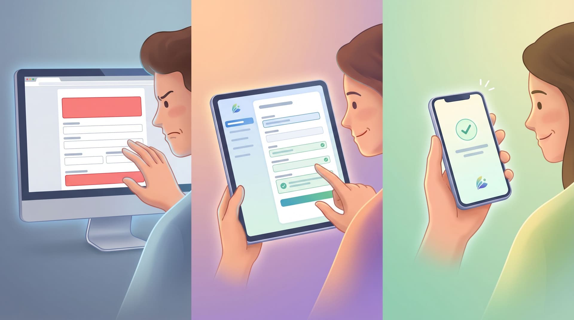
Principle 4: Make Error States and Edge Cases Feel Held
Nothing breaks a sense of safety faster than a harsh red error or a lost response.
Gentle, specific errors
Error messages should:
- Blame the system, not the person.
- Offer clear next steps.
- Preserve any text already entered.
Instead of:
- “Invalid input.”
Try:
- “That email address doesn’t look quite right. Can you check for a missing character?”
For required sensitive fields, explain why they’re required:
- “We need at least one way to contact you if you’d like a follow‑up. If you prefer to stay anonymous, choose ‘No follow‑up needed’ above.”
For more on designing errors that build trust instead of eroding it, see Brand-First Error States.
Resilience to interruptions
People filling out sensitive forms may:
- Close the tab mid‑way.
- Lose connection.
- Need to step away.
Design for resilience:
- Autosave drafts where possible (especially for long narratives).
- Warn on navigation away: “You have unsaved responses. Are you sure you want to leave?”
- Offer a ‘Save and come back’ link if your stack supports authenticated flows.
Thoughtful confirmation states
The confirmation screen is your last chance to reinforce safety.
Include:
- A clear acknowledgment: “We’ve received your submission.”
- What happens next: Who will review it, how long it usually takes, and what channels you’ll use.
- Resources they can use right now:
- Support docs
- Emergency contacts (for mental health or safety issues)
- Links to policies written in plain language
Avoid generic “Thanks for submitting!” messages here—they trivialize the effort it took to share.

Principle 5: Align Form Behavior With Brand Promises
A form can look safe but still betray trust underneath if your operations don’t match the UX.
Tighten access and routing
For sensitive topics, default to least necessary visibility:
- Route submissions to a small, clearly defined group (e.g., People Ops, Safety Team).
- Avoid dumping them into wide‑open channels or shared inboxes.
- Use tools like Ezpa.ge + Google Sheets to:
- Store sensitive responses in a dedicated, permission‑locked Sheet.
- Separate identifying info (e.g., contact details) from narrative content where possible.
Turn responses into predictable workflows
Nothing feels worse than pouring your heart into a form and hearing nothing back.
Set up simple workflows:
- Triage rules in Sheets:
- Tag submissions by type, urgency, and required owner.
- Use color‑coding or filters to highlight high‑risk items.
- Response SLAs:
- Define internal expectations: e.g., “All harassment reports get a first human response within 24 hours.”
- Templates for follow‑ups:
- Draft compassionate, clear follow‑up messages that can be customized per case.
If you’re already using Sheets as your operational backbone, you can adapt patterns from From Sheet to System to keep these flows reliable over time.
Be transparent about data handling
You don’t need a wall of legal text, but you do need:
- A short, plain‑language summary near the form:
- “Only the People team can see your full responses.”
- “We store submissions in an encrypted database and a restricted Google Sheet.”
- “We keep reports for at least 12 months so we can identify patterns and act on them.”
- A link to the full policy for those who want to go deeper.
The key is proximity: put the summary where decisions are made—right next to the fields that feel riskiest to fill out.
Putting It All Together: A Practical Blueprint
Here’s a concrete pattern you can adapt for your own “safe room” forms, whether you’re using Ezpa.ge or another tool.
1. Create a dedicated theme
- Softer brand colors
- Generous padding and spacing
- Smaller, friendlier headlines
- Subtle dividers between sections
2. Structure the flow into three short sections
-
Reason for reaching out
- A multiple‑choice question with 4–6 categories
- A short, optional text field: “Anything you’d like to share at a high level?”
-
How we can support you
- A multiple‑choice question: “What would you like to happen next?”
- Talk to someone
- Document this only
- Get information/resources
- Conditional follow‑ups based on choice.
- A multiple‑choice question: “What would you like to happen next?”
-
Identity & follow‑up preferences
- “How would you like to share this?” (identity modes)
- Conditional fields for name, contact info, and best time to reach you.
3. Layer in micro‑copy
- A grounding intro at the top.
- Helper text on any field that might raise eyebrows.
- Normalizing statements near open‑ended questions.
4. Design the confirmation moment
- Clear acknowledgment and next steps.
- A realistic timeline.
- Links to immediate resources.
5. Wire up your back‑end
- Sync submissions into a restricted Google Sheet.
- Add filters/tabs for:
- New / In progress / Resolved
- High‑urgency items
- Create a simple weekly review ritual for patterns and follow‑through.
Summary
When your form touches sensitive topics, you’re not just designing a funnel—you’re designing a safe room your brand is responsible for.
The most effective patterns are quiet:
- Theming and layout that feel calm, not clinical.
- Minimal, well‑explained fields that respect emotional effort.
- Question shapes that invite honesty without forcing over‑disclosure.
- Gentle error and confirmation states that keep people grounded.
- Operational workflows that match the promises your UI makes.
Get those right, and your forms stop feeling like bureaucratic checkpoints and start acting like trustworthy, human entry points into your product, your team, or your community.
Ready to Design Your Own Brand Safe Room?
You don’t need a new stack or a six‑month project to do this well.
With Ezpa.ge, you can:
- Spin up dedicated themes for sensitive flows.
- Use custom URLs that are easy to share but hard to stumble into.
- Sync submissions into permissioned Google Sheets where your team can triage and follow through.
Start small: pick one high‑stakes form—an incident report, a hardship request, a mental health check‑in—and redesign it as a safe room using the patterns above.
Then ship it, watch how people use it, and iterate.
Your users are already telling you the hard things. The question is whether your forms are ready to hold them.