Form UX for Tiny Screens: Designing High-Stakes Flows for Mobile-Only Markets

High-stakes forms used to live on big, comfortable screens.
Loan applications. Healthcare intake. Government benefits. Insurance claims. KYC and onboarding for financial products.
Now, a huge share of those flows are happening on 5–6 inch devices—often on older phones, with spotty connections, and in markets where “mobile-only” isn’t a persona; it’s reality.
When the screen is tiny and the stakes are high, form UX stops being a “conversion optimization” exercise. It becomes infrastructure. It determines who gets access, who gives up, and whose data is safe.
This piece is about how to design those flows deliberately—especially if you’re using a flexible builder like Ezpa.ge to ship forms quickly across markets.
Why tiny screens change the rules
Designing forms for mobile-only users isn’t just about shrinking a desktop layout. The constraints are different, and so are the risks.
1. Attention and context are fragile
On mobile, your users are:
- Working with one thumb, not a full keyboard
- Dealing with glare, noise, and motion (buses, queues, sidewalks)
- Switching between apps to find documents, OTP codes, or reference numbers
Every extra scroll, tap, or unclear question compounds friction. In high-stakes flows—money, identity, healthcare—that friction quickly turns into abandonment or errors.
2. Connectivity is unreliable
In many mobile-first and mobile-only markets, your form has to survive:
- 2G/3G speeds or congested networks
- Prepaid data plans where every megabyte matters
- Frequent app switching when a connection drops
If your flow assumes a perfect connection or large assets, you’ll lose the users who most need what you’re offering.
3. Devices and input methods vary widely
You’re not just designing for the latest iPhone. You’re designing for:
- Smaller, low-resolution screens
- Older Android versions and browsers
- Virtual keyboards that obscure half the viewport
This makes layout, tap targets, and error handling more than aesthetic concerns—they’re accessibility and equity issues.
4. Stakes are higher than “nice-to-have” signups
For many users, these forms are how they:
- Access credit or financial products
- Register for essential services
- Apply for jobs or government programs
A confusing error, a tiny tap target, or a timeout doesn’t just hurt your metrics. It can shut someone out of an opportunity.
Start from the outcome, then design backwards
Before opening a form builder, get painfully clear on what “success” looks like—for the user and for your team.
Ask:
- What decision will this form power? Approving a loan, verifying identity, assigning a support tier?
- What is the minimum information required to make that decision responsibly? Not “nice to have,” but truly required.
- What happens within 5 minutes of submission? Who reads it? What tools does it feed? What SLA are you promising implicitly?
This is especially critical in high-stakes flows, where it’s tempting to ask “just one more question.” If you want a deeper dive on connecting forms to downstream workflows, see how we map intake to automation in From Intake to Inbox Rules: Turning Form Responses into Automated Internal Playbooks.
Once you know the outcome, you can:
- Split the flow into phases (e.g., pre-qualify → collect essentials → request documents → confirm).
- Decide which phases must live on mobile, and which can be safely deferred to a larger device or later step.
- Design each phase as a self-contained win—so if a user drops, you still gained something useful.
Core principles for mobile-only, high-stakes forms
1. Design thumb-first, not “responsive”
On a tiny screen, the primary interaction is a thumb moving in an arc from the bottom of the device.
Optimize for that reality:
- Single-column layouts only. No side-by-side fields.
- Big, forgiving tap targets. At least 44px high; more for primary actions.
- Sticky, bottom-aligned primary buttons (e.g., “Next”, “Submit”) so users don’t have to scroll back up.
- Avoid horizontal scroll at all costs.
If you want more patterns here, our piece on Beyond ‘Mobile-Friendly’: Designing Thumb-First Forms for On-the-Go Users dives deep into thumb zones and motion-aware UX.
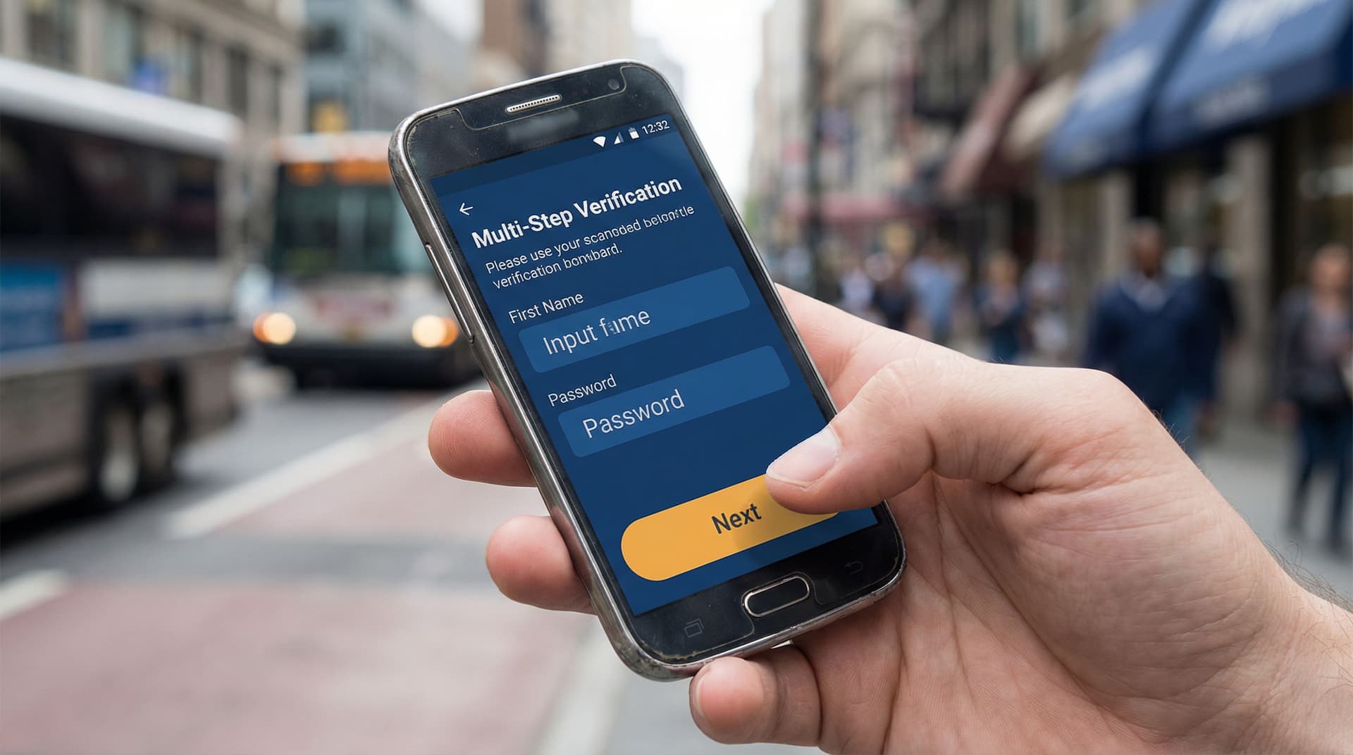
2. Make every screen do one clear job
On mobile, each screen should answer one question:
“What do I need to do right now?”
Tactics:
- Limit each step to 1–3 closely related fields. For example, a “Personal Info” step might only ask for full name and date of birth.
- Use a clear, honest step label: “Step 2 of 5 — Identity details”.
- Show progress visually: a simple stepper or progress bar reduces anxiety.
This “micro-step” approach pairs well with Ezpa.ge’s multi-step layouts and custom themes, letting you keep each screen focused without losing brand cohesion.
3. Ruthlessly reduce cognitive load
Complexity isn’t just about length. It’s about thinking.
Reduce cognitive load by:
- Using plain language. Replace jargon (“beneficiary relationship”) with real words (“How do you know this person?”).
- Explaining why you ask sensitive questions. A short helper text like “We ask for your ID number to verify your identity and protect your account” builds trust.
- Auto-formatting where possible. For phone numbers, dates, and currency, use input masks so users don’t have to guess the format.
- Matching keyboard types to fields. Numeric keypad for numbers, email keyboard for email, etc.
4. Fail gracefully, especially on errors
On a tiny screen, bad error handling is brutal. You scroll, lose context, and feel blamed.
Instead:
- Validate inline, not just on submit. Catch issues field-by-field where possible.
- Place error messages directly under the field, not at the top of the screen.
- Use blame-free language. “That ID number doesn’t look right yet” beats “Invalid input.”
- Never erase user input on error. Losing data is the fastest way to lose trust.
For sensitive flows, combine this with the patterns from Quiet Security: Subtle UX Patterns That Signal Safety Without Killing Conversion to reassure users without overwhelming them.
Structuring high-stakes flows for mobile-only users
Let’s turn principles into a concrete structure you can apply to your next Ezpa.ge form.
Step 1: Separate eligibility from enrollment
Don’t make people invest 10 minutes before they learn they’re not eligible.
- Screen early with 2–4 high-signal questions.
- Example: country, age range, income band, employment status.
- Give immediate, respectful feedback.
- Eligible? “You’re likely eligible—let’s confirm a few details.”
- Not eligible? “Based on what you shared, this program isn’t a fit right now. Here’s what you can try instead.”
Use conditional logic in Ezpa.ge to branch paths: one for eligible users, one for graceful exits.
Step 2: Front-load only what’s fragile
Some data is fragile:
- Time-sensitive (e.g., OTP codes)
- Hard to retrieve (e.g., ID numbers, reference codes)
- Dependent on a single device (e.g., photos stored locally)
Place these earlier in the flow so that if something breaks later, the user doesn’t have to:
- Dig out the same document twice
- Re-request an OTP
- Re-scan a physical ID
Combine this with real-time syncing (e.g., Ezpa.ge → Google Sheets) so your ops team can recover partial data if needed.
Step 3: Chunk complex requirements into mini-flows
High-stakes forms often require:
- Identity verification
- Employment and income details
- References or guarantors
- Document uploads
Instead of one long, scrolling form, treat each as a mini-flow:
- Intro screen — what you’ll need and why it matters.
- 1–3 focused steps — just for that requirement.
- Confirmation screen — recap and next step.
This keeps users oriented and makes it easier to debug drop-off with low-noise analytics.
Step 4: Design for interruption and return
Mobile-only users will be interrupted:
- Battery dies
- Network drops
- They get a call or notification
Build resilience by:
- Keeping each step short enough to complete in under 30–45 seconds.
- Saving progress server-side after each step where possible.
- Sending a magic link or SMS so users can resume later from where they left off.
- Using clear, stable custom URLs so support can easily reference the exact flow. (If you’re designing many related URLs, see Form Systems, Not One-Off Links: Designing a URL Taxonomy That Scales With Your Ops.)
Step 5: Make success unmistakable
When someone submits a high-stakes form on a tiny screen, uncertainty is your enemy.
Your confirmation state should:
- Use a clear headline: “Application submitted” or “You’re verified.”
- Provide a reference number that’s easy to copy.
- Explain what happens next, with realistic timelines.
- Offer a clear next action: download receipt, view status, or contact support.
Avoid vague copy like “Thanks!” with no follow-up details.
Handling documents and identity on small screens
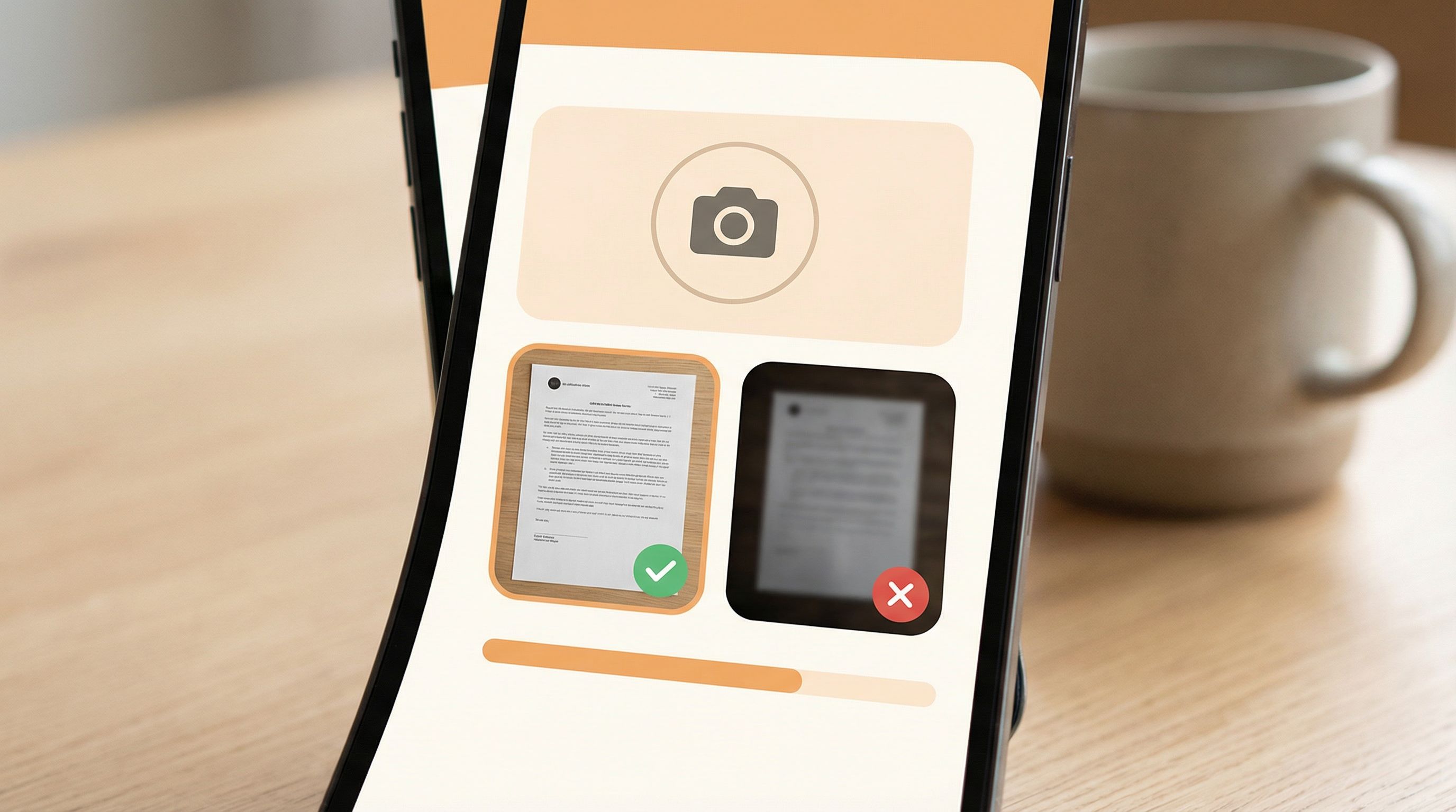
Document-heavy flows are where mobile-only UX often breaks. You can’t assume a scanner, printer, or desktop.
Make capture native to the phone
Wherever possible, let users:
- Take a photo of a document directly from the form
- Upload from gallery as a fallback
Tips:
- Show example photos (“Good vs. bad”) so users know what “readable” means.
- Automatically compress images to reduce upload time and data usage.
- Indicate upload progress clearly; never leave users staring at a frozen screen.
Reduce precision requirements
Typing long ID numbers or bank details on a small keyboard is error-prone.
Mitigate this by:
- Breaking long numbers into groups with spaces or dashes.
- Confirming critical fields with a second entry or checksum.
- Using camera-based capture (e.g., scanning a card) where privacy and compliance allow.
Be explicit about security and storage
For high-stakes flows, users worry—often silently—about where their documents go.
Reassure them by:
- Stating why each document is needed.
- Clarifying how long it will be stored.
- Linking to a privacy policy in language a non-lawyer can understand.
Pair this with the “quiet security” design patterns you use elsewhere in your product: consistent branding, professional theming, and subtle security indicators.
Adapting flows without rebuilding from scratch
Mobile-only markets are not static. Regulations shift, fraud patterns evolve, and your team learns what’s working.
Rebuilding from scratch every time is a recipe for form sprawl and inconsistent UX. Instead, treat your mobile flows as living systems.
Use live data to refine, not redesign
With Ezpa.ge syncing submissions into Google Sheets in real time, you can:
- Track where users drop off by step index.
- See which questions correlate with abandonment.
- Identify segments that struggle more (e.g., certain age groups or regions).
From there, apply the mindset we explore in Adaptive Question Paths: Using Live Response Data to Reshape Your Forms Without a Redesign:
- Hide questions that add friction but little decision value.
- Add conditional sub-questions only for edge cases.
- Reorder steps so the most critical, easiest questions come earlier.
Keep a stable URL, evolve the experience
High-stakes flows often live in documentation, SMS campaigns, and support scripts. Changing URLs frequently breaks trust and creates confusion.
Instead:
- Keep your core URL stable (e.g.,
/apply), updating the underlying form as you learn. - Use custom URLs for specific campaigns or partners that route into the same base flow with minor variations (e.g., pre-filled fields, localized copy).
- Document your URL taxonomy so ops and support know which link to use when.
Design for ops as much as for users
Remember: the form is just the start. For high-stakes flows, your internal handling matters just as much.
Make life easier for your team by:
- Using structured fields instead of open text wherever possible.
- Including internal-only tags or routing fields (e.g., region, risk band) that never show to users but help with triage.
- Syncing to Google Sheets with filters and views tailored to each team.
This is where Ezpa.ge’s real-time Sheets sync shines—your underwriting, support, or compliance teams can work from a single, always-up-to-date source without logging into yet another tool.
Putting it all together: a checklist for your next mobile-only, high-stakes form
Use this as a quick review before you ship:
Clarity & scope
- [ ] I can describe the form’s purpose in one sentence.
- [ ] I’ve separated eligibility screening from full enrollment.
- [ ] I’ve identified the minimum data needed to make a responsible decision.
Layout & interaction
- [ ] Single-column layout, no horizontal scroll.
- [ ] Buttons and tap targets are large and reachable with a thumb.
- [ ] Each step has 1–3 related fields and a clear title.
Copy & guidance
- [ ] Every sensitive question has a short explanation of “why we ask.”
- [ ] Helper text uses plain language, not internal jargon.
- [ ] Error messages are inline, specific, and blame-free.
Resilience & performance
- [ ] The form loads quickly on slower connections (no heavy assets).
- [ ] Progress is saved at logical checkpoints.
- [ ] Users can resume later via a stable link or message.
Documents & identity
- [ ] Users can capture documents with the phone camera.
- [ ] I show examples of acceptable document photos.
- [ ] Critical numbers are grouped, validated, and confirmed.
Trust & security
- [ ] The visual design feels consistent, professional, and calm.
- [ ] Security and privacy are explained succinctly, with a clear policy link.
- [ ] Confirmation screens clearly state what happens next.
Ops & evolution
- [ ] Responses sync to a structured, shared destination (e.g., Google Sheets).
- [ ] Routing and tags support the teams who act on submissions.
- [ ] I have a simple plan to review performance and iterate.
If you can check these boxes, you’re well on your way to a mobile form that respects both the user’s constraints and the stakes of the decision you’re powering.
Summary
Designing high-stakes forms for mobile-only markets is not about squeezing a desktop flow onto a smaller canvas. It’s about:
- Starting from the decision you’re enabling and working backwards.
- Embracing thumb-first, single-task screens that reduce cognitive load.
- Handling errors, interruptions, and weak connections as normal, not exceptional.
- Making document capture and identity verification native to the phone.
- Treating your forms as living systems, refined by real-world data rather than periodic redesigns.
When you get this right, your forms become quiet infrastructure for access—helping more people complete critical tasks successfully from the device they actually have.
Take the first step with Ezpa.ge
You don’t need a full redesign or a new app to serve mobile-only users better. You can start with one high-stakes flow and improve it this week.
Here’s a simple way to begin:
- Pick one form that really matters—loan pre-qualification, benefits enrollment, or a key KYC step.
- Rebuild it in Ezpa.ge as a multi-step, thumb-first flow with clear progress and focused screens.
- Connect it to Google Sheets so your team can see submissions in real time and spot friction.
- Ship it to a small segment and watch how it performs. Iterate on copy, step order, and logic.
The sooner you ship a mobile-first version of your high-stakes flows, the sooner you’ll see where users struggle—and how much more they can accomplish when the form finally fits the screen in their hand.
Start with one form. Make it great on a tiny screen. Then use what you learn to upgrade everything else.