Beyond ‘Mobile-Friendly’: Designing Thumb-First Forms for On-the-Go Users

Mobile traffic passed desktop years ago, but most forms are still designed as if people are sitting at a big screen, hands on a keyboard, full attention on the task.
That’s not how your users live.
They’re:
- Holding a phone in one hand and a coffee in the other
- Filling out a demo request while walking between meetings
- Tapping through a signup flow on a cramped subway
- Trying to submit feedback before the elevator doors open
“Mobile-friendly” — a responsive layout and slightly bigger fonts — isn’t enough. To win those moments, you need something more specific: thumb‑first forms.
Thumb‑first design starts from a simple question: What does this feel like for someone using one thumb on a small screen, with partial attention and limited patience?
This post is about how to answer that question, and how to build forms (especially with tools like Ezpa.ge) that feel effortless on the move.
Why Thumb-First Forms Matter So Much
1. Most people are actually using their thumbs
Multiple studies have found that about 75–85% of smartphone interactions happen one-handed, and most of those are thumb-driven. On larger phones, that number climbs even higher as people struggle to reach the top corners.
If your primary actions, key fields, or error messages live in the hard‑to‑reach zones, you’re quietly telling most of your users: this wasn’t built for you.
2. Mobile forms are where money and momentum leak
Forms are where intent turns into action:
- A signup form turns curiosity into an account.
- A demo form turns interest into a sales conversation.
- A feedback form turns frustration into a roadmap signal.
We covered this in depth in Form UX for Non-Designers: A Practical Checklist for High-Converting Flows — but on small screens, every friction point is amplified. A field that’s “slightly annoying” on desktop can be a deal‑breaker when someone is juggling a bag, a notification, and a low battery warning.
3. On-the-go users have zero tolerance for friction
People filling forms on the move are:
- Distracted – notifications, real‑world interruptions, spotty connections
- Time‑boxed – the time it takes for a light to change or a latte to be made
- Battery‑conscious – they might abandon anything that feels like a slog
Thumb‑first forms respect that reality. They:
- Minimize reaching and awkward hand gymnastics
- Make it obvious what to do next
- Recover gracefully from errors and interruptions
The payoff: higher completion rates, better data quality, and a brand experience that feels quietly competent.
Start With the Hand: Mapping the Thumb Zone
Before you think about fonts, colors, or field types, think about the physical hand holding the phone.
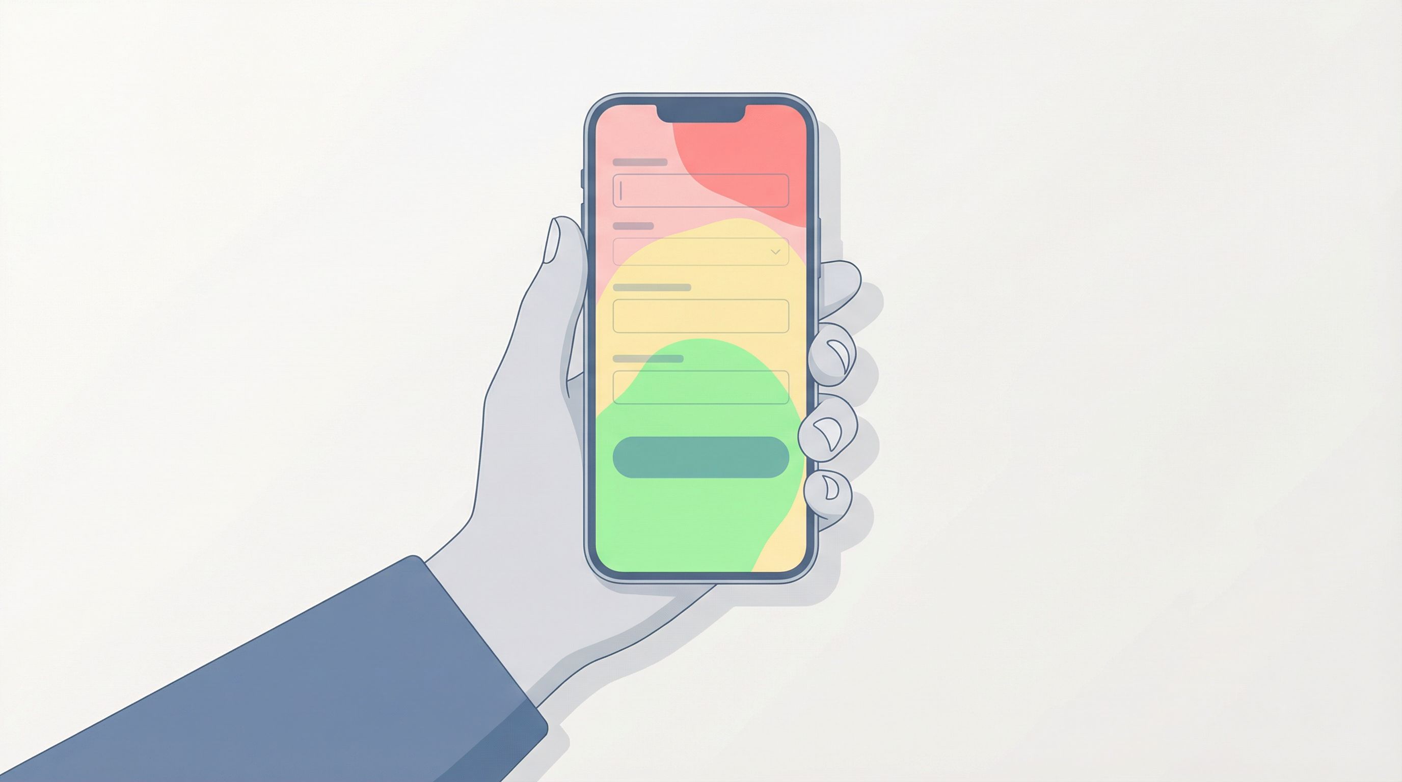
The comfortable vs. stretch zones
On most modern phones, you can roughly divide the screen into three regions for one‑handed use:
-
Comfort zone (bottom center and bottom sides)
- Easy to tap repeatedly
- Ideal for primary buttons, navigation, and the current field
-
Stretch zone (middle of the screen)
- Reachable, but requires small adjustments
- Good for supporting content: labels, helper text, progress indicators
-
Risk zone (top corners, especially top left for right‑handed use and top right for left‑handed)
- Hard to reach without shifting grip or using the other hand
- Should not contain critical, frequently tapped actions
Thumb‑first rule of thumb (pun intended): Primary actions live in the comfort zone.
What this means for your form layout
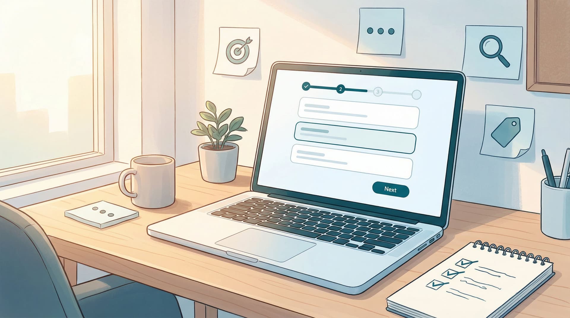
- Put the current input field as close to the middle‑bottom of the screen as possible.
- Keep primary buttons (Next, Submit, Continue) anchored near the bottom.
- Use the top of the screen for static context: form title, short description, optional progress bar.
If you’re using Ezpa.ge, this is where themes and spacing matter. A “pretty” layout that pushes the primary button into the stretch zone for the sake of symmetry is working against you.
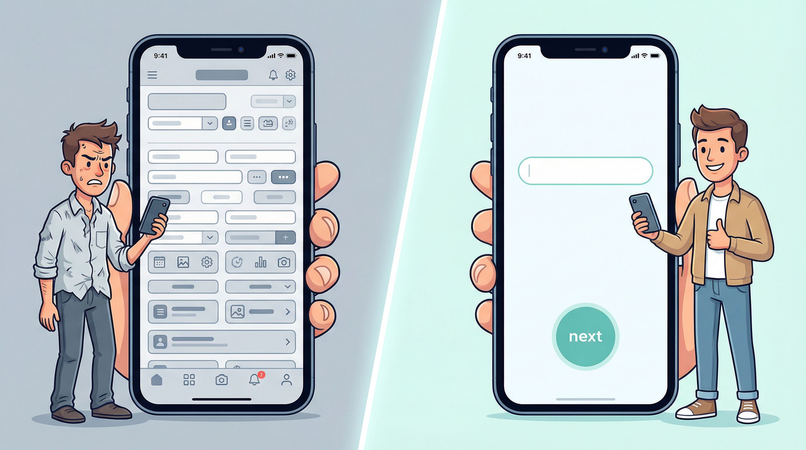
Make Every Screen Thumb-Simple
Thumb‑first forms are not just “the same form, smaller.” They’re often re‑sequenced and simplified for mobile reality.
1. One clear job per screen
On a small screen, cognitive load adds up quickly. Instead of cramming multiple decisions into one view:
- Aim for one main question or decision per screen, especially for complex flows.
- Use multi‑step forms where each step feels lightweight.
- Show clear progress (e.g., “Step 2 of 4”) so users know the path is finite.
If you’re already experimenting with micro‑forms and one‑question flows, you’re halfway there. Our post on Micro-Forms for Macro Decisions: Using One-Question Flows to De-Risk Product Bets goes deeper into how small, focused forms can capture high‑signal data.
2. Design for the primary hand — but don’t punish the other
Most people are right‑handed, but plenty of left‑handed users (and right‑handers using their left hand temporarily) will use your form.
Good patterns:
- Full‑width buttons at the bottom rather than right‑aligned buttons
- Center‑aligned key actions, so both hands have equal access
- Avoid placing destructive or secondary actions in corners that are hard to reach and easy to mis‑tap
3. Keep labels close and obvious
On mobile, distance between label and field is a common source of confusion. People scroll slightly, the label disappears, and now they’re guessing what the field was asking for.
Better patterns:
- Use floating labels that move above the field when it’s focused
- Keep helper text directly below the field, not buried in tooltips
- Avoid long paragraphs; break guidance into short, scannable lines
4. Prioritize tap targets over density
Thumbs are not precision instruments.
- Make tap targets at least 44px high (Apple’s long‑standing guideline) or the equivalent in your design system.
- Add generous spacing between checkboxes, radio buttons, and list items.
- Turn entire rows into tap targets (e.g., for multiple‑choice answers), not just the tiny circle.
You might show fewer options per screen, but the tradeoff is worth it: fewer mis‑taps, less frustration, and higher completion.
Ask Less, Infer More
On-the-go users don’t have patience for 20‑field interrogations. Thumb‑first forms are ruthless about what they ask.
1. Cut fields that don’t earn their keep
For every field, ask:
- What will we do differently if we have this information?
- Can we infer or enrich this later from other data?
- Is this a “nice to know” masquerading as “need to know”?
If you can’t answer those questions clearly, the field probably doesn’t belong in a mobile‑first flow.
For more on this mindset, see Signals, Not Surveys: Designing Micro-Interactions That Capture User Intent Without Extra Fields — it’s all about capturing intent with fewer, smarter inputs.
2. Use the phone’s strengths
Modern phones can do a lot of the work for you. Where it makes sense and is privacy‑appropriate:
- Use autocomplete for email, name, and address.
- Use native pickers for dates, times, and countries instead of free‑text fields.
- Offer scan or upload options for documents instead of long manual entry.
3. Progressive disclosure over front‑loading
If you truly need more detail, don’t show everything at once.
- Start with a minimal first step (often just email or phone).
- Reveal additional fields only when relevant, using conditional logic.
- Let users skip non‑critical questions and follow up later via email or in‑product prompts.
Tools like Ezpa.ge make this easier with conditional logic and real‑time syncing into Google Sheets, so you can gradually enrich profiles over time instead of demanding everything up front.
Make Input Types Do the Heavy Lifting
Thumb‑first design isn’t just visual; it’s about choosing the right way to answer each question.
1. Match keyboard to field
Nothing kills momentum like tapping a field and getting the wrong keyboard.
- Email fields → email keyboard (with
@and.visible) - Phone fields → numeric keypad
- Number fields (e.g., quantity, budget) → numeric keypad
- URL fields → URL keyboard
In Ezpa.ge or similar tools, this is usually just a field type setting — but it dramatically improves speed and reduces typos.
2. Replace typing with tapping where possible
Typing on the move is error‑prone. Look for opportunities to swap free‑text for structured inputs:
- Use radio buttons or segmented controls for short, mutually exclusive choices.
- Use dropdowns sparingly; they often hide options and require extra taps.
- For ranges (e.g., team size, budget), use bucketed options instead of asking for exact numbers.
3. Design for short, natural answers
When you do need text input:
- Ask one clear question at a time.
- Provide gentle prompts (e.g., “One or two sentences is fine”) to set expectations.
- Use placeholder examples that show the style of answer you want.
This not only helps users move faster; it also yields cleaner, more actionable data on the backend.
Reduce Errors and Recovery Time
On-the-go users will make mistakes. Thumb‑first forms assume this and make recovery painless.
1. Validate early, not all at once
Avoid the dreaded “You have 5 errors” message after someone hits Submit.
Better patterns:
- Inline validation as users move between fields
- Clear, specific error messages (“Please enter a valid work email, not a personal address”) instead of generic red text
- Auto‑formatting for phone numbers, credit cards, and dates
If you’re interested in going deeper on validation strategy, Beyond ‘Required’: Rethinking Form Validation Rules for Better Data and Happier Users is a dedicated guide.
2. Guard against fat‑finger mistakes
Common thumb‑driven issues:
- Tapping the wrong option in a dense list
- Accidentally closing the form or navigating away
- Hitting a destructive action instead of a safe one
Mitigations:
- Use spacious layouts and full‑row tap targets.
- Add lightweight confirmation only for truly destructive actions (e.g., “Clear all answers?”).
- Keep primary actions visually distinct from secondary ones.
3. Handle interruptions gracefully
Connections drop. Screens lock. Someone gets a call.
Where your tooling allows:
- Autosave progress between steps.
- Send a magic link or follow‑up email when someone partially completes a high‑value form.
- Keep the form URL stable so users can return without losing everything.
Ezpa.ge’s real‑time syncing with Google Sheets means partial submissions can still be captured and used, even if the user doesn’t complete the final step.
Style, Themes, and Copy That Support Thumbs
Visual design and copy are not just “polish” — they’re part of making thumb‑first forms feel calm and trustworthy.
1. Use themes that prioritize clarity over decoration
- High color contrast for text and buttons
- Minimal visual noise around interactive elements
- Consistent button styles for primary vs. secondary actions
If you’re running a rebrand or evolving your product story, The Form-Led Rebrand: How Themes, Copy, and Custom URLs Signal a New Product Story shows how to use themes and URLs to make forms feel like a coherent part of your brand.
2. Write copy for tiny, busy screens
Good thumb‑first copy is:
- Short – aim for half the words you’d use on desktop.
- Concrete – avoid jargon; say exactly what will happen.
- Reassuring – especially when asking for sensitive data.
Examples:
- Instead of: “Please provide your contact information so our team can reach out with additional details regarding your inquiry.”
- Try: “How can we reach you?” with a subline: “We’ll send 1–2 emails, no spam.”
3. Make the next step obvious
Every screen should answer:
- What do I do now?
- What happens when I tap this button?
Use:
- Descriptive button labels (“Get my demo time”, “Join the waitlist”) instead of generic “Submit”
- Microcopy near the button to set expectations (“Takes less than 30 seconds”, “No credit card required”)
Putting It All Together With Ezpa.ge
Thumb‑first design isn’t a separate project; it’s a way of building forms from the start. With Ezpa.ge, you can bake these principles into your default patterns:
-
Start with a mobile view in mind
- Design your form while previewing it on a phone-sized canvas.
- Anchor primary buttons at the bottom; keep fields in the comfortable thumb zone.
-
Use themes that respect thumbs
- Choose or create themes with large tap targets, clear typography, and strong contrast.
- Keep decorative elements light so they don’t push key actions into the stretch zone.
-
Lean on logic and micro‑flows
- Break complex flows into short, multi‑step forms.
- Use conditional logic to show only relevant questions.
- Consider micro‑forms for high‑leverage questions, then follow up with richer flows later.
-
Wire everything to Google Sheets
- Capture partial and complete submissions in real time.
- Use Sheets to analyze drop‑off, device type, and completion times.
- Iterate quickly: tweak one field or step at a time and watch the impact.
If you want to go deeper on turning forms into full workflows, From Form to Workflow: Automating Onboarding, Support, and QA with Ezpa.ge + Google Sheets is a great next read.
Quick Thumb-First Checklist
Before you ship your next form, run through this on a real phone:
- Can I complete it comfortably with one thumb?
- No grip gymnastics, no stretching for key actions.
- Is there one clear job per screen?
- No crowded, multi‑question walls of text.
- Are the most important actions in the bottom half of the screen?
- Primary buttons full‑width and easy to tap.
- Is typing minimized?
- Right keyboard for each field, lots of tap‑based inputs.
- Do errors show up early and clearly?
- Inline validation, human language messages.
- Does it still feel fast and clear on a shaky connection?
- Lightweight pages, no unnecessary reloads, clear progress.
If you can say “yes” to each of these, you’re well on your way to a genuinely thumb‑first experience.
Wrap-Up: Beyond “Mobile-Friendly” Is Where the Wins Are
Most teams stop at responsive layouts and call their forms “mobile‑friendly.” But the real gains — higher completion rates, better data, happier users — come from going further:
- Designing around the thumb zones, not just the viewport
- Simplifying flows to one clear job per screen
- Asking fewer, smarter questions, and letting logic do the rest
- Choosing input types and validation that support on‑the‑go use, not fight it
- Using themes, copy, and structure to create a calm, confident experience
Thumb‑first forms respect how people actually live and work. They meet users where they are — on a bus, in a hallway, between meetings — and make it feel effortless to raise their hand.
Your Next Step
Don’t wait for a full redesign to start.
Pick one high‑value form — a signup, a demo request, an onboarding flow — and:
- Open it on your phone.
- Try to complete it one‑handed, with your non‑dominant thumb.
- Note every moment that feels awkward, slow, or confusing.
- Move your primary actions into the comfort zone, trim one or two non‑essential fields, and switch at least one free‑text field to a tap‑based input.
Then rebuild that form in Ezpa.ge with a thumb‑first mindset: mobile view first, strong themes, clean copy, and real‑time syncing into Google Sheets.
You don’t need permission for a massive project. You just need one form that proves how much better things can feel when you design for the hand that actually does the work — the thumb.