Secure by Default: Minimalist Form Patterns That Protect PII Without Legalese Overload

Most teams don’t wake up planning to mishandle personal data.
What actually happens is quieter:
- A form asks for one more field “just in case.”
- Someone copies a template that’s been floating around for years.
- A lawyer drops in a 600-word policy link that nobody reads.
- Submissions sync into a Sheet that slowly turns into a liability.
Security risk creeps in through routine decisions, not dramatic ones.
“Secure by default” flips that pattern. Instead of treating security and privacy as something you bolt on with encryption badges and a legal footer, you design your forms so they naturally collect less sensitive data, expose it to fewer people, and make its purpose obvious.
And you can do that without drowning users in legalese.
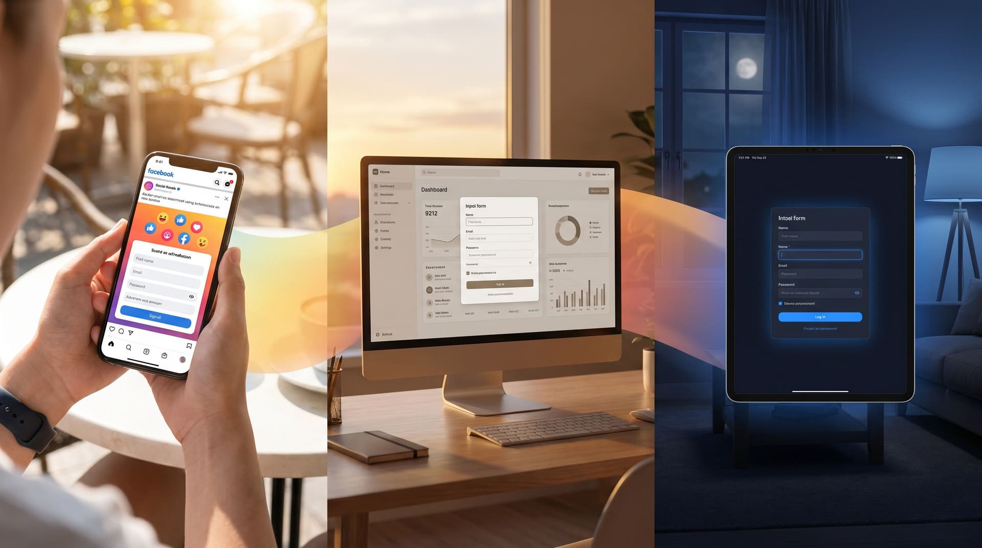
This post is about minimalist form patterns that protect personally identifiable information (PII) almost automatically—especially when you’re building on tools like Ezpa.ge, with custom themes, URLs, and real‑time Google Sheets syncing.
Why “Secure by Default” Matters for Forms
Before tactics, it’s worth grounding why this isn’t just a compliance chore.
1. Less data, less risk
If you don’t collect a piece of PII, it can’t be:
- Leaked in a breach
- Misrouted to the wrong team
- Misused by a future vendor
- Exposed in a sloppy export or screenshot
Security teams call this data minimization. It’s not just a legal principle; it’s a business strategy. Every field you don’t add is one less liability.
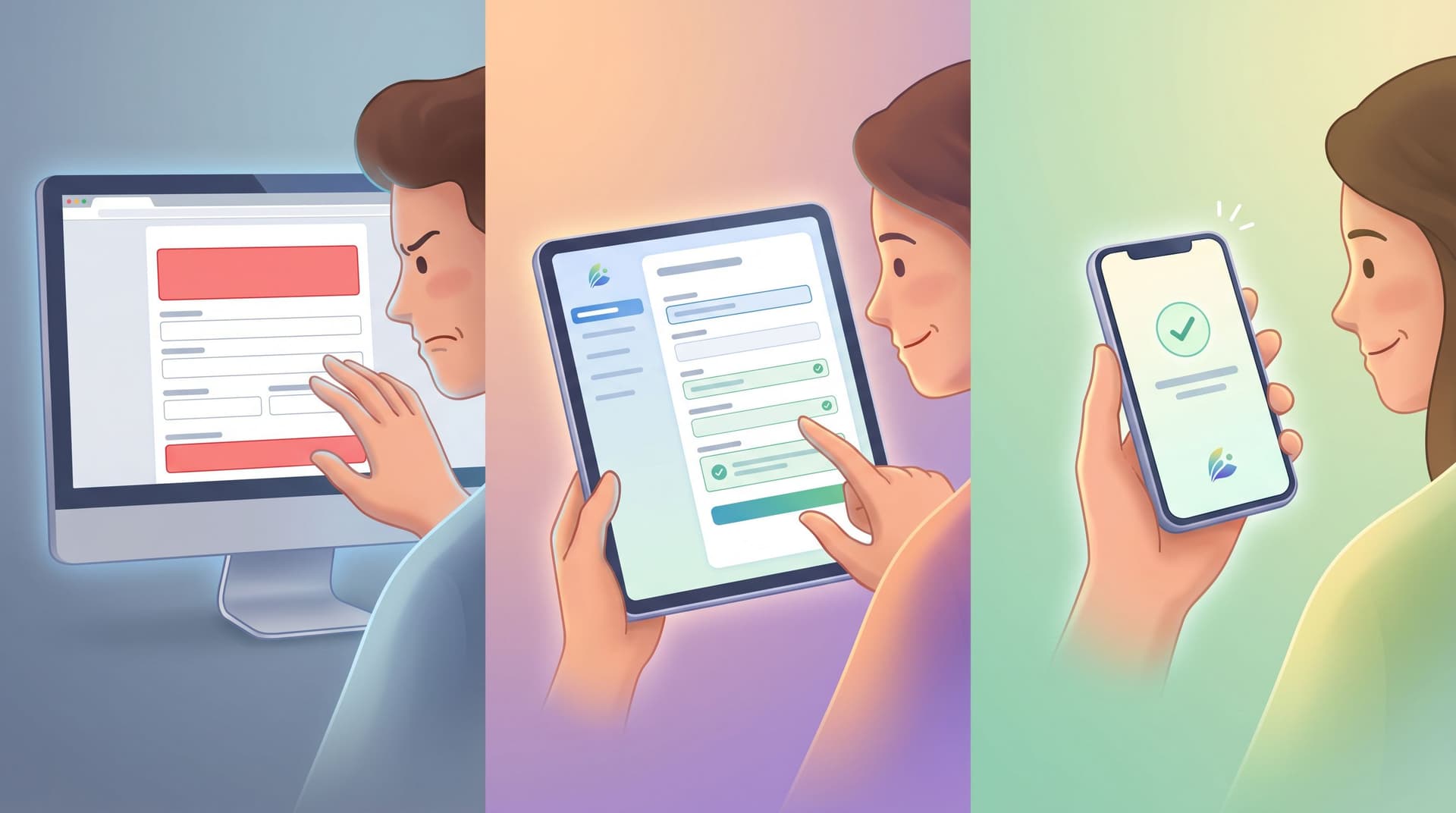
2. Trust is now a core UX metric
People are noticeably more cautious about where they type their details. Forms that feel grabby or opaque get abandoned—or filled with junk data.
Minimal, purpose‑driven forms:
- Convert better (especially on mobile)
- Get more accurate answers
- Reduce support tickets about “where did my data go?”
If you’re already experimenting with theme‑driven A/B tests, you’ve probably seen that small changes in copy and layout can move completion rates. Privacy clarity is one of those levers.
3. Regulations are rising, but users don’t speak in clauses
You absolutely need legal coverage. But your users don’t think in terms of articles and recitals. They think in terms of:
- “Why do you need this?”
- “What happens after I hit submit?”
- “Can I undo this later?”
Your job is to translate legal obligations into plain, UI-level patterns that make those answers obvious—without turning your form into a wall of policy text.
Start With One Question: “What’s the Minimum Signal We Need?”
The most powerful security move you can make is a planning question, not a technical feature:
“What is the minimum signal we need from this form to do the job?”
A “signal” is the smallest piece of information that lets you take the next step.
- For a demo request, maybe that’s: work email + company size + use case.
- For a beta waitlist, maybe it’s: email + role.
- For a support intake, it might be: email + product area + free‑text description.
Everything else should be earned over time, not front‑loaded.
This is where the mindset from progressive profiling helps. You don’t need someone’s job title, budget, and tech stack on their first touch. You can ask more once there’s mutual value.
Practical exercise before you build a form:
- Write down the decision or workflow this form should power.
- List every field you think you need.
- For each field, ask: “What will we actually do with this?”
- If you can’t name a concrete action, cut it—or move it to a later interaction.
This pre-work alone can cut 20–40% of fields from most forms.

Pattern 1: Default to Non‑PII When You Can
You don’t always need a direct identifier.
Replace open PII with structured signals
Instead of:
- “What’s your full address?” → Use city + country, or even just region, unless you truly need mailing details.
- “What’s your phone number?” → Ask if phone is the preferred channel first. Only show the number field when they say yes.
- “What’s your exact revenue / salary / budget?” → Use ranges (e.g.,
$1–5M,$5–20M) instead of precise numbers.
Why it helps:
- Reduces sensitivity of stored data.
- Makes submissions easier to aggregate and score.
- Lowers friction for respondents.
If you’re feeding responses into Sheets and using formulas to prioritize leads or accounts, structured ranges play nicely with the approach in Sheets‑Native Scoring.
Use pseudonymous identifiers where possible
For internal tooling or research:
- Consider generating respondent IDs instead of capturing names.
- Keep the mapping from ID → user in a more controlled system (e.g., your app database), not in the form response sheet.
This way, the working dataset your team sees is less sensitive by default.
Pattern 2: Progressive Disclosure for Sensitive Fields
Some fields are inherently sensitive: phone numbers, addresses, IDs, health or financial details.
You can’t always avoid them—but you can:
- Ask them later in the flow.
- Show them only when needed.
- Surround them with clear, concise context.
How to design it
-
Gate with intent first.
Start with low‑risk fields that clarify what someone wants (use case, product area, urgency). Only reveal sensitive fields when there’s a clear reason. -
Use conditional logic.
- If someone selects “Phone call preferred,” then show the phone field.
- If someone chooses “Ship me a physical kit,” then ask for address.
-
Add one‑line explanations beside sensitive inputs.
Examples:- “We’ll only use this number to confirm your appointment—no marketing texts.”
- “Address is required so we can ship your welcome kit. We don’t share this with third parties.”
-
Clarify what’s optional.
Don’t hide behind asterisks. If something is truly optional, say so in plain language: “Optional, but helps us tailor your onboarding.”
This keeps the form visually light while giving people the information they need to feel safe.
Pattern 3: Plain‑Language Microcopy Instead of Policy Dumps
You still need your privacy policy and terms. But most users will never read them before they decide whether to submit.
So treat microcopy as your first line of privacy communication.
Where to put it
- Right under the form title: A one‑sentence promise.
- “We’ll use these details only to follow up about your request.”
- Near the submit button: A short reassurance + link.
- “By submitting, you agree we can contact you about this request. Learn more in our privacy policy.”
- Next to especially sensitive fields: A 5–10 word explanation.
- “Used only for fraud prevention.”
How to write it
Aim for:
- Short sentences. One idea per line.
- Concrete verbs. “Use,” “store,” “share,” “delete”—not “process,” “handle,” “leverage.”
- Specific outcomes. “To schedule your demo,” not “to improve our services.”
Bad:
“We may use your information in accordance with our privacy policy.”
Better:
“We’ll use this email to send your report and follow up once. No newsletters unless you opt in.”
The legal team can still ensure accuracy—but the user sees something they can actually understand.
Pattern 4: Minimize Who Sees What, Not Just What You Collect
Security isn’t just about which fields exist; it’s also about who can see them and where they show up.
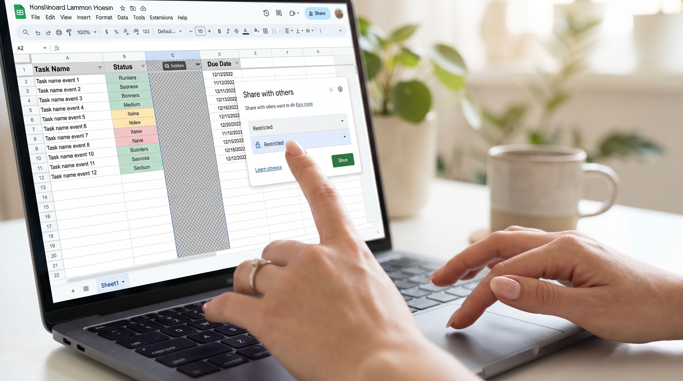
When you’re syncing forms to Google Sheets in real time, it’s easy for access to sprawl.
Practical guardrails for Sheets‑backed forms
-
Separate sheets for sensitive flows.
Don’t dump everything into “Form Responses (Master).” Create dedicated Sheets for, say, HR intakes vs. marketing leads. -
Role‑based tabs.
Use formulas to copy only the columns each team needs into their own tab (e.g.,=FILTERor={}array formulas). Give broader access to the sanitized tab, tighter access to the raw one. -
Avoid PII in helper columns.
When you build operational rituals around your data—as in Ops Analytics, Not Dashboards—be intentional about which columns show up in weekly review views. You rarely need full names and phone numbers in a leadership recap. -
Limit exports and screenshots.
Encourage teams to use links to live, permissioned Sheets instead of downloading CSVs or pasting screenshots with visible PII into decks.
These aren’t glamorous technical controls, but they dramatically reduce everyday exposure.
Pattern 5: Opinionated Defaults in Your Form Builder
Tools like Ezpa.ge give you a lot of flexibility: themes, custom URLs, Google Sheets syncing, and more. You can use that flexibility to bake security into your defaults, so every new form starts safer.
Consider establishing a “secure base template” that your team clones instead of starting from scratch.
What your secure base template might include
-
A minimal, opinionated field set.
- Start with only 3–5 fields.
- Mark just 1–2 as required.
- Include examples of ranges and dropdowns instead of open text when possible.
-
Pre-written privacy microcopy.
- A short description near the top: “We only ask for what we need to help you. Here’s how we use your answers.”
- A standard line near submit: “We’ll never sell your data. Read our privacy policy.”
-
Conservative theming for sensitive flows.
- Calm colors, high contrast, strong focus states.
- Clear error states that don’t expose entered data in weird ways (e.g., avoid echoing full inputs in error banners).
- If this is new territory, the principles from Brand‑First Error States (see:
/brand-first-error-states-designing-form-failures-that-still-bui) are a good reference for designing trust‑building failures.
-
Pre-wired Google Sheets connection with limited columns.
- Use a sheet where only essential columns are visible in the main tab.
- Add a hidden or protected tab if you truly need more detail for specific workflows.
Over time, you can maintain a small library of templates: one for lead gen, one for support, one for internal requests—each with built‑in, security‑friendly defaults.
Pattern 6: Explain Retention and Deletion in Human Terms
People don’t just care what you collect; they care how long you keep it.
Instead of burying this in policy pages, surface a simple version near the form.
Examples:
- “We keep form responses for 12 months to help with follow‑up and reporting, then delete them from our systems.”
- “If you delete your account, we remove your form responses within 30 days, except where we’re legally required to keep them.”
If you’re using Sheets as your operational source of truth, pair this with an internal habit:
- A recurring calendar reminder to archive or delete old response tabs.
- A simple status column (e.g.,
Archived,Active) and filters to make cleanup easy.
This doesn’t need to be complex; it just needs to be predictable.
Pattern 7: Make Consent Granular, Not All‑or‑Nothing
One of the fastest ways to erode trust is to hide multiple uses of data behind a single checkbox.
Instead, separate operational consent (needed to fulfill the request) from marketing or research consent (optional extras).
Concrete approach:
- Operational: “We’ll use your details to follow up about this request.” (This is implied by submitting the form, but you can still state it.)
- Marketing: A separate, unchecked box: “Yes, I’d like occasional emails about product updates and events.”
- Research: Another optional box: “You can invite me to user research about this product.”
This keeps the core flow simple while giving people real control over how their data fuels other programs.
Pattern 8: Test for Misuse, Not Just Conversion
Most teams A/B test forms for completion rate or lead quality. Add one more lens: potential for misuse or confusion.
When you review a new form design, ask:
- Could this question be misunderstood in a way that leads to oversharing?
- Would someone reasonably expect their answer to be used in a way we don’t intend?
- If a screenshot of this form appeared on social media, would we feel comfortable defending every field?
You can even run “red team” reviews with colleagues:
- Share the form link.
- Ask them to list any fields that feel unnecessary or invasive.
- Ask what they think happens with their data after submit.
- Compare their answers to your actual process.
Where there’s a gap, fix it in the UI—not just in a policy document.
Bringing It All Together
Designing secure‑by‑default forms isn’t about memorizing regulations or stuffing more text into your footer. It’s about a handful of practical habits:
- Start from the smallest signal you need. Cut anything you can’t act on.
- Default to non‑PII and structured fields. Use ranges, regions, and IDs instead of precise, direct identifiers when possible.
- Reveal sensitive fields only when necessary. Use conditional logic and short, clear explanations.
- Treat microcopy as your primary privacy channel. One sentence near the top, one near submit, and small notes near sensitive inputs.
- Limit who sees what in Sheets. Separate tabs, role‑based views, and fewer exports.
- Bake opinionated defaults into your templates. So every new form starts from a safer baseline.
- Be explicit about retention and consent. Simple timeframes and separate checkboxes go a long way.
- Test for trust, not just conversion. Ask how your form would look if it were screenshotted and shared.
The payoff is bigger than “staying out of trouble.” You get:
- Higher‑quality data from people who feel respected.
- Cleaner, more maintainable operations around your Sheets.
- A form system that can scale without becoming a privacy nightmare.
Your Next Step
You don’t need a multi‑quarter project to move toward secure‑by‑default forms. You can start this week.
Pick one live form—ideally something important, like your demo request, support intake, or community application—and do the following:
- Audit every field. Remove anything you can’t clearly justify.
- Add two lines of microcopy. One at the top explaining how you’ll use the data, one near submit reinforcing it.
- Tighten your Sheet. Create a new tab that shows only the columns each team truly needs, and direct people there.
- Save it as a template in Ezpa.ge. Use that as the default starting point for the next form you create.
Once you’ve done it once, the second and third forms get dramatically easier.
If you’re already building on Ezpa.ge, you have the building blocks: flexible themes, custom URLs, and real‑time Sheets syncing. The shift is in how you use those tools—treating security and privacy as core design constraints, not afterthoughts.
Start small. Ship one safer form. Then make that your new default.
Your users—and your future self—will thank you.