Adaptive Themes in the Wild: Matching Form Skins to Channels, Devices, and Time of Day

Forms don’t live in a vacuum. A signup form in a late‑night TikTok bio, a feedback form inside a B2B dashboard, and a waitlist form embedded in a blog post might all collect the same fields—but they should not look or feel the same.
That’s where adaptive themes come in.
With tools like Ezpa.ge, where you can customize themes, set custom URLs, and sync to Google Sheets in real time, you can treat form theming as a dynamic layer—not a one‑time brand exercise. Your forms can adapt to:
- Channel (ad click, social, email, in‑product)
- Device (mobile, desktop, tablet, in‑app webview)
- Context (time of day, user lifecycle stage, campaign)
Done well, adaptive themes quietly boost completion rates, trust, and data quality—without feeling like gimmicky personalization.
Why Adaptive Themes Matter More Than You Think
Most teams still ship a single “on‑brand” form theme and call it a day. The problem isn’t that this looks bad; it’s that it ignores context.
Context changes how people feel and what they’re willing to do.
- Someone filling a form on a phone during a commute has different patience than someone at a laptop.
- A user clicking from a high‑energy social ad expects a different aesthetic than someone in a calm, enterprise dashboard.
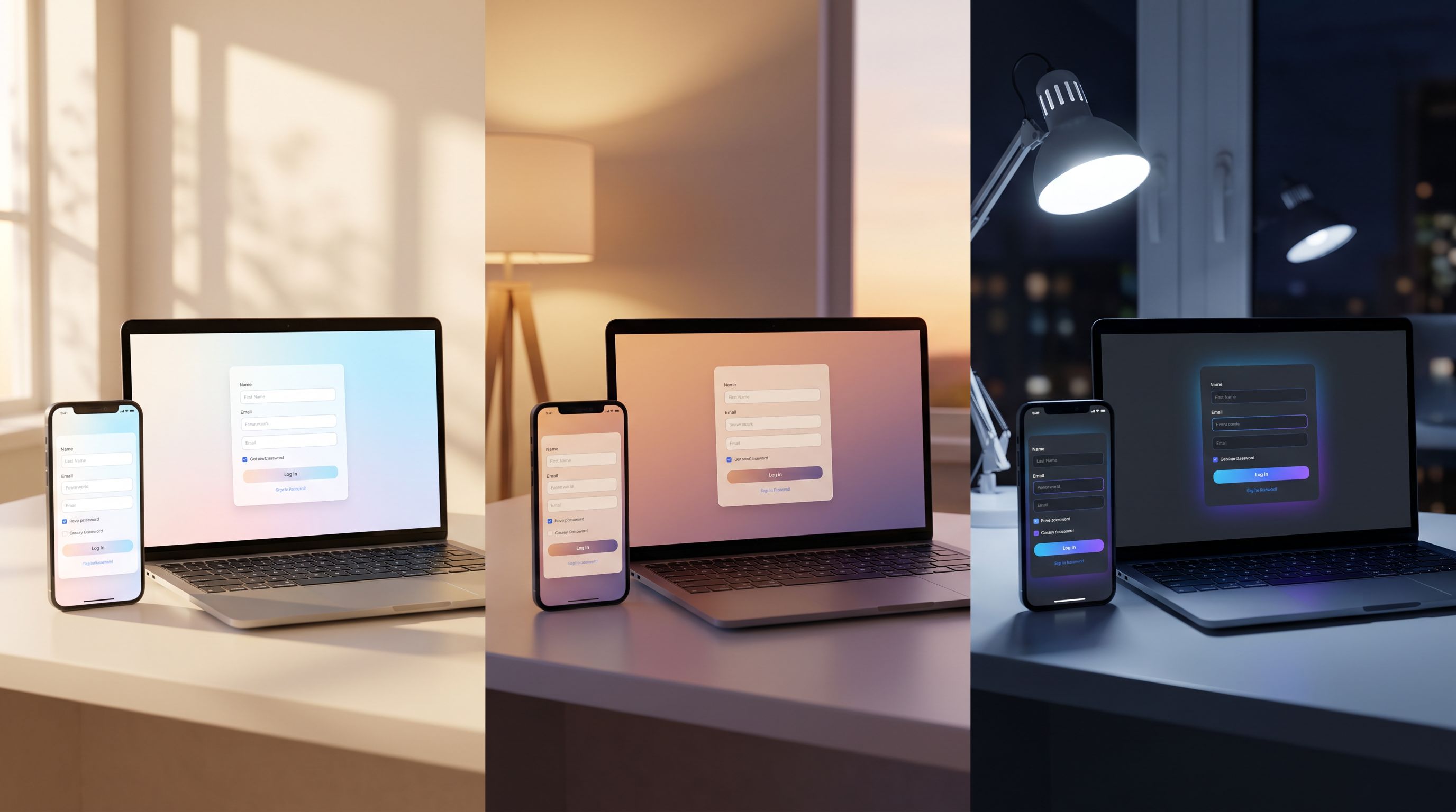
- A person checking your site at 11:30 PM from their couch might be more sensitive to bright, high‑contrast themes than someone at 11:30 AM in an office.
A few reasons adaptive themes are worth the effort:
-
Higher completion rates.
- Mobile‑optimized themes with larger tap targets and minimal distractions reduce drop‑off.
- Themes that visually match the source channel (e.g., an ad or email) create continuity and reduce “Wait, where am I?” friction.
-
Stronger brand trust.
- A form that looks native to where it appears (inside your app, on a partner site, in a community portal) feels more legitimate.
- Consistent but context‑aware visuals show that you’ve thought about the experience end‑to‑end—something we explored from another angle in Brand‑First Error States: Designing Form Failures That Still Build Trust.
-
Better data quality.
- When a form feels easy and appropriate for the moment, people are more willing to answer thoughtfully instead of rushing or abandoning.
-
More room for experimentation.
- Once themes are treated as flexible, you can A/B test visual variants per channel or time window without rebuilding forms from scratch—very much in the spirit of Form UX for Experiments: Designing A/B Tests, Holdouts, and Variant Themes Without New Pages.
The Three Axes of Adaptation: Channel, Device, Time
Let’s break adaptive themes into three practical dimensions you can actually design for.
1. Matching Themes to Channel
A “channel” is wherever someone encounters your form: a paid ad, an email footer, a QR code at an event, a link inside your product, a community portal, or a partner integration.
Each channel carries its own expectations. Your goal is to honor the promise of that channel with a theme that feels like a natural continuation.
Common channels and how to theme for them:
-
Paid ads (search, social, display)
- Visual continuity: Reuse the ad’s primary color, imagery style, and headline tone on the form.
- Focus: Remove navigation, extra links, and clutter. The form is the landing experience.
- Microcopy: Reinforce the exact promise from the ad (“Get the full teardown,” “Reserve your spot,” etc.).
-
Email campaigns
- Brand alignment: Match the email’s typography scale and color accents so the click feels like a smooth continuation.
- Lightweight feel: Email clicks are often lower‑intent than ads. Use softer visuals, fewer fields, and a theme that feels conversational rather than transactional.
-
In‑product prompts
- Native look: Use the same base colors, border radius, and typography as your product UI.
- Subtle differentiation: Slightly adjust background shade or add a soft card outline so the form is discoverable but not jarring.
- State‑aware themes: For power users vs. new users, you can even vary accents or badges to reflect their journey—similar to the lifecycle‑aware approach in Form Themes for Product-Led Growth: Matching In-App Prompts to Lifecycle, Not Just Brand.
-
Community & events
- Human warmth: Use softer palettes, avatars, or subtle illustrations to signal connection, not bureaucracy.
- Co‑branding: If the form is for a partner event or community, blend both brands’ colors or logos in a balanced way.
How to implement channel‑aware themes in Ezpa.ge:
- Create theme presets per channel:
Ad_Landing,Lifecycle_Email,In_App,Community. - Use custom URLs that map to campaigns or channels (e.g.,
/demo-ad-fb,/demo-email-q2,/inapp-upgrade-form). - Drive your ad and email tooling to use the right form URL per campaign so themes line up automatically.
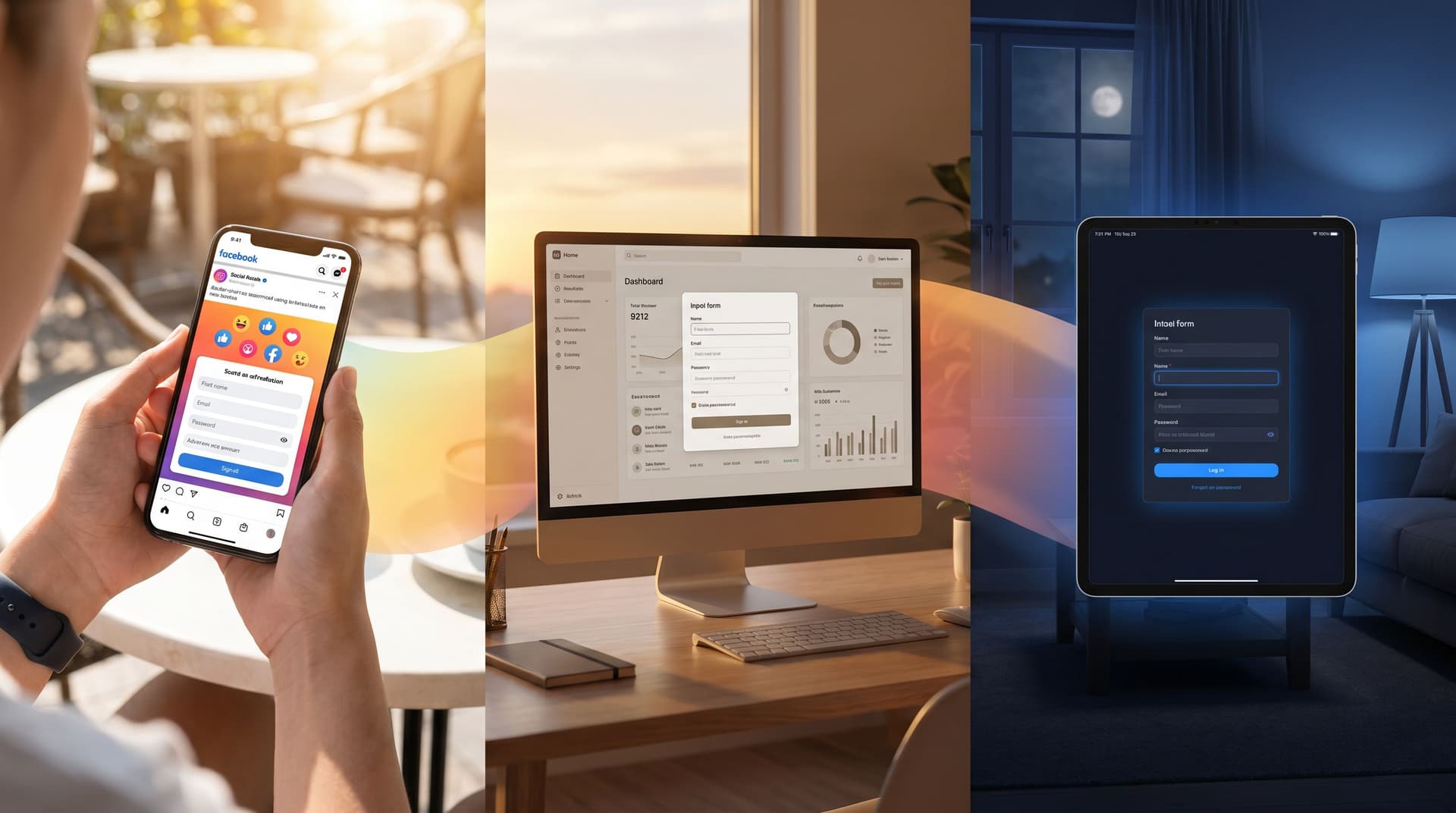
2. Matching Themes to Device
Responsive layouts are table stakes. The real opportunity is making the form feel native to the device.
If you’ve read The Responsive Form Stack: How to Make Every Field Feel Native on Mobile, Desktop, and In-App, you know that responsiveness is as much about interaction patterns as it is about breakpoints.
On mobile:
Design for:
-
Thumb‑friendly controls.
- Larger buttons and inputs.
- Generous vertical spacing.
- Sticky submit bar or progress indicator near the bottom of the screen.
-
Reduced visual noise.
- One primary action per screen.
- Minimal background imagery; prioritize contrast and clarity.
-
System‑native cues.
- Use input types that trigger the right keyboard (email, number, phone).
- Align corner radii, shadows, and motion with common mobile OS patterns.
On desktop:
You have more room, but that doesn’t mean you should cram more in.
- Two‑column layouts can work for short, related fields (e.g., first/last name), but avoid scattering attention.
- Inline help text and sidebars can provide context without crowding the main flow.
- Visual hierarchy should still guide the eye: clear title, short description, then fields.
In embedded or in‑app webviews:
This is where many teams stumble. The form is technically responsive, but visually foreign.
- Match container styling. Align background, border radius, and spacing with the host app.
- Respect constraints. If the embed area is narrow or short, design a compact, card‑like theme.
- Prioritize speed cues. In constrained environments, latency feels worse. Use skeleton states, optimistic UI, and clear loading indicators so the form feels responsive even if your backend isn’t—building on ideas from Latency-Aware Form Design: Keeping Users Engaged When Your Backend Is Slow.
Practical Ezpa.ge setup for device‑aware themes:
-
Define base tokens per device profile
mobile_base: larger font sizes, bigger hit areas, reduced shadows.desktop_base: slightly smaller fonts, more spacious layouts.
-
Use media queries or theme variants
- Many modern form tools (including Ezpa.ge) let you define responsive breakpoints and conditional CSS.
- Apply small but meaningful changes: button size, padding, font scale, and layout.
-
Preview on real devices
- Don’t trust only the browser’s responsive mode. Test forms:
- On a physical phone.
- In an in‑app webview (if you embed forms inside a mobile app).
- On a small laptop screen.
- Don’t trust only the browser’s responsive mode. Test forms:
3. Matching Themes to Time of Day
Time‑based theming is one of the most underused levers in form design.
Think about your own behavior:
- Early morning: You’re clearing email, skimming newsletters, maybe open to quick, low‑friction actions.
- Midday: You’re at your desk, more willing to complete a detailed form if it’s work‑related.
- Late evening: You’re on the couch, on a phone, with lower tolerance for glare and cognitive load.
What can change based on time of day?
-
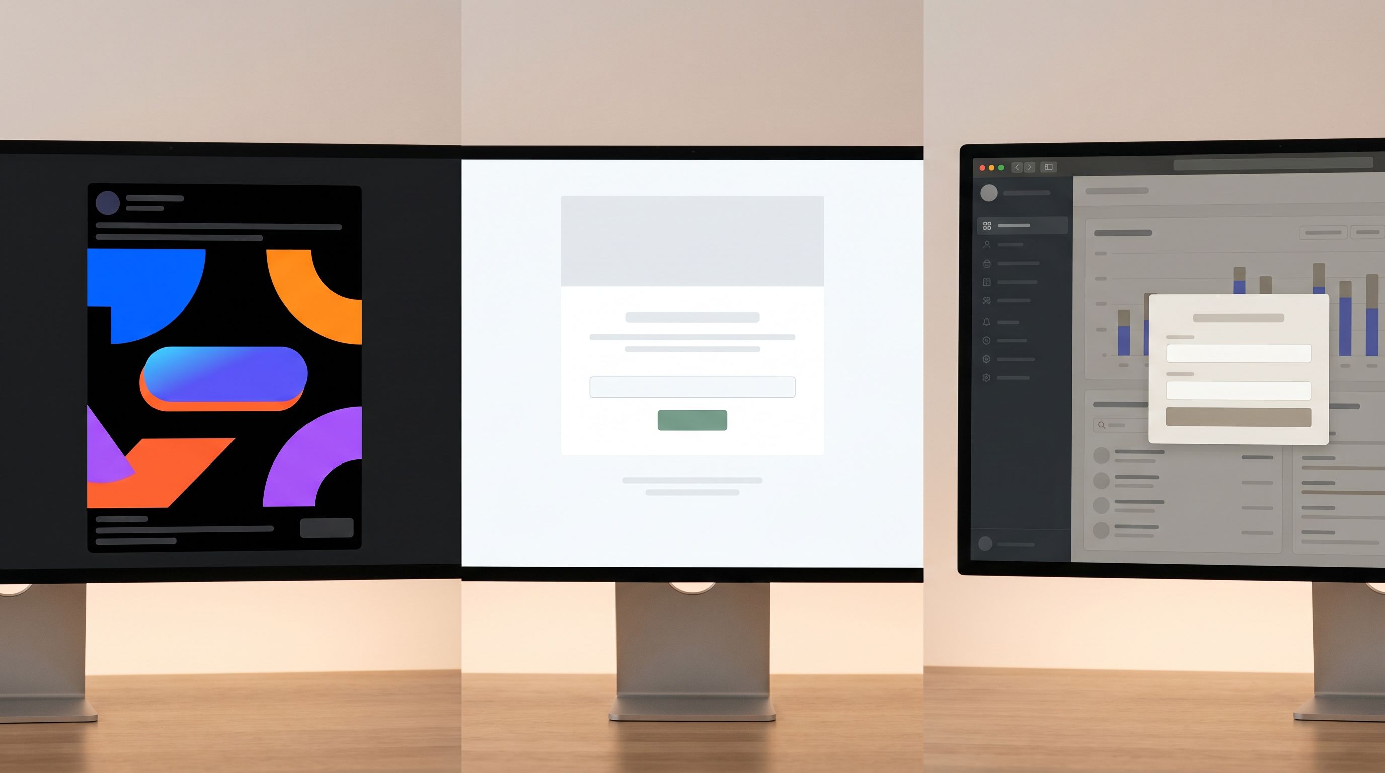
Light vs. dark (or softer) themes
- Daytime: Slightly brighter backgrounds, higher contrast, more energetic accent colors.
- Evening/night: Dark or muted backgrounds, softer contrast, reduced blue‑white glare.
-
Tone of microcopy
- Morning: “Start your week with…” or “Kick off your project by…”
- Evening: “Wrap this up in under 2 minutes” or “Finish this now, pick up tomorrow.”
-
Perceived effort
- At night, favor shorter forms and more progressive disclosure.
- During work hours, people might accept more detailed fields if the value is clear.
How to implement time‑aware themes in practice:
You don’t need to over‑engineer this.
-
Step 1: Define two or three time windows.
Day: 8am–5pm (user’s local time if possible).Evening: 5pm–10pm.Late: 10pm–8am (optional; use only if your audience is truly global or night‑active).
-
Step 2: Create theme variants.
Form_Default_Day: light background, standard accent.Form_Default_Evening: softer background, slightly dimmed accent.Form_Default_Late: dark or near‑dark theme with high‑legibility text.
-
Step 3: Switch themes dynamically.
- If embedding Ezpa.ge forms, pass a theme parameter in the URL or use a small script that checks local time and loads the appropriate variant.
- If you’re sending links via email, you might choose a fixed theme based on when the email is scheduled to send.
-
Step 4: A/B test the impact.
- Track completion rate, time on form, and drop‑off per time window.
- If late‑night users show higher completion on darker themes, standardize that pattern.
A Simple Framework for Designing Adaptive Themes
It’s easy to get lost in permutations. Let’s keep this manageable.
Use this three-layer framework:
-
Core brand layer
- Your non‑negotiables: logo usage, primary typeface, core color palette.
- This layer ensures every form still feels like you, regardless of where it appears.
-
Context layer (channel + device)
- Adjustments for:
- Layout (single vs. multi‑column, card vs. full‑bleed)
- Density (more or less whitespace)
- Emphasis (which elements stand out most)
- This is where you create presets like
Ad_Landing_Mobile,In_App_Desktop,Email_Generic.
- Adjustments for:
-
Moment layer (time of day + lifecycle)
- Subtle tweaks based on when and who:
- Light vs. dark.
- Microcopy tone.
- Presence or absence of helper text.
- Subtle tweaks based on when and who:
Start small:
- Pick one high‑value flow (e.g., your primary demo request or newsletter signup).
- Design 3–4 theme variants that cover your most important channel + device combos.
- Add 1 time‑based variant (e.g., a dark mode for late‑night mobile traffic).
- Instrument metrics and learn before expanding.
Concrete Patterns You Can Steal
To make this tangible, here are specific patterns you can apply immediately.
Pattern 1: Ad‑to‑Form Continuity Theme
Use when: You’re driving paid traffic to a form.
What to do:
- Mirror the headline style from the ad on the form.
- Use the same hero color for the submit button as the ad’s primary accent.
- Keep the background simple—no new imagery that distracts from the promise.
- Place a short reassurance line under the CTA: “No spam. Just the teardown.”
Why it works:
It reduces the cognitive jump between click and form. People feel like they’re still in the same story the ad started.
Pattern 2: Cozy Night Mode for Feedback Forms
Use when: You get a lot of engagement from evening users or global audiences.
What to do:
- Offer a theme with:
- Dark slate background.
- Soft accent color (not pure neon).
- Clear, high‑contrast text.
- Add copy like: “Share your thoughts in under 60 seconds.”
- Keep fields minimal and optional where possible.
Why it works:
Late‑night users are often more reflective but less patient. A cozy, low‑glare theme plus a short form encourages thoughtful responses without fatigue.
Pattern 3: Native In‑App Upgrade Prompt
Use when: You want to upsell or gather product feedback inside your app.
What to do:
- Match your app’s card styling and typography.
- Use a subtle border or background shift so the form is distinct but not foreign.
- Include inline validation and friendly error states so errors don’t feel like system failures—this is where practices from Brand-First Error States really shine.
Why it works:
It feels like a natural part of the product, not a bolt‑on survey.
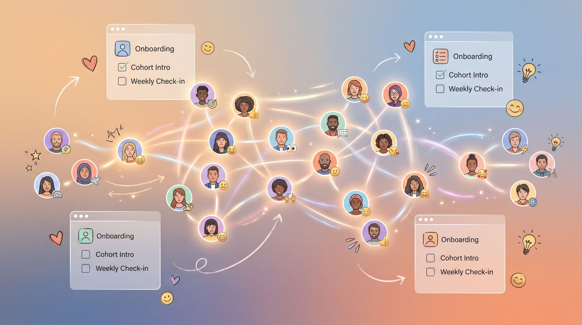
Pattern 4: Community‑Themed Intros Form
Use when: You’re onboarding cohorts, ambassadors, or beta groups.
What to do:
- Use warm colors, avatar placeholders, and subtle illustration.
- Add a short intro: “You’re joining a small group of builders. This helps us introduce you well.”
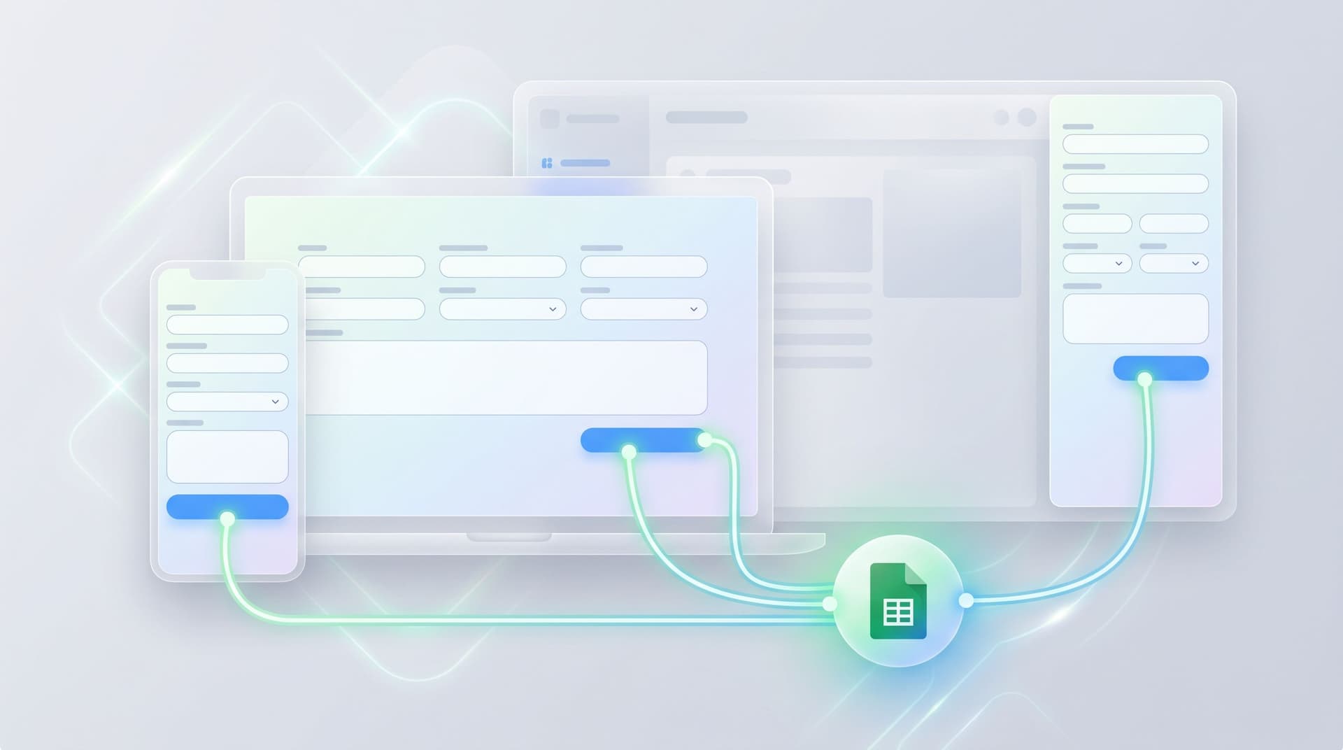
- Sync responses to a Google Sheet and use them to generate intros or icebreakers—an approach we go deeper into in Forms for Community-Led Growth: Onboarding, Cohort Intros, and Rituals Without a Custom Portal.
Why it works:
The theme signals that this form is about people, not just data.
Operationalizing Adaptive Themes Without Chaos
The risk with adaptive anything is sprawl. Suddenly you have 20 themes and no one remembers which form uses which.
Here’s how to keep things sane.
1. Name themes systematically
Adopt a naming convention that encodes channel, device, and moment:
AD_FB_Mobile_DayEMAIL_Generic_DesktopINAPP_Dashboard_DesktopCOMMUNITY_Onboarding_Mobile_Evening
Even if your tool doesn’t enforce this, your team can.
2. Centralize ownership
- Make one person or a small group the source of truth for themes.
- Document:
- What each theme is for.
- Where it’s used.
- Any performance notes (e.g., “Night mode improved completion by 8% on mobile feedback forms”).
3. Limit the initial set
- Start with 5–7 themes that cover 80% of your needs.
- Only add new themes when:
- There’s a clear new context (e.g., new channel or product surface).
- Data suggests a new variant could solve a real problem.
4. Treat themes as testable, not sacred
- Schedule regular reviews (quarterly is fine) to:
- Retire underperforming themes.
- Consolidate similar ones.
- Promote winners to “defaults.”
This is where tools like Ezpa.ge shine: you can update a theme once and instantly improve every form that uses it, without touching individual URLs or embeds.
Bringing It All Together
Adaptive themes aren’t about showing off clever tricks. They’re about meeting people where they are—on the channel they trust, on the device they have in hand, at the time they’re most likely to respond.
When you:
- Align form visuals with the channel that brought someone there,
- Make the experience feel native to the device they’re using,
- And soften or energize the theme based on the time of day,
…you’re not just making a prettier form. You’re reducing friction at the exact moment someone decides whether to share information with you.
With Ezpa.ge, this doesn’t require a huge redesign. You already have:
- Customizable themes.
- Custom URLs per campaign or surface.
- Real‑time syncing to Google Sheets so you can actually measure the impact of your experiments.
The leap is mental, not technical: treating theming as a dynamic system instead of a static setting.
Next Step: Ship One Adaptive Theme, Not a Strategy Deck
You don’t need a 40‑page spec to start.
Here’s a simple first move you can take this week:
-
Pick one critical form.
- A demo request, beta waitlist, or core feedback form.
-
Identify its top channel and device.
- For example: “Most traffic here comes from mobile clicks on LinkedIn ads.”
-
Design a single adaptive variant that better matches that context.
- Bolder, ad‑matched theme.
- Mobile‑first layout.
-
Optionally, add one time‑based variant.
- A darker or softer version for evening traffic.
-
Measure for two weeks.
- Track completion rate, time to submit, and any qualitative feedback.
Once you see a lift, you’ll have the internal proof you need to expand adaptive theming across more forms.
If you’re already using Ezpa.ge, open your dashboard, duplicate your highest‑impact form, and start experimenting with themes per channel, device, and time window. If you’re not, this is the perfect use case to try it: a small, controlled experiment with outsized impact on how people experience your brand.
Your forms are already out in the wild. Adaptive themes make sure they actually belong there.