Forms as First Meetings: Designing Intake Flows That Feel Like a Great Intro Call

When someone hits your intake form, they’re not “filling fields.” They’re stepping into a first meeting with your team.
If that first meeting feels stiff, confusing, or one‑sided, it doesn’t matter how good your product is. People drop off, hedge their answers, or show up to the real call already skeptical.
If it feels like a great intro call—clear, human, and focused on them—you earn something much harder to buy: trust and momentum.
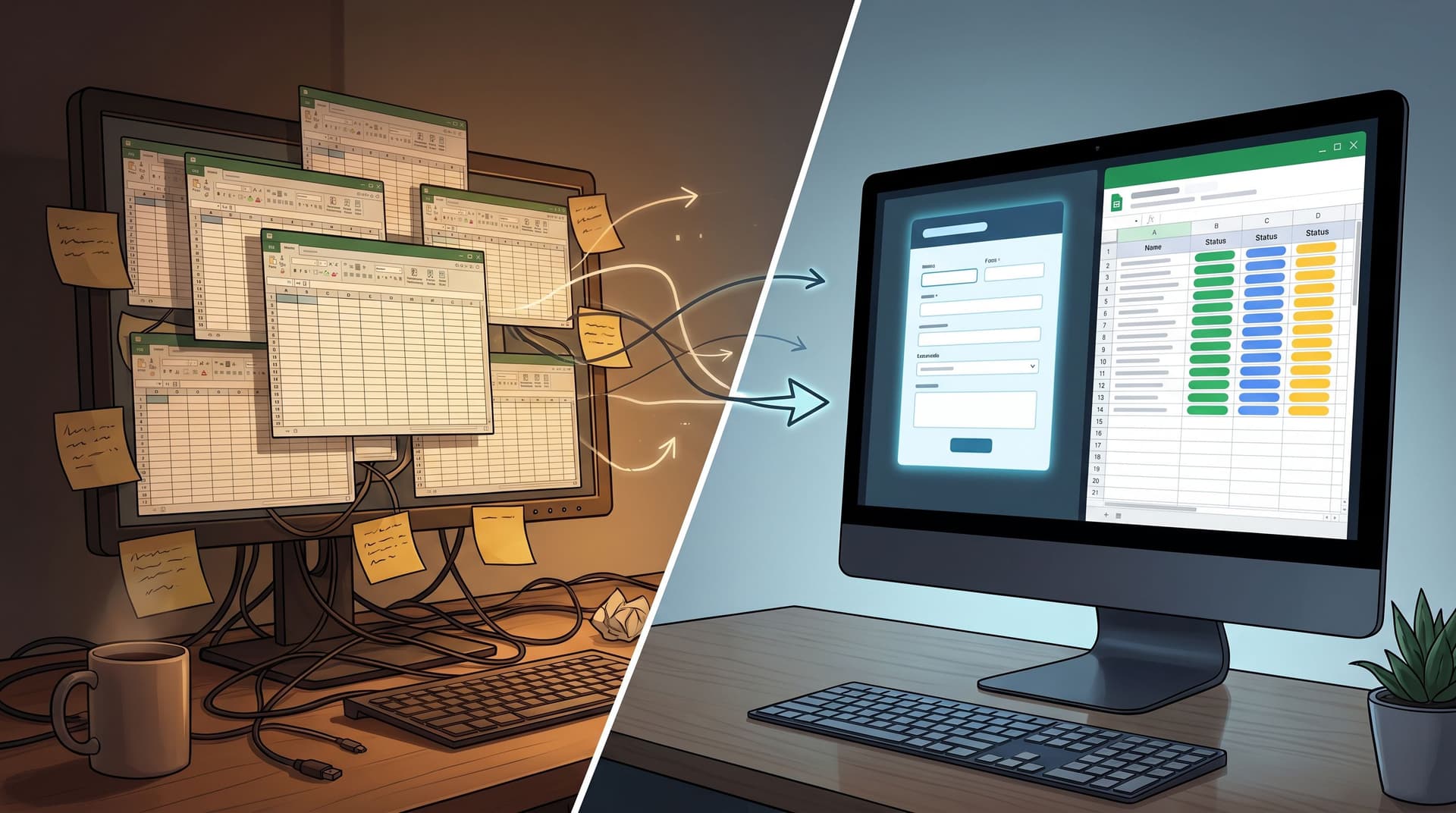
This is where forms quietly carry more weight than most teams admit. With tools like Ezpa.ge—where you can theme forms, set custom URLs, and stream responses into Google Sheets—you have everything you need to design intake flows that feel like a conversation, not a questionnaire.
Why treating forms like first meetings changes everything
Think about the best intro call you’ve ever had with a vendor or partner. It probably had three qualities:
- You felt understood quickly. They asked sharp, relevant questions.
- You knew what would happen next. Timelines, expectations, and next steps were clear.
- You didn’t feel interrogated. The conversation was guided, but not scripted.
Your forms can do the same thing—before anyone talks.
What you gain when your intake feels like a great call
Higher completion and better data.
People are more willing to finish (and answer honestly) when:
- They see why each question matters.
- The form doesn’t feel longer than the value they expect in return.
- The tone sounds like a person, not a policy doc.
Shorter, sharper live conversations.
If the form captures the right context, the first real call can skip the basics and move straight to:
- Priorities and constraints
- Fit / non‑fit signals
- Clear recommendations
Cleaner routing and less internal chaos.
A well‑designed intake flow doesn’t just collect data; it shapes operations:
- Sales vs. success vs. support routing
- Priority tiers (who gets a same‑day response vs. a nurture sequence)
- Which follow‑up playbook to run (demo, content, trial, etc.)
If you’re already thinking about your form stack as a unified intake system, this connects directly to the ideas in From Spreadsheet Chaos to Form OS: How to Turn Rogue Sheets into a Unified Intake System.
Principle 1: Start with the “agenda,” not the fields
Great intro calls start by setting the agenda: why we’re here, what we’ll cover, and what you’ll walk away with.
Your form should do the same in the first screen.
Make the promise explicit
Above the fold, answer three questions:
-
What is this?
“Share a bit about your team so we can recommend the right onboarding plan.” -
Why should I care?
“You’ll get a tailored walkthrough, not a generic product tour.” -
How long will this take?
“Takes 2–3 minutes. We’ll show progress as you go.”
Concrete tips:
- Use a short, benefit‑oriented headline:
“Help us prep a useful first call”, not “Discovery Form – v3.2”. - Add a one‑sentence subhead tying effort to outcome:
“The more specific you are, the more we can skip on the call.” - If your form is multi‑step, include a simple step indicator (e.g., “Step 1 of 3: About you”).
Bring your brand voice into the intro
Before someone reads a single label, the form is already saying something about your brand. Colors, spacing, typography, and micro‑copy all send signals. If you haven’t thought about that layer, you’ll get a lot from Signals in the Theme: What Your Form Aesthetics Quietly Tell Users About Your Brand.
A few quick wins:
- Match the tone of your best reps, not your legal docs.
- Use contractions and plain language.
- Avoid internal jargon in field titles (“CSM owner” means nothing to a prospect).

Principle 2: Ask questions like a skilled interviewer
On a great intro call, the best questions:
- Start broad, then go specific.
- Follow a clear logic.
- Only go “deep” once there’s context and trust.
Your form can mirror that pattern.
Map your question flow to a real conversation
Before you open your form builder, sketch the conversation you wish every rep had:
- Who are we talking to?
Role, company, region. - Why now?
Trigger event, current pain, or goal. - What have you tried?
Existing tools or processes. - What does success look like?
Timeline, constraints, “must‑haves.”
Then translate that into sections or steps:
- Step 1 – About you: name, email, role, company size.
- Step 2 – Your context: “What prompted you to reach out?”
- Step 3 – What good looks like: “If this goes well, what will be true 3 months from now?”
This keeps your form from becoming a random checklist of fields. It also helps teams later when they read responses: they’re reading a structured story, not a pile of ungrouped data.
Use open questions strategically
You don’t need walls of free‑text, but one or two well‑placed open questions can transform the quality of your intake:
- “What’s the main problem you’re hoping we can help with?”
- “Anything else we should know before we talk?”
Guidelines:
- Place open questions later, once you’ve earned a bit of effort.
- Add helper text with examples (e.g., “For example: ‘We’re migrating from X’ or ‘We’re rolling out Y to 200 reps’”).
- Use character limits to keep answers concise but useful (e.g., 400–600 characters).
Remove questions you don’t actively use
A good interviewer doesn’t ask questions they’ll ignore. Your form shouldn’t either.
Audit your intake form with three filters:
- Operational necessity: Do we need this to route or schedule? (e.g., region for time zones.)
- Decision impact: Will this answer change what we do next? (e.g., budget range for qualification.)
- User benefit: Can we explain how this helps them? (e.g., “We ask about your current tools so we don’t recommend features you already have.”)
If a field fails all three, delete it—or move it to a later stage in the relationship.
For teams exploring this over time, Beyond Required Fields: Progressive Profiling Strategies That Don’t Annoy Returning Users is a helpful companion.
Principle 3: Make the form feel responsive and human
On a call, a good facilitator adapts based on what they hear. Your form can do a version of that with logic, theming, and micro‑copy.
Use conditional logic like branching questions on a call
Instead of showing every possible question to everyone, branch:
- If someone selects “Support request”, show fields tailored to product, plan, and urgency.
- If they pick “Talk to sales”, show fields about team size, use case, and timeline.
- If they’re an existing customer, skip the basic “How did you find us?” section.
In Ezpa.ge, you can set up multi‑step flows and conditional sections that only appear when a user’s earlier answers make them relevant. That keeps the experience focused and respectful of time.
Write helper text like a side‑comment on a call
You know the little explanations reps give after asking a question? That’s what helper text should feel like.
Examples:
-
Field: “Team size using the product”
Helper: “A ballpark is fine—this helps us recommend the right rollout plan.” -
Field: “Budget range (optional)”
Helper: “We ask so we can suggest a plan that’s realistic for you. It’s okay if you’re not sure yet.”
Guidelines:
- Use helper text to lower anxiety, not add pressure.
- Explain why sensitive questions exist (budget, revenue, user counts).
- Keep it short—one sentence, two at most.
Design error states like a calm, competent teammate
Even the best flows have errors: mistyped emails, missing required fields, network hiccups. How you handle them is part of the “first meeting.”
Instead of harsh, generic errors:
- Use clear, non‑blaming language:
“That email doesn’t look quite right—mind checking it?” - Anchor errors near the field, not in a banner that forces a scavenger hunt.
- Preserve what the user already typed; don’t make them start over.
If you want to go deep on this, Brand-First Error States: Designing Form Failures That Still Build Trust is a detailed playbook.

Principle 4: Connect the form to a crisp next step
A first meeting that ends with “We’ll be in touch” feels vague. A form that ends with “Thanks for submitting” feels the same.
Make the “handoff” visible
Right on the confirmation screen (and email, if you send one), answer:
- What happens now?
“We’ll review your answers and match you with a specialist.” - When will that happen?
“You’ll hear from us within one business day.” - What can they do in the meantime?
Link to a relevant guide, case study, or product tour.
If you’re syncing submissions into Google Sheets via Ezpa.ge, you can wire this into lightweight workflows:
- Auto‑tag priority leads (e.g., by company size, urgency, or use case).
- Trigger email sequences tailored to their segment.
- Feed dashboards or weekly review rituals, like the ones described in Ops Analytics, Not Dashboards: Turning Form + Google Sheets Data into Weekly Decision Rituals.
Route like a smart coordinator, not a shared inbox
Your form should collect just enough data to:
- Decide which team “owns” the next step (sales, support, success, community).
- Decide the urgency tier.
- Decide the right format (live call, async resource, product trial).
Common routing fields:
- “Are you an existing customer?”
- “What best describes what you’re looking for?” (options: troubleshooting, pricing, partnership, etc.)
- “How urgent is this?” with definitions (“Same day,” “This week,” “Just exploring”).
When this is wired well, your intake form becomes the front door to a whole set of structured flows, not just a submission pipe. If you’re curious how this looks in support, check out Form UX for Product-Led Support: Turning ‘Contact Us’ Into Guided Self-Service Flows.
Principle 5: Use your data to keep improving the “first meeting”
Great intro calls get better over time because reps learn which questions matter. Your forms should evolve the same way.
Track more than just submissions
If your Ezpa.ge forms sync into Google Sheets in real time, you can track:
- Start vs. completion rate per form.
- Drop‑off by step in multi‑step flows.
- Time to complete (median and outliers).
- Field‑level completion for optional questions.
Patterns to look for:
- A big drop between steps → maybe the step label or intro needs work.
- Long completion times on a specific step → too many fields or confusing wording.
- Optional fields nobody fills → either remove them or explain their value.
Run small, focused experiments
You don’t need a full experimentation program to improve your intake.
Start with one change at a time:
- Rewrite the intro copy to make the value clearer.
- Split a long form into two steps with a reassuring transition.
- Move a sensitive question later, with better helper text.
If you’re using themes in Ezpa.ge, you can even test layout and visual hierarchy without touching your underlying data model—similar to the approach in Theme-Driven A/B Testing: Experimenting with Copy, Layout, and Visual Hierarchy Without New Pages.
Close the loop with your team
The people who feel the impact of your forms most are usually:
- Sales reps running the calls
- Support and success teams handling tickets
- Ops folks wrangling the Sheet
Build a simple rhythm:
- Once a month, review a sample of recent submissions.
- Ask: “What do you wish we knew before the call?” and “Which questions feel unnecessary now?”
- Ship one improvement per cycle.
Over a quarter or two, that cadence can quietly transform your intake from “just a form” into a reliable, high‑signal first meeting.
Putting it together: A simple blueprint for your next intake form
If you’re redesigning an intake flow right now, here’s a concrete checklist you can follow:
-
Clarify the promise.
- What will the user get after submitting?
- How soon?
- How will the form make the live call or next step better for them?
-
Sketch the conversation.
- Outline the ideal intro call.
- Group questions into 2–3 logical steps.
-
Design the experience.
- Write a clear, benefit‑oriented intro.
- Use conversational labels and helper text.
- Add a simple progress indicator for multi‑step flows.
-
Wire in smart logic.
- Show only relevant questions based on earlier answers.
- Branch by intent (sales vs. support vs. partnership).
- Adjust questions for existing vs. new customers.
-
Plan the handoff.
- Define routing rules (who gets what, when).
- Set clear expectations on the confirmation screen.
- Sync everything to Google Sheets for visibility.
-
Measure and iterate.
- Track completion, drop‑off, and time to complete.
- Meet with frontline teams monthly.
- Ship one improvement at a time.
If you build your next Ezpa.ge form with this blueprint, you’ll feel the difference not just in conversion metrics, but in the quality of the conversations that follow.
Summary
Forms are not just data capture—they’re first meetings.
When you design intake flows like great intro calls, you:
- Set a clear agenda and promise up front.
- Ask questions in a logical, human sequence.
- Use logic and helper text to keep things focused and respectful.
- Handle errors and edge cases in a way that builds trust, not frustration.
- Connect every submission to a crisp, visible next step.
- Use data and team feedback to keep improving over time.
With Ezpa.ge’s themes, custom URLs, and real‑time Google Sheets syncing, you already have the building blocks to make this real. The work now is intentional design.
Ready to redesign your “first meeting”? Start with one form.
You don’t need to overhaul every flow at once. Pick one high‑leverage intake point:
- Your demo request form
- Your partner application
- Your main support or “contact” form
Then:
- Rewrite the intro to make a clear promise.
- Trim or reorder questions to match the conversation you wish you were having.
- Wire it into Ezpa.ge with a clean theme, a meaningful custom URL, and a live Sheets sync so your team can see the impact.
The next time someone submits that form and shows up to a call saying, “That was actually a really nice intake,” you’ll know you’ve turned a once‑boring asset into one of your strongest first impressions.