Forms as Lightweight Onboarding Academies: Teaching While You Collect Data


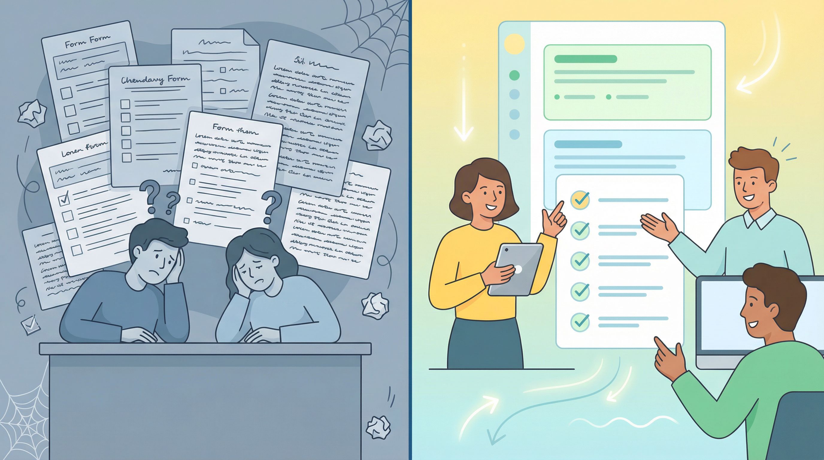
Most teams still treat forms as one-way funnels: “Give us your info so we can do our job.”
But the most effective teams are quietly doing something different. They’re turning forms into mini onboarding academies—places where people learn just enough to feel confident, make good decisions, and reach value faster, while you collect exactly the data you need.
This isn’t about adding more fields or long-winded help text. It’s about designing forms that teach as they go.
- A signup flow that explains pricing models while asking about team size.
- A partner intake that clarifies expectations while collecting use cases.
- A support form that trains customers to triage their own issues while routing tickets to the right queue.
With tools like Ezpa.ge—where you can theme forms, use custom URLs, and sync everything straight into Google Sheets—this pattern is surprisingly easy to ship and iterate on.
In this piece, we’ll walk through why this matters, what it looks like in practice, and how to design your own “onboarding academies” using forms you probably already have.
Why Teaching Inside the Form Works So Well
Onboarding is fundamentally about reducing uncertainty:
- “What does this product actually do for me?”
- “What happens after I hit Submit?”
- “Am I setting this up right?”
If your form only asks questions and never answers any, you push that uncertainty downstream—to support, sales, or churn.
You’re catching people at the highest-intent moment
When someone is filling out a form, they’re:
- Focused
- Motivated
- Already investing effort
That’s exactly when teaching lands best. Research on microlearning shows that short, targeted learning moments significantly improve retention and completion compared to longer, separate training modules. Many studies report onboarding time dropping by around 30% when teams switch to bite-sized learning segments embedded in workflow, not separate from it.
Embedding those “micro-lessons” directly into forms means:
- People don’t have to context-switch to docs or videos.
- You can clarify why you’re asking something.
- You can nudge them toward better choices (and better data) in real time.
You improve both activation and data quality
Teams that add guided, checklist-style onboarding often see 20–30% lifts in completion and activation rates when those steps are tied to real user value instead of internal milestones. Onboarding experts also report that reducing time-to-first-value by even a day can move activation by several percentage points.
When forms teach as they go, you get:
- More completions – fewer abandoned signups and half-filled intakes.
- Better answers – because users understand what’s being asked and why.
- Cleaner routing – because users self-select the right paths when they’re educated.
If you’re already thinking about how forms shape your operations, this pairs naturally with patterns like:
Those pieces explore forms as experiences. Here, we’ll go deeper on forms as learning environments.
The Core Idea: Every Field Is a Tiny Lesson
To turn a form into a lightweight academy, treat each field as a micro-lesson plus a question:
“Here’s what you need to know → now show us how it applies to you.”
You’re aiming for a pattern like this:
- Set context – A short line or tooltip explaining the concept.
- Offer a recommended path – Defaults or examples that show what “good” looks like.
- Ask for the input – The field itself, often with smart options.
Example: Pricing & team size
Instead of:
- Field label: Team size
- Options: 1–10, 11–50, 51–200, 201+
Try:
- Micro-lesson: “We use team size to recommend the right plan and avoid surprise overages later.”
- Helper text: “If you’re just testing, pick your expected team size for the next 3–6 months.”
- Field: Team size (with the same options)
You’re teaching:
- That pricing is tied to team size.
- That it’s okay to think ahead, not just “right now.”
- That you’re trying to prevent future billing friction.
Example: Support severity
Instead of:
- Field label: Priority
- Options: Low / Medium / High / Urgent
Try:
- Micro-lesson: “We triage based on impact so urgent issues get faster help.”
- Inline examples:
- Low: Cosmetic issues, minor copy updates.
- Medium: Feature not working, but there’s a workaround.
- High: Core workflow blocked for your team.
- Urgent: Data loss, security, or full outage.
Now you’re training customers to classify their own tickets—and giving your team better data.
Where Forms Make the Best “Academies”
You don’t need to overhaul every form you own. Start where learning gaps are most painful.
1. Product signup & first-touch questionnaires
Your signup flow is the perfect place to:
- Explain what will happen next.
- Help users choose the right plan or configuration.
- Capture what “success” looks like for them.
Ideas:
- Job-to-be-done questions with examples (“I want to automate weekly reports,” “I need a client-friendly intake form”).
- Segmented paths: if someone says they’re a marketer vs. an engineer, adapt subsequent questions and micro-lessons accordingly.
- Progressive profiling: ask for the bare minimum to start, then use later forms inside the product to deepen the profile.
This builds directly on patterns from Forms for PLG funnels, where self-serve users quietly feed sales the context they need.
2. Customer and partner onboarding
Onboarding forms—especially multi-step ones—are natural places to turn policy PDFs into bite-sized explanations:
- “Here’s what we mean by ‘data processor’ vs. ‘data controller’.”
- “Here’s how our co-marketing approvals work in practice.”
- “Here’s the minimum we need to set up your workspace.”
If you’re running partner programs on forms instead of a heavyweight portal, this dovetails nicely with the patterns in Forms for partner ecosystems.
3. Internal ops intake (support, design, research, HR)
Internal teams often drown in low-quality requests because requesters don’t know what “good” looks like.
Use forms to:
- Teach requesters what information is required.
- Show examples of a “good” brief or ticket.
- Gate advanced paths until prerequisites are met.
For example, a design intake form can:
- Show a mini gallery of “good briefs” before asking for goals.
- Explain what counts as a deliverable vs. an experiment.
- Ask, “What decision will this design help you make?” with examples.
This pattern is explored in depth in posts like From form fill to Figma file and Forms for service teams—your form is the classroom and the front door.
Designing Your First Onboarding Academy Form
Let’s walk through a practical blueprint you can apply to any existing form.
Step 1: Define the “graduation moment”
Before you touch fields or copy, answer this:
“If someone completes this form and ‘graduates,’ what should they now understand or be able to do?”
Examples:
- Signup form: “They know which plan fits them and what happens after they sign up.”
- Partner onboarding: “They understand our co-marketing rules and what we expect from them in return.”
- Support intake: “They can correctly classify severity and include enough detail for us to help without back-and-forth.”
Write that down. This is your learning outcome, not just a data outcome.
Step 2: Audit your current form for “silent confusion”
Go through your existing form and mark every place where users might silently think:
- “Why do you need this?”
- “What does this option actually mean?”
- “What am I committing to if I pick this?”
Common culprits:
- Vague dropdowns (e.g., “Enterprise” vs. “Business” vs. “Pro”).
- Compliance-related fields with legal jargon.
- Open text areas with no guidance.
For each of these, decide whether you need to:
- Explain the concept (micro-lesson)
- Constrain the answer (better options, chips, or toggles)
- Defer the question (progressive profiling later in the journey)
Step 3: Turn each step into a micro-module
Now, group fields into thematic steps that each teach one idea.
Instead of:
- Account details
- Company info
- Preferences
Try something like:
- “Help us understand your role” – teach how your product supports different roles.
- “Shape your first week” – explain how settings affect their early experience.
- “Set expectations” – clarify timelines, SLAs, or next steps.
For each step, add:
- A one-sentence promise at the top (“This will help us tailor your workspace so you don’t start from a blank slate.”)
- One or two inline hints per field, not giant paragraphs.
- Optional “Learn more” links for people who want depth without crowding the UI.
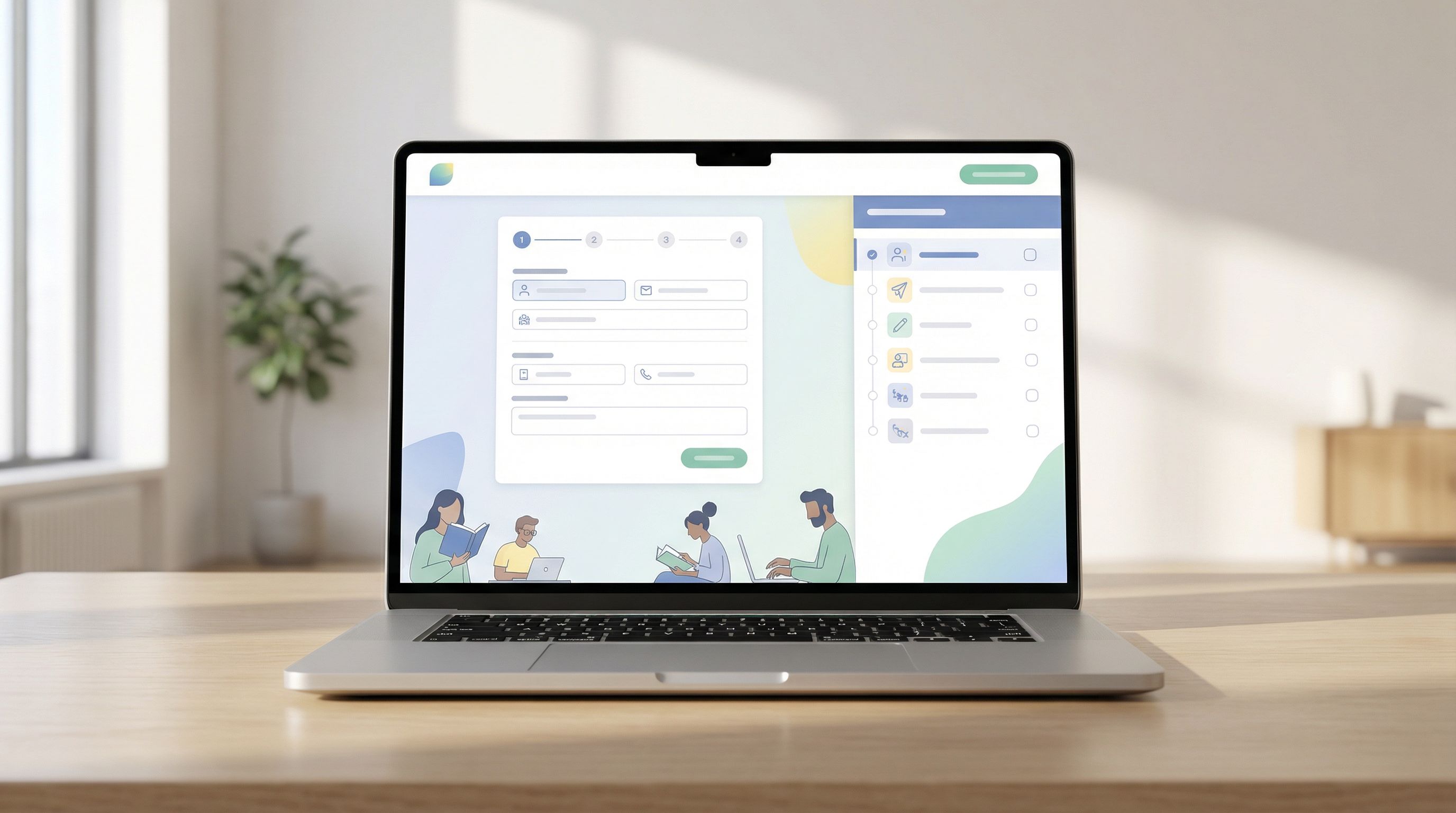
On Ezpa.ge, this might mean using multi-step forms with custom step titles and short descriptions, rather than a single long page.
Step 4: Use examples and defaults as teaching tools
People often learn more from what you suggest than what you say.
Use:
- Placeholder text as a mini-example, not “Enter value here.”
- Pre-selected defaults that represent a sensible starting point.
- Preset chips or buttons that encode best practices.
Examples:
- “What’s your first goal?” → chips like “Launch a weekly report,” “Collect NPS,” “Onboard new clients.”
- “How often should we notify you?” → default to “Smart (recommended)” with a short explanation.
This pairs nicely with AI-assisted form generation. If you’re using tools like Ezpa.ge’s AI-powered suggestions (see AI-powered field suggestions), you can let models propose common options, then refine them into opinionated defaults.
Step 5: Add a visible learning checklist
Checklists and progress indicators don’t just show how far you are; they show what you’re learning.
Instead of:
- Step 1 of 3, Step 2 of 3, Step 3 of 3
Try:
- “Understand your plan” → “Set up your workspace” → “Invite your team (optional)”
Tips:
- Keep it to 3–5 items max.
- Tie each item to a user outcome, not an internal process.
- Make at least one step feel like an easy win (“Confirm your name and timezone”).
Teams that adopt in-app onboarding checklists tied to clear outcomes often see double-digit improvements in activation and completion rates, without shipping any new core features.
With Ezpa.ge, you can mirror this in your form design: each step title becomes a mini learning module, and the progress bar becomes your academy “syllabus.”
Making It Operational: Data, Sheets, and Iteration
A form that teaches is only half the story. The other half is what you do with the data.
Structure your data for downstream learning
If your form is an academy for users, your Google Sheet is the academy for your team.
Use structured fields to:
- Track which learning paths people chose (e.g., role, use case, segment).
- Record which micro-lessons they saw (via hidden fields or URL params).
- Capture self-assessed confidence (“How confident do you feel about X after this setup?”).
Then, in Sheets, you can:
- Filter by segment to see where confusion remains.
- Correlate certain choices with higher activation or retention.
- Feed that back into better micro-lessons and defaults.
If you want to go deeper, the patterns in Google Sheets as your ops brain show how to turn this into a live decision engine, not just a log.
Close the loop with real-time triage
Teaching inside the form is powerful, but some users will still need help.
By syncing Ezpa.ge forms into Sheets in real time, you can:
- Build live queues for onboarding, support, or partner ops.
- Route high-risk or confused users to human follow-up.
- Trigger automations (emails, Slack pings, tasks) based on responses.
If you haven’t set this up yet, the patterns in From form to live queue show how to go from:
Form → Structured data → Live queue → Clear owners
This ensures your “academy” doesn’t just hand out lessons—it also knows when to escalate to a real instructor.
Measure what matters
When you treat forms as onboarding academies, traditional vanity metrics (views, submissions) aren’t enough.
Instrument for:
- Time-to-first-value (TTFV): How long from form start to the first meaningful outcome (e.g., first project created, first integration connected)?
- Segmented activation: Does the learning path for marketers perform better than for engineers? Where do they drop off?
- Field-level friction: Which questions cause the most abandonment or edits?
- Confidence or clarity scores: A 1–5 “How clear does this feel now?” question at the end can be gold.
Then, iterate like you would on any product surface:
- Test shorter explanations vs. longer ones.
- Try different defaults.
- Reorder steps so “aha” moments come earlier.
Common Pitfalls (and How to Avoid Them)
Turning forms into academies doesn’t mean turning them into textbooks. A few traps to watch for:
1. Over-teaching every field
Not every question needs a paragraph. Use a simple rule:
- If a field is obvious and low-risk → keep it short.
- If a field is confusing, high-stakes, or often answered wrong → add a micro-lesson.
2. Treating the form like a policy dump
If you paste your entire onboarding deck or policy PDF into a form, people will skim or bail.
Instead:
- Pull out only the decision-critical bits.
- Link to deeper docs for those who care.
- Use plain language over legalese where possible.
3. Forgetting mobile and tiny screens
Your academy needs to work on a 5-inch screen too.
- Keep helper text to 1–2 short lines.
- Use accordions or expandable “Learn more” sections.
- Test on mobile to ensure the form still feels light, not claustrophobic.
4. Ignoring brand and tone
A teaching form should still sound like you.
- Align micro-lessons with your brand voice.
- Use themes and tokens to keep visual language consistent (see Theme tokens, not one-off styles for a deep dive).
- Make sure your “academy” doesn’t feel like a different product.
Bringing It All Together
When you design forms as lightweight onboarding academies, you get a triple win:
- Users learn while they sign up, request, or apply. They make better choices, feel more confident, and reach value faster.
- Your team gets cleaner, richer data. Better routing, fewer follow-ups, and more reliable reporting.
- Your operations become more predictable. Because expectations are set early, not patched over later.
You don’t need a new LMS or a full onboarding overhaul to start. You just need to look at the forms you already have and ask:
“Where could we teach one small thing right here, instead of hoping they figure it out later?”
That’s the essence of a lightweight academy.
Where to Start This Week
If you want to put this into practice without boiling the ocean, try this simple plan:
- Pick one high-impact form. Signup, partner onboarding, or a key internal intake.
- Define a single learning outcome. What should someone understand better after completing it?
- Add micro-lessons to 3–5 fields. Focus on the ones that cause the most confusion.
- Rename your steps to reflect outcomes. “Understand plans,” “Shape your workspace,” “Set expectations.”
- Wire it to a live Sheet. Track segments, paths, and friction points.
- Review the data in two weeks. Did completion, activation, or ticket quality improve?
If you’re using Ezpa.ge, you can do most of this in an afternoon: tweak themes, rename steps, add helper text, and watch new responses land in Google Sheets in real time.
Your Next Move
You’re probably already collecting the right data. The opportunity now is to teach while you collect it.
Take one form—just one—that matters to your team’s revenue, retention, or sanity. Turn it into a lightweight onboarding academy:
- Add context where people get stuck.
- Use examples and defaults to show what “good” looks like.
- Structure steps around outcomes, not internal org charts.
Then ship it, watch the data, and iterate.
If you’re ready to experiment, open Ezpa.ge, clone an existing form, and:
- Rename the steps to reflect what users will learn.
- Add 3–5 micro-lessons where confusion is highest.
- Point the form at a fresh Google Sheet so you can see the impact clearly.
Your forms are already doing the work of collecting information. It’s time to let them do the work of onboarding, too.