Forms as Onboarding UX: Turning First-Touch Questionnaires into Guided Tours of Your Product


Most teams still treat the signup form as a hurdle: something to “get through” before the product starts.
That’s backwards.
Your first-touch questionnaire is often the richest moment of attention you’ll ever get. Someone has raised their hand, clicked Sign up, and is willing to answer questions. If that moment is just data collection for your CRM, you’re wasting it.
Handled well, forms can be the onboarding experience:
- They explain what the product does in plain language.
- They help users make smart choices instead of guessing at settings.
- They shape the account so the first session feels tailored and relevant.
In other words, the form becomes a guided tour of your product—without needing a heavy in-app walkthrough or a long product tour video.
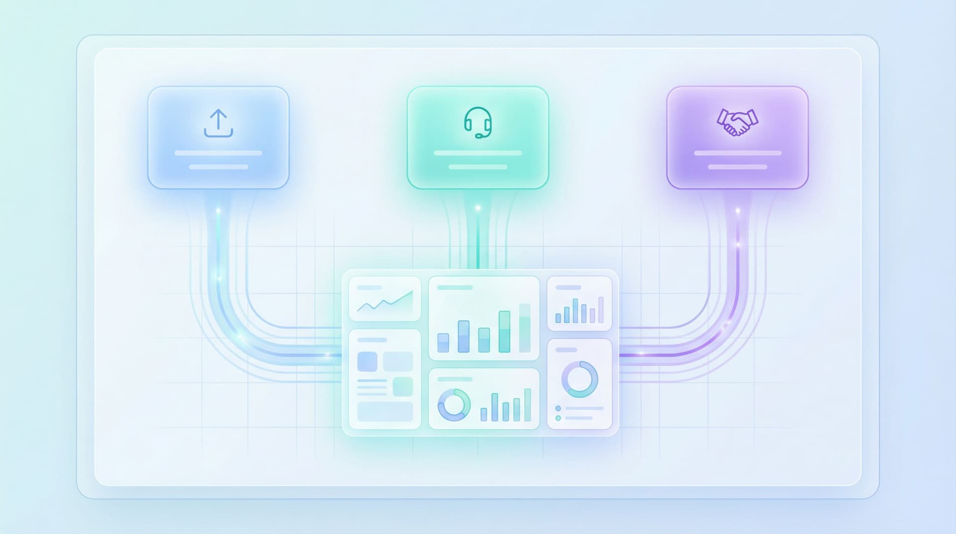
This is where tools like Ezpa.ge shine. You can design responsive, branded flows with custom URLs and real-time Google Sheets syncing, then connect those answers directly into your onboarding logic.
Why your onboarding form is more than “just fields”
When someone signs up, three things are happening at once:
- They’re trying to understand you.
“Is this for teams like mine? Will this actually solve my problem?” - They’re trying to place themselves.
“Which plan is for me? Which template should I choose? Am I the right kind of user?” - They’re making micro-commitments.
Every question they answer is a small investment. Done right, that investment increases motivation to continue.
A well-designed onboarding form leans into all three:
- It teaches by asking: the questions hint at what the product can do.
- It segments without feeling like qualification.
- It configures the account so the first screen is already tuned to the user.
Think of it less as “signup” and more as co-creating the product setup with your user.

From questionnaire to guided tour: the core mindset shift
Traditional onboarding forms ask:
“What do we need to know to score and route this user?”
Guided-tour forms ask:
“What does this user need to tell us so their first 5 minutes feel obviously worth it?”
That shift changes everything about how you design:
-
From internal fields to user outcomes.
Instead of “Company size” for your CRM, you ask, “How big is the team that will use this?” so you can pick better defaults, invite flows, or permissions. -
From static to adaptive.
If someone says they’re a solo founder, they don’t need the same questions as an enterprise admin. Adaptive paths matter here—something we dive deeper into in Adaptive Question Paths: Using Live Response Data to Reshape Your Forms Without a Redesign. -
From friction to clarity.
A few good questions can actually increase completion rates by reducing anxiety and decision fatigue. Users feel guided, not interrogated.
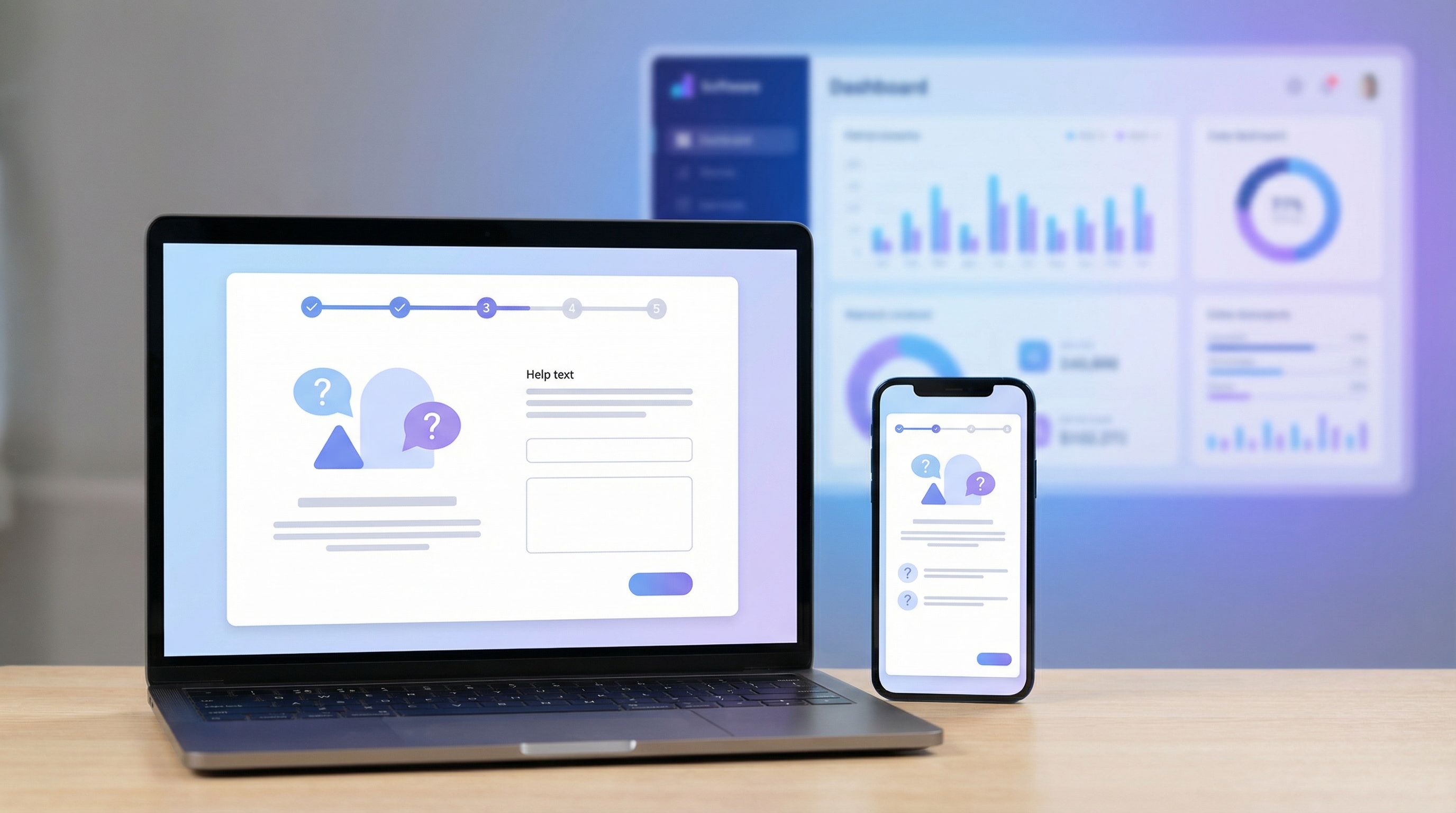
Step 1: Start with the “first win” you want to deliver
Before you write a single question, define the first meaningful win your product can deliver in 5–10 minutes.
Examples:
- Analytics tool → Show a real chart based on their data.
- Email platform → Send a test campaign to a segment they care about.
- Collaboration app → Create a shared workspace with one teammate invited.
- Form builder like Ezpa.ge → Publish a working form with a shareable custom URL and live Google Sheets sync.
Then ask:
“What do we absolutely need to know to make that first win feel tailored and impressive?”
That short list becomes the backbone of your onboarding form.
Filter ruthlessly:
- If a field doesn’t change what they see or how they’re treated in the first session, consider moving it later.
- If a field is “nice to have for sales someday,” it probably belongs in a follow-up or a later profile step.
This is the same discipline behind high-intent flows we’ve written about in Form UX for Fast Decisions: Designing High-Intent Flows for Sales, Support, and Hiring. The goal is to support the user’s decision and momentum, not slow it down.
Step 2: Turn product choices into questions
Most products hide key configuration decisions inside settings pages or long dropdowns. Your onboarding form is a chance to lift those decisions up and walk users through them.
For each major product choice, ask:
- Can this be expressed as a simple question?
- Can we explain the tradeoff in one sentence?
- Can we show a default that’s “good enough” if they’re unsure?
Example: A project management tool
Instead of dumping users into a blank workspace, your onboarding form might ask:
-
“What kind of work will you manage here first?”
- Client projects
- Product development
- Marketing campaigns
- Something else
-
“How structured do you like things to be?”
- I want clear stages and workflows.
- I prefer flexible boards and lists.
- Not sure yet.
-
“Who are you mainly collaborating with?”
- Internal team
- Clients
- External partners
- Just me for now
Each answer can map to:
- A starting template.
- Which features are highlighted first.
- Copy and examples that reflect their context.
The user feels like they’re answering simple questions. Behind the scenes, you’re configuring a tailored tour.
Step 3: Make the form itself feel like the product
If your product promises clarity, speed, or confidence, your onboarding form has to embody those qualities.
Some practical patterns:
-
Mirror your product’s information architecture.
Group questions the same way the product groups features: “Team & access,” “Data & integrations,” “Goals.” When they land in the app, it feels familiar. -
Use microcopy to preview capabilities.
Under a question like “What will you use this for first?”, add a hint:“We’ll use this to recommend templates and default dashboards.”
-
Show progress in meaningful chunks.
Replace “Step 1 of 10” with labels like:- About you
- Your team
- Your first project
That framing reinforces the narrative: this isn’t bureaucracy; it’s setup.
-
Reflect their answers back.
As they move through, show small confirmations:“Got it — we’ll start you with templates for client projects.”
These touches make the form feel less like a gate and more like a conversation.
Step 4: Use branching logic to create mini-tours
A single linear form can only do so much. The real power comes when the questionnaire adapts to what users say.
Branching logic lets you:
-
Ask deeper questions only when relevant.
If someone selects “Enterprise” as company size, you can ask about SSO or approval flows. A solo user never sees those. -
Skip entire sections for simple use cases.
If they’re “just testing,” you might hide advanced billing or governance questions until later. -
Route users into different onboarding paths.
Product admins might land in a configuration tour; end-users might land in a “do your first task” tour.
With Ezpa.ge, you can design these conditional paths without code and keep all responses flowing into a single, live Google Sheet. That makes it much easier to experiment with new branches, monitor drop-off, and continuously refine.
If you’re interested in going deeper on this pattern beyond onboarding, take a look at Forms for Non-Linear Journeys: Designing Paths That Let Users Jump, Skip, and Return Without Getting Lost.
Step 5: Personalize with restraint
Personalization is powerful—but it’s also easy to overdo.
In onboarding forms, start with visible, understandable personalization:
-
Prefill what you truly know.
If they clicked from an email, prefill their email address and name. If they came from a specific campaign, pre-select the likely use case. -
Tailor copy by audience.
A developer might see “Connect your data via API or webhook,” while a marketer sees “Connect your data from spreadsheets or campaigns.” -
Use URL parameters for context.
With custom URLs, you can pass channel, campaign, or partner info directly into the form, then adjust questions or labels accordingly. We explore this pattern in depth in URL-Level Personalization: Tailoring One Form to Many Audiences with Naming, Prefills, and Logic.
What to avoid:
- Overly specific guesses that feel creepy (“We noticed you visited our pricing page 7 times…”).
- Hidden personalization that changes pricing or features without explanation.
The rule of thumb: If the user can’t understand why something is personalized, it’s safer not to.
Step 6: Design for mobile and partial attention
A huge share of signups happen on phones, often while people are doing something else. If your onboarding form only works well on a 27" monitor, you’re losing people.
Some mobile-first considerations:
-
Chunk questions into small, scannable screens.
One to three questions per screen is usually the sweet spot. -
Use tap-friendly inputs.
Radios, buttons, and sliders beat tiny dropdowns. Reserve free-text fields for when they really matter. -
Save progress automatically.
If someone gets interrupted, they should be able to pick up where they left off—ideally via a magic link or by recognizing their email. -
Keep help text short but available.
Use expandable tooltips instead of long paragraphs.
We’ve written more broadly about designing forms for on-the-go users in Beyond ‘Mobile-Friendly’: Designing Thumb-First Forms for On-the-Go Users. The same principles apply doubly to onboarding, where drop-off is most painful.
Step 7: Connect answers directly to the product experience
The real magic of forms-as-onboarding UX isn’t just asking better questions—it’s using every answer immediately.
Some concrete patterns:
-
Template selection.
Use the “What are you here to do?” answer to:- Pre-load a relevant template.
- Rename example projects or dashboards.
- Hide features that don’t matter yet.
-
Role-based UI.
If someone identifies as an admin, show setup tasks first. If they’re an end-user, show “do this one thing” tasks. -
Guided checklists.
Turn answers into a personalized checklist:“Based on what you told us, here’s your 5-minute setup:”
- Import your first dataset
- Invite 1 teammate
- Schedule your first report
-
Messaging and help.
Route them into the right onboarding email sequence or in-app tips based on their use case and experience level.
If you’re using Ezpa.ge with real-time Google Sheets sync, you can:
- Pipe answers into Sheets.
- Use simple formulas or scripts to assign segments or next steps.
- Feed those back into your product, CRM, or messaging tools.
That loop turns a static questionnaire into a living configuration layer for your onboarding.
Step 8: Measure and iterate like a product surface
Treat your onboarding form like any other core product surface: something you ship, measure, and improve, not “set and forget.”
Track a few key signals:
- Completion rate by device, channel, and segment.
- Time to first value: how long from form start to the first meaningful action in the product.
- Drop-off points: which questions cause the most exits or hesitation.
- Downstream quality: do users who choose certain paths activate or retain better?
Then iterate:
- Remove or rephrase high-friction questions that don’t pull their weight.
- Test different explanations or defaults for complex choices.
- Try moving some questions after the first win instead of before.
This is where low-noise analytics shines: you don’t need 40 metrics; you need a few sharp ones that tell you where to focus each week.
Putting it all together: a simple blueprint
Here’s a concrete starting blueprint you can adapt to your product.
Screen 1 – Context & promise
- Short headline: “Let’s set up your workspace.”
- 1–2 sentences about what will happen next.
“Answer a few quick questions so we can set up templates and defaults that fit your team. This takes about 2 minutes.”
Screen 2 – Who you are
- Role (e.g., founder, manager, individual contributor, admin).
- Team size or company size (framed as “How many people will use this with you?”).
Screen 3 – What you want to do first
- Primary use case (with 3–5 clear options and an “other” field).
- Optional: urgency or goal (e.g., “Launch something this week” vs. “Exploring options”).
Screen 4 – How you like to work
- Preference questions mapped to product modes (e.g., structured vs. flexible, visual vs. list-based).
Screen 5 – Setup helpers
- Ask for data source or integration (if critical to first value).
- Offer to invite a teammate (but make it skippable).
Screen 6 – Confirmation & handoff
- Brief recap: “Here’s what we’ll start you with…”
- Button: “Create my workspace” that takes them directly into a tailored in-app checklist.
Building this in Ezpa.ge means you can:
- Theme it to match your product.
- Use custom URLs to create variants for different channels or partner programs.
- Sync responses into Google Sheets for analytics and routing.
Summary
Onboarding forms don’t have to be a wall between your user and your product.
When you:
- Start from the first meaningful win you want to deliver.
- Turn product decisions into clear, friendly questions.
- Make the form feel like a guided conversation, not a data grab.
- Use branching logic and personalization with restraint.
- Connect every answer directly to what the user sees next.
…your first-touch questionnaire becomes a guided tour of your product, tuned to each person who walks through the door.
You collect better data. Users get a faster path to value. Sales, support, and product all benefit from cleaner segmentation and more intentional setup.
Your next step
Don’t try to redesign your entire onboarding in one go.
Instead:
- Pick one product: your main app, a new feature, or even a beta program.
- Define a single, sharp first win you can deliver in under 10 minutes.
- Draft a 4–6 screen Ezpa.ge form that asks only what you need to tailor that win.
- Connect the answers to real changes in the first in-app experience.
- Ship it to a subset of new users for two weeks and watch what happens.
If you’re already using Ezpa.ge, you have everything you need: customizable themes, custom URLs, logic, and real-time Google Sheets sync to power these guided onboarding flows.
Your form is already the front door. Now’s the time to make it feel like a tour guide, not a turnstile.