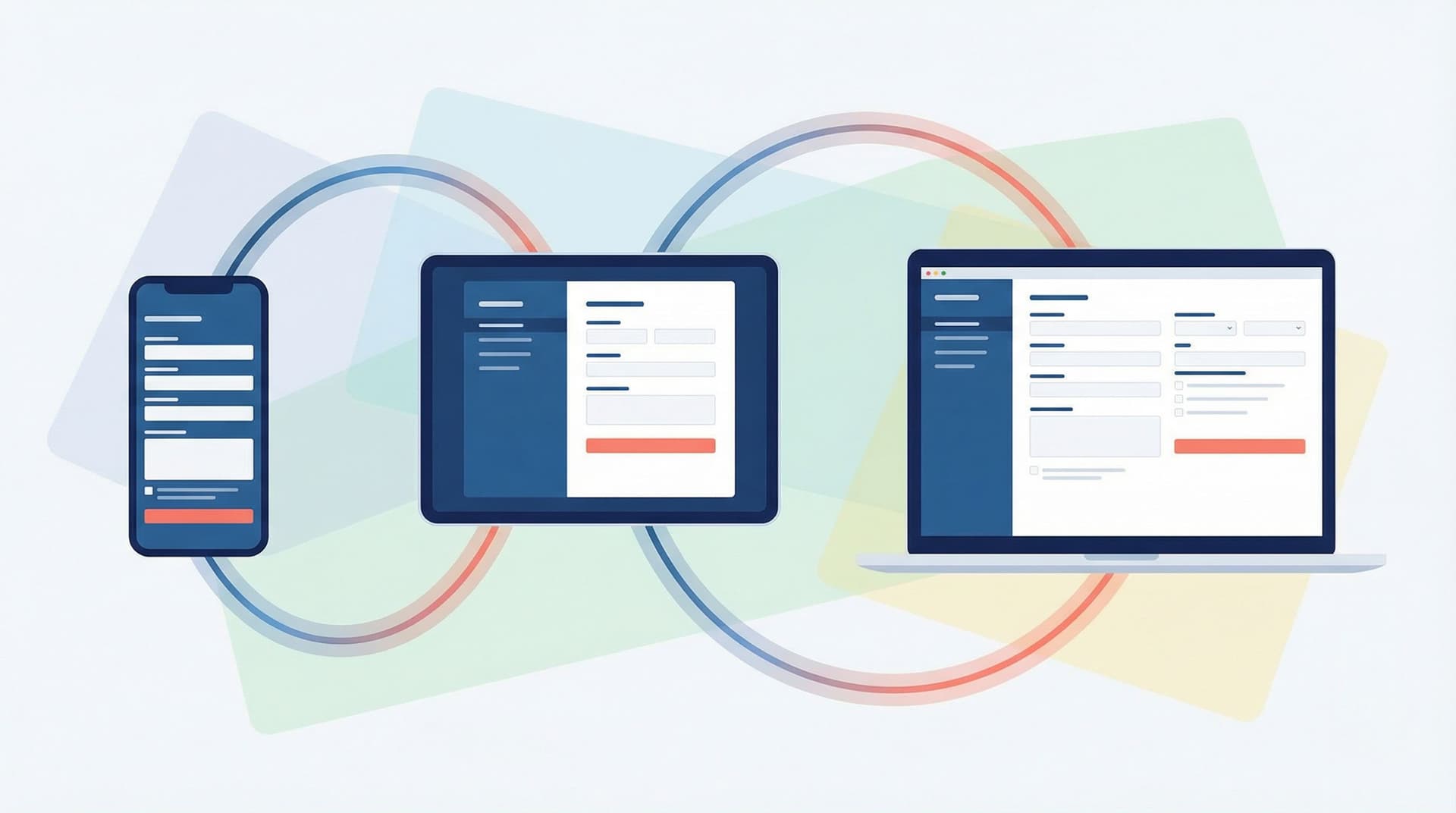
Flow, Not Fields: Mapping Your User’s Mental Journey Before You Design a Single Input


Flow, Not Fields: Mapping Your User’s Mental Journey Before You Design a Single Input
Forms don’t fail because you picked the wrong input type.
They fail because the flow in your head doesn’t match the journey in your user’s head.
If you start your form project by dragging fields onto a canvas, you’re already skipping the most important work: understanding what people are thinking, feeling, and deciding from the moment they see your link to the moment they close the tab (with or without hitting Submit).
This post is about designing that invisible layer first—the mental journey—so every field you add has a clear reason to exist.
Why Flow Comes Before Fields
When a form “just works,” it’s rarely because of a clever widget. It’s because the experience lines up with the story in the user’s mind:
- They know what they’re getting. The promise is clear from the link, the headline, and the first sentence.
- They know why you’re asking. Each question feels justified, not nosy.
- They know how long it’ll take. The scope feels manageable and honest.
- They feel progress. Each step moves them closer to something they want.
When you skip mapping this journey, you tend to get:
- Wall-of-fields syndrome. Everything your team wants to know jammed into one screen.
- Random friction. Jarring jumps in difficulty (easy name/email, then a long essay question).
- Mismatched expectations. A link that promises a quick quote, followed by 20 qualifying questions.
- Hidden drop-off points. Users quietly abandon halfway through and you’re not sure why.
Teams that design the mental journey first see tangible benefits:
- Higher completion rates. Because the form feels like a guided path instead of an interrogation.
- Better data quality. Because questions arrive at the right time, with the right context.
- Fewer revisions. Because stakeholders align on the flow before anyone argues about pixels.
- Faster iteration. Because you can tweak one step in the journey without breaking the whole thing.
If you’re already thinking about how to keep forms shorter without losing insight, you’ll find this complements ideas from Form Fatigue Is Real: Designing Shorter Flows That Still Capture Rich Data.
Step 1: Define the Before and After
Before you map the steps, you need to understand the endpoints:
- Where is your user mentally before they see your form?
- Where do you want them to be after they submit?
Think in terms of motivation, questions, and risk.
Clarify the user’s starting point
Ask:
- What triggered them to open this form?
- An email? A support issue? A social post? A sales call?
- What do they believe they’re here to do?
- “Get a quote,” “join a waitlist,” “give quick feedback,” “apply for a role.”
- What are they worried about?
- Spam, wasted time, being disqualified, not knowing what happens next.
Capture this in a short paragraph. For example:
“A small-business owner clicked a ‘Get a custom quote’ button from our pricing page. They’re cost-sensitive, short on time, and wary of bait-and-switch tactics. They expect 3–5 quick questions, not a full application.”
Define the after-state you’re aiming for
On your side and theirs:
- For the user:
- What do they walk away with? (Confirmation, next steps, a download, a scheduled call.)
- How should they feel? (Relieved, confident, excited, understood.)
- For your team:
- What decision will this submission power? (Qualify a lead, route a ticket, segment a user.)
- What minimum data do you need to make that decision responsibly?
Write a second paragraph:
“After submitting, they should feel like they took a meaningful step toward a tailored quote, know when they’ll hear from us, and have a clear expectation of price range. We should know their business size, industry, and primary use case—nothing more.”
These two paragraphs become your north star. If a field doesn’t support getting from before to after, it probably doesn’t belong.

Step 2: Map the Mental Journey in Plain Language
Now you translate that before-and-after into a sequence of thoughts.
A simple pattern:
- Discovery – “What is this and is it worth my time?”
- Commitment – “Okay, I’ll start. How much effort is this?”
- Disclosure – “I’m sharing real information. Do I trust you?”
- Resolution – “Did this do what I hoped? What happens now?”
For your specific form, write the internal monologue at each stage.
Example for a beta waitlist form:
- Discovery: “This tool might solve a problem I have. Is this a quick signup or a long survey?”
- Commitment: “I’ll give my email and a bit of context if it helps me get earlier access.”
- Disclosure: “You’re asking about my team size and current tools. Are you going to hard-sell me?”
- Resolution: “Cool, I’m on the list. Will I actually hear from you? When?”
Do this before you name a single field.
Make it collaborative
Bring in:
- Support or success teams to share real user quotes.
- Sales or marketing to clarify promises made before the form.
- Product or ops to sanity-check what data is truly required.
Capture disagreements now; they’re much cheaper to resolve in words than in UI.
Step 3: Turn Thoughts into Stages, Then Questions
Once you have the mental monologue, you can group it into stages. Each stage should answer one big question in the user’s mind.
For each stage, define:
- Goal (user-centric): What does the user need to feel or know to move forward?
- Goal (team-centric): What do we need to learn or confirm at this point?
- Constraints: What we must avoid (e.g., long text answers too early, sensitive data without context).
Example: 4-stage flow for a “Request a Demo” form
Stage 1 – Orientation
- User goal: “Understand what kind of demo I’m requesting and whether it’s tailored to me.”
- Team goal: Confirm which product line or use case they care about.
- Likely questions: high-level interest (e.g., “What would you like to explore?” with 3–5 options).
Stage 2 – Light identity
- User goal: “Quickly share who I am without feeling like I’m signing a contract.”
- Team goal: Capture basic contact info and company context.
- Likely questions: name, work email, company size bracket.
Stage 3 – Qualification without interrogation
- User goal: “Explain my situation enough to get a relevant demo, not a generic sales pitch.”
- Team goal: Assess fit and prep the right rep.
- Likely questions: primary challenge, timeline, current tool (short, structured where possible).
Stage 4 – Clear expectations
- User goal: “Know what happens next and when.”
- Team goal: Lock in routing and follow-up path.
- Likely questions: preferred time zone or region, optional scheduling, communication preference.
Only after you’ve defined stages like this should you start translating them into fields, layouts, and logic.
If you’re building multi-step flows, this way of thinking pairs well with techniques from The Silent Drop-Off: Diagnosing and Fixing Hidden Friction in Multi-Step Forms.
Step 4: Decide What Not to Ask (Yet)
A strong flow is as much about restraint as it is about structure.
Use a ruthless inclusion filter
For each potential question, ask:
- Does this directly support a decision we’ll make in the next 7 days?
- Will we actually use this field in a workflow, segment, or report?
- Is there a lighter-weight proxy we could use instead?
If the honest answer is “no” or “maybe later,” consider:
- Dropping it entirely.
- Moving it to a follow-up survey.
- Making it optional and clearly labeled as such.
Sequence sensitive or effortful questions carefully
Some questions carry more emotional or cognitive load:
- Salary, budget, or revenue
- Health or personal identity details
- Long free-text descriptions
Place them after you’ve built trust and demonstrated value:
- Explain why you’re asking.
- Show how the answer benefits the user (better match, faster support, more relevant content).
- Use helper text to reduce anxiety.
This is where good microcopy and error handling matter. If you haven’t yet, it’s worth pairing this mindset with patterns from Form Microcopy that Converts: Writing Labels, Helpers, and Errors that Users Actually Read and Error States that Convert: Turning Validation Messages into Micro-Moments of Trust.

Step 5: Sketch the Flow Before You Touch a Builder
Now you’re ready to sketch—but still not ready for fields.
Use low-fidelity diagrams
On paper, a whiteboard, or a simple diagramming tool, create a flow with:
- Nodes for stages (e.g., “Orientation,” “Light identity”).
- Edges showing how a user moves from one stage to the next.
- Branches where answers change the path (conditional logic).
Keep it high-level:
- Label stages with verbs: “Confirm interest,” “Collect basics,” “Clarify needs,” “Set expectations.”
- Note emotional checkpoints: “Reassure about time,” “Explain why we ask budget,” “Celebrate completion.”
Decide where logic actually helps
Conditional logic is powerful, but overused logic becomes a maze.
Use it when:
- You can meaningfully shorten the journey for some users.
- You can avoid irrelevant questions for others.
- You have clear rules that are easy to maintain.
Avoid it when:
- It only saves one or two fields but doubles complexity.
- Stakeholders can’t explain the rule in one sentence.
If you’re using Ezpa.ge, this is the moment to think about how one form can serve multiple audiences with smart branching, as explored in One Form, Many Audiences: Using Conditional Logic to Personalize Paths Without Losing Your Mind.
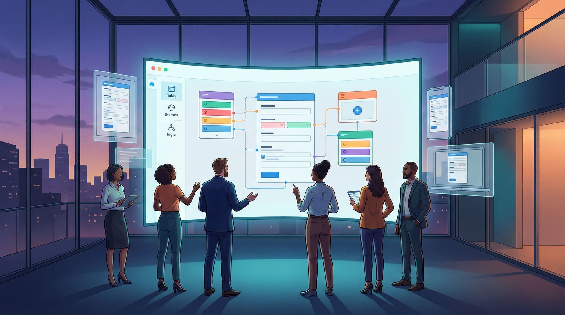
Step 6: Only Now—Choose Fields and Layouts
With the flow solid, you can finally open your form builder.
Start with one stage at a time
For each stage:
- Re-read its user and team goals.
- List the minimum fields needed.
- Choose field types that match the mental effort:
- Low-friction: toggles, checkboxes, short selects.
- Medium: short text, email, numeric.
- High: long text, multi-select with many options.
Aim to keep early stages in the low-friction zone.
Align layout with perceived effort
People judge effort visually before they read a single label.
- Group related fields into clear sections.
- Avoid long, unbroken columns of inputs.
- Use progress indicators for multi-step flows.
- Make the first screen feel doable at a glance.
If you’re on Ezpa.ge, theme and responsiveness are handled for you, but it’s still worth thinking through how the form feels on different screens. The ideas in Adaptive Form Themes: Designing One Look That Automatically Fits Any Device can help ensure your carefully designed flow doesn’t fall apart on mobile.
Step 7: Rehearse the Journey Out Loud
Before you ship, do a “table read” of the form.
Script the experience
Aloud, narrate what a user would think at each step:
- “I click the link from the pricing page. The headline says ‘Get a tailored quote in under 2 minutes’—okay, that matches what I expected.”
- “First screen: it just asks what I’m interested in and my company size. That feels light; I’m willing to continue.”
- “Now it asks about my current tool and key challenge. The helper text explains why. That makes sense.”
- “After submitting, I see exactly when I’ll hear back and what the email subject line will be. Nice.”
If anything feels jarring, confusing, or heavier than it looked, adjust.
Watch someone else use it
Grab a colleague or friend who wasn’t involved in the build. Ask them to:
- Share their screen.
- Think out loud as they complete the form.
- Tell you when they hesitate or feel annoyed.
Note where their mental journey diverges from the one you designed. Those are your highest-impact tweaks.
Step 8: Connect the Journey to Real-Time Feedback
A mapped journey is a hypothesis. Real users will tell you where it’s wrong—if you’re listening.
Use live data as a feedback loop
If your form syncs to Google Sheets (as Ezpa.ge does), you can:
- Track where people stop (e.g., timestamp differences, missing later-stage fields).
- Add calculated columns that flag incomplete or suspicious submissions.
- Run quick experiments on order, wording, or stage boundaries.
For deeper dives into turning that live stream of responses into a system that protects data quality and powers experimentation, check out:
- Real-Time Guardrails: Using Google Sheets Logic to Auto-Clean and Validate Form Data
- Real-Time A/B Testing with Google Sheets: Ship Form Experiments in a Single Afternoon
Your mental journey map should evolve as you learn. Treat it as a living artifact, not a one-time exercise.
Putting It All Together
Designing forms around flow—not just fields—means:
- Start with the story, not the schema. Define the user’s before/after and mental monologue.
- Chunk the journey into stages. Each stage has a clear user goal and team goal.
- Be ruthless about scope. Ask only what you need, when you’ve earned the right.
- Sketch the path. Use simple diagrams and conditional logic only where it truly helps.
- Then—and only then—pick fields and layouts. Let the journey dictate the UI.
- Rehearse and refine. Test the flow out loud, with real people, and with live data.
When you work this way, you stop shipping forms that are technically correct but emotionally off. Instead, you ship experiences that feel obvious, respectful, and purposeful—because they were designed from the inside out.
Your First Step: Map One Journey
You don’t need to rebuild your whole form library to start.
Pick one high-impact form:
- Your main signup or lead form
- A beta waitlist
- A key survey that always gets complaints
Then, this week:
- Write the before and after paragraphs.
- Draft the user’s mental monologue in 4–5 steps.
- Turn that into stages with clear goals.
- Compare your current form to that map.
- Where are you asking for too much, too soon?
- Where are you leaving expectations fuzzy?
If you’re using Ezpa.ge, open that form and start aligning it to the journey you just mapped. Use themes, custom URLs, and live Google Sheets sync to iterate quickly as you learn.
The tools are ready. The difference now is that you’ll be designing from flow, not just fields—and your users will feel it.