From ‘Submit’ to ‘Subscribed’: Designing Forms That Quietly Grow Your Newsletter and Community


Email is still one of the highest‑ROI channels marketers have. Across recent studies, brands consistently report $36–$40 in revenue for every $1 spent on email—and the best operators push far beyond that. Yet most teams treat the newsletter signup as an afterthought: a generic form, a default theme, and a lonely “Subscribe” button buried in the footer.
If your forms are where people start their relationship with your newsletter and community, that’s a huge missed opportunity.
This post is about turning those quiet little forms into steady engines of growth—without resorting to dark patterns or gimmicks. We’ll look at how to design newsletter and community forms that:
- Feel trustworthy and low-friction
- Attract the right subscribers, not just more addresses
- Plug cleanly into your tools, from Google Sheets to email platforms
- Keep improving over time with small, testable tweaks
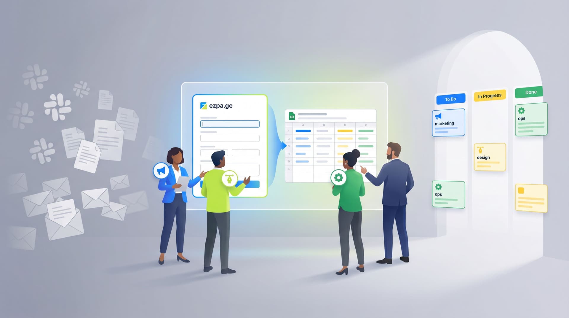
Throughout, we’ll assume you’re using a form builder like Ezpa.ge, where you can:
- Apply themes that match your brand
- Use custom URLs that are easy to share and remember
- Sync responses in real time to Google Sheets for clean, structured data
Why your newsletter form deserves real design attention
A “simple” email form is doing more work than it looks:
-
It’s the front door to your highest-ROI channel.
If email is where you nurture, educate, and sell, then the form is where that compounding value begins. -
It sets expectations for the relationship.
The way you ask for someone’s email quietly answers questions like:- “Is this brand thoughtful or sloppy?”
- “Do they respect my time and data?”
- “Will this be useful, or just more noise in my inbox?”
-
It shapes the quality of your list.
A vague, low-friction form might grow faster—but with disengaged subscribers, weak deliverability, and lower revenue per send. A clear, well‑positioned form can grow a smaller list that actually buys. -
It’s one of the easiest places to experiment.
You can change form copy, fields, theme, and URL structure without a full redesign. If you’re curious how to do this systematically, see how we approach it in Form-Led Experimentation for Non-Designers.
When you treat your newsletter and community forms as strategic assets—not just boxes for an email field—you unlock a quiet, compounding growth loop.
Step 1: Get brutally clear on the “why” of your form
Before you touch layout or colors, answer two questions:
-
What exact outcome do you want from this form?
Some examples:- Weekly newsletter subscribers
- Early access list for a new product
- Members for a paid or private community
- Waitlist for a cohort or event
-
What exact outcome does the subscriber get?
Not “updates.” Not “news.” Something concrete:- “One teardown per week of a real signup flow, with screenshots.”
- “A monthly summary of the three experiments that moved our metrics.”
- “Access to a private channel where founders share launch feedback.”
If you can’t answer both clearly, you’re not ready to design the form.
Practical exercise:
- Write a single sentence that starts with:
“This form exists so that…”
and finish it with both sides of the relationship: what you get and what they get.
Example:
This form exists so that product leaders who care about UX can join a weekly teardown newsletter, and so our team can build a high-intent audience for future launches.
That sentence becomes your north star for copy, fields, and follow‑up.
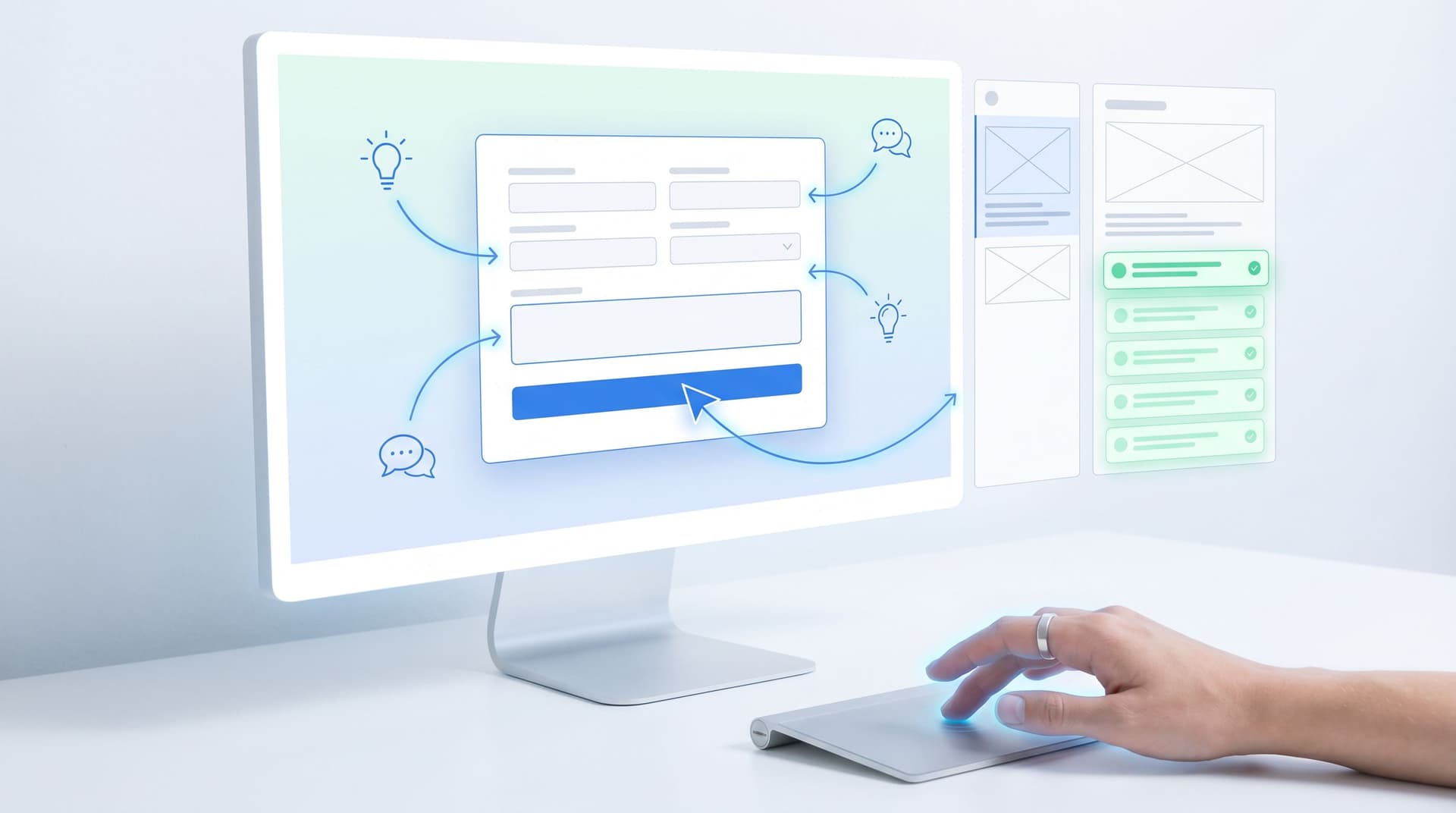
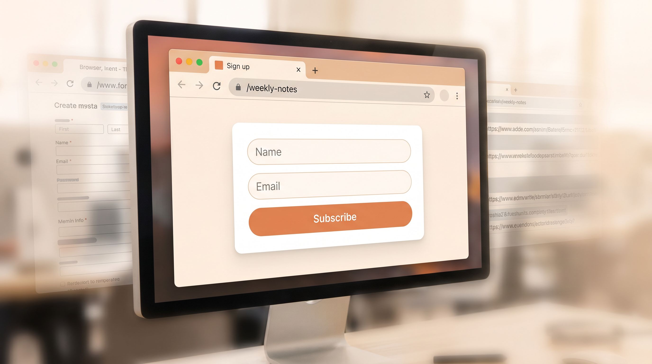
Step 2: Design for “zero-instruction” completion
For a newsletter or community form, you rarely need more than a handful of fields. That means you can—and should—aim for zero-instruction use: people understand what to do at a glance.
Borrow patterns from Designing Forms for ‘Zero Instruction’ Use:
- One clear headline that answers “What am I signing up for?”
- One supporting sentence that answers “Why is this worth it?”
- One primary action that answers “What happens when I click?”
Layout patterns that work well
-
Single-column, stacked fields.
No side‑by‑side inputs. Vertical rhythm is easier to scan and complete. -
Short form above the fold.
If this is a standalone Ezpa.ge form, keep the core fields visible without scrolling on mobile. -
Minimal decoration, strong hierarchy.
Use theme settings to make the headline visually dominant, the button high-contrast, and everything else quieter.
Copy patterns that reduce friction
Replace vague labels and microcopy with concrete, outcome‑oriented language:
-
Instead of “Subscribe”, try:
- “Send me the teardown each Friday”
- “Join the waitlist for the next cohort”
-
Instead of “Sign up for updates”, try:
- “Get one practical growth idea each week—no fluff”
If you’re not sure where to start with wording, you can lean on the patterns in AI as Your Form Editor to quickly generate and refine labels, hints, and button copy.

Step 3: Ask for the least data that gives you leverage
The temptation is strong: “While we’re here, let’s ask for name, company, role, budget, interests…”
The problem isn’t just friction. Every extra field is a tiny trust test.
A better approach is outlined in The Minimal Field Manifesto: start with as few inputs as possible, then add only what truly improves:
- Personalization that matters
- Segmentation that you’ll actually use
- Onboarding or follow‑up relevance
A simple decision tree for fields
-
Email (required)
Non‑negotiable. Make this the first field, not buried. -
First name (optional or required?)
- Require it only if you genuinely use first‑name personalization in emails or community spaces.
- If you’re not sure, make it optional and test later.
-
One segmentation field (optional, short)
Choose a single, high‑leverage dimension, like:- Role (founder, marketer, PM, engineer)
- Company size (1–10, 11–50, 51–200, 200+)
- Primary goal (learn, hire, launch, grow)
-
Everything else goes in onboarding, not the form.
Use your welcome email or first community touchpoint to ask deeper questions once trust is established.
Rule of thumb: if a field doesn’t change what you send, who you send it to, or how you follow up, remove it.
Step 4: Make the value proposition specific and believable
People don’t subscribe because you asked nicely. They subscribe because they:
- Recognize themselves in your description
- Believe you can consistently deliver something useful
- Feel the cost (inbox space, attention) is justified
Three small tweaks that move the needle
-
Anchor on a cadence.
“One email every Wednesday” feels safer than “occasional updates.” It sets a rhythm and reduces anxiety about spam. -
Name the format and depth.
- “A 3‑minute summary of…”
- “One teardown with screenshots and commentary…”
- “A curated list of 5 links with 1‑line explanations…”
-
Show a preview.
Link to or embed a sample issue, or summarize last week’s topic in one line. That single concrete example often does more than a paragraph of promises.
If you’re running multiple lists (e.g., a general newsletter and a deeper community digest), consider separate Ezpa.ge forms with custom URLs that reflect the promise:
yourbrand.ezpa.ge/newsletteryourbrand.ezpa.ge/community-digest
That URL clarity reinforces the value proposition even before someone sees the form. For more on how much URLs matter in behavior, see The URL Is the New CTA.
Step 5: Use themes and custom URLs as trust signals
Your form is often the first time someone sees your brand outside of an ad or social feed. Small visual and structural choices send strong signals about whether you’re worth trusting.
Theme choices that build confidence
In Ezpa.ge, you can adjust colors, typography, and spacing without touching code. For newsletter and community forms:
-
Match your primary brand color on the button, not the background.
High-contrast buttons are easier to spot and feel more intentional. -
Use generous spacing and clear section breaks.
Dense, cramped forms feel like work. Airy layouts feel approachable. -
Avoid novelty fonts for labels.
Keep labels and helper text in a clean, readable typeface. If you want personality, use it in the headline.
We go deeper on what your theme communicates in Signals in the Theme: What Your Form Aesthetics Quietly Tell Users About Your Brand.
Custom URLs that feel human and memorable
Where your link points matters as much as what the button says. Instead of:
yourbrand.ezpa.ge/form/123abc
Use URLs that:
- Describe the action or promise:
/join-the-lab/weekly-product-notes/community-waitlist
- Match what’s written on the button:
If your CTA is “Join the teardown list,” make the URL/teardown-list.
This consistency builds a subtle but powerful sense of coherence: the ad, the button, the URL, and the form all feel like the same promise.
Step 6: Connect your form to a real onboarding path
A great form that leads to a generic “Thanks!” page and a bland welcome email wastes momentum.
Instead, treat the moment after submission as the first step in an intentional journey. If your Ezpa.ge form is already syncing to Google Sheets, you have everything you need to:
- Trigger welcome sequences in your email platform
- Segment subscribers by the fields you collected
- Create tasks or notifications for community managers
For a deeper walkthrough of mapping submissions to downstream actions, see From Form to Onboarding Journey.
Minimum viable onboarding for a newsletter form
-
Thank-you state on the form itself that:
- Confirms what they’ll receive and when
- Repeats the value proposition in one sentence
- Optionally suggests one next step (e.g., “Check your inbox for a welcome email”).
-
Welcome email that:
- Arrives within a few minutes
- Reiterates the promise and cadence
- Shares 2–3 of your best past issues or resources
- Asks one low‑friction question (e.g., “Reply with the one thing you’re trying to improve right now.”)
-
Tagging or segmentation based on form fields:
- If they selected “Founder” as role, add them to a founder segment
- If they chose “Launch a new product” as goal, enroll them in a short, goal‑specific mini‑sequence
The form is just the trigger; the real magic is in the system behind it.
Step 7: Treat your form as an experiment, not a monument
The best newsletter and community forms are not “finished.” They’re quiet experiments that run in the background, getting a little better each month.
With Ezpa.ge, it’s easy to:
- Duplicate a form
- Change the theme or copy
- Give each variant a different custom URL
- Route all responses into a shared Google Sheet with a column for
source_url
From there, you can track:
- View-to-submit rate by URL
- List quality by URL (open/click rates, eventual revenue)
Some simple experiments to run:
-
Value proposition A/B test
- Version A: “Weekly growth teardown for SaaS founders”
- Version B: “One screenshot-packed teardown every Wednesday for SaaS teams”
-
Field count test
- Version A: Email only
- Version B: Email + Role (with 3–4 quick options)
-
Theme contrast test
- Version A: Light background, dark button
- Version B: Dark background, light button
Keep experiments small and focused. Change one major element at a time, and run them long enough to get meaningful data—not just a handful of submissions.
If you want a more structured playbook for this kind of testing, circle back to Form-Led Experimentation for Non-Designers.
Step 8: Make forms part of your community fabric, not just your site
Newsletter and community forms shouldn’t live only on your homepage. They should be woven into the places where your audience already pays attention:
- In-product surfaces: feature flags, empty states, upgrade prompts
- Content surfaces: blog posts, docs, templates
- Community surfaces: Slack, Discord, forums
Because Ezpa.ge forms are responsive and URL-based, you can:
- Share the same signup form in a podcast description, a Slack channel, and a tweet
- Create micro-forms for specific segments (e.g., “PMs interested in experimentation”) and route them to tailored sequences
If you’re curious how far you can take this pattern, Micro-Form Funnels: Chaining Single-Question Flows Without Losing Context or Data explores how to break longer flows into tiny, high‑intent steps.
Bringing it all together
Designing forms that quietly grow your newsletter and community isn’t about clever growth hacks. It’s about:
- Clarity: A specific promise, cadence, and audience
- Respect: Minimal, meaningful fields and honest expectations
- Craft: Themes and URLs that signal trust and coherence
- Systems: Clean data flowing into Sheets and email tools, powering real onboarding
- Curiosity: Small, ongoing experiments instead of one‑and‑done designs
When those pieces work together, the journey from “Submit” to “Subscribed” feels natural—for your audience and your ops. Your list grows with people who actually want to hear from you, and your community benefits from members who arrived through a thoughtful, intentional entry point.
Quick summary
If you skimmed, here’s the condensed version:
- Treat your newsletter and community forms as strategic assets, not boilerplate.
- Start by defining why the form exists and what concrete value subscribers receive.
- Design for zero-instruction use: one clear headline, one supporting line, one obvious action.
- Keep fields minimal. Ask only for data that changes what you send or how you segment.
- Use themes and custom URLs in Ezpa.ge to send strong trust signals and make links memorable.
- Connect submissions to a real onboarding path—welcome emails, tags, and follow‑ups—using Google Sheets as your operational backbone.
- Run small, focused experiments on copy, fields, and layout, and measure both conversion and downstream list quality.
- Distribute your forms across the channels where your audience already is, not just on your homepage.
Do those things consistently, and your forms become quiet, compounding engines for newsletter and community growth.
Your next step
You don’t need a full redesign to start.
- Pick one existing newsletter or community form.
- Rewrite the headline and button to clearly state what subscribers get and how often.
- Remove every field that doesn’t change what you’ll send or how you’ll follow up.
- Give the form a human, memorable custom URL.
- Connect it to a simple onboarding: a welcome email and a tag based on one key field.
If you’re using Ezpa.ge, you can do all of this in under an hour. Ship that improved form, watch what happens over the next few weeks, and then iterate.
Your best subscribers and community members are already out there. A thoughtful form is how you invite them in.