Form-First Lead Gen: Replacing Landing Pages with High-Intent Micro-Flows


Most teams still treat landing pages as the default front door for lead generation:
- Ad → landing page → long scroll → form at the bottom.
It works… until it doesn’t.
You start to see the cracks:
- High click-through from ads, but weak form completion.
- Prospects skimming or bouncing before they ever raise their hand.
- “Leads” that downloaded a PDF but never actually told you what they need.
A different pattern is emerging: form-first lead gen—where the form itself becomes the primary experience, and the “page” around it shrinks to almost nothing.
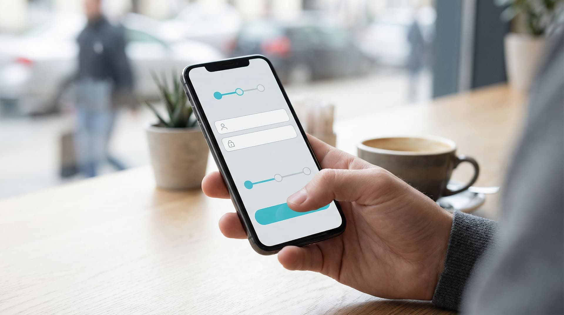
Instead of a big, static landing page, you use short, high-intent micro-flows: 2–6 screens that feel more like a conversation than a brochure. Each step asks one clear question, adapts based on answers, and moves the person closer to a specific next step.
For a tool like Ezpa.ge—where you can spin up beautiful, responsive forms with themes, custom URLs, and real-time Google Sheets syncing—this isn’t a theoretical idea. It’s something you can put into production in an afternoon.
Why Lead Gen Is Moving From Pages to Flows
A traditional landing page tries to do a lot at once:
- Tell your story
- Overcome objections
- Explain the offer
- Capture the lead
That’s a heavy cognitive load for someone who just clicked an ad while juggling 3 other tasks.
Form-first micro-flows flip the script:
Instead of asking people to read more, you ask them to do a tiny next step.
That shift matters for a few reasons.
1. Higher Intent, Less Fluff
When your first touch is a form, not a wall of copy, you’re filtering for people who are ready to engage—even a little.
Well-designed micro-flows:
- Start with a low-friction first question ("What are you trying to do?" instead of "Enter your email")
- Use branching logic to keep each path relevant
- Ask for contact details only once the person has invested a bit of effort
You’re not just collecting more leads—you’re collecting clearer signals about what they actually want.
If you want to go deeper on intent signals and micro-interactions, check out Signals, Not Surveys: Designing Micro-Interactions That Capture User Intent Without Extra Fields.
2. Better Mobile Performance by Default
Most of your paid traffic is already on mobile. Long pages that were “shrunk down” from desktop are hard to parse on a small screen. Micro-flows, by contrast, are naturally chunked into thumb-sized moments:
- One question per screen
- Large tap targets
- Clear progress indicators
If you’ve ever tried to complete a full landing page form on a subway with one hand, you know why Beyond ‘Mobile-Friendly’: Designing Thumb-First Forms for On-the-Go Users has become such a critical topic.
Form-first lead gen bakes that thinking into your acquisition strategy instead of treating it as a last-minute responsive tweak.
3. Cleaner Data and Easier Routing
Landing pages typically dump leads into a single bucket: “MQLs.” Someone then has to:
- Manually qualify them in a CRM
- Ask more questions on a call or via email
- Guess which playbook to use
Micro-flows do more of that work upfront, without feeling like an interrogation. With Ezpa.ge syncing directly to Google Sheets, you can:
- Capture structured fields (use case, company size, urgency, budget range)
- Trigger automations from those fields (e.g., send to the right sales pod, fire a personalized email sequence)
- Build dashboards that show which paths convert best
That’s a lot easier to do when your “page” is already a structured flow.

What Is a High-Intent Micro-Flow, Exactly?
Think of a high-intent micro-flow as a mini onboarding conversation instead of a static page.
Characteristics:
- Short: 2–6 steps, each with one primary action
- Contextual: Copy and questions adapt based on previous answers
- Outcome-driven: Every path leads to a clear next step (book a call, start a trial, get a tailored resource)
- Branded: Visual design, tone, and URL match your product story
Examples:
- A B2B SaaS demo request that starts with: “What are you trying to improve this quarter?” and branches into tailored questions.
- A pricing inquiry flow that asks for team size, current tool, and timeline, then routes to the right sales rep.
- A “choose your own adventure” trial signup that configures the workspace based on role and use case.
If you’ve read Signup, Intake, or Survey? Choosing the Right Form Pattern for Your Product Use Case, micro-flows are often a hybrid of signup + intake: just enough information to personalize the experience and route the lead, not so much that it feels like paperwork.
When to Replace a Landing Page With a Micro-Flow
You don’t need to rip out every landing page. But some use cases are perfect matches for form-first lead gen.
Great Candidates
-
High-Intent Search Campaigns
If someone searches “<your product> demo” or “<category> pricing,” they’re signaling that they’re ready to talk specifics.Instead of:
- Ad → generic feature page → scroll → form
Try:
- Ad → micro-flow that starts with, “What brought you here today?”
-
Mid-Funnel CTAs
From product tours, comparison pages, or nurture emails where visitors already know the basics.For example:
- “See if we’re a fit” → 4-step fit-check flow
- “Get a tailored rollout plan” → intake micro-flow that asks about team size, tools, and timeline
-
Complex Offers That Need Qualification
If not every lead should go to sales, use a micro-flow to qualify and route.- Ask about budget, role, and urgency
- Route high fit to “book a call” and low fit to self-serve content
-
Channel-Specific Experiments
When you’re running lots of campaigns and want to tailor the experience per channel, micro-flows + custom URLs shine. If that’s your world, you’ll probably enjoy Channel-Specific Forms: Using Custom URLs to Tailor Messaging for Ads, Email, and Social.
When a Landing Page Still Makes Sense
- Education-heavy offers where someone truly needs context before deciding (e.g., new category creation).
- SEO content where the primary goal is discovery and learning, not immediate conversion.
- Legal or compliance-heavy flows where disclosures need to be visible in full.
Even in those cases, you can often embed a micro-flow or link to it as the primary CTA.
Designing a Form-First Lead Gen Flow: Step-by-Step
Let’s walk through how to design a high-intent micro-flow you can build in Ezpa.ge.
Step 1: Define the Single Outcome
Before you write any copy, answer one question:
What’s the one thing this flow should achieve?
Examples:
- Book a qualified demo
- Start a trial with the right configuration
- Capture hand-raisers for a specific feature or program
Everything else—questions, branching, confirmation screens—should support that outcome.
Step 2: Map the Minimal Question Set
Work backwards from the outcome. Ask:
- What do we truly need to know to route or personalize?
- What can we infer later from behavior or enrichment tools?
Turn that into a short list of fields, then group them by step.
A useful pattern:
- Motivation – Why are you here? What are you trying to solve?
- Context – Role, company size, current tools.
- Constraints – Timeline, budget range, urgency.
- Contact – Name, email, maybe one optional qualifier (e.g., company URL).
If you’re not sure what to keep or cut, Form UX for Non-Designers: A Practical Checklist for High-Converting Flows has a great “must-have vs nice-to-have” lens you can borrow.
Step 3: Turn Questions Into a Conversation
Micro-flows feel different because the copy feels different.
Instead of:
- "Industry" (dropdown)
- "Company size" (dropdown)
Try:
-
“Which best describes your team?”
- I’m the first person exploring tools
- We have a small team (2–10)
- We’re scaling fast (11–100)
- We’re an established org (100+)
-
“What are you hoping we can help with in the next 3 months?”
- Replace spreadsheets
- Consolidate tools
- Improve reporting
- Something else (short text)
Guidelines:
- Use plain language, not internal jargon.
- Keep one idea per screen.
- Use progress indicators ("Step 2 of 4") to reduce anxiety.
- Echo the user’s choices back in later steps to show you’re listening.
Step 4: Use Branching Logic to Keep It Short
Not every visitor needs every question.
In Ezpa.ge, conditional logic can:
- Hide irrelevant steps (e.g., only show “migration” questions if they say they’re switching from another tool).
- Change copy based on role (e.g., “team” vs “company”).
- Route to different outcomes (e.g., instant calendar vs “we’ll follow up” message).
A simple rule of thumb:
If a question only matters for a subset of users, gate it behind a previous answer.
That’s how you keep the flow feeling light while still gathering rich data.
Step 5: Design the Visual Rhythm
Form-first doesn’t mean design-last. Visual rhythm is what makes a micro-flow feel smooth instead of choppy.
Key elements:
- Consistent theming: Use a single Ezpa.ge theme that matches your brand colors and typography.
- Hierarchy: Clear headline, short helper text, then the field or options.
- Tap targets: Large, well-spaced buttons and inputs—especially for mobile.
- Microcopy: Tiny bits of reassurance under sensitive fields ("We’ll never share this" or "Rough estimate is fine").
If you’re rethinking your brand story at the same time, The Form-Led Rebrand: How Themes, Copy, and Custom URLs Signal a New Product Story is a helpful companion.
Step 6: Make the “After” State Do Real Work
The thank-you screen is part of the flow, not an afterthought.
Depending on the outcome, you can:
- Embed a calendar to book time immediately.
- Offer a tailored resource based on answers (e.g., “Since you’re on a small team, here’s our 3-person rollout guide”).
- Nudge toward a lightweight next action (join a community, watch a 3-minute tour, start a sandbox).
This is where form-first lead gen overlaps with the ideas in Forms as On-Ramps, Not Dead Ends: Designing Submission Flows That Feed Your Growth Stack. You’re not just capturing data—you’re guiding the relationship.

Connecting Micro-Flows to Your Growth Stack
A form-first strategy only works if the data doesn’t disappear into a spreadsheet abyss.
With Ezpa.ge + Google Sheets, you can turn micro-flows into live inputs for your growth engine.
Structure Your Sheet Like a Source of Truth
Instead of one tab per form version, use:
- One main tab per core flow (e.g.,
demo_requests) - Columns for every field you care about, including hidden metadata (UTM parameters, channel, experiment ID)
- Calculated columns for lead score, segment, or routing logic
If you’re drowning in tabs already, From Spreadsheet Chaos to Source of Truth: Structuring Google Sheets for Scalable Form Data is worth bookmarking.
Trigger Workflows Without Engineers
Once data is flowing cleanly into Sheets, you can:
- Use tools like Make, Zapier, or native integrations to:
- Create or update CRM records
- Post to Slack channels for specific segments
- Start personalized email sequences
- Build live dashboards that show:
- Which micro-flow variants drive the most qualified demos
- Conversion by channel, segment, or use case
The key is to treat your micro-flow as a front-end to a workflow, not just a prettier form.
Measuring Success: New Metrics for Form-First Lead Gen
When you replace landing pages with micro-flows, your measurement strategy should evolve too.
Beyond simple “form completion rate,” track:
- Step-level drop-off: Where do people hesitate or bail? That’s your copy or friction hotspot.
- Path performance: Which answer paths (e.g., “small team, urgent need”) lead to the highest downstream revenue?
- Time to qualified meeting: Are micro-flows shortening the time from click → meeting → opportunity?
- Rep feedback: Do sales and success teams feel that leads are better prepared and more specific?
These metrics help you optimize not just for more leads, but for better fits and faster cycles.
Getting Started: A Simple Pilot You Can Run This Week
You don’t need a full redesign to go form-first. Start small.
-
Pick one high-intent CTA.
For example: your “Request a demo” or “Talk to sales” button. -
Replace its destination with a micro-flow.
- Use Ezpa.ge to create a 3–5 step flow.
- Focus on motivation, context, and contact details.
-
Mirror your old form fields—but better.
- Turn dry fields into conversational questions.
- Use multiple-choice where possible to keep answers structured.
-
Add one or two smart branches.
- Different paths for small vs enterprise teams.
- Extra questions only for “migration” use cases.
-
Connect it to Sheets and your CRM.
- Map fields so your team sees richer context immediately.
-
Run it side-by-side with your existing landing page for 2–4 weeks.
- Split traffic 50/50.
- Compare not just submission rate, but meeting booked and opportunity created.
You’ll quickly see whether form-first is a better fit for your audience. In most cases, you’ll discover that:
- You get fewer junk leads.
- Sales has better conversations, faster.
- Your team starts asking, “Where else can we do this?”
Bringing It All Together
Form-first lead gen is not about glorifying forms. It’s about respecting intent.
When someone clicks your ad, opens your email, or taps your CTA, they’re not asking for a long scroll and a static pitch. They’re asking:
- “Can you help me with this?”
- “Are we a fit?”
- “What’s the next step?”
High-intent micro-flows answer those questions by turning your “landing page” into a short, focused conversation—one that:
- Filters for real interest
- Captures structured, actionable data
- Routes people to the right next step without friction
With Ezpa.ge, you already have most of the building blocks: themes, custom URLs, conditional logic, and real-time Google Sheets syncing. The shift is less about tooling and more about starting with the form instead of the page.
Ready to Try Form-First Lead Gen?
If you’ve ever been stuck waiting on a landing page before you could launch a campaign, this is your moment to flip the script.
Here’s a concrete first move:
- Pick one high-intent CTA.
- Design a 3–5 step micro-flow in Ezpa.ge that asks only the questions you truly need.
- Connect it to Google Sheets and your existing stack.
- Run it as an experiment for a couple of weeks and see how it changes the quality—and speed—of your pipeline.
You don’t need a redesign. You don’t need a new CMS. You just need a form and a clear outcome.
Open Ezpa.ge, create your first micro-flow, and let your form become the front door for your next great lead.