Responsive by Intention, Not Accident: Designing Forms for Fold, Thumb Zone, and Scroll Depth

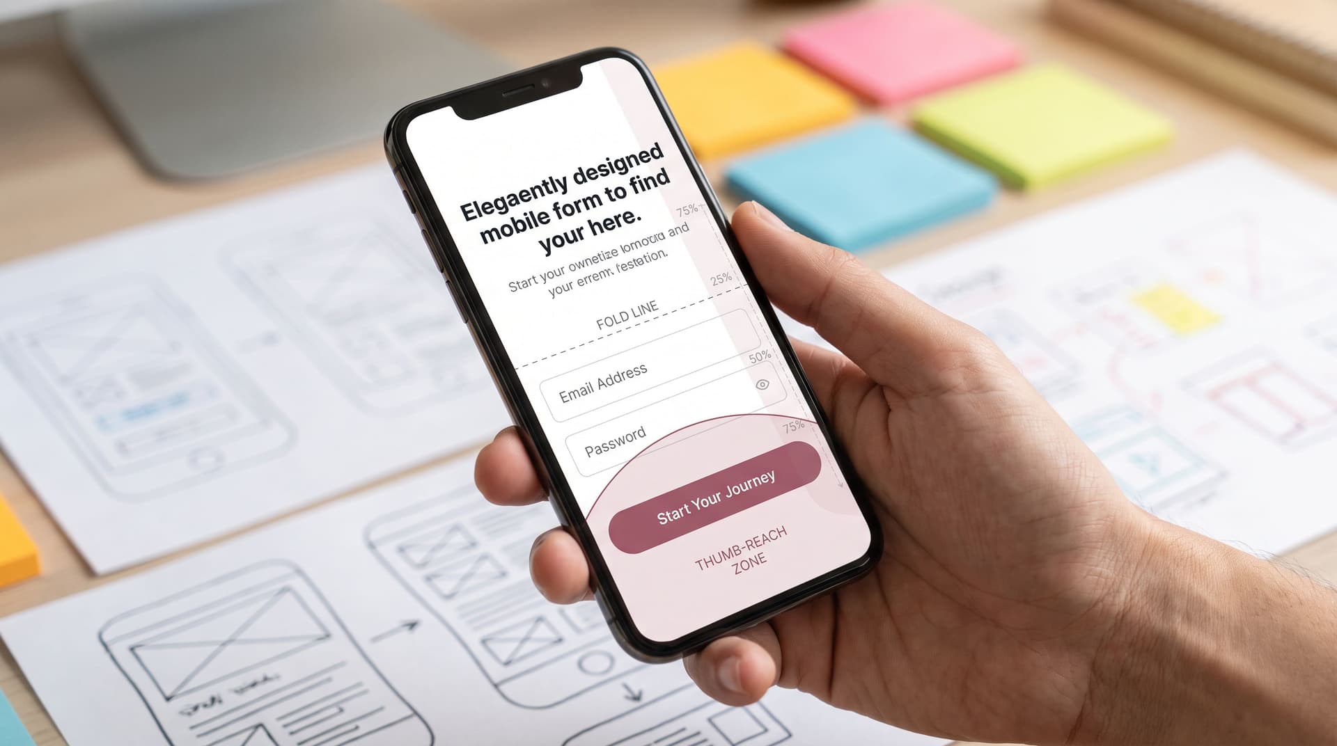
Most teams think about “responsive” as a checkbox: the form technically resizes on a phone, so it must be fine.
But responsiveness isn’t a media query. It’s a set of decisions about what shows up first, what’s easy to reach, and when people decide to keep going or bail out.
This post is about treating that layout as a product decision, not a side effect of your CSS. We’ll look at three core concepts:
- The fold – what people see before they scroll
- The thumb zone – what they can comfortably reach
- Scroll depth – how far they actually go
And then we’ll turn those into concrete patterns you can use in any form—especially when you’re building with tools like Ezpa.ge, where themes, layouts, and Google Sheets syncing give you room to experiment without touching code.
Why this level of detail matters for forms
Form UX is where intent turns into data. Every extra bit of friction shows up as:
- Lower completion rates
- Sloppier answers
- More partial submissions and drop-offs
Industry benchmarks vary by use case, but multiple studies put average form abandonment around 60–80% for longer or more complex forms. Small layout changes—like moving a primary button into the natural thumb zone or shortening the first screen—can change completion by double digits.
When you design for fold, thumb zone, and scroll depth, you get:
- Higher completion – people see the right cues early and feel like the form is manageable.
- Better data quality – fewer rushed, last-minute answers and more focus on the questions that matter.
- More trust – a layout that feels intentional signals that you respect people’s time and attention.
If you’ve already explored conditional flows (see One Form, Many Journeys) or mobile patterns (see Mobile-First Forms in a Desktop-Designed World), this is the next layer down: shaping how the form feels, not just what it asks.
The fold: designing the first screen like a pitch
The fold is the bottom edge of the initial viewport—the line between what’s visible on load and what requires a scroll.
On a phone, that first screen is tiny. You might only get:
- A short headline
- 1–3 form fields
- A primary button or progress indicator
Yet that first impression does three jobs:
- Explain why this form is worth finishing
- Set expectations for length and effort
- Make the first action feel easy
What belongs above the fold
Think of the first screen as a mini-landing page for your form. It should answer three questions instantly:
-
What is this?
- A clear title or sentence: “Apply for early access,” “Request a demo,” “Share event feedback.”
-
Why should I care?
- One line of value: “Get a tailored walkthrough in under 24 hours,” “Help us improve your next visit in 2 minutes.”
-
How much work is this going to be?
- A short progress cue: “Step 1 of 3,” “Approx. 2 minutes,” or a compact progress bar.
After that, you want the easiest possible first interaction:
- A single, low-friction field (email, name, or a simple multiple choice)
- Or a Start button that leads into step 1, if your form needs more framing
Common fold mistakes (and how to fix them)
1. Stuffing everything above the fold
Trying to cram the whole form onto the first screen makes it feel heavy.
Fix:
- Limit the first screen to 1–3 fields for most use cases.
- Push secondary content (fine print, long descriptions) below the fold or into an expandable section.
2. Hiding the commitment
If people can’t tell how long the form is, they assume the worst.
Fix:
- Add lightweight length indicators: “3 short steps,” a progress bar, or even “Takes ~2 minutes.”
3. Leading with the hardest question
Starting with a complex or sensitive field (budget, SSN, legal consents) is a fast way to spike abandonment.
Fix:
- Use the first screen to build momentum: start with easy, non-threatening fields.
- Save high-friction questions for later, when people have already invested effort.
With Ezpa.ge, you can tune this quickly: reorder fields, split into steps, and change copy without touching code. If you’re using AI to generate field sets (see AI as Your Form Architect), treat the first screen as a separate pass—optimize it like a mini-landing page.
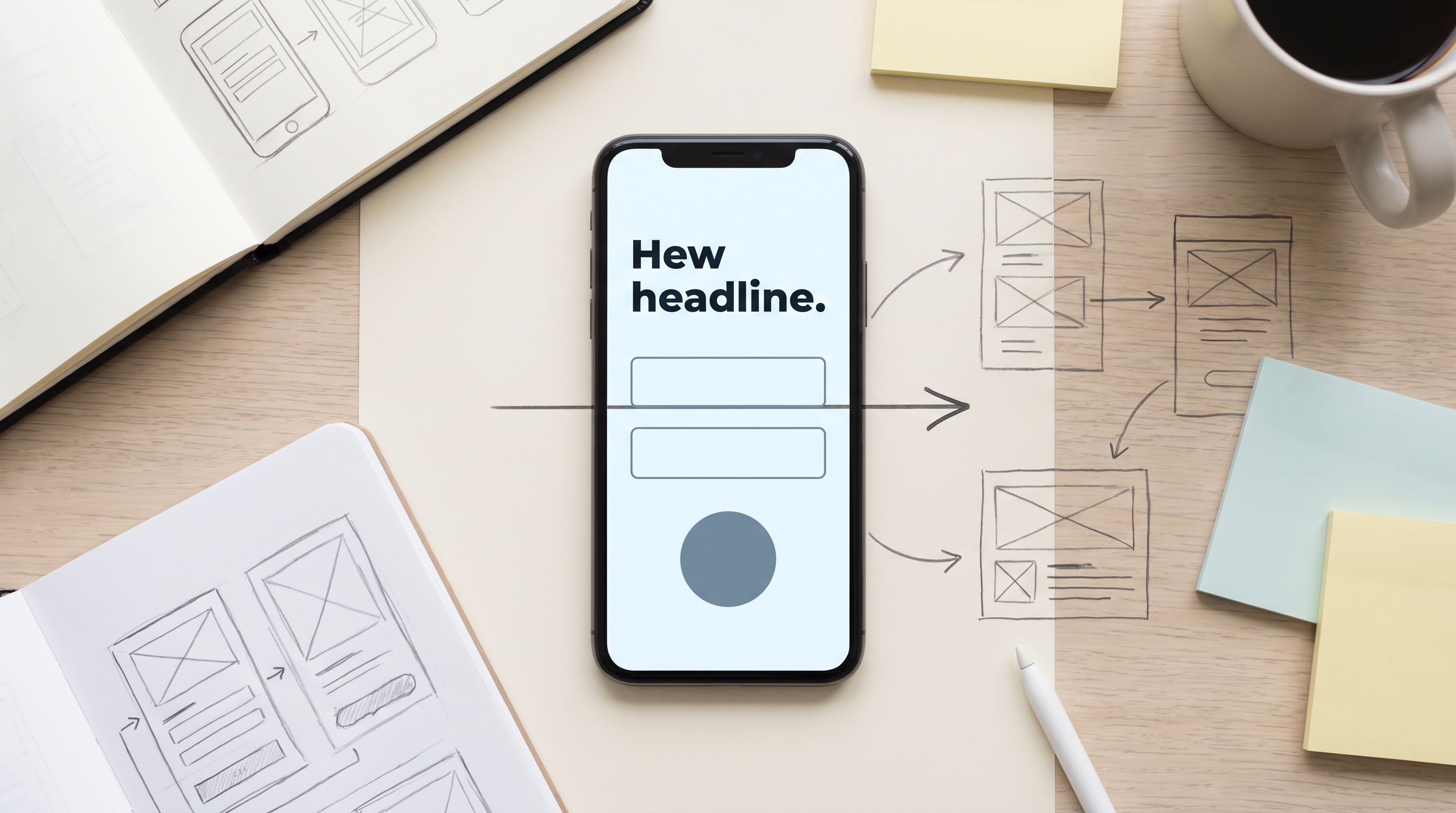
The thumb zone: design for one-handed use by default
On mobile, most people hold their phone in one hand and use their thumb. Multiple usability studies have mapped a “thumb zone”: an area that’s comfortable to reach without stretching.
What this means for your form:
- Primary actions should live in the easy zone.
- Destructive or secondary actions (Cancel, Reset) should live in harder-to-reach areas.
- Critical info shouldn’t be hidden under the keyboard.
Key thumb-zone patterns for forms
1. Anchor primary actions to the bottom
Instead of placing the main button at the top or floating in the middle:
- Use a sticky bottom bar for primary actions on long steps:
- “Next” / “Continue”
- “Submit”
- “Save and exit” (if that’s the main intent)
This keeps the action within the natural thumb zone, even as people scroll through fields.
2. Separate primary and secondary actions clearly
Avoid clustering buttons like Submit and Cancel right next to each other.
- Make the primary action:
- Visually dominant (solid color, strong label)
- Located in the easiest reach area
- Move secondary actions to:
- A link above the button
- A less prominent area (top corner, smaller text)
3. Design with the keyboard in mind
On mobile, the keyboard can cover 40–50% of the screen. If your Next or Submit button sits just above the bottom, it may be hidden.
- Add in-keyboard actions when possible (e.g., “Next” on the keyboard for single-field steps).
- Ensure there’s visible affordance that more content or the button exists—e.g., a partially visible button peeking above the keyboard, or a sticky bar that stays pinned.
4. Respect tap target sizes
Tiny checkboxes and radio buttons are a thumb’s worst enemy.
- Follow platform guidelines (roughly 44–48px minimum tap target height).
- Increase spacing between interactive elements to avoid accidental taps.
If you’re using Ezpa.ge themes, this is where a “mobile-first” theme pays off. Instead of shrinking desktop styles, pick or customize a theme that:
- Uses large tap targets and generous spacing
- Anchors buttons to the bottom on mobile
- Keeps labels and help text readable without zooming
For a deeper dive into these patterns, the post on Mobile-First Forms in a Desktop-Designed World unpacks thumb zones, keyboards, and tap targets in more detail.
Scroll depth: shaping the journey, not just the page length
People don’t scroll endlessly through forms. They pause, scan, and decide whether to continue.
Scroll depth—how far people get before they stop—is one of your most useful signals. It tells you:
- Where friction spikes
- Which sections feel optional or confusing
- Where to place reassurance, microcopy, or progress cues
Make each scroll feel like progress
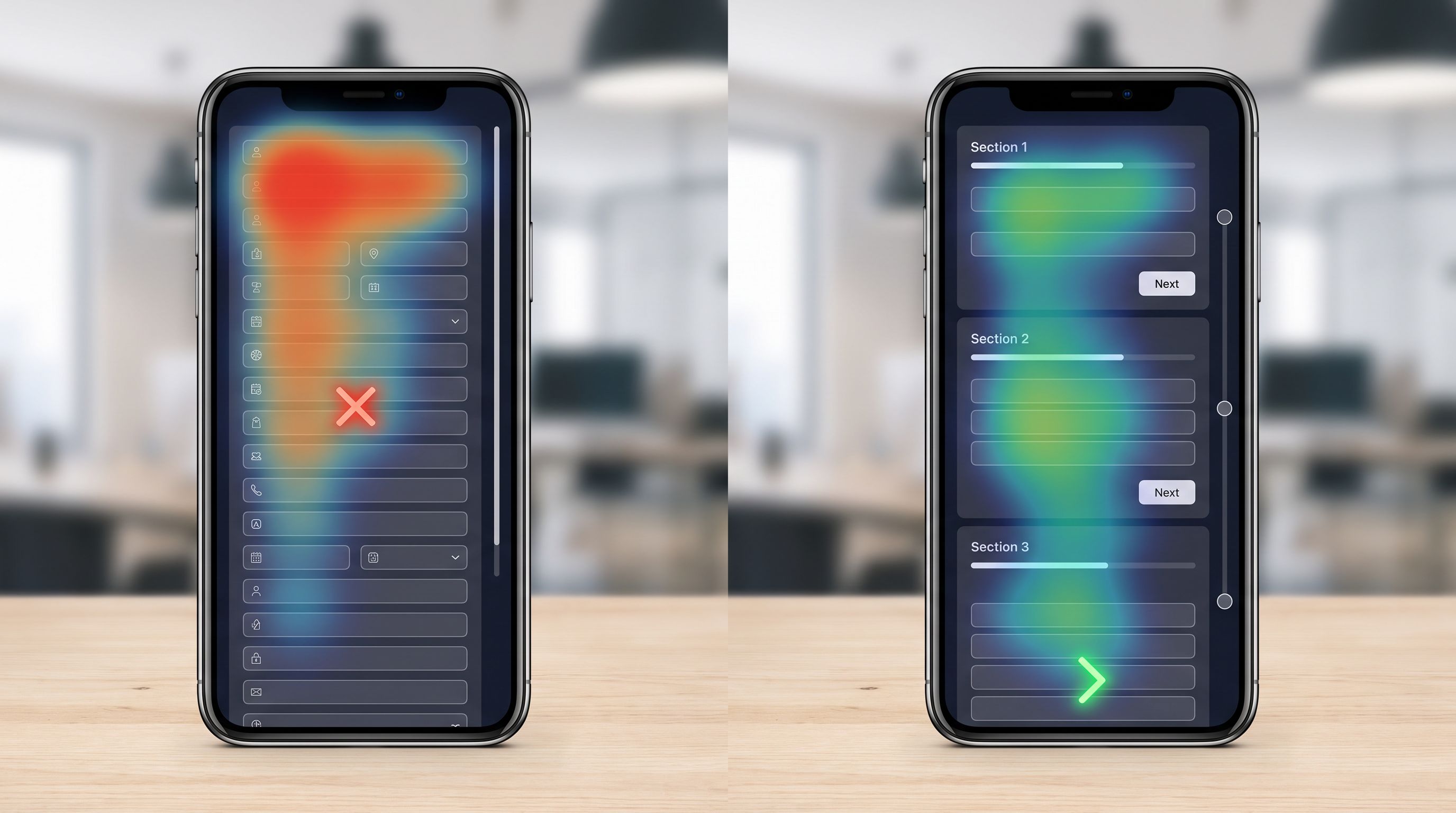
A long, unstructured form feels like a wall of work. A long form with clear sections and milestones feels manageable.
1. Chunk by intent, not by field type
Instead of grouping by data type (all contact info, all preferences, all consents), group by what the user is trying to accomplish.
Examples:
- "About you" → basic identity and contact details
- "What you’re looking for" → goals, preferences, or use case
- "Final details" → consents, legal, or optional extras
Each chunk should:
- Fit within one to two screens of scroll on mobile
- Have a short, descriptive subheading
- End with a clear sense of completion (e.g., a line like “That’s it for your preferences”).
2. Use progressive disclosure for heavy content
If you have long explanations or optional sections:
- Hide them behind expandable accordions or “Learn more” links.
- Keep the main path short and scannable.
This reduces perceived length without removing important context for those who need it.
3. Place reassurance at key depth milestones
As people scroll, strategically add moments of reassurance:
- Midway: “You’re halfway there—just a few more details.”
- Before sensitive fields: “We only ask this to match you with the right plan. It won’t be shared with third parties.”
For high-stakes flows (loans, admissions, compliance) this kind of depth-aware reassurance is vital. The post on Forms for High-Stakes Decisions covers additional patterns for balancing risk, regulation, and drop-off.
Turning theory into a concrete layout checklist
Let’s turn all of this into a checklist you can apply to any form—especially if you’re building in Ezpa.ge and can iterate quickly.
1. Start with the first screen
Before touching the rest of the form, ask:
- Is the purpose obvious in one line?
- Is there a clear value statement?
- Can someone see how big the commitment is? (steps, time estimate)
- Is the first action low-friction? (easy field or “Start” button)
If the answer is no to any of these, fix the first screen before optimizing anything else.
2. Map primary actions to the thumb zone
On mobile previews:
- Where do your main buttons sit when the keyboard is open?
- Can someone tap Next/Submit with one thumb without stretching?
- Are secondary or destructive actions clearly separated?
Adjust your theme or layout so that:
- Primary actions are in a sticky bottom bar or comfortably low on the screen.
- Secondary actions are visually and spatially distinct.
3. Audit scroll depth and chunking
Walk through the form on a phone and count screens of scroll per section.
Aim for:
- 1–2 screens per logical section
- Clear subheadings that describe what each section is about
- Short, skimmable labels and help text
If a single section takes more than two full scrolls:
- Split it into two steps, or
- Use expandable details to hide nonessential text
4. Place reassurance where drop-off is likely
Look for:
- Sensitive fields (income, health, legal consents)
- Big text blocks (terms, disclosures)
- Jumps in effort (suddenly longer text answers after short multiple choice)
Add:
- Short explanations about why you’re asking
- Links to privacy or data handling details
- Microcopy that reduces anxiety (“You can update this later,” “This won’t affect your credit score,” etc.)
If you’re syncing responses into Google Sheets with Ezpa.ge, you can pair this with behavioral analysis: look at partial submissions and where people stop. The post on Signals in Partial Submits walks through how to use those drop-offs as design feedback.
5. Test on real devices, not just responsive previews
Responsive previews are helpful, but they can hide real-world issues:
- Keyboard overlap
- Thumb reach on larger phones
- Glare, one-handed grip, or rushed contexts
Run a quick test:
- Open the form on two different phones (small and large).
- Hold each phone in one hand and try to complete the form without changing your grip.
- Note:
- Where you have to stretch
- Where you have to pause to understand
- Where you feel unsure about how much is left
Use these notes to adjust:
- Button placement
- Section breaks
- Copy and microcopy around sensitive or complex areas
Using Ezpa.ge to operationalize intentional responsiveness
Ezpa.ge gives you building blocks that make this kind of intentional design much easier to maintain over time:
- Themes – so you can bake thumb-zone-aware buttons and generous tap targets into your default look.
- Custom URLs – so you can create different entry points (and first screens) for different audiences without cloning entire forms.
- Real-time Google Sheets syncing – so you can correlate drop-offs and partial submissions with specific sections or fields, then iterate.
Combine that with the patterns above and you get a workflow like this:
- Draft the form structure (fields, logic, steps).
- Design the first screen as a mini-landing page.
- Tune the theme for thumb zones and keyboards.
- Chunk content based on scroll depth, adding progress cues and reassurance.
- Watch partials and completion rates in Sheets, then adjust sections where people stall.
Over time, your forms stop being “responsive by accident” and start feeling like they were designed for the exact way people hold, scroll, and decide.
Wrapping up
When you design forms for fold, thumb zone, and scroll depth, you’re not just making them look good on smaller screens. You’re:
- Respecting the first impression by treating the first screen as a pitch.
- Respecting the body by making primary actions easy to reach with one hand.
- Respecting attention by structuring the journey into clear, reassuring chunks.
Those are product decisions, not just layout tweaks. They shape whether people finish, how they feel while doing it, and how much they trust you with their data.
Your next move
Pick one high-impact form—maybe your main signup, demo request, or onboarding intake.
This week:
- Rewrite the first screen so it clearly states what the form is, why it matters, and how long it takes.
- Move your primary button into the thumb zone on mobile (sticky bottom bar if possible).
- Split any section that takes more than two screens of scroll into smaller, clearly labeled chunks.
If you’re using Ezpa.ge, you can do all three in minutes. Open your form, tweak the theme and layout, and watch what happens to completion rates once your forms are responsive by intention—not just by accident.
Your users are already telling you how they want to interact—with their thumbs, in short bursts, on small screens. Your forms just need to meet them there.