Security Without Paranoia: Low-Friction Patterns for Collecting Sensitive Data in Forms


Security Without Paranoia: Low-Friction Patterns for Collecting Sensitive Data in Forms
Collecting sensitive data is a trust exercise.
Credit card details, government IDs, health history, salary information—these aren’t just “fields.” They’re moments where a person decides whether your form (and by extension, your brand) is worth the risk.
The tension:
- Security and compliance teams want strong controls, explicit consent, and airtight logs.
- Growth and product teams want short forms, high completion rates, and smooth flows.
- Users want to get something done quickly without feeling like they’re stepping into a legal contract or a phishing attempt.
This post is about operating in that middle space: security without paranoia. You’ll learn how to design forms that handle sensitive data with rigor and ease—so users feel safe, not spooked.
We’ll focus on patterns you can implement right away, especially if you’re using Ezpa.ge with real-time Google Sheets syncing as your backend.
Why Sensitive Forms Fail (Even When They’re “Secure Enough”)
Most teams think about sensitive-data forms in terms of technical security:
- Is the connection encrypted (HTTPS)?
- Is data stored in an encrypted database?
- Do we have access controls, audit logs, backups?
All of that matters. But users can’t see any of it.
What users do see:
- A long, dense page of fields with tiny labels
- A generic or sketchy URL that doesn’t match your brand
- Legalese crammed into unreadable blocks
- Confusing questions like “Mother’s maiden name” with no explanation
- Aggressive validation errors that feel accusatory
The result is predictable:
- Abandonment right before the most important fields
- Fake or partial data (“123-45-6789” SSNs, placeholder phone numbers)
- Support tickets asking, “Is this legit?”
Security that users don’t trust isn’t really security. It just moves the risk somewhere else—into workarounds, shadow workflows, and manual exceptions.
If that sounds familiar, you’ll probably also appreciate how we approach high-risk flows in High-Stakes, Low Friction: Designing Verification and Consent Flows That Users Actually Finish.
Principle 1: Make the Stakes Explicit, Early
People are more willing to share sensitive data when they understand why it’s needed and what they get in return.
Instead of surprising users with high-stakes questions halfway through, front-load clarity.
What to do
-
Set expectations before the first field.
- Briefly explain what you’ll ask for and why.
- Example: “This form will ask for your ID and proof of address so we can verify your account and comply with financial regulations.”
-
Tie each sensitive field to a benefit.
- Next to a salary field: “We use this to benchmark fair compensation and ensure your offer is competitive.”
- Next to a health history field: “These details help your clinician recommend safe, appropriate treatment options.”
-
Clarify what’s optional vs. required—and why.
- “Optional, but helps us prioritize your request.”
- “Required so we can verify your identity and protect your account.”
-
Avoid vague catch-all justifications.
- Bad: “We need this for security.”
- Better: “We use this to verify it’s really you before we approve large withdrawals.”
This isn’t just UX nicety; it’s a low-friction way to align with privacy-by-design principles and reduce your legal risk.
Principle 2: Reduce the Surface Area of Sensitive Data
The safest data is the data you never collect.
Before you add a sensitive field, ask:
- Can we infer this from behavior or context instead?
- Can we collect this later, when trust is higher?
- Can we reduce the precision? (e.g., age range instead of birthdate)
Practical reduction tactics
-
Replace raw identifiers with tokens.
- Use a verification link or one-time code instead of asking users to re-enter full account numbers.
-
Collect in stages.
- Start with low-risk details (name, email, basic intent).
- Only ask for SSNs, full medical history, or financial documents once the user has a clear reason to continue.
- This staged approach pairs well with the ideas in Signup, Intake, or Survey? Choosing the Right Form Pattern for Your Product Use Case.
-
Use ranges and categories.
- Income: ranges instead of exact numbers.
- Date of birth: month/year if exact day isn’t strictly needed.
-
Avoid “just in case” fields.
- If your team can’t articulate a specific workflow that uses a field, don’t collect it—especially if it’s sensitive.
This doesn’t just protect users; it shrinks your compliance surface and makes incident response simpler.

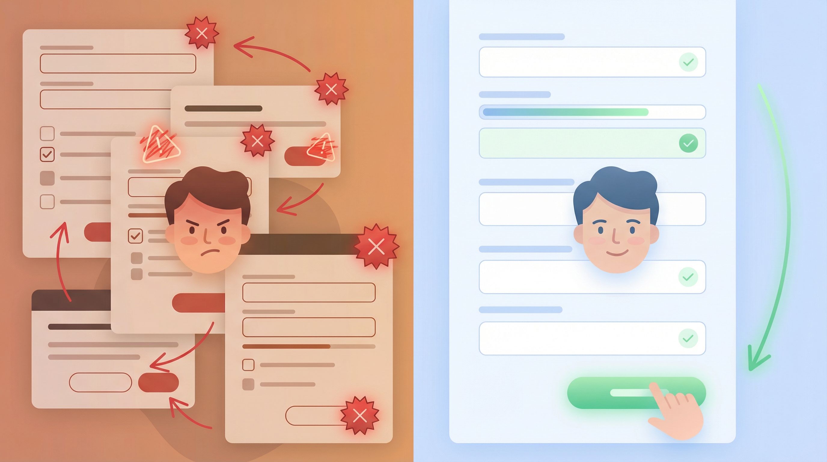
Principle 3: Design Calm, Trustworthy Visuals
Visual design is your first security signal.
A form can be technically perfect and still feel unsafe if it looks sloppy or off-brand. Conversely, a well-designed form with consistent branding, readable text, and clear hierarchy builds confidence before a single field is filled.
Visual trust checklist
-
Consistent branding and URL.
- Use custom domains or URLs that clearly map back to your organization.
- Align colors, typography, and logo usage with your main site.
-
Minimal, focused layouts.
- Group related sensitive fields in clearly labeled sections (e.g., “Identity Verification,” “Payment Details”).
- Avoid clutter—extra buttons, banners, or unrelated content add anxiety.
-
Readable, human-scale typography.
- Use sufficient font size and contrast.
- Keep line lengths short for explanations and consent copy.
-
Progress indicators for longer flows.
- Show where users are and how much is left.
- Consider a dedicated step for “Review & Confirm” so the final decision feels deliberate, not rushed.
Tools like Ezpa.ge make this easier with adaptive themes that stay consistent across devices, which we dive into more in Adaptive Form Themes: Designing One Look That Automatically Fits Any Device.
Principle 4: Use Microcopy as a Safety Net, Not a Scare Tactic
Security language often swings between two extremes:
- Too vague: “We care about your privacy.” (Okay… but how?)
- Too intense: Huge blocks of legal text and warnings that feel like you’re signing a mortgage.
The sweet spot is brief, specific, and reassuring.
Where microcopy matters most
-
Inline field help
- Explain why you’re asking for something and how it’s handled.
- Example: “We’ll use this ID photo only to verify your identity. It’s encrypted at rest and never shared with advertisers.”
-
Error messages
- Avoid blame: “That doesn’t look like a valid ID number” beats “Invalid input.”
- Give clear next steps: “Double-check the last 4 digits. If you don’t have them, contact support at …”
-
Consent and disclosures
- Summarize the key point in plain language before (or above) the legal text.
- Example: “By checking this box, you agree we can run a soft credit check. This won’t affect your credit score.”
-
Reassurance near high-friction fields
- Add a one-line reassurance near fields that cause anxiety.
- Example: “We’ll never show your salary to other candidates or employers.”
Thoughtful microcopy is a low-cost, high-impact way to reduce abandonment without weakening your legal posture.
Principle 5: Validate with Care—Guardrails, Not Roadblocks
Validation is where security and UX most often collide.
Overly strict or opaque validation:
- Frustrates legitimate users
- Encourages workarounds (fake phone numbers, junk SSNs)
- Increases support burden
But loose validation:
- Lets junk or malicious data into your systems
- Creates compliance and reporting headaches later
The goal is guardrails that feel helpful, not hostile.
Practical validation patterns
-
Validate early, but gently.
- Use inline validation as users type, with clear explanations.
- Example: “Card number should be 16 digits” instead of “Error code 402.”
-
Separate format from content.
- First, check that the field looks structurally valid (e.g., date format, Luhn check for cards).
- Only then, if needed, check against deeper rules (e.g., age restrictions, region-specific IDs).
-
Offer alternatives when possible.
- If a user’s ID type isn’t accepted, offer a fallback: “No driver’s license? Upload a passport or national ID instead.”
-
Use Sheets as a validation brain.
- With Ezpa.ge syncing into Google Sheets, you can:
- Flag risky or incomplete submissions in real time
- Normalize formats (phone numbers, addresses)
- Trigger manual review workflows for edge cases
- For a deeper dive, see Real-Time Guardrails: Using Google Sheets Logic to Auto-Clean and Validate Form Data.
- With Ezpa.ge syncing into Google Sheets, you can:
Done well, validation becomes a quiet partner: catching mistakes, guiding users, and protecting your systems without turning the form into a fight.
Principle 6: Give Users Control Over Their Data
Control is a powerful antidote to paranoia.
When users feel they can see, correct, and revoke their data, they’re more willing to share it in the first place.
Lightweight control mechanisms
-
Review step before submission.
- Let users see all sensitive fields in one place.
- Highlight anything that’s legally binding (e.g., consent to terms, authorization for background checks).
-
Edit access after submission.
- For some workflows, allow limited post-submission edits (e.g., updating contact info, correcting typos) without restarting the entire process.
-
Clear instructions for corrections and deletion.
- If post-submission edits aren’t possible, clearly explain how to request changes or deletion.
- Example: “To correct your information or request deletion, email privacy@company.com with the subject ‘Data Request’.”
-
Download or export options where appropriate.
- For high-stakes applications (loans, healthcare intake, hiring), consider offering a simple “Download a copy of your responses” option.
These patterns also help you align with privacy regulations without making the form itself feel like a legal gauntlet.
Principle 7: Connect Security to Workflow, Not Just Storage
Security doesn’t end at submission.
If your form feeds into:
- Ad-hoc email threads
- Unsecured spreadsheets shared broadly
- Manual copy-paste into other tools
…then the weakest link in your chain is probably after the form, not inside it.
How to keep workflows safe and sane
-
Use a single, structured destination.
- Sync submissions into one well-structured Google Sheet with proper access controls.
- Avoid multiple “final_v7” copies floating around.
-
Minimize who can see sensitive fields.
- Use separate tabs, filtered views, or access rules so only the right people see high-risk data.
-
Automate routing instead of forwarding.
- Trigger notifications or workflows based on form responses instead of forwarding raw data via email or chat.
- This is where the approach in From Form to Workflow: Automating Onboarding, Support, and QA with Ezpa.ge + Google Sheets really shines.
-
Log access and changes.
- Rely on tools that give you version history and access logs so you can answer “who saw what, when” if you ever need to.
When your workflow is as intentional as your form design, you reduce both security risk and operational chaos.
Putting It All Together: A Low-Friction Sensitive Form Blueprint
To make this concrete, here’s a simple checklist you can use for any high-stakes form—payments, healthcare intake, hiring, financial applications, and more.
Before you build
- [ ] List every sensitive field and justify it: why do we need this, and when?
- [ ] Decide what can be collected later or at lower precision.
- [ ] Map where the data goes after submission and who needs to see it.
While you design
- [ ] Use a trustworthy URL and consistent branding.
- [ ] Add a short intro explaining what you’ll ask for and why.
- [ ] Group sensitive fields into clearly labeled sections.
- [ ] Add inline explanations for any field that could trigger anxiety.
- [ ] Design validation that’s specific, kind, and helpful.
While you implement
- [ ] Ensure HTTPS and secure storage are in place by default.
- [ ] Sync responses into a single, access-controlled Sheet or database.
- [ ] Use formulas or scripts to flag risky or incomplete submissions.
- [ ] Set up notifications or automations instead of manual forwarding.
After launch
- [ ] Monitor completion and abandonment around sensitive fields.
- [ ] Review support tickets for confusion or fear signals.
- [ ] Iterate copy, layout, and validation before adding more fields.
You don’t need a massive compliance project to start. Small, deliberate changes in how you ask for and handle sensitive information can dramatically improve both security and completion rates.
Recap: Security Without Paranoia
When you ask for sensitive data, you’re asking users to take a risk.
You earn that risk by:
- Being explicit about what you’re collecting and why
- Reducing the amount and precision of sensitive data whenever possible
- Designing calm, trustworthy visuals and clear microcopy
- Using validation as a guardrail, not a gatekeeper
- Giving users meaningful control over their data
- Treating the workflow after submission as part of your security story
Do those things well, and your forms stop feeling like interrogation rooms and start feeling like what they should be: clean, confident pathways to outcomes users actually want.
Your Next Step
If you’re responsible for any form that touches sensitive data—payments, onboarding, intake, verification—pick one live form and run it through the blueprint above.
- Remove a field you don’t truly need.
- Add one line of microcopy to your riskiest question.
- Tighten where that data goes in Google Sheets and who can see it.
If you’re using Ezpa.ge, you can do most of this in an afternoon: update your theme for trust, adjust your fields and copy, and wire submissions into a structured Sheet that powers secure, automated workflows.
Security doesn’t have to feel like saying “no” to users.
Done right, it’s how you give them the confidence to say “yes.”