The Form-Led Rebrand: How Themes, Copy, and Custom URLs Signal a New Product Story

Most teams think of a rebrand as a new logo, a fresh color palette, and maybe a big launch day.
But if you look at how people actually experience your product, the story starts somewhere much smaller—and much closer to intent:
Your forms.
Signup forms. Waitlist forms. Demo requests. Feedback flows. These are the moments where someone is raising their hand and saying, “I’m interested.” If your rebrand doesn’t show up there, it doesn’t really exist.
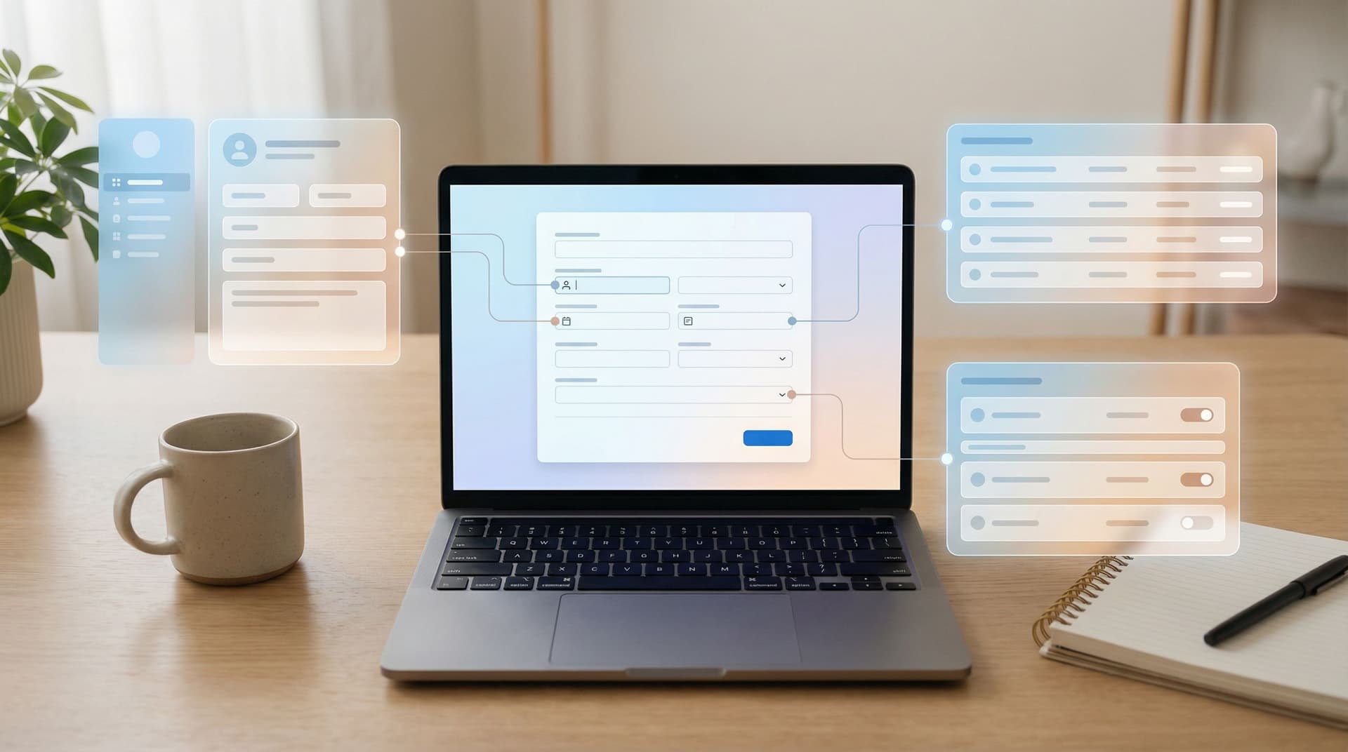
A form-led rebrand is about using three levers you already control—themes, copy, and custom URLs—to tell a sharper product story long before you redesign every page or rebuild every flow.
Done well, your forms become:
- The clearest expression of who you are and what you promise
- A low-risk lab for testing new positioning and visual directions
- A bridge between your old brand and your next chapter
This post walks through how to do exactly that with practical patterns you can ship quickly—especially if you’re using a tool like Ezpa.ge, where themes, custom URLs, and Google Sheets syncing are already built in.
Why Forms Are the First Place Your Rebrand Should Show Up
Rebrands often start with a deck and end with a press release. But the real test is much simpler:
When someone fills out a form from your company, do they immediately understand what you’re about now—not last year?
There are a few reasons forms are such a powerful place to express a new story:
-
Forms sit at the point of commitment.
When someone is ready to sign up, request access, or give feedback, they’re paying attention. They’re scanning your words, your URL, your visual cues. Small changes here land with outsized impact. -
Forms are cheaper to change than full flows.
Updating a form theme or headline is a lot faster than rebuilding a marketing site or in-app onboarding. You can iterate quickly, then roll proven patterns into the rest of your stack. -
Forms are measurable.
You can see how a new story performs—conversion rate, completion time, drop-off—without guessing. A form-led rebrand is inherently testable. -
Forms touch every team.
Sales, product, marketing, support, and ops all rely on forms. Aligning them on a new story through shared form patterns is one of the fastest ways to make the rebrand feel real internally.
If you’ve already experimented with concepts like form-first launches, you’ve seen this in action: a simple form often becomes the first place a new idea takes shape.
The Three Levers of a Form-Led Rebrand
A form-led rebrand uses three main ingredients:
- Themes – Colors, typography, spacing, and visual rhythm
- Copy – Headlines, helper text, microcopy, button labels
- Custom URLs – The link itself as a brand statement and routing tool
Each one carries its own kind of signal. Together, they create a cohesive story.
Let’s break down how to use each one deliberately.
1. Themes: Turning Visual Direction into a Reusable System
Your theme is the quickest way to make a form feel like it belongs to your new brand—even if the rest of your site hasn’t caught up yet.
Think beyond “make it pretty.” A strong theme encodes your product story into:
- Color choices (calm vs energetic, playful vs serious)
- Typography (friendly vs technical, large vs compact)
- Density and spacing (airy and focused vs data-dense and power-user oriented)
- Emphasis (what gets color, what stays neutral, where the eye is drawn)
How to design a story-driven theme
When you’re refreshing your brand, ask:
- What should someone feel at the start of this form?
Reassured? Energized? Curious? Urgent? - What’s the single most important action here?
Submitting a request? Selecting a plan? Choosing a use case? - What’s the risk level?
Is this a casual newsletter signup or a high-stakes consent flow?
Then translate those answers into specific theme decisions:
- For trust-heavy flows (payments, healthcare, hiring):
- Softer colors, generous whitespace, minimal distractions
- Clear, high-contrast labels and error states
- Subtle brand accents instead of aggressive gradients
- For growth-focused flows (waitlists, promos, early access):
- Bolder accent colors on CTAs
- Strong hierarchy: one hero headline, one primary button
- Progress indicators that make the flow feel quick, not endless
If you’re running multiple brands or product lines, this is where a shared system shines. The patterns in Multi-Brand, One Form System map directly to rebrands: you define a small set of reusable themes and roll them out across forms instead of one-off redesigns.
Practical steps
-
Create 2–3 theme variants, not 20.
- Example: “Core Product,” “Enterprise,” and “Labs/Experimental.”
- Map each form to one of these based on its purpose.
-
Align theme tokens with your new brand guidelines.
- Use the same primary/secondary colors, typography, and border-radius language your design team is defining elsewhere.
-
Test themes on your highest-traffic forms first.
- Signup, demo request, and core feedback forms are your best early candidates.
-
Lock in patterns that work.
- Once you see improved completion or fewer support questions, codify that theme as the default for similar flows.
2. Copy: Making Your New Story Concrete in 10–20 Words
If themes set the mood, copy sets the meaning.
Your form copy is often the first place your new positioning gets boiled down into a single sentence. That’s a feature, not a bug.
Where copy matters most in a rebrand
Focus on the moments users actually read carefully:
- Form title & subtitle
The clearest place to state your new promise. - Section headers
How you group questions signals what you care about. - Field labels & helper text
Show how you talk about your product, your users, and their context. - Error messages
A huge opportunity to express tone—supportive vs scolding. - Buttons & confirmation states
The last words someone sees before and after committing.
Turn positioning into form copy
Start from your new product story:
- Who is this for now?
- What outcome are you promising?
- What’s changed from the old story?
Then reflect that directly in your forms by:
-
Renaming the form to match the new narrative.
- From: “Request a Demo”
- To: “Talk with a Specialist About Your Workflow” or “Design Your First Automation with Us”
-
Reframing sections around user outcomes, not your org chart.
- From: “Marketing Details,” “Technical Details”
- To: “What You’re Trying to Achieve,” “How Your Team Works Today”
-
Writing helper text that anticipates hesitation.
- Example: Under a budget field: “A ballpark range is fine—this helps us suggest the right plan.”
-
Making microcopy do real work.
- Replace “Submit” with “Get My Plan” or “Join the Pilot” where appropriate.
- Use confirmation copy to restate the promise: “We’ll review and respond within 1 business day with a tailored setup plan.”
A simple copy audit for rebrands
Take your top 3–5 forms and run them through this lens:
-
Does the headline use your new language?
If your product is moving from “tool” to “platform,” does the form still say “Sign up for our tool”? -
Are you asking questions that belong to the old story?
If you’re shifting to self-serve, why are you still asking for “Team Size” before someone can try the product? -
Do your tone and stakes match?
High-stakes flows deserve calm, clear, rigorous language. For patterns, see Form UX for High-Stakes Data.
Revamping copy is also a safe way to test new positioning. With Ezpa.ge forms synced to Google Sheets, you can A/B test headlines or field explanations and watch how they affect completion and lead quality—without waiting on a full site rewrite.
3. Custom URLs: Links as Story, Not Just Plumbing
A URL is more than a way to get to a form. It’s a tiny piece of messaging that shows up in:
- Browser address bars
- Chat shares and DMs
- QR codes and offline materials
- Analytics and routing rules
Custom URLs are especially powerful during a rebrand because they:
- Reinforce the new name or product framing
- Segment audiences by story (e.g.,
/founders,/enterprise,/partners) - Make experimentation easier without new landing pages
If you’ve explored the patterns in URL-First Campaigns, you already know how much mileage you can get from smart URL design.
How to use custom URLs to support a new story
-
Align URLs with your new product architecture.
- Example: You’re moving from a single product to a suite.
/signupbecomes/workspace-signup/enterprise-demobecomes/platform-consult/betabecomes/labs-signup
- Example: You’re moving from a single product to a suite.
-
Create audience-specific URLs that mirror your new ICPs.
/founders-waitlist,/ops-teams-intake,/agencies-partner-form
Each URL can point to the same base form with slight theme or copy variations.
-
Use URLs to track old vs new story performance.
- Run the “legacy” narrative at
/request-demoand the new narrative at/design-session. - Compare completion and downstream conversion using your Google Sheets data.
- Run the “legacy” narrative at
-
Avoid cryptic or internal names.
- Replace
/q4_form_v3with something a human would recognize:/customer-feedbackor/upgrade-request.
- Replace
Technical hygiene during a rebrand
-
Redirect legacy URLs gracefully.
If you’re changing slugs, set up redirects so old links don’t die. This is especially important if you’ve shared form links in campaigns, docs, or partner materials. -
Standardize naming conventions.
- Use clear patterns like
/product-signup,/product-feedback,/product-beta. - Keep channel tracking in query params (
?utm_source=linkedin) rather than in the slug itself.
- Use clear patterns like
-
Document your URL map.
A simple spreadsheet with “Old URL → New URL → Owner → Purpose” prevents chaos as the rebrand rolls out.
Putting It All Together: A Form-Led Rebrand Playbook
Let’s translate this into a concrete sequence you can run over a few weeks—not months.
Step 1: Choose three forms to lead the way
Start where the stakes and visibility are highest:
- Your primary signup or trial form
- Your sales/demo request form
- One high-intent feedback or intake form (e.g., feature request, onboarding intake)
These are the forms most likely to:
- Influence revenue
- Be seen by multiple segments
- Reveal whether the new story resonates
Step 2: Define your “v1 rebrand kit” for forms
For each of the three forms, define:
- Theme: Which of your 2–3 new themes it should use
- Copy: A new headline, subtitle, and button label that reflect your updated positioning
- URL: A clear, on-story slug that matches your new architecture
Keep this lightweight. The goal is to ship a coherent first pass, not a perfect final version.
Step 3: Wire in measurement from day one
Because Ezpa.ge syncs directly to Google Sheets, you can:
- Add columns for source URL, campaign, or segment
- Track which story (old vs new) each submission came from
- Use simple formulas or dashboards to compare performance
If you’re already using patterns from From Form Link to Full Funnel, this step becomes almost trivial—you’re just adding a new slice to your existing funnel views.
Step 4: Run controlled experiments
You don’t need a full-blown experimentation platform to learn quickly. Try:
-
Theme tests:
- Variant A: Calm, trust-heavy theme
- Variant B: High-contrast, energetic theme
Compare completion and drop-off.
-
Copy tests:
- Variant A: Outcome-focused headline
- Variant B: Feature-focused headline
Look at both conversion and lead quality.
-
URL tests:
- Share different custom URLs in different channels
- Keep the underlying form the same, but track which narrative or audience framing pulls better.
Step 5: Roll proven patterns across your form ecosystem
Once you see what works, expand:
- Apply the winning theme to all forms in the same category (e.g., all onboarding flows).
- Use the most effective headline patterns as templates for new forms.
- Standardize URL conventions so every new initiative starts aligned with your brand story.
Over time, this turns into a lightweight design system you can drag-and-drop anywhere. If you want to go deeper on that idea, Atomic Form Patterns is a great next read.
Common Pitfalls (and How to Avoid Them)
As you roll out a form-led rebrand, watch for these traps:
-
Visual refresh without story change
- Symptom: New colors, same confusing questions.
- Fix: Rewrite section headers and helper text to match your new positioning before you touch the palette.
-
Story change without ops alignment
- Symptom: Forms ask new questions, but your spreadsheets and workflows still expect old fields.
- Fix: Update your Google Sheets structure and downstream workflows in parallel so data stays usable. See From Spreadsheet Chaos to Source of Truth for a blueprint.
-
Too many one-off experiments
- Symptom: Every form looks and sounds slightly different, even under the new brand.
- Fix: Promote successful experiments into shared themes and copy templates.
-
Ignoring high-stakes flows
- Symptom: Payment or consent forms still feel like a different company.
- Fix: Prioritize these flows early. They’re where trust is most fragile—and where a cohesive brand matters most.
Quick Checklist for Your Next Rebrand
Before you announce anything, run through this checklist for your top forms:
Theme
- [ ] Uses updated brand colors and typography
- [ ] Matches the emotional tone and risk level of the flow
- [ ] Applies consistently across similar forms
Copy
- [ ] Headline reflects your new positioning in plain language
- [ ] Sections are grouped around user outcomes, not internal teams
- [ ] Helper text answers the “Why are you asking this?” question
- [ ] Button labels describe the outcome, not just “Submit”
Custom URL
- [ ] Slug is human-readable and aligned with new product naming
- [ ] Old URLs redirect cleanly to new ones
- [ ] Audience- or story-specific URLs are documented and tracked
If you can check most of these boxes, your rebrand is already much more real than a new logo on a slide.
Wrapping Up: Your Brand Story Starts at the Form
A rebrand isn’t just what people see on your homepage. It’s what they feel when they’re about to take a step with you.
Forms are where that step happens.
By treating themes, copy, and custom URLs as first-class levers, you can:
- Express your new story where it matters most: at the moment of intent
- Test and refine your positioning before locking it into long-lived assets
- Align product, marketing, and ops around a shared, measurable system
You don’t need a giant redesign project to start. You need a handful of thoughtfully updated forms—and a willingness to learn from how people respond.
Start Your Form-Led Rebrand This Week
Pick one high-impact form. Give it:
- A theme that reflects where your brand is going
- Copy that says, in plain language, what you now stand for
- A custom URL that tells the right story at a glance
Wire it to a Google Sheet, watch the responses, and iterate.
With Ezpa.ge, you can do all of that in an afternoon—no engineering tickets, no rebuilds. Your next chapter doesn’t have to wait for a full redesign. It can start with the very next form you ship.