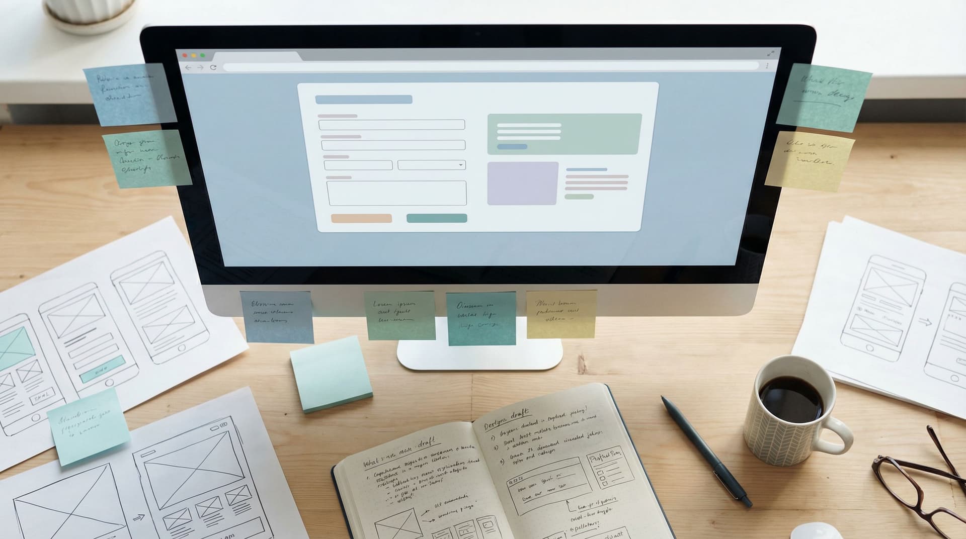
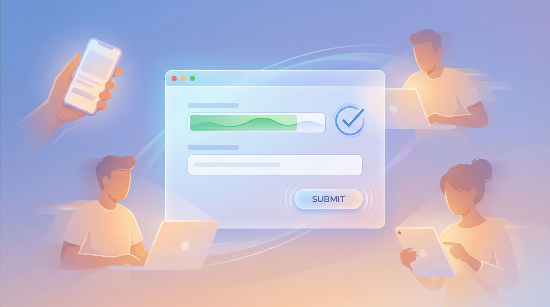
Micro-Animations in Forms: Subtle Motion That Reduces Drop-Off (Not Just Looks Cool)

Most teams treat motion in forms like confetti: a little sprinkle at the end to make things feel “fun.”
Used well, though, micro-animations are a conversion tool, not just decoration. They guide attention, reduce uncertainty, and make every interaction feel smoother—which quietly lowers drop-off.
If you’re already thinking about conversion-first layouts and sharp microcopy, adding purposeful motion is one of the highest-leverage upgrades you can make.
Why Subtle Motion Matters for Form Completion
People abandon forms for a few predictable reasons:
- They’re unsure what to do next
- They’re not sure if something “worked”
- They’re anxious about errors or commitment
- The experience feels clunky or effortful
Micro-animations help on all four fronts.
1. They make the path forward obvious
A tiny nudge can be more powerful than a giant arrow.
Examples:
- A gentle pulse on the primary button when all required fields are valid
- A soft slide-in of the next step in a multi-step form
- A label that glides upward when a field is focused, making space without hiding context
These motions tell the user, “You’re here. Do this next.” That clarity alone reduces hesitation—and hesitation is where drop-off lives.
2. They confirm actions and build confidence
Forms are full of ambiguous moments:
- “Did that click register?”
- “Did my data save?”
- “Did I just break something?”
Micro-animations can answer those questions instantly:
- A button depress + color shift when tapped
- A smooth checkmark draw when validation passes
- A subtle shake or wiggle when something needs attention
These cues pair beautifully with strong microcopy (see Form Microcopy that Converts). Together they communicate: “We heard you, you’re doing it right, keep going.”
3. They make friction feel lighter
You can’t remove every field. Sometimes you need more info, or you’re working with compliance constraints.
What you can do is make each interaction feel less like work:
- Progress bars that fill smoothly, not jump in harsh steps
- Step transitions that fade or slide, not hard-cut
- Error messages that ease in, instead of instantly flashing red walls of text
The task is the same, but the perceived effort is lower.
4. They support your brand and theme system
If you’re already working with a reusable theme system for your forms, micro-animations are a natural extension of that design language. They can:
- Reinforce your brand personality (calm, playful, precise)
- Maintain consistency across campaigns and teams
- Make your Ezpa.ge themes feel like a cohesive product, not one-off skins (for more on that, see Theme Systems, Not One-Off Skins).
Motion becomes part of the system: just as standardized as colors and typography.

Where Micro-Animations Do the Most Work in a Form
You don’t need to animate everything. In fact, you shouldn’t.
Focus on a few high-impact moments where people tend to get confused or drop off.
1. Field focus and input states
These are the micro-moments where someone decides whether to commit to typing.
Helpful motions:
- Focus highlight:
- A 150–200ms border color transition
- Slight glow or background tint
- Label gently moving up and shrinking to a caption above the field
- Typing feedback:
- Cursor and text appear instantly (no delay here)
- Optional: a tiny, almost imperceptible easing when characters appear in password strength meters or character counters
Best practices:
- Keep focus states high contrast for accessibility
- Avoid big jumps; use short ease-in-out transitions
- Don’t move the field itself—move supporting elements (labels, shadows, borders)
2. Inline validation and errors
Validation is where many forms quietly lose people. Sudden red text and layout shifts can feel like a slap on the wrist.
Micro-animations can make the same feedback feel supportive instead of punitive.
Use motion to:
- Reveal errors:
- Fade in error text over 150–200ms
- Slide it up from below the field instead of popping it on top of content
- Nudge attention:
- A tiny shake of the field (5–8px) if the user tries to submit with missing required fields
- A brief “vibrate” on mobile when something truly critical is missing
- Celebrate success:
- A checkmark that draws itself in 200–250ms
- A soft green border that eases in instead of snapping
Pair these with clear copy and you get the trifecta: motion, messaging, and color all pointing in the same direction.
3. Buttons and primary actions
Buttons are commitment points. They deserve thoughtful motion.
Effective button micro-animations:
- Hover / focus (desktop):
- Color shift and slight elevation over 120–160ms
- Shadow softens or sharpens slightly
- Tap / click:
- Button “presses” down 1–2px
- Background darkens a bit
- Ripple or highlight radiates subtly from the click point (especially on mobile)
- Loading state:
- Label transitions to a spinner with clear text (e.g., “Submitting…”) over 100–150ms
- Button width stays the same to avoid layout shift
These small motions reassure users that the form is doing something, which is especially important on slower connections or heavier submissions.
4. Step transitions in multi-step forms
Multi-step forms are powerful—but only if people keep moving.
Without motion, step changes can feel jarring:
- “Wait, what just happened?”
- “Did I lose my data?”
Use micro-animations to:
- Transition steps:
- Slide left/right to suggest progress
- Fade out old content and fade in new content
- Animate progress bar or step indicator in sync with the content change
- Preview progress:
- A progress bar that fills smoothly
- Step dots that “pop” as they activate
If you’re already thinking about mid-flow friction, pair this with the diagnostics from The Silent Drop-Off to decide where motion might help people push through.
5. Final confirmation and success states
The moment after submission is your chance to close the loop.
Instead of a dead-end “Thanks,” consider:
- A checkmark animation that draws in a circle
- A subtle confetti burst that fades quickly (if on brand)
- The success panel sliding up or fading in over 200–250ms
This isn’t just about delight. It tells the user, unmistakably: “You’re done. You can relax now.”
Designing Micro-Animations That Actually Help (Not Distract)
The goal isn’t motion. The goal is clarity and confidence.
Here’s how to design motion that serves the form instead of stealing the spotlight.
Anchor every animation to a user question
Before you add any animation, complete this sentence:
“This animation exists to answer the question: __________?”
Examples:
- “Did my click register?” → Button press animation
- “What do I do next?” → Next-step panel sliding into view
- “What went wrong?” → Error text easing in beside the problematic field
If you can’t name the question, you probably don’t need the animation.
Use timing as your secret weapon
A few practical timing guidelines:
- 100–150ms: “Instant” feedback (button presses, hover states)
- 150–250ms: State changes (field focus, validation, progress bar updates)
- 250–400ms: Larger transitions (step changes, modal open/close)
Shorter than 100ms often feels like a glitch. Longer than 400ms starts to feel slow.
Use easing curves like ease-out or cubic-bezier(0.4, 0, 0.2, 1) to keep things feeling natural.
Prioritize accessibility and motion sensitivity
Not everyone experiences motion the same way. For some users, even subtle animation can be distracting or nauseating.
Design with this in mind:
- Respect
prefers-reduced-motionin CSS - Avoid large parallax or long-travel animations in forms
- Use opacity, color, and scale changes more than big position shifts
- Ensure the form is fully understandable without motion at all
If you’re working on inclusive forms more broadly, pair these patterns with the guidance from Designing Inclusive Forms.
Keep motion consistent across your forms
Random motion feels messy. Systematic motion feels intentional.
Create a tiny “motion system” for your forms:
- One focus animation used for all fields
- One success animation (e.g., checkmark) reused across steps
- One error animation (e.g., shake + red border) applied everywhere
- One step transition style (slide or fade, not both)
If you’re using Ezpa.ge, you can bake these into a reusable theme so every new form inherits the same motion language, just like it inherits typography and color.
Implementing Micro-Animations in Ezpa.ge (and Beyond)
You don’t need a motion designer to start.
Think of this as a series of small upgrades you can layer onto your existing forms.
Step 1: Identify your top 3 friction points
Look at your analytics and your own experience:
- Where do people drop off the most?
- Where do they hesitate (long dwell times)?
- Where do you personally feel unsure when using the form?
Common hotspots:
- Step transitions in multi-step flows
- Error handling on required fields
- Final submission and loading states
Pick three moments you want to improve with motion.
Step 2: Define the job of each animation
For each hotspot, write down:
- What the user is trying to do
- What they might be worried about
- The single message your animation should convey
Example for a submit button:
- User: “I’m trying to submit my info.”
- Worry: “Did it work? Is it stuck?”
- Animation message: “We received it and we’re processing it.”
That might translate to:
- Button press animation → instant feedback
- Label-to-spinner transition → clear loading state
- Success checkmark → completion
Step 3: Start with no-code or low-code tools where possible
If you’re using Ezpa.ge, you already have:
- Responsive layouts that pair well with soft step transitions
- Theme customization that can include consistent focus and hover states
- Real-time Google Sheets syncing, which makes live validation and progress feedback feel more meaningful
Even without touching code, you can:
- Choose themes with clear focus states and button feedback
- Use multi-step layouts that support smooth progress indicators
- Configure confirmation screens that feel like a proper “moment,” not an afterthought
If you are coding your own forms, consider:
- CSS transitions on
border-color,box-shadow,opacity, andtransform prefers-reduced-motionmedia query for accessibility-friendly defaults- Small, reusable animation utility classes instead of one-off keyframes
Step 4: Test with real people (or at least yourself on three devices)
Don’t ship motion blind. Watch how it feels:
- On a small phone with one hand
- On a laptop with trackpad and keyboard
- On a slower connection (throttle your network in dev tools)
Ask:
- “Did you ever wonder if something worked?”
- “Did anything feel too slow or flashy?”
- “Where did the form feel especially smooth or reassuring?”
Trim anything that feels like flair without function.
Step 5: Iterate based on data
Once your micro-animations are live, keep an eye on:
- Start rate: Are more people engaging with the first field?
- Step completion: Are fewer people dropping between steps?
- Error frequency: Are people recovering from mistakes faster?
If you’re syncing to Google Sheets in real time, you can even set up lightweight dashboards to watch completion rates and time-to-submit trends as you tweak motion patterns.
Bringing It All Together
Micro-animations in forms are not about showing off. They’re about:
- Guiding attention to the next right action
- Confirming every interaction so nothing feels uncertain
- Softening friction in the moments that matter most
- Expressing your brand through a consistent motion language
When you design motion with intent, your forms stop feeling like chores and start feeling like conversations—smooth, clear, and human.
Where to Go From Here
If you’re ready to turn subtle motion into a real conversion lever:
- Pick one high-traffic form—a signup, a feedback form, an application.
- Choose three key moments to enhance with micro-animations: focus, validation, and submission are a great starting set.
- Implement small, consistent motions using your existing Ezpa.ge themes or a few CSS transitions.
- Watch the numbers—start rate, completion rate, and error recovery time.
You don’t need a full redesign or a motion-heavy overhaul. You just need a few thoughtful, well-placed micro-animations that make every interaction feel clearer and more trustworthy.
If you’re building with Ezpa.ge, open one of your existing forms right now and ask: Where could a tiny bit of motion make someone feel more confident? Start there—and let your next round of completions tell you what to do next.