Form UX for Non-Designers: A Practical Checklist for High-Converting Flows


You don’t need to be a designer to build a form that converts.
Most of the lift comes from a handful of decisions that anyone on a growth, ops, or product team can make: what you ask, how you ask it, and how it feels to move from the first field to the final click.
This guide is a practical, non-jargony walkthrough of those decisions—a checklist you can keep next to you while you build your next form in Ezpa.ge (or any tool).
We’ll focus on the parts that move the needle on completion rate, data quality, and user trust.
Why Form UX Matters More Than You Think
Forms are where intent turns into data.
- A signup form turns curiosity into an account.
- A demo request turns interest into a sales conversation.
- A feedback form turns frustration into a roadmap signal.
When the UX is rough, you don’t just “lose a few conversions.” You:
- Distort your funnel: People who would have converted drop out silently.
- Collect worse data: Users rush, guess, or abandon fields that feel confusing or invasive.
- Erode trust: Clunky, inconsistent, or broken-feeling forms make your whole product feel less reliable.
On the flip side, small UX improvements compound:
- A study from Baymard Institute found that better checkout UX can recover over 35% of abandoned carts on ecommerce sites—driven largely by clearer fields, fewer steps, and better error handling.
- Simplifying forms, reducing fields, and clarifying value has been shown to lift conversion by 10–40% in many signup and lead-gen flows (HubSpot and Formstack have published multiple case studies in this range).
You don’t need a rebrand or a new website to get those gains. You can start with your next form.
Step 1: Define One Clear Job for the Form
Most low-converting forms try to do too much.
Before you touch a field, answer two questions:
-
What is the single outcome this form should achieve?
Examples:- “Book a qualified sales demo.”
- “Capture high-intent beta signups.”
- “Collect structured feature feedback.”
-
What is the minimum information we need to achieve that outcome?
Not “nice to have,” not “would be interesting for a dashboard.” Truly need.
Write that list down. That’s your first pass at required fields. Everything else is either optional or belongs in a different flow.
If you’re not sure which pattern you’re designing—signup, intake, or survey—pause and read Signup, Intake, or Survey? Choosing the Right Form Pattern for Your Product Use Case. Picking the right pattern up front will prevent a lot of UX thrash later.
Step 2: Make the Value Obvious Above the First Field
People don’t fill out forms because they love forms. They do it to get something.
Above your first field, answer this question for the user:
“If I complete this, what do I get—and how soon?”
A simple structure you can reuse:
- Headline: Outcome-focused, specific.
- “Get a personalized demo in under 24 hours”
- “Join the early access list for our AI reporting beta”
- Subheadline: Who it’s for + what to expect.
- “For B2B teams with >10 reps. Tell us a bit about your setup so we can match you with the right specialist.”
- Optional bullets (1–3 max): Set expectations.
- “No credit card required”
- “We’ll never share your data”
- “Takes ~2 minutes”
This framing does two things:
- Filters out the wrong people (which is good; less noise).
- Motivates the right people to push through small bits of friction.

Step 3: Ask Only What You Can Use in the Next 30 Days
A reliable rule for non-designers:
If you can’t point to how a field changes behavior in the next 30 days, remove it.
Walk through each field and ask:
- What decision will this answer change?
- Who uses it, and how often?
- Could we infer this from another source (analytics, enrichment, CRM)?
Common cuts:
- “How did you hear about us?” (if you already track UTM or use URL-first campaigns)
- Full mailing address when all you need is country or region
- Phone number when you don’t have a sales or support motion that actually calls
If you must ask more (e.g., for complex onboarding), consider:
- Progressive profiling: Ask only for basics up front, then collect richer data later via micro-surveys or in-product prompts. Tiny Forms, Big Revenue is a great playbook for this.
- Microcopy that justifies the question:
- “We ask for your role so we can tailor onboarding content.”
- “Your phone number is only used for critical account alerts.”
Step 4: Order Questions the Way a Conversation Would Flow
Good form UX feels like a short, efficient conversation.
A simple ordering pattern that works in most cases:
- Identity basics
- Name, email
- Context
- Company, role, team size
- Intent / goals
- “What are you hoping to accomplish?”
- Constraints / details
- Budget range, timeline, technical requirements
Keep related fields together and avoid jarring jumps. For example:
- Don’t go: email → long text question → phone → checkbox → another long text question.
- Do group: all contact fields together, then all “about your company,” then all “what you’re looking for.”
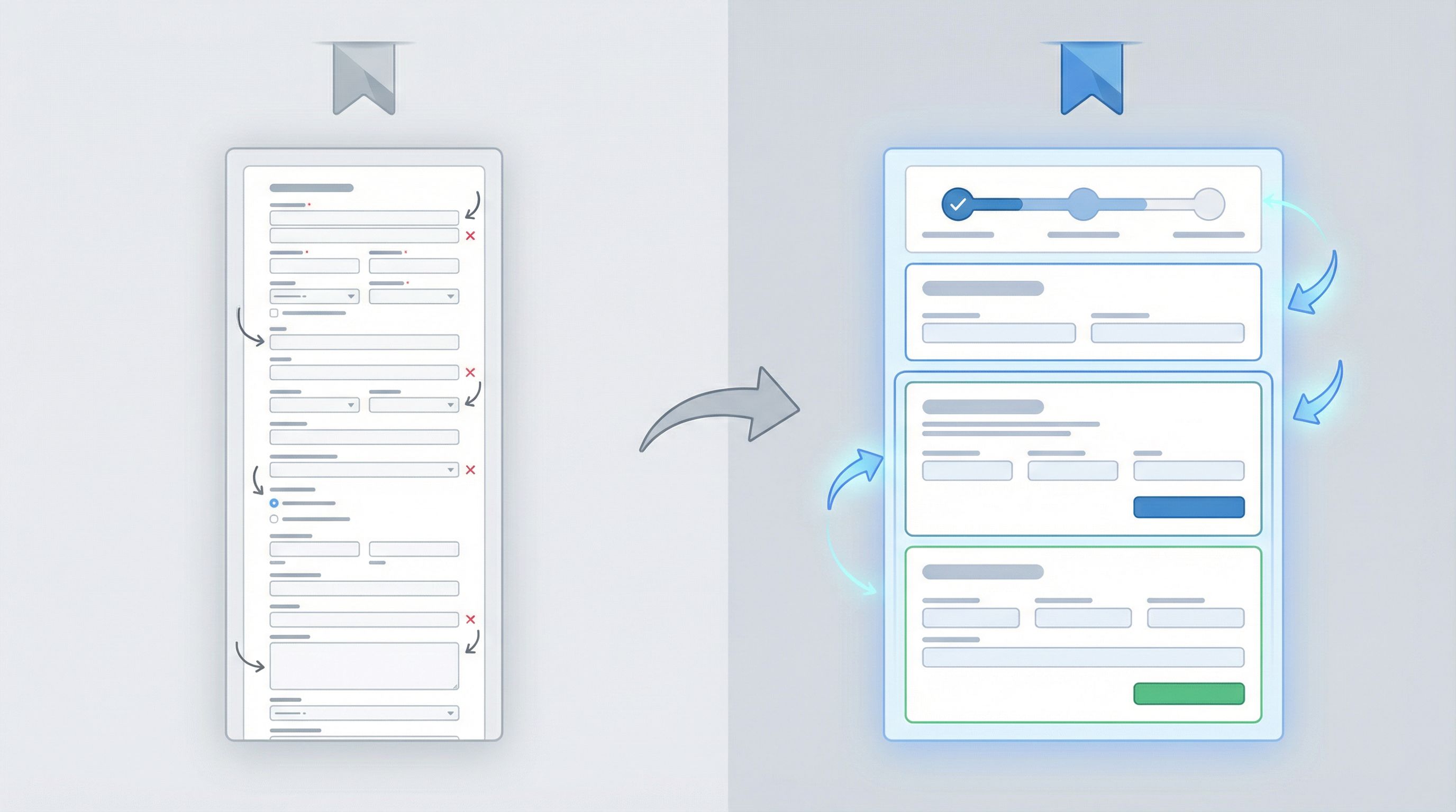
If your form is long (10+ fields), consider splitting into 2–3 logical steps instead of one scroll-heavy page. Multi-step forms often perform better when each step feels manageable and progress is clear.
Step 5: Use Labels, Help Text, and Examples to Remove Guesswork
Most “confusing” forms aren’t actually complex—they’re just vague.
Make every field answerable at a glance:
-
Labels should be literal, not clever.
- Use: “Work email”
- Avoid: “Where can we reach you?”
-
Help text should answer the question: “What exactly do you want here?”
- “Include country code, e.g., +1 555 123 4567.”
- “We’ll use this to personalize your dashboard; you can change it later.”
-
Placeholders should be concrete examples, not repeats of the label.
- Label: “Company size”
Placeholder: “e.g., 11–50 employees” - Label: “What are you hoping to achieve in the next 3 months?”
Placeholder: “e.g., reduce manual reporting time by 50%.”
- Label: “Company size”
Consistency matters too:
- Use sentence case or Title Case consistently across labels.
- Align labels the same way (top-aligned is usually safest and most readable on mobile).
Step 6: Make It Feel Short (Even If It Isn’t)
Perception matters as much as the actual field count.
To make forms feel lighter:
-
Group fields into sections with short headings.
- “About you”
- “About your team”
- “What you’re looking for”
-
Use multi-column layout sparingly and only for tightly related fields.
- First/last name side by side on desktop, but stacked on mobile.
- City/state/ZIP grouped together.
-
Show progress for multi-step flows.
- “Step 1 of 3: About you”
- A simple progress bar with clear labels.
-
Surface the payoff early.
- If you’re offering a quote or a price estimate, show a “preview” or partial result as soon as possible, then ask follow-up questions to refine it.
Remember: people are more willing to answer a few extra questions after they feel committed and see value.
Step 7: Design a Button That Actually Feels Clickable
The submit button is where intent meets friction.
A few non-designer-friendly rules:
- Use a solid, high-contrast color that stands out from the background and other elements. This is where Ezpa.ge themes help: pick a primary accent and reserve it for primary actions.
- Write copy that completes the sentence “I want to…”
- “Get my demo”
- “Join the waitlist”
- “Send feedback”
- Make the button full-width on mobile and comfortably tappable (44px height is a good minimum target).
If you have secondary actions (e.g., “Back,” “Skip for now”), de-emphasize them visually with outline styles or muted colors so the primary action is obvious.
Step 8: Handle Errors Like a Human, Not a Server
Error handling is where many forms quietly lose people.
Bad patterns:
- Red text with no explanation: “Invalid input.”
- Errors shown only at the top of the page after submit.
- Wiping out what the user already typed.
Better patterns you can implement quickly:
-
Validate inline where it helps, not on every keystroke.
- Email format, required fields, and password rules can be checked when a field loses focus.
-
Explain what went wrong and how to fix it.
- “That doesn’t look like a valid work email. Try name@company.com.”
-
Highlight the exact field with an issue.
- Use a clear red border, an icon, and a short error message beneath the field.
-
Keep user input whenever possible.
- If the form fails to submit, don’t clear all fields.
For a deeper dive into smarter validation patterns, bookmark Beyond ‘Required’: Rethinking Form Validation Rules for Better Data and Happier Users.
Step 9: Design for Trust, Not Just Aesthetics
People decide whether to trust your form in seconds.
You don’t need a full-time designer to avoid the biggest trust leaks:
-
Match your brand basics.
- Use your logo, colors, and type choices consistently.
- Avoid mixing too many fonts or off-brand colors.
-
Use a clean, readable layout.
- Plenty of white space.
- Clear separation between sections.
- No tiny, dense text blocks.
-
Be explicit about privacy and security when stakes are higher.
- Link to your privacy policy.
- Add a short reassurance line near sensitive fields:
- “We’ll only use this to schedule your demo.”
- “Securely stored and never shared with third parties.”
If you’re collecting high-stakes data (payments, healthcare, hiring), combine these basics with patterns from Form UX for High-Stakes Data: Designing Calm, Trustworthy Experiences for Payments, Healthcare, and Hiring and Security Without Paranoia.
Step 10: Make the “After Submit” Moment Count
The user’s job isn’t done when they hit Submit—and neither is yours.
Avoid the generic “Thanks, we’ll be in touch.” It wastes a high-intent moment.
Instead, use your confirmation screen to:
-
Confirm what will happen next and when.
- “We’ll review your request and get back to you within 1 business day.”
-
Offer a meaningful next step.
- Link to docs, a webinar, or a relevant case study.
- Prompt them to book time directly on a calendar.
- Offer to join a community or follow a product changelog.
-
Set expectations for communication.
- “We’ll send a confirmation email to name@company.com. Check your spam if you don’t see it in 5 minutes.”
If you’re using Ezpa.ge with real-time Google Sheets syncing, this is also where your internal workflows kick in. For ideas on turning submissions into automated onboarding or support playbooks, see From Form to Workflow: Automating Onboarding, Support, and QA with Ezpa.ge + Google Sheets.
Step 11: Align UX with Channel and Audience
The same form shouldn’t look or feel identical everywhere.
Someone coming from:
- A high-intent search ad is ready for a more detailed intake.
- A casual social post might only be ready to answer 1–3 questions.
- A warm newsletter click may not need a long brand explanation at all.
You don’t need a new design system for each of these—just small UX adjustments:
- Shorter forms or micro-surveys for low-intent channels.
- More context and qualification questions for high-intent or high-touch flows.
- Tweaked headlines and examples that match the promise of the ad or email.
If you’re using Ezpa.ge, you can spin up channel-specific forms with custom URLs that share the same underlying structure but differ in copy, length, and emphasis. For a deeper walkthrough, see Channel-Specific Forms: Using Custom URLs to Tailor Messaging for Ads, Email, and Social.
Step 12: Treat Your Form as a Test, Not a Monument
You don’t have to get everything perfect on day one.
A simple iteration loop for non-designers:
- Launch a solid v1 using the checklist above.
- Watch completion rate and drop-off.
- If your tool supports it, track where people abandon (step or field).
- Gather qualitative feedback.
- Add a tiny optional question on the confirmation screen:
- “Anything confusing about this form?”
- Add a tiny optional question on the confirmation screen:
- Make one change at a time.
- Remove a field, clarify a label, split a step.
- Let it run long enough to see a signal.
When forms stream into Google Sheets (as they do with Ezpa.ge), you can combine UX changes with structured data analysis. Posts like From Spreadsheet Chaos to Source of Truth: Structuring Google Sheets for Scalable Form Data and From Form Link to Full Funnel: Tracking Every Touchpoint Without a Developer can help you close the loop between UX tweaks and real outcomes.
A Quick Checklist You Can Reuse
Print this or paste it into your next form doc:
Clarity & Purpose
- [ ] One clear job for the form
- [ ] Only fields you’ll use within 30 days
- [ ] Outcome-focused headline and subheadline
Structure & Flow
- [ ] Questions ordered like a conversation
- [ ] Related fields grouped into sections
- [ ] Long forms split into logical steps with progress
Fields & Labels
- [ ] Literal labels, no clever phrasing
- [ ] Helpful examples in placeholders
- [ ] Brief help text wherever confusion is likely
Buttons & Errors
- [ ] High-contrast primary button with “I want to…” copy
- [ ] Clear, field-level error messages with guidance
- [ ] User input preserved on error
Trust & Follow-Through
- [ ] Branding and layout feel consistent and calm
- [ ] Privacy and security expectations are explicit
- [ ] Confirmation screen sets clear next steps and offers a useful follow-up
Optimization
- [ ] Channel and audience matched with form length and tone
- [ ] Basic tracking in place to see completion/drop-off
- [ ] A plan to test one improvement at a time
Bringing It All Together
Form UX doesn’t have to be an art project.
If you:
- Know the job your form is supposed to do,
- Ask only for what you’ll actually use,
- Make each question easy and unambiguous to answer,
- And treat the submit button as the middle of the journey, not the end,
…you’ll already be ahead of most teams.
Tools like Ezpa.ge give you the building blocks—responsive layouts, themes, custom URLs, and real-time Google Sheets syncing. This checklist gives you the judgment to use those blocks in ways that respect your users’ time and boost your own outcomes.
Take the First Step: Fix One Form This Week
You don’t need a full redesign or a quarter-long project.
Pick one form that matters:
- Your main product signup
- Your demo request
- Your feature feedback form
Then, this week:
- Remove 1–3 fields you don’t actively use.
- Rewrite the headline to promise a clear outcome.
- Clarify any label or placeholder that could make someone hesitate.
- Improve your confirmation screen so it sets expectations and offers a real next step.
If you’re using Ezpa.ge, duplicate the existing form, apply these changes in a new theme or variant, and ship it as a lightweight A/B test using custom URLs.
You’ll be surprised how much impact a few thoughtful UX decisions can have—no design degree required.