Signals, Not Surveys: Designing Micro-Interactions That Capture User Intent Without Extra Fields


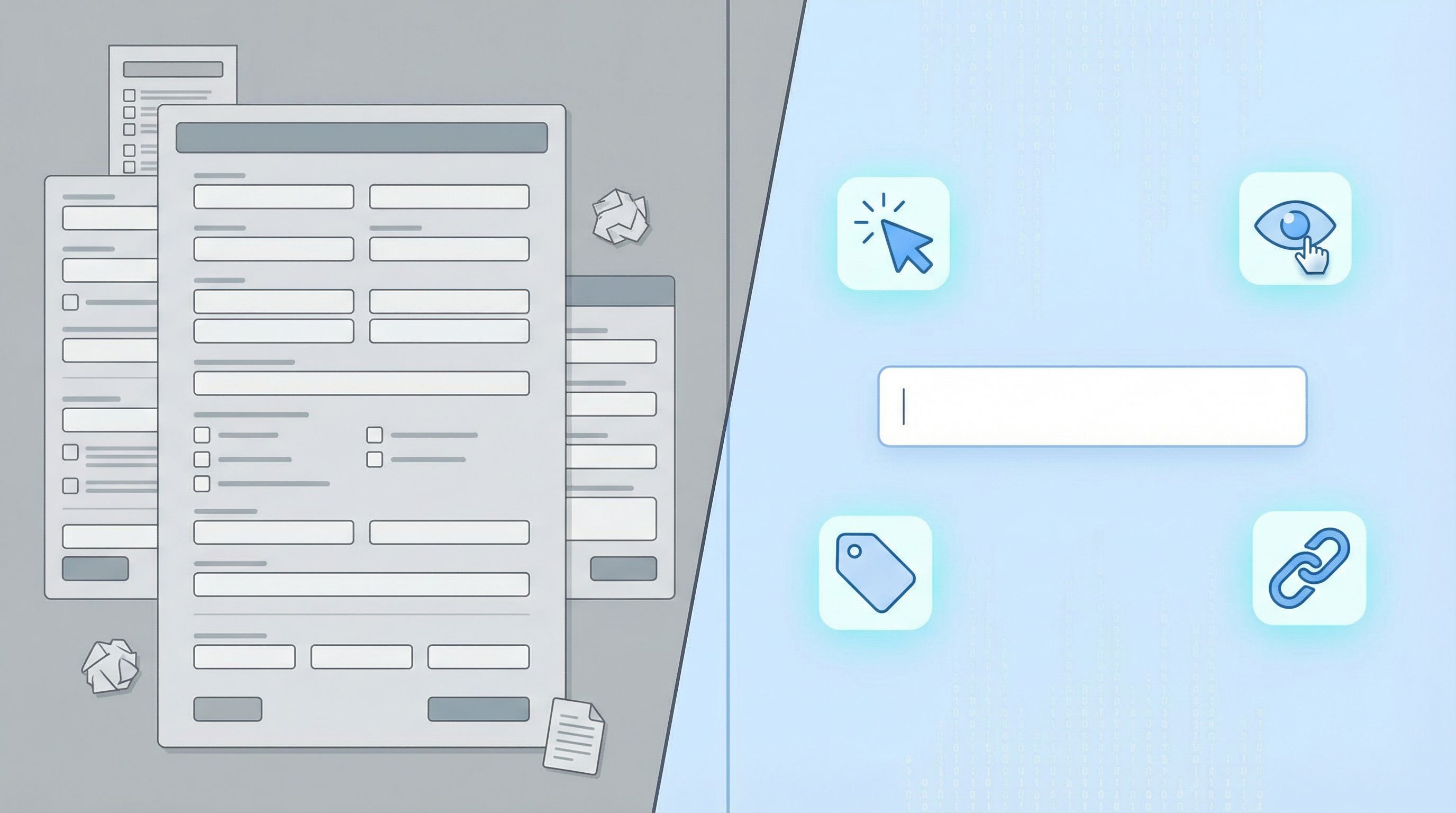
Forms have a reputation problem.
When teams want more insight, the reflex is almost always the same: add more questions.
“Let’s ask for use case.”
“Let’s add a budget field.”
“Let’s ask how they heard about us.”
Every one of those questions might be reasonable on its own. But together, they turn a simple moment of intent—I want to sign up, I want to talk to sales, I want to give feedback—into a chore.
The better path is to design signals, not more surveys.
Signals are the tiny behaviors and choices users already make:
- Which plan they click first
- How long they hover on a pricing card
- Whether they choose “Continue with Google” or email
- Whether they scroll to advanced options before submitting
With thoughtful micro-interactions and a bit of instrumentation, you can capture rich intent data without adding a single visible field.
This post is about how to do exactly that—especially when you’re building with tools like Ezpa.ge, where custom URLs, themes, and real-time Google Sheets syncing make it easy to turn subtle signals into structured data.
Why “More Questions” Is Usually the Wrong Answer
When your data feels thin, it’s tempting to bolt on more inputs. But extra fields come with real costs.
The hidden price of every new field
Every additional question:
- Adds cognitive load – Users stop and think, “Why do they need this?” or “Do I have time for this right now?”
- Introduces risk – Sensitive or ambiguous questions (“Budget?”, “Phone number?”) trigger hesitation.
- Creates more room for junk data – If people don’t see the value, they’ll type whatever gets them through.
- Hurts completion rates – Even a single extra step can tip someone from “Sure, I’ll do this” to “I’ll come back later” (they won’t).
You might get more columns in your spreadsheet, but not necessarily more truth.
That’s why so many high-intent flows succeed when they ask less but infer more—a theme we explored from a different angle in Flow, Not Fields: Mapping Your User’s Mental Journey Before You Design a Single Input.
Instead of interrogating users, you can:
- Design micro-interactions that let people express preference and intent with a click, scroll, or choice they’d make anyway.
- Capture passive signals (UTM parameters, referrers, time on page, device type).
- Use defaults, grouping, and progressive disclosure to learn more without visibly asking more.
From Questions to Signals: A New Mental Model
Before we get tactical, it helps to reframe how you think about “data collection.”
1. Treat every interaction as a potential signal
Instead of asking, “What fields do we need?” ask:
- What are people trying to do here?
- Where do they hesitate, compare, or explore?
- What choices are they already making that reveal intent?
Examples:
- The order in which someone clicks options can reveal priority.
- The time they spend on a step can indicate confusion or high consideration.
- The path they took to the form (campaign, page, partner) often says more than a “How did you hear about us?” dropdown.
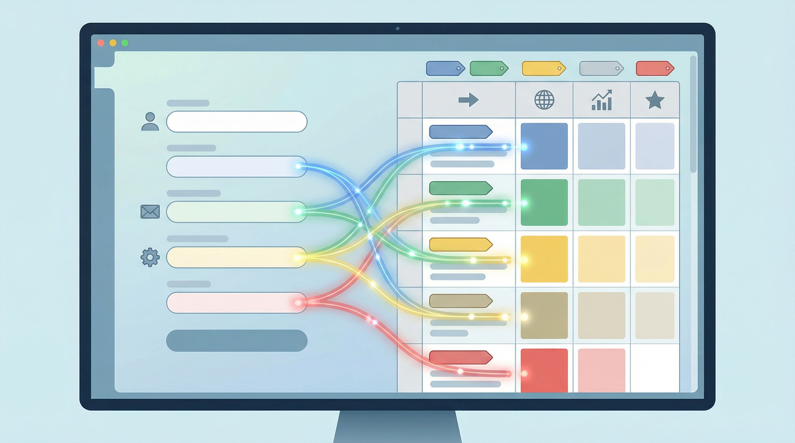
2. Separate visible questions from invisible signals
Think of your form as having two layers:
- Visible layer – The fields users see and consciously answer.
- Invisible layer – The signals you capture automatically: URL parameters, click events, micro-interaction choices, and derived fields.
Your goal is to minimize friction in the visible layer while maximizing insight in the invisible layer.
3. Design for intent, not just identity
Most forms over-focus on who someone is (title, company size, industry) and under-focus on what they’re trying to do right now.
Signals help you capture:
- Urgency – Are they choosing “Schedule this week” vs. “Next month”?
- Maturity – Are they selecting “Just exploring” vs. “Ready to move budget”?
- Path to value – Which use case or product area they lean into first.
That’s the information your sales, product, and ops teams can actually act on.
Common Questions You Can Replace With Signals
Let’s make this concrete. Here are classic “more fields” questions and how you can replace them with micro-interactions and signals instead.
1. “How did you hear about us?”
Problem: Users don’t remember, choose “Other,” or pick randomly.
Signals to use instead:
- UTM parameters in your form URL (source, medium, campaign).
- Referrer URL (page or partner that sent them).
- Custom URLs per campaign or partner (easy in Ezpa.ge).
How to implement:
- Give each channel its own custom form URL, e.g.
/demo-linkedin,/demo-podcast,/demo-partner-acmeusing Ezpa.ge’s URL customization. - Sync submissions into Google Sheets and add a column like
channelthat’s pre-filled based on the URL. - If you want a user-facing confirmation, use a small, optional question like “Anything we should know about how you found us?” instead of a required dropdown.
For a deeper dive on wiring this into your analytics and funnel reporting, see From Form Link to Full Funnel: Tracking Every Touchpoint Without a Developer.
2. “What’s your budget?”
Problem: People don’t want to say, don’t know yet, or lowball to avoid being disqualified.
Signals to use instead:
- Plan or package clicked (Starter vs. Enterprise).
- Feature groups selected (basic vs. advanced options).
- Team size or volume range chosen.
Micro-interactions that help:
- Show plan cards or usage tiers before the form and track which one they click.
- Use a slider or simple ranges (“Solo”, “Small team”, “Growing team”, “Large org”) instead of a free-text budget field.
- Offer two clear CTAs: “Talk to sales” vs. “Get started free” and treat that choice as a budget/commitment signal.
3. “What’s your role?” / “What best describes you?”
Problem: Long dropdowns, overlapping options, and titles that don’t fit.
Signals to use instead:
- Entry point (Docs page vs. Pricing vs. Integrations).
- Content consumed before hitting the form (e.g., they came from a “For Developers” page).
Micro-interactions that help:
- Use segmented buttons with 3–5 clear personas instead of a 20-option dropdown.
- Default to the most common persona but let users switch with a single tap (and record that switch as a signal).
Designing Micro-Interactions That Reveal Intent
Micro-interactions are the small, focused moments where users:
- choose one option over another
- expand an advanced section
- hover long enough to reveal a tooltip
- pick a login method
These are goldmines for intent—if you design and capture them deliberately.
1. Segment with buttons, not fields
Instead of asking:
“What are you interested in? (Check all that apply)”
…design a simple, visual choice:
- Primary goal
- ◻ Launch my first form
- ◻ Consolidate existing forms
- ◻ Improve analytics & automation
Each choice can:
- Tag the submission in your Google Sheet (e.g.,
goal = analytics). - Drive conditional logic in your Ezpa.ge form (show different follow-up questions or thank-you states).
- Trigger tailored workflows (e.g., different onboarding email sequences).
This feels like a natural step for the user, not an extra question.
2. Use progressive disclosure for “power user” data
Not every user needs advanced options—but those who expand them are sending a strong signal.
Patterns that work well:
- A collapsed section titled “Advanced settings (optional)”.
- An expandable “I have specific requirements” checkbox that reveals extra fields.
- A “Tell us more” link that opens an additional textarea.
Signals you get:
- Whether someone cares enough to open advanced options.
- Which advanced fields they actually fill.
You can treat “opened advanced section = high sophistication / high intent” even if they don’t answer every advanced question.
3. Turn choices into tags
Any time a user:
- clicks a specific CTA
- selects a category
- chooses a plan
…you can map that choice to a structured tag in your data.
Examples:
- CTA
"Book a strategy call"→ tagintent = consultative - CTA
"Start free"→ tagintent = self-serve - Option
"IT & Security"→ tagsegment = technical
In Ezpa.ge, you can:
- Use hidden fields populated via query parameters or logic.
- Sync everything into Google Sheets and use formulas to derive tags based on choices.
For inspiration on turning those tags into automation, check out Ops in the Loop: Using Real-Time Form Data to Trigger Playbooks, Notifications, and Automations.
Passive Signals: What You Can Capture Without Asking
Not every signal needs a visible interaction. A lot of useful context is already available the moment someone loads or submits your form.
Here are passive signals you should consider capturing by default.
1. Traffic and campaign data
- UTM parameters –
utm_source,utm_medium,utm_campaign,utm_content. - Referrer – the page or site they came from.
- Landing path – which page they saw before the form.
How to use them:
- Auto-fill hidden fields in your Ezpa.ge form with UTM values.
- In Google Sheets, add columns like
channel_groupthat map raw UTMs into friendly categories. - Use that data to replace or validate any “How did you hear about us?”-style questions.
2. Device and environment
- Device type – desktop, tablet, mobile.
- Browser and OS – helpful for debugging friction.
- Locale or time zone – often inferrable from browser settings.
How to use them:
- Flag mobile submissions to see if drop-off is higher on certain screens.
- Tailor follow-up flows by time zone (e.g., schedule calls only in business hours for the user).
3. Behavioral signals
Even lightweight analytics can capture:
- Time to complete – short vs. long completion time can indicate confidence or confusion.
- Field focus and blur events – where people hesitate or correct themselves.
- Abandonment step – which question caused the most exits.
You don’t need a full analytics stack to benefit from this. With Ezpa.ge + Google Sheets, you can:
- Include a timestamp on load and timestamp on submit, then calculate duration.
- Use multi-step forms and log which step they reached.
Putting It Together: A Practical Design Process
Let’s walk through a concrete workflow you can follow on your next form project.
Step 1: Define the one moment of intent
Ask your team:
- What is the real commitment the user is making here?
- What decision are we trying to help them make (and them help us make)?
Examples:
- “Book a sales conversation.”
- “Request product access.”
- “Share feedback about a recent experience.”
Everything else should serve that moment—not distract from it.
Step 2: List the decisions you need to make
For this form, what do you actually need to decide on your side?
- Is this lead high, medium, or low priority?
- Should this request go to team A or team B?
- Is this feedback about bugs, UX, or pricing?
Write these as internal questions first. Then ask: What’s the lightest signal that can help us answer each one?
Step 3: Replace questions with signals
For each internal question:
- Can we infer it from traffic or campaign data?
→ Use UTMs, referrer, or custom URLs. - Can we infer it from a simple choice instead of a text field?
→ Use segmented buttons, plan cards, or sliders. - Can we infer it from behavior?
→ Time on page, advanced section opened, path taken.
Only if the answer is “no” to all three should you consider adding a new visible field.
Step 4: Design the minimal visible form
Keep the visible form focused on:
- Identity basics you truly need (often just name + email).
- 1–3 high-leverage choices (goal, segment, urgency).
- Optional, open-ended context (a single “Anything else we should know?” box).
Everything else lives in:
- Hidden fields (UTMs, tags, source info).
- Derived columns in Google Sheets (priority score, routing rules).
If you’re working across multiple brands or product lines, this is where a system mindset helps. You can reuse the same minimal pattern and just change themes and URLs, as we covered in Design Once, Reuse Everywhere: Building a Scalable Form System for Your Entire Team.
Step 5: Wire signals into routing and automation
Signals are only valuable if they change what happens next.
Use your Ezpa.ge + Google Sheets setup to:
- Auto-assign owners based on segment or intent tags.
- Trigger different email sequences for “just exploring” vs. “ready to buy.”
- Flag high-intent submissions (e.g., opened advanced settings + chose “this week”) for immediate follow-up.
This is where your forms stop being static and start behaving like part of a live system—an idea we unpacked further in Forms as On-Ramps, Not Dead Ends: Designing Submission Flows That Feed Your Growth Stack.
Step 6: Iterate by watching signals, not just submissions
Instead of only tracking “How many people submitted?”, also track:
- Which segments or goals are most common.
- Where people drop off in multi-step flows.
- Which CTAs get the most clicks.
Use that insight to:
- Simplify or remove steps that don’t add signal.
- Promote high-signal micro-interactions earlier in the flow.
- Refine your routing rules and automations.
Real-World Examples of Signal-First Design
A few patterns you can borrow right away:
-
Two-path CTAs on signup forms
- Buttons: “Start free” and “Talk to sales.”
- Signal: self-serve vs. high-touch intent.
- Use: route “Talk to sales” to a priority queue; send “Start free” into a product-led onboarding sequence.
-
Goal selection as navigation, not survey
- Show three large tiles: “Launch my first form,” “Optimize existing forms,” “Connect to Sheets & automations.”
- Clicking a tile both navigates to a tailored form variant and tags the user’s goal.
-
“Urgency” as a micro-choice
- Instead of asking “When do you plan to start?” as a text field, offer:
- “This week”
- “This month”
- “Just exploring”
- Use this to prioritize outreach without forcing people to estimate exact dates.
- Instead of asking “When do you plan to start?” as a text field, offer:
-
Feedback without a questionnaire
- A single inline prompt: “How was this experience?” with three faces (sad, neutral, happy).
- One optional textarea that appears only after a click.
- Signal: satisfaction score + whether they cared enough to elaborate.
All of these give you high-quality, structured data without long, survey-style forms.
Bringing It Back to Ezpa.ge
Ezpa.ge is built for exactly this style of form design:
- Custom URLs let you encode campaign, partner, or experiment info directly into the link.
- Flexible themes and layouts make it easy to design micro-interactions that feel natural and on-brand.
- Real-time Google Sheets syncing turns every signal—visible or invisible—into a row you can route, tag, and automate against.
Combine that with Sheets formulas, filters, and conditional formatting, and you’ve got a lightweight intent engine without adding more visible questions.
If you’re already using Ezpa.ge, your next form is a chance to strip away fields and lean on signals instead.
Quick Recap
We covered a lot. Here’s the essence:
- Extra fields are expensive. They hurt completion, trust, and data quality.
- Signals beat surveys. Use the interactions and context you already have—clicks, paths, UTMs, choices—to infer what you need.
- Design micro-interactions on purpose. Segmented buttons, plan cards, advanced sections, and two-path CTAs are powerful intent signals.
- Capture passive context by default. UTMs, referrers, device, and time-to-complete add rich color without adding friction.
- Turn signals into systems. Use Ezpa.ge + Google Sheets to route, prioritize, and automate based on the signals you capture.
When you do this well, your forms feel lighter for users and more powerful for your team.
Your Next Move
Pick one live form—just one—that currently feels too long or too blunt.
- List every field and ask, “Can we infer this from a signal instead?”
- Remove or hide at least one question you don’t truly need.
- Add one micro-interaction (like a goal selector or urgency choice) that gives you a clearer intent signal.
- Wire that signal into your Google Sheet and use it to change what happens next.
You don’t need a full redesign to start. One small shift toward signals over surveys is enough to prove the value.
If you’re ready to go further, open Ezpa.ge, duplicate a key form, and experiment with a signal-first version. Watch what happens to completion rates, follow-up quality, and how your team talks about “good” submissions.
Less asking. More understanding. That’s the promise of signal-driven forms—and you can start building them today.