Form Themes as Brand Labs: Rapidly Prototyping Positioning, Pricing, and Messaging Without Rebuilding Your Site


Most teams wait for a full rebrand or a new website before they seriously test new positioning or pricing.
By then, it’s usually too late.
You’ve already:
- Spent weeks in Figma debating hero copy.
- Burned cycles on dev tickets and QA.
- Locked yourself into a direction that’s hard to unwind.
Meanwhile, the only part of the experience that actually tells you whether a story works is the moment someone decides to raise their hand: the form.
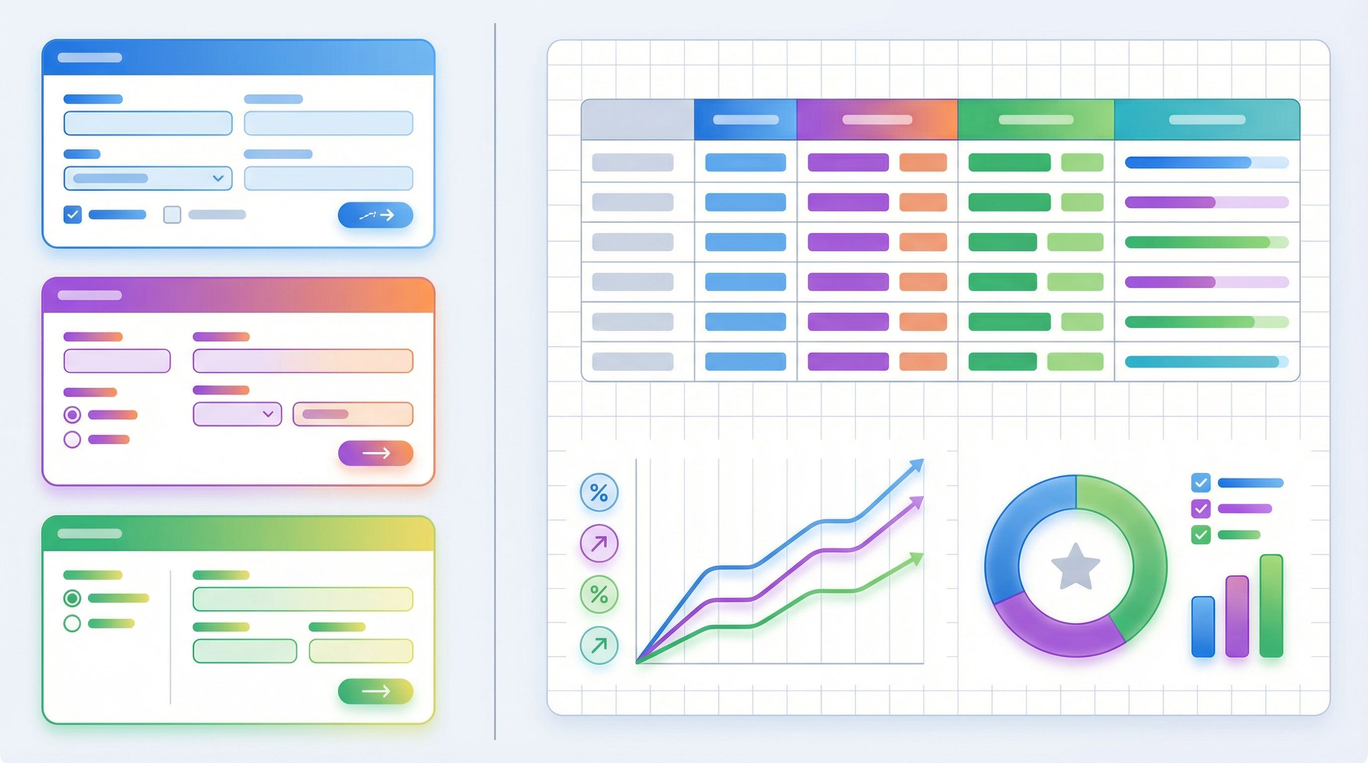
Tools like Ezpa.ge—where you can ship fully themed, responsive forms with custom URLs and real-time Google Sheets syncing—let you flip the script. Instead of treating forms as an afterthought, you can use form themes as live brand labs:
- Test new positioning without touching your homepage.
- Trial different pricing narratives and offer structures.
- Explore bolder visual directions in a safe, reversible way.
All while keeping your core site stable and your ops stack intact.
Why Your Forms Are the Perfect Brand Lab
Your forms sit at the intersection of intent, information, and trust. That makes them one of the best places to experiment with brand direction.
Here’s why.
1. High intent, low surface area
People don’t casually wander into your forms. They:
- Click a “Talk to sales” or “Request access” button.
- Respond to a campaign CTA.
- Follow a partner or referral link.
By the time they see your form, they’re already leaning in. That means:
- You’re testing on the right audience. These are the people who will feel the impact of new pricing or messaging most acutely.
- You don’t need a full narrative arc. A focused headline, a few lines of framing, and a cohesive theme are enough to see if a direction resonates.
We dig into this pattern more in Forms as Microsites: Replacing One-Off Landing Pages with Theme-Driven Flows, where the form itself becomes the primary surface for storytelling.
2. Themes are safer than redesigns
Redesigning your homepage is a big bet. Changing a form theme is not.
With a theme-first approach, you can:
- Swap colors, typography, spacing, and illustration styles.
- Adjust microcopy, labels, and helper text.
- Pair each theme with slightly different narratives or offer structures.
All without:
- Breaking navigation or SEO.
- Rewriting a dozen product pages.
- Re-training your sales team on a brand-new deck.
If a direction underperforms, you roll it back. If it wins, you promote that direction to your main site later—confident that it’s grounded in real behavior, not internal taste.
We talk about this strategy in depth in Theme-First Branding: Using Form Skins to Test Positioning Before You Redesign Your Site.
3. Data is clean, structured, and immediate
Because forms already sync into systems like Google Sheets or your CRM, every experiment produces:
- Quantitative signals: conversion rates, completion times, drop-off by step.
- Qualitative signals: which open-ended answers cluster, which objections show up, what people say when asked to describe their use case.
With Ezpa.ge’s real-time Google Sheets syncing, you can watch experiments play out live and adjust quickly—no manual exports, no BI dashboards required.

What You Can Safely Test at the Form Layer
Not everything belongs in a form experiment. But a surprising amount does.
Think in three layers: positioning, pricing, and messaging.
Positioning: Who is this for, and why now?
On a themed form, you can test:
- Audience framing
- “Built for RevOps leaders” vs. “Built for GTM teams”
- “For agencies managing dozens of clients” vs. “For in-house marketing teams”
- Primary value promise
- “Close deals faster with structured approvals”
- “Protect margin with clear discount guardrails”
- “Give Finance and Legal full visibility into every deal”
- Use-case emphasis
- Demo request form that highlights “Implementation in weeks, not months.”
- Partner intake form that leads with “Co-marketing, not just referrals.”
You don’t have to rewrite your entire product story—just tilt the spotlight.
Pricing: How do we frame value and commitment?
You might not publish your full price list on a form, but you can absolutely test how pricing is introduced and justified.
Examples:
- Anchoring models
- “Starts at $X/month for teams of 10+” vs. “Usage-based pricing that scales with your volume.”
- “Flat fee per workspace” vs. “Per-seat with volume discounts.”
- Commitment framing
- “Try it free for 14 days, no card required.”
- “Pilot with 3 teams for 60 days—then decide.”
- Qualification questions that hint at pricing tiers:
- “How many reps are on your sales team?”
- “What’s your average monthly ticket volume?”
The goal isn’t to close the deal on the form; it’s to see which framing attracts the right people and sets healthy expectations for sales.
Messaging: What words actually move people?
Forms are perfect for testing microcopy:
- Field labels and helper text
- Section headings (“Tell us about your team” vs. “Who’s involved in approvals?”)
- Short trust-building snippets (“We’ll respond within one business day.”)
You can even embed tiny narrative elements:
- A one-sentence explainer above a multi-step flow.
- A sidebar blurb that clarifies who gets the most value.
- A closing line on the submit button state (“Got it—expect a reply by tomorrow.”)
Because Ezpa.ge themes let you control typography, spacing, and visual hierarchy, you can make these messages feel intentional—not like an afterthought bolted onto a generic form.
Designing Your Brand Lab: A Practical Blueprint
Let’s walk through how to actually set this up using Ezpa.ge and Google Sheets.
Step 1: Choose one journey to focus on
Don’t start with everything. Start with one high-intent journey where brand, pricing, and messaging really matter.
Good candidates:
- Demo or sales consultation requests
- Enterprise or high-ACV contact forms
- Partner or reseller applications
- Pilot program or beta access requests
Ask:
- If we improved conversion or quality here by 20%, would it materially change the business?
- Is this a journey where we’re already debating positioning internally?
If yes, it’s a strong candidate for your first brand lab.
Step 2: Define 2–3 hypotheses, not 10
You’re not trying to test every possible variant. You’re trying to answer a few sharp questions.
Examples:
- Positioning hypothesis: “Leaning into ‘RevOps as the hero’ will drive more qualified demo requests than generic ‘sales tooling’ language.”
- Pricing hypothesis: “Framing pricing as ‘pilot first, then commit’ will reduce drop-off at the qualification step.”
- Messaging hypothesis: “Plainspoken, concrete language will outperform jargon-heavy enterprise speak.”
Turn each hypothesis into a theme + copy direction.
- Theme A: Clean, minimal, high-contrast; plain language; RevOps-forward headlines.
- Theme B: Richer color palette; more enterprise visual cues; language that emphasizes risk reduction and compliance.
- Theme C (optional): Bolder, product-led visuals; “self-serve first” language; emphasis on speed and autonomy.
If you’re working across multiple brands or sub-brands, the token-based approach in Theme Tokens, Not One-Off Styles: Building a Form Design System That Scales Across Brands will help you spin up these themes quickly without design chaos.
Step 3: Build one canonical form, then theme it
Resist the urge to fork your form logic for every experiment.
Instead:
- Create one canonical form in Ezpa.ge that captures everything you need:
- Core contact info
- Key qualification questions
- A few open-ended fields to capture context and language
- Wire it once into Google Sheets (or your CRM) with clear columns and downstream workflows.
- Attach multiple themes and URLs to the same underlying form.
This is where Ezpa.ge shines:
- One form → many URLs, each with its own theme.
- All submissions land in the same Sheet, tagged by URL or theme.
- Ops doesn’t have to rewire anything every time marketing wants to try a new direction.
For more on this pattern, see URL-Driven Ops: How Custom Links Turn One Form into a Dozen Targeted Workflows.
Step 4: Map traffic sources to themes
Next, decide who sees what.
Common patterns:
- Channel-based
- Paid search → Theme A (direct, outcomes-focused, fast to parse)
- Organic search → Theme B (more narrative, trust-building)
- Partner referrals → Theme C (co-branded, partnership-forward)
- Audience-based
- Mid-market prospects → URL with Theme A
- Enterprise prospects → URL with Theme B
- Existing customers exploring expansion → URL with Theme C
Because each theme lives at its own custom URL, you can:
- Drop the right link into specific campaigns.
- Use UTM parameters to track performance by channel.
- Keep your main site CTA pointing to the “control” theme while you quietly test alternatives elsewhere.
Step 5: Decide what success looks like (before you launch)
Before you ship anything, define how you’ll judge the experiment.
Look beyond raw submission count. Consider:
- Conversion rate
- Click → Form view
- Form view → Submission
- Completion quality
- Are fields filled out thoughtfully or rushed?
- Are key qualification questions answered in full sentences?
- Downstream impact
- Lead-to-opportunity rate by theme
- Average deal size or time-to-close by theme
- No-show rate for booked calls
Even if you don’t have a full analytics stack, a well-structured Google Sheet can tell you a lot:
- Add a
themeorlanding_urlcolumn. - Use filters and pivot tables to compare performance.
- Track outcomes (qualified, unqualified, closed-won, etc.) in the same Sheet or a linked one.
Running Experiments Without Breaking Ops or Brand
Experiments are only useful if they’re safe—for your data, your team, and your reputation.
Here’s how to keep your brand lab controlled instead of chaotic.
Keep the data model stable
No matter how wild your themes get, keep fields consistent across variants.
- Same field names and types.
- Same required vs. optional configuration.
- Same validation rules.
If you need to add a field for a specific experiment, do it thoughtfully:
- Add a clearly named optional field (e.g.,
experiment_additional_context_v1). - Document why it exists and when you’ll remove or standardize it.
This is the difference between healthy experimentation and the “14 slightly different forms” problem described in Brand-Consistent Forms at Scale: Governance Rules for Themes, URLs, and Copy.
Use themes, not rogue one-offs
Resist the urge to hand-tune every single visual detail per URL.
Instead:
- Define reusable themes (e.g.,
revops_premium,enterprise_trust,product_led). - Store them centrally and document when to use each.
- Allow only small, controlled overrides (like swapping a logo for a partner co-brand).
This keeps your experiments:
- Easier to compare (you know what changed).
- Easier to roll back (switch back to a known-good theme).
- Easier to scale across teams and regions.
Time-box and document each experiment
Every experiment should have:
- A start and end date.
- A single owner.
- A short experiment brief:
- What are we testing?
- Which URLs/themes are involved?
- What metrics define success?
At the end of the window:
- Pull results into a short summary.
- Decide: promote, iterate, or retire.
- Archive unused themes or clearly label them as deprecated.
If your team is already using patterns from Ops-Ready Form Experiments: Shipping New Intakes, URLs, and Logic in a Single Afternoon, you can fold brand experiments into the same governance habits.
Turning Winners Into Lasting Brand Direction
The real power of treating form themes as brand labs isn’t just better forms. It’s de-risking bigger brand moves.
When a particular theme + narrative combination clearly outperforms:
-
Promote it to your main site
- Update hero copy to mirror the winning form headline.
- Borrow the visual direction (color, type, spacing) that tested well.
- Bring over any microcopy that clearly resonated (e.g., a specific way of describing value).
-
Align sales and success teams
- Share the form variant that performed best.
- Highlight phrases prospects used in open-text answers.
- Update decks and talk tracks to echo those phrases.
-
Refine your pricing narrative
- If a certain commitment framing (e.g., pilot-first) improved completion and lead quality, bake that into your pricing page and contracts.
-
Standardize winning themes as presets
- Turn the best-performing form theme into a default for new campaigns.
- Create a small internal “theme library” with notes on when to use each.
Over time, your brand doesn’t evolve in one risky leap. It evolves experiment by experiment, grounded in what real people actually respond to.
Bringing It All Together
Form themes aren’t just a way to make your forms prettier. They’re a low-risk, high-signal surface for brand, pricing, and messaging experiments.
By treating your forms as brand labs, you can:
- Test bold new directions without touching your core site.
- Learn which narratives attract and qualify the right people.
- Refine pricing framing before you roll it out broadly.
- Keep your ops stack stable while marketing moves faster.
And because Ezpa.ge gives you:
- Fully themed, responsive forms
- Custom URLs for each variant
- Real-time syncing into Google Sheets
…you can run these experiments in days, not quarters.
Your Next Move
You don’t need a rebrand to start acting like a brand that experiments.
Here’s a simple way to begin this week:
- Pick one high-intent form (demo, partner, or pilot request).
- Clone it into Ezpa.ge as a canonical, well-structured version.
- Create two themes that represent distinct positioning or pricing narratives you’ve been debating.
- Give each theme its own custom URL and map them to different channels or audiences.
- Run the experiment for 2–4 weeks, then review conversion, lead quality, and downstream impact.
From there, you can decide what to promote, what to iterate, and what to retire—confident that your brand decisions are grounded in how real people behave, not just how internal decks look.
Your site can stay stable. Your brand doesn’t have to stand still.
If you’re ready to turn your forms into a live brand lab, spin up your first Ezpa.ge theme, connect it to Google Sheets, and ship an experiment before the week is over.