Form UX for Busy Operators: How to Build Flows Your Team Can Update Without a Designer or Developer


If you run ops, CX, sales, or marketing, you already know the pattern:
- A process changes.
- A field needs to be added.
- Legal wants new consent language.
- A new channel or campaign needs its own version of the form.
And suddenly, you’re waiting on a designer to update the layout or a developer to tweak logic and push a deploy. Meanwhile, your team is stuck working around a broken or outdated flow.
It doesn’t have to work that way.
Form UX can be designed so that operators own the day‑to‑day changes—without sacrificing clarity, conversion, or trust. With the right patterns, tools, and guardrails, your team can ship and iterate on forms the same day a new need appears.
This piece is about how to get there.
We’ll walk through how to structure your forms, your themes, and your data so that:
- Non-technical teammates can safely make edits.
- The experience still feels polished and consistent.
- You don’t wake up six months from now with form sprawl and messy Sheets.
Why “Operator-Editable” Form UX Matters
If you treat every form as a mini design and engineering project, you pay for it in three ways:
-
Slow reaction time
When pricing, policy, or messaging shifts, your forms lag behind. That delay doesn’t just look sloppy—it creates real risk: wrong expectations, incorrect data, or compliance issues. -
Shadow workflows
If updating forms is hard, teams route around them. They go back to “Just email me” or “DM me the details.” You lose structure, searchability, and the ability to automate. (If this feels familiar, you’ll like the patterns in /from-inbox-chaos-to-intake-clarity-turning-ad-hoc-requests-into.) -
Design drift and tech debt
Every custom one-off form is another surface you have to remember, maintain, and secure. Over time, the UX gets inconsistent and your data model gets brittle.
When you flip the model and design for operator control from day one, you get the opposite:
- Forms that stay accurate because the people closest to the work can update them.
- A single, consistent visual system, even as content changes.
- Cleaner data and easier automation, because you’re iterating on a stable backbone.
That’s where tools like Ezpa.ge are especially useful: they separate form structure, visual themes, and data sync so each can be updated independently—by the right person, at the right level.
Principle 1: Separate What Changes Often From What Should Be Stable
The core trick to operator-editable UX is decoupling:
- Some things should change frequently (copy, options, help text, routing rules).
- Some things should almost never change (core fields, identifiers, data schema, security patterns).
Design your forms so that busy operators mostly touch the first set.
Decide on Your “Backbone Fields”
Start by defining a small set of fields that represent the stable shape of the data you need for a workflow. For example, in a candidate intake form, backbone fields might be:
- Role applied for
- Seniority level
- Location / time zone
- Portfolio or résumé URL
- Source (how they found you)
You might add other questions later, but these are the ones your reports, dashboards, and automations will rely on.
Guidelines for backbone fields:
- Use generic but clear labels that won’t need constant rewording.
- Standardize field types and options (e.g., dropdown vs. free text) to keep data clean.
- Avoid baking campaign-specific language into the field name itself; keep that in descriptions.
Once you’ve defined these, treat them as infrastructure. Operators can:
- Reorder them within reason.
- Adjust helper text.
- Add conditional logic around them.
…but they shouldn’t delete or rename them without a quick review from whoever owns your data model.
Make “Flexible Layers” Easy to Edit
Around that backbone, design layers that invite operator edits:
- Intro and confirmation copy – Set up a pattern where the header and a short paragraph can be updated quickly (e.g., for a new campaign or policy).
- Non-critical questions – Optional questions that help with prioritization or personalization, but won’t break reports if they change.
- Routing and notifications – Which inbox gets notified, which Sheet tab receives the row, which Slack channel gets pinged.
In Ezpa.ge, this might look like:
- A locked section with backbone fields.
- An unlocked section labeled “Context (safe to edit)” with optional questions and copy.
- A clear naming convention for notification rules and Sheets destinations.
When operators know where it’s safe to tinker, they’re more likely to improve flows instead of working around them.

Principle 2: Standardize Themes So UX Doesn’t Depend on One Designer
If every form requires a designer to look good, you’ve already lost.
Instead, invest once in a small set of reusable themes that encode your brand and UX decisions. After that, operators simply pick a theme and focus on content.
What to Lock Into a Theme
A solid theme should handle:
- Typography – Font families, sizes, and line heights for titles, labels, descriptions, and error messages.
- Spacing and layout – Consistent padding, section spacing, and max width so forms feel breathable instead of cramped.
- Color system – Primary, secondary, accent, and semantic colors (success, error, warning) that meet accessibility standards.
- Field styles – Input borders, hover states, focus rings, and disabled states.
- Button hierarchy – Clear primary vs. secondary actions, with consistent placement.
Once these are set in Ezpa.ge, your team shouldn’t need to touch them for most forms. You get visual consistency for free, even as operators spin up dozens of flows.
Where to Allow Light Customization
Operators will still need some flexibility. The key is to give them safe knobs:
- Logo and header image – Swappable per form or per campaign.
- Accent color from a pre-approved palette – E.g., “Brand Blue,” “Campaign Green,” “Partner Purple.”
- Layout mode – Single-column vs. two-column for desktop, while preserving mobile behavior.
By constraining choices to a few presets, you avoid the “PowerPoint problem” where every form looks like a different brand.
If you’re already using Ezpa.ge themes for things like PLG signup or onboarding, you can reuse those patterns here. (The examples in /forms-as-onboarding-ux-turning-first-touch-questionnaires-into are a good reference for how to make these themes feel like part of your product.)
Principle 3: Design for Live Data, Not Static Mockups
Forms don’t live in isolation. They’re part of an operational loop:
User submits → Data lands in a live source of truth → Team takes action → Process evolves → Form gets updated
If you want operators to own that loop, you have to make the data side just as friendly as the UX side.
Use Real-Time Sheets as Your “Control Room”
For many teams, Google Sheets is the operational cockpit. Ezpa.ge’s real-time sync means every submission lands in a Sheet instantly, ready for:
- Filters and views by owner, priority, segment, or SLA.
- Lightweight automations via formulas or tools like Zapier and Make.
- Quick audits of which fields are actually used.
A few patterns that make this sustainable:
- One form → one primary Sheet (with tabs for different statuses or owners).
- Consistent column ordering across related forms, based on your backbone fields.
- Named filters or views that match how your team works (e.g., “Needs Triage,” “Enterprise Only,” “Urgent Bugs”).
If you’re building something like a candidate funnel, pairing Ezpa.ge with live filters in Sheets can give you a surprisingly robust system without ever touching a database. We walk through that pattern in detail in /from-intake-to-interview-building-candidate-funnels-with-ezpage.
Let Data Guide UX Changes
When operators can see live data, they can also make smarter UX decisions without waiting for a UX researcher.
Encourage them to regularly check:
- Drop-off points – Are people abandoning at a particular question or page? Maybe that field belongs later, or should be optional.
- Low-signal fields – Are you asking questions no one reads or that don’t change decisions? Time to remove or rephrase.
- Free-text chaos – Are open-ended answers making Sheets unreadable? Consider switching to structured options.
Paired with low-noise analytics (like we outline in /low-noise-analytics-measuring-form-performance-without-drowning), your operators can move from “I think this form is too long” to “We’re losing 30% of users on this one unnecessary question—let’s fix it this afternoon.”

Principle 4: Use URL and Logic Patterns Instead of Cloning Forms
A common failure mode of operator-owned forms is form sprawl:
- One form for each campaign.
- One form per partner.
- One form per region or segment.
It works for a few months, then no one remembers which link is current or where the “real” data lives.
A better pattern is to keep one core form and let the URL and logic do the work.
Custom URLs as a Control Panel
With Ezpa.ge, you can use custom URLs and URL parameters to:
- Pre-fill hidden fields like
source,campaign, orpartner. - Change copy or optional questions based on where the user came from.
- Route submissions to different owners or tabs.
Instead of cloning the form 12 times, you:
- Maintain one UX (safer and easier to improve).
- Generate many URLs for different channels and audiences.
For example:
/demo– Default demo request./demo?source=linkedin&segment=enterprise– Same form, slightly different intro copy and routing./demo?source=partner_x&priority=high– Same backbone fields, but submissions go to a partner manager.
We go deeper on this pattern in /custom-urls-as-routing-logic-directing-traffic-by-intent-channe and /url-level-personalization-tailoring-one-form-to-many-audiences.
Logic as a Safety Valve
Conditional logic is your friend when you’re trying to keep a form both flexible and maintainable:
- Show extra fields only for certain segments (e.g., enterprise, regulated industries).
- Hide complexity from most users while still collecting what ops needs in edge cases.
- Route high-intent or high-risk submissions to different teams.
The key is to design logic rules that operators can understand at a glance:
- Use plain-language names for conditions (e.g., “If Region is EU” instead of “Cond_3”).
- Document the most important logic blocks in a short internal doc or even in the form description itself.
- Avoid deeply nested rules that only the original creator can decipher.
When logic is readable, non-technical teammates can safely tweak it as processes evolve.
Principle 5: Give Operators Guardrails, Not Just Access
Handing over edit access without guidance is a recipe for accidental breakage. Instead, pair access with simple, opinionated guardrails.
Create a “Form Owner’s Checklist”
Before any operator publishes or edits a form, they should run through the same short list. For example:
-
Clarity check
- Does the intro explain what happens after submission?
- Are you asking only for what you actually use?
-
Data check
- Are backbone fields present and correctly typed?
- Are new fields mapped to clear Sheet columns?
-
Routing check
- Who gets notified?
- Where does the submission land?
- Is there a clear owner for follow-up?
-
Trust and security check
- Are you collecting any sensitive data unnecessarily?
- Are security signals (branding, SSL, privacy link) present and consistent?
-
Mobile check
- Does the form feel usable on a phone—especially for longer flows?
You can keep this checklist in your internal wiki and link it from your Ezpa.ge workspace so it’s always close at hand.
Define Roles and Permissions
Not every operator needs the same level of control. A simple model:
- Creators – Can spin up new forms from approved templates, add non-critical fields, and edit copy.
- Maintainers – Can adjust logic, routing, and backbone field order, and retire old URLs.
- Admins – Own themes, data schemas, and integrations.
Most teams can get away with 2–3 admins and a larger group of creators/maintainers. The goal is to unlock speed without losing accountability.
Principle 6: Start With Templates That Reflect Real Workflows
Blank forms are intimidating. Templates are how you encode institutional knowledge so operators don’t have to reinvent patterns.
A strong template library might include:
- Demo / contact request – With clear qualification fields, routing, and SLAs baked in.
- Internal intake – For design, research, marketing, or engineering requests.
- Support / escalation – With fields that map cleanly to your ticketing system.
- Hiring funnels – From initial intake to structured interview feedback.
Each template should come with:
- A short description of when to use it.
- Notes on which sections are safe to edit.
- Pointers to the Sheet or system it connects to.
Over time, you’ll refine these templates based on what actually works. The more they reflect real workflows, the more your team will use them instead of going back to ad-hoc channels.
Bringing It All Together
Designing form UX for busy operators isn’t about dumbing things down. It’s about moving decisions to the edge—to the people who see problems first and feel the friction every day.
When you:
- Separate stable backbone fields from flexible layers,
- Standardize themes so visual quality is a given,
- Sync everything into live Sheets that operators actually use,
- Lean on URLs and logic instead of cloning forms,
- Give clear guardrails and roles,
- And seed the system with thoughtful templates…
…you turn forms from fragile artifacts into a living part of your operating system.
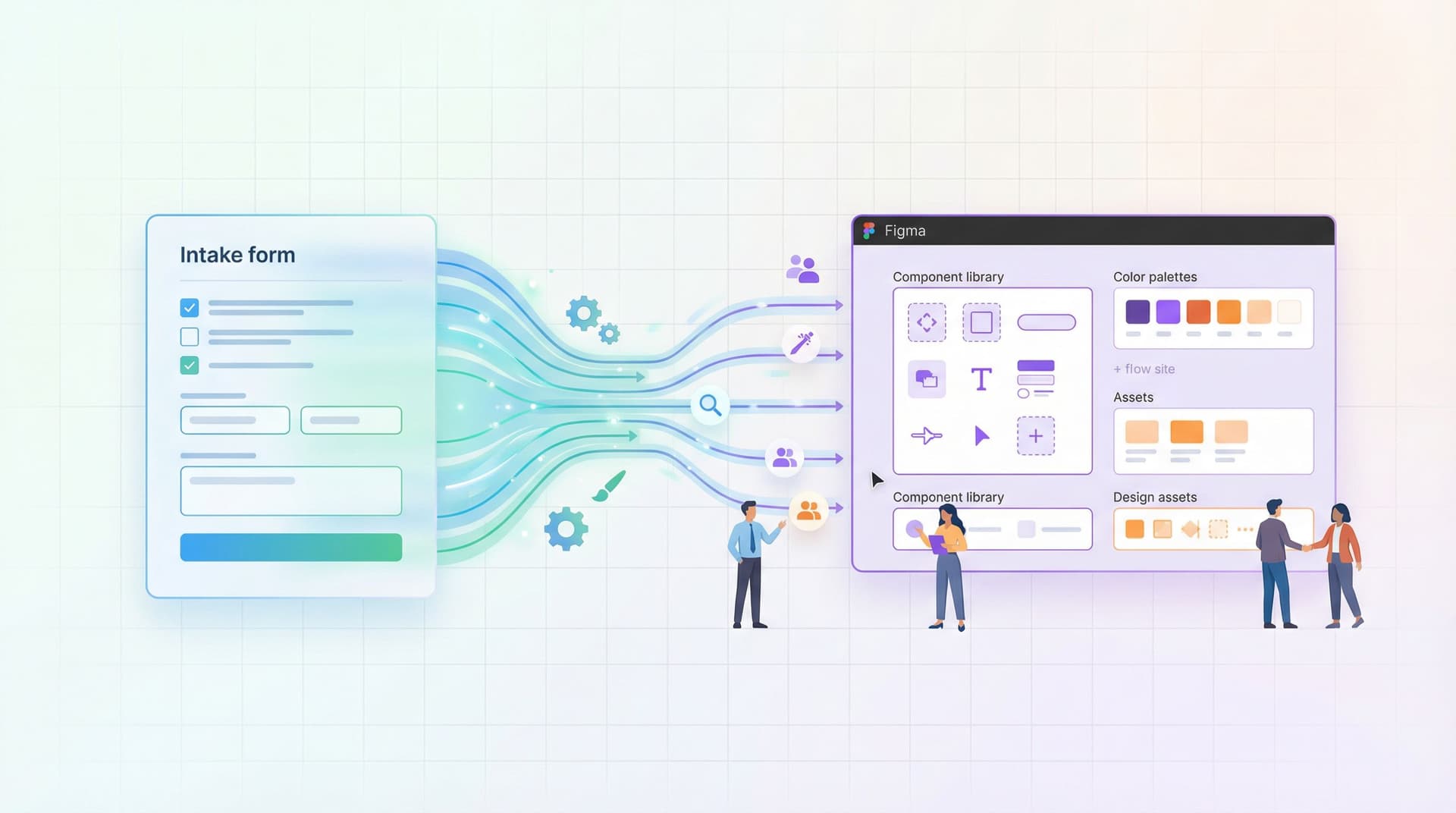
Ops, CX, marketing, and product teams can adjust flows the same day a need appears—without a ticket, a sprint, or a new Figma file.
Where to Go Next
If you’re ready to make your forms something your operators can truly own, here’s a simple first move for this week:
- Pick one high-impact form that’s currently hard to change—maybe your demo request, your internal intake form, or your candidate application.
- List its backbone fields and decide which are truly stable vs. flexible.
- Rebuild it in Ezpa.ge using:
- A shared theme,
- A clean Google Sheet destination,
- At least one URL-based variation for a specific channel.
- Share edit access with one or two trusted operators and walk them through the guardrails.
- Iterate together based on live data for two weeks.
You don’t have to redesign your entire system at once. Start with one flow, prove that operators can safely own it, and expand from there.
If you’re using Ezpa.ge already, open your workspace and identify the forms that would benefit most from this kind of structure. If you’re not, this is a great moment to experiment with a builder that’s designed for operator control from the start.
Either way, the goal is the same: flows your team can update on a Tuesday afternoon, without waiting for a designer or developer—while still feeling polished, intentional, and trustworthy.