From QR Code to Conversion: Designing Forms for In-Person Events, Packaging, and Out-of-Home

QR codes have quietly gone from novelty to default. They’re on badges, billboards, coffee cups, receipts, and retail shelves. A 2025 survey from Bitly found that marketers now lean on QR codes heavily across events (≈43%), product packaging (≈46%), and print/out-of-home (≈40%) as core channels for driving action from physical touchpoints.
But a scan isn’t the goal. A conversion is.
The gap between “someone pointed their camera at this square” and “they actually signed up, paid, or shared feedback” is where most teams lose people. The culprit is rarely the QR code itself. It’s the form on the other side—too slow, too long, off-brand, or simply mismatched to the context where the scan happened.
This post is about closing that gap. We’ll look at how to design Ezpa.ge-powered forms that turn real-world attention into measurable results across three high-impact surfaces:
- In-person events (conferences, meetups, pop-ups)
- Product packaging (boxes, labels, inserts)
- Out-of-home (OOH) and on-site signage (posters, billboards, retail displays)
Along the way, we’ll pull in lessons from related Form & Function posts like Conversion by Context: How to Tune Form Themes for Ads, Email, In-App, and QR Codes and Offline-Adjacent Forms: Designing Intakes That Work When Your Users Have Bad Wi-Fi.
Why QR-to-Form Experiences Matter More Than Ever
QR codes are no longer a gimmick. Native camera support on iOS and Android, the rise of scan-to-pay, and years of “scan to see the menu” have trained people that pointing their phone at a code is normal.
For teams running events, shipping products, or investing in OOH, that matters because:
- They’re your only reliable bridge from offline to online. If someone sees your booth or billboard, you often have one shot to move them into a trackable, ownable channel.
- They make attribution possible. Unique QR codes and custom URLs let you see which room, product line, or poster actually drove signups.
- They compress time-to-action. Instead of “remember this URL later,” you can get a form in front of someone while the interest is fresh.
The catch: that bridge is only as strong as the form experience you put at the end of it. A QR code that opens a slow, generic desktop form is like a beautiful storefront with a locked door.
Step 1: Start with the Context, Not the Code
Before you generate a single QR code or spin up a form in Ezpa.ge, answer one question:
Where will someone be, and what will they be doing, at the moment they scan?
That answer should drive almost every design decision.
Context 1: In-Person Events
Typical scenarios:
- Scanning a badge or table tent during a session
- Scanning signage at a booth
- Scanning a slide at the end of a talk
Constraints:
- Standing, often one-handed, juggling coffee or a bag
- Noisy, distracting environment
- Wi‑Fi that may be overloaded or flaky
Implications for your form:
- Ultra-short, mobile-first layout (ideally 3–5 fields max)
- Progressive disclosure for anything extra (e.g., an optional follow-up questions step)
- Offline-adjacent behavior—helpful if the connection drops mid-submit; we covered patterns for this in Offline-Adjacent Forms: Designing Intakes That Work When Your Users Have Bad Wi-Fi.
Context 2: Product Packaging
Typical scenarios:
- Scanning a box or label at home
- Scanning an insert card right after unboxing
- Scanning in-store while comparing products
Constraints:
- More time, but variable attention (multitasking, TV on, kids around)
- Lighting may be poor, code size may be small
Implications for your form:
- Slightly richer flows are possible (e.g., registration + quick survey)
- Device-agnostic: they might scan on a phone but complete on a laptop later
- Persistent value: the QR might be scanned weeks or months after purchase, so the landing experience has to age well.
Context 3: Out-of-Home and On-Site Signage
Typical scenarios:
- Scanning a transit ad or poster while walking
- Scanning a sign near a checkout or service desk
- Scanning a billboard or window cling from a distance
Constraints:
- Very limited dwell time
- Safety and practicality (no one should need to stand in traffic to scan)
Implications for your form:
- One clear, low-friction job: join waitlist, get coupon, enter giveaway
- Minimal typing; lean on pre-filled fields where ethical and appropriate, as explored in Pre-Filled, Not Pre-Judged: Ethical Personalization Patterns for Smarter Custom URLs.
Step 2: Define the Smallest Valuable Conversion
Once you understand the context, define the smallest meaningful action you want from that scan.
Resist the temptation to turn every QR into a full onboarding flow. At a busy booth or on a subway platform, asking for company size, budget, and use case is a fast path to abandonment.
Ask yourself:
- What’s the minimum data we need to deliver value back?
- What can we safely ask later, once they’re in our system?
Some examples of “right-sized” conversions:
- Events
- Session feedback: 2–3 rating fields + one optional text field
- Lead capture: email + role, with an optional “what are you exploring?”
- Packaging
- Warranty registration: email + product ID (auto-populated via URL param if possible)
- Loyalty signup: email + opt-in checkbox; everything else can wait
- OOH
- Offer unlock: email to receive a discount code
- Location interest: ZIP/postcode + email to be notified when service is available
Then design your Ezpa.ge form so that Step 1 is always this smallest conversion. Additional questions can live behind a gentle “Tell us a bit more” prompt after the primary submit.
Step 3: Design the Form for the Scan Moment
With the job and context clear, you can design the actual form. Here’s a practical checklist tailored to QR-origin traffic.
1. Match the Visual Promise
If someone scans a code on a bold magenta poster and lands on a plain white form, there’s a subtle trust gap.
Use Ezpa.ge themes to:
- Mirror the key colors and typography from your event, packaging, or signage
- Reinforce the same headline or offer language at the top of the form
- Keep brand elements consistent across many forms by reusing a governed theme—something we dig into more in Brand-Consistent Forms at Scale: Theme Governance for Distributed Marketing Teams.
This is a direct extension of the principles in Conversion by Context: How to Tune Form Themes for Ads, Email, In-App, and QR Codes: treat the QR entry point as its own context with its own tuned theme.
2. Optimize for One-Handed, On-the-Move Use
Most QR scans are mobile. Borrow patterns from Mobile-First Forms in a Desktop-Designed World: Fixing Thumb Zones, Keyboards, and Tap Targets:
- Large tap targets and generous spacing between fields
- Input types that summon the right keyboard (email, number, etc.)
- Primary button pinned or easy to reach near the bottom of the screen
- Short labels and helper text; long explanations belong in tooltips or expandable sections
On Ezpa.ge, that means:
- Choosing a mobile-first layout
- Keeping above-the-fold content focused on the core ask
- Using multi-step only if it reduces visible complexity, not to cram in more questions
3. Write Scan-Aware Microcopy
Your form copy should acknowledge where they came from and what they were promised.
Some examples:
- Event feedback form header: “You just left Session B3 — how did it land?”
- Packaging loyalty form header: “Thanks for trying our cold brew. Want early access to new roasts?”
- OOH waitlist form header: “You saw us on 5th & Main. Want first dibs when we launch here?”
Good microcopy:
- Confirms they’re in the right place
- Restates the benefit of completing the form
- Sets expectations about time: “Takes 30 seconds” is powerful and usually accurate for a well-designed QR form.
4. Keep Fields Ruthlessly Focused
A helpful rule of thumb:
- Events & OOH: Aim for 3 fields or fewer on the first screen.
- Packaging: You can stretch to 5–7 fields if there’s clear value (e.g., extended warranty), but consider splitting into two steps.
Prioritize:
- Contact detail (usually email)
- One segmentation field that actually changes what you do next (e.g., role, location, or intent)
- Consent/opt-in where required
Defer or drop:
- Detailed firmographic data (company size, budget, etc.)
- Open-ended “tell us your life story” questions
If you’re not sure what to keep, our post From Gut Feel to Form Analytics: A Practical Playbook for Measuring Drop-Off, Time-to-Complete, and Quality walks through how to identify fields that cause abandonment.
Step 4: Engineer the QR and URL Like a Product Surface
The QR code itself is not just a graphic; it’s a transport layer for your form.
1. Use Custom URLs You Can Actually Read Aloud
With Ezpa.ge, you can give each form a human-readable custom URL, then encode that in your QR. That matters because:
- People often type the URL later instead of scanning again.
- It builds trust:
forms.yourbrand.com/event-feedbackfeels safer than a random tracking link.
Patterns that work well:
/event/{event-name}/feedback/product/{sku}/register/city/{city-name}/waitlist
This also plays nicely with more advanced URL strategies we covered in Custom Domains, Custom Journeys: Advanced URL Structures for Multi-Product SaaS.
2. Make the QR Actually Scannable in the Real World
A beautifully designed form is useless if the QR code fails.
Practical guidelines from print specialists and QR vendors:
- Size:
- For arm’s length scans (packaging, badges): minimum ~2.5–3 cm (about 1–1.25") on each side.
- For posters read from a few feet away: think 3–5 cm or larger.
- Resolution:
- Export at 300 DPI or higher for print; prefer vector formats (SVG, PDF) when handing off to designers or printers.
- Contrast:
- Dark code on a light background; avoid low-contrast combos (e.g., gold on beige).
- Quiet zone:
- Leave a clear margin around the code (no text or graphics crowding the edges).
Before committing to a run of badges or boxes:
- Print a test at actual size
- Scan with multiple phones under different lighting conditions
- Try from the likely angle and distance (e.g., hanging lanyard, shelf edge)
3. Use Dynamic Destinations Where It Makes Sense
For packaging and OOH, you may want the ability to change where the QR points without reprinting:
- Rotate seasonal campaigns
- A/B test different form variants
- Update offers without invalidating old stock
With Ezpa.ge and URL routing, you can:
- Point a short, branded URL at the current “live” form
- Update that destination over time while the QR itself stays the same
Just be careful not to violate user expectations: if the packaging promises a warranty form, don’t quietly swap it to a generic newsletter signup.
Step 5: Tune for Events, Packaging, and OOH Specifically
Let’s put this all together with concrete patterns you can copy.
A. In-Person Events: From Badge Scan to Follow-Through
Use QR-linked forms at events for:
- Lead capture at booths
- Session feedback at room exits
- Resource delivery (slides, recordings, bonus content)
Patterns that work:
-
Per-session feedback forms
- Custom URL:
/event/{event-name}/session-{code} - QR on: slide at the end, door signage, handouts
- Form fields:
- Session rating (1–5)
- “What’s one thing you learned?” (optional)
- Email (optional, if you’re offering follow-up resources)
- Custom URL:
-
Booth lead capture
- Custom URL:
/event/{event-name}/meet-{team} - QR on: table tents, banner stand, demo screens
- Form fields:
- Role / team
- “What brought you to our booth?” (multiple choice)
- Confirmation message:
- Immediate value: “We’ll send you the teardown deck + a summary of tools mentioned.”
- Custom URL:
Operational tips:
- Create separate forms per event so you can segment and compare performance.
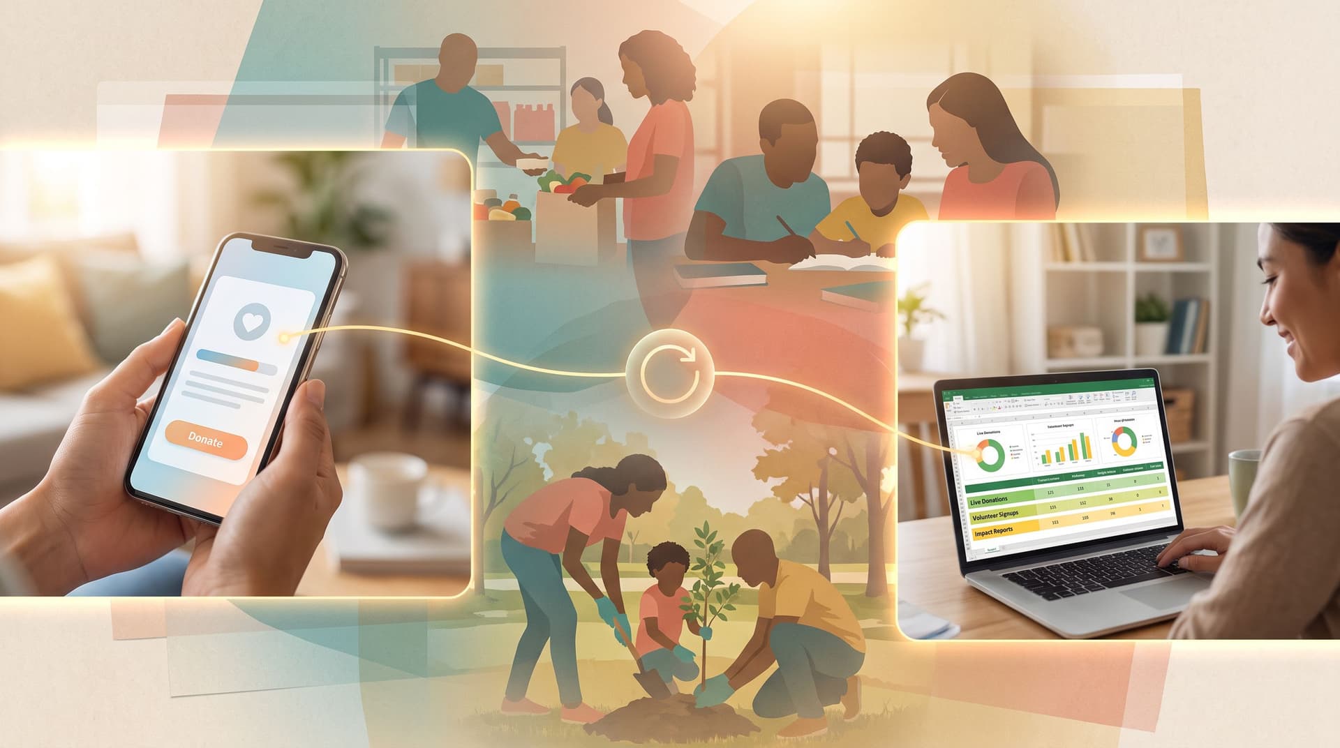
- Use Google Sheets syncing in Ezpa.ge to feed a live dashboard for the event team.
- Connect with your CRM or email tool to trigger automatic follow-ups within 24 hours.
B. Product Packaging: From Box to Relationship
On packaging, QR codes tend to live longer. Design forms that respect that longevity.
Common use cases:
- Warranty registration
- Loyalty or referral programs
- How-to content or recipes
- Feedback and NPS-style surveys
Patterns that work:
-
Warranty + ownership registration
- Custom URL:
/register/{product-line} - QR on: side panel, instruction manual, or insert card
- Form fields:
- Purchase date
- Product variant (dropdown)
- Optional step 2:
- “Where did you buy this?”
- “How likely are you to recommend us?” (1–10)
- Custom URL:
-
Loyalty and repeat purchase
- Custom URL:
/rewards/{brand} - QR on: primary packaging and any refill packs
- Form fields:
- Opt-in checkbox
- Post-submit:
- Show a unique discount code or link to a loyalty explainer; send the same via email.
- Custom URL:
Operational tips:
- Make sure the form works well months later; avoid time-limited copy like “this week only” unless you have a plan for expired offers.
- Use UTM parameters or custom URLs per SKU or retailer to track which products and channels drive the most scans.
C. Out-of-Home & On-Site Signage: From Glance to Hand-Raise
Out-of-home and on-site signage can include:
- Transit ads
- Billboards and street posters
- In-store displays and window clings
Here, the QR code is fighting for attention. Make the payoff obvious.
Patterns that work:
-
Local waitlists
- Custom URL:
/city/{city-name}/waitlist - QR on: “Coming soon” storefront posters
- Form fields:
- ZIP/postcode
- Confirmation:
- “You’re in. We’ll email you when we open + send a launch-day offer.”
- Custom URL:
-
Quick offers near point of sale
- Custom URL:
/offer/{store-id} - QR on: counter displays, shelf talkers
- Form fields:
- Email only
- Confirmation:
- Display a code the cashier can apply immediately, plus send it by email.
- Custom URL:
Operational tips:
- Use large, high-contrast QR codes and a short, legible URL for people who can’t or won’t scan.
- Make the call to action explicit on the sign: “Scan for 10% off today” beats “Learn more.”
Step 6: Close the Loop with Analytics and Iteration
Once your QR-linked forms are live, the work is just beginning.
Use Ezpa.ge + Google Sheets syncing to:
- Track submission counts by event, product, or location
- Measure completion rate from QR scans (using UTM tags or analytics tools)
- Compare time-to-complete and field-level drop-off between contexts
Then iterate:
- If an event form has a high start rate but low completion, try removing one field or splitting into two steps.
- If packaging scans are high but conversions are low, revisit offer clarity and perceived value.
- If OOH forms underperform, test different CTAs (“remind me when you launch” vs. “apply now”) and adjust friction accordingly.
Our post From Gut Feel to Form Analytics: A Practical Playbook for Measuring Drop-Off, Time-to-Complete, and Quality walks through a concrete process you can apply directly to QR-sourced traffic.
Bringing It All Together
When you treat QR codes as just a way to link to your homepage, you get… homepage results.
When you treat “QR → form → conversion” as a single, designed journey, you get something else entirely:
- Event attendees who actually give feedback before they leave the room
- Customers who register products, join loyalty programs, and come back
- Passersby who turn a fleeting glance at a poster into a trackable, nurturable relationship
The ingredients aren’t complicated:
- Start with context and smallest valuable action
- Design scan-aware, mobile-first forms that match the promise of the surface
- Engineer custom URLs and scannable QR codes like product surfaces, not afterthoughts
- Use analytics and iteration to keep tightening the flow from scan to conversion
Do that consistently, and your forms stop being a leak in the funnel and start acting like the connective tissue between your offline presence and your online operations.
Your Next Step with Ezpa.ge
If you’re already running events, shipping products, or buying OOH, you don’t need more surfaces—you need better bridges.
Here’s a simple way to start this week:
- Pick one use case: an upcoming event, a specific product line, or a single in-store poster.
- Spin up a dedicated Ezpa.ge form for that context, using a clear custom URL and a theme that matches the surface.
- Generate and test a QR code at real-world size, on real devices, in real lighting.
- Run it for a week or a campaign cycle, then review the submissions and completion behavior.
From there, you can scale the pattern: more sessions, more SKUs, more locations—without losing control of the experience or the data.
Your forms are already the front door to your operations. With thoughtful QR-to-form design, they can also be the front door to everything you do offline.
If you’re ready to turn those little black-and-white squares into real conversions, Ezpa.ge gives you the building blocks: themes, custom URLs, and live Google Sheets syncing—all tuned for forms that start in the physical world and end in measurable results.