Theme-First Onboarding: Using Form Skins to Match User Intent, Not Just Brand Colors

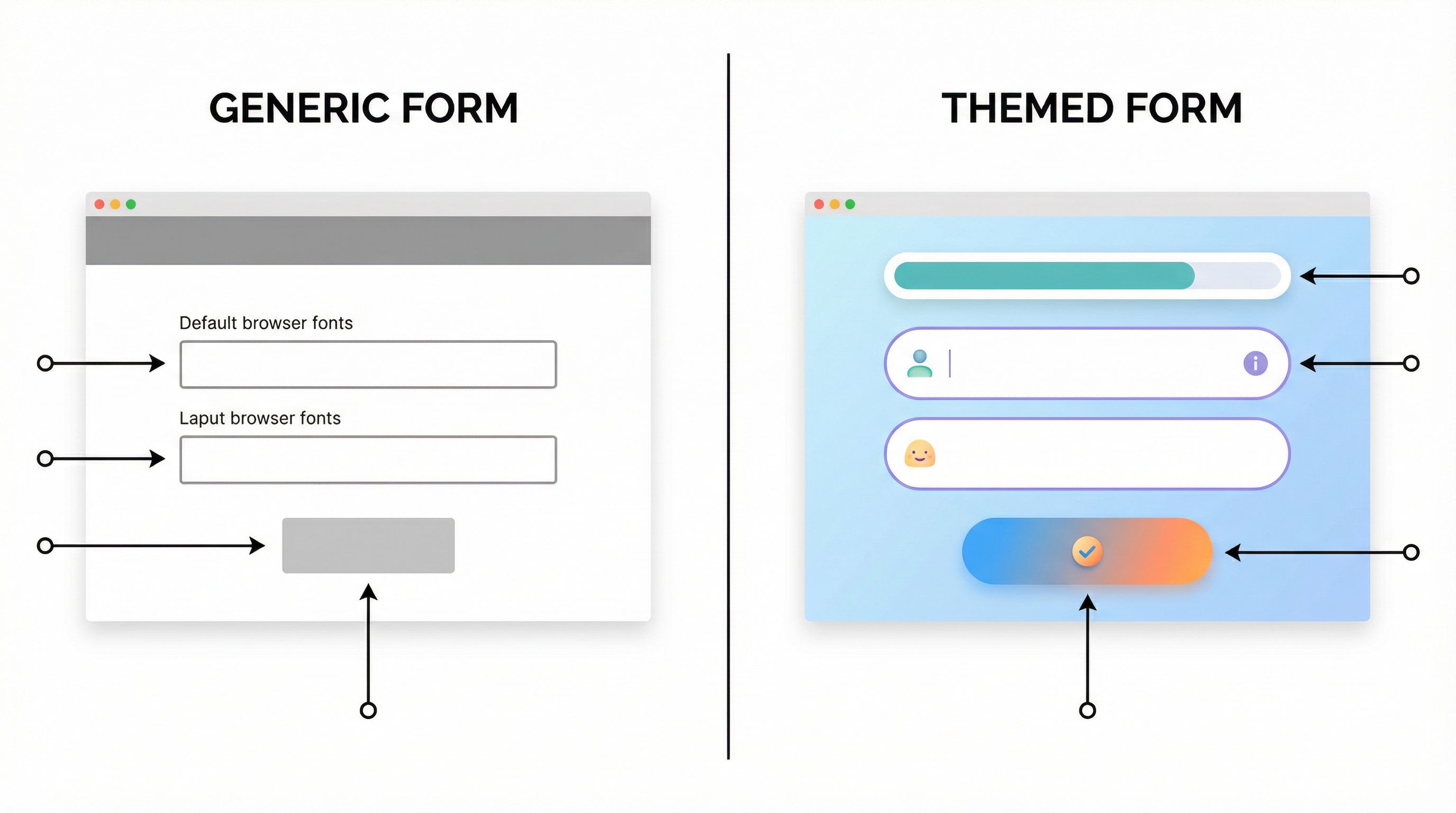
Most teams treat form theming as a finishing touch.
Pick the brand colors. Drop in the logo. Call it a day.
That’s enough if your only goal is visual consistency. But if you care about conversion, data quality, and how people feel as they move through your funnel, it’s not enough.
A better approach: theme-first onboarding—using form skins that are designed around user intent, context, and emotional state, not just your style guide.
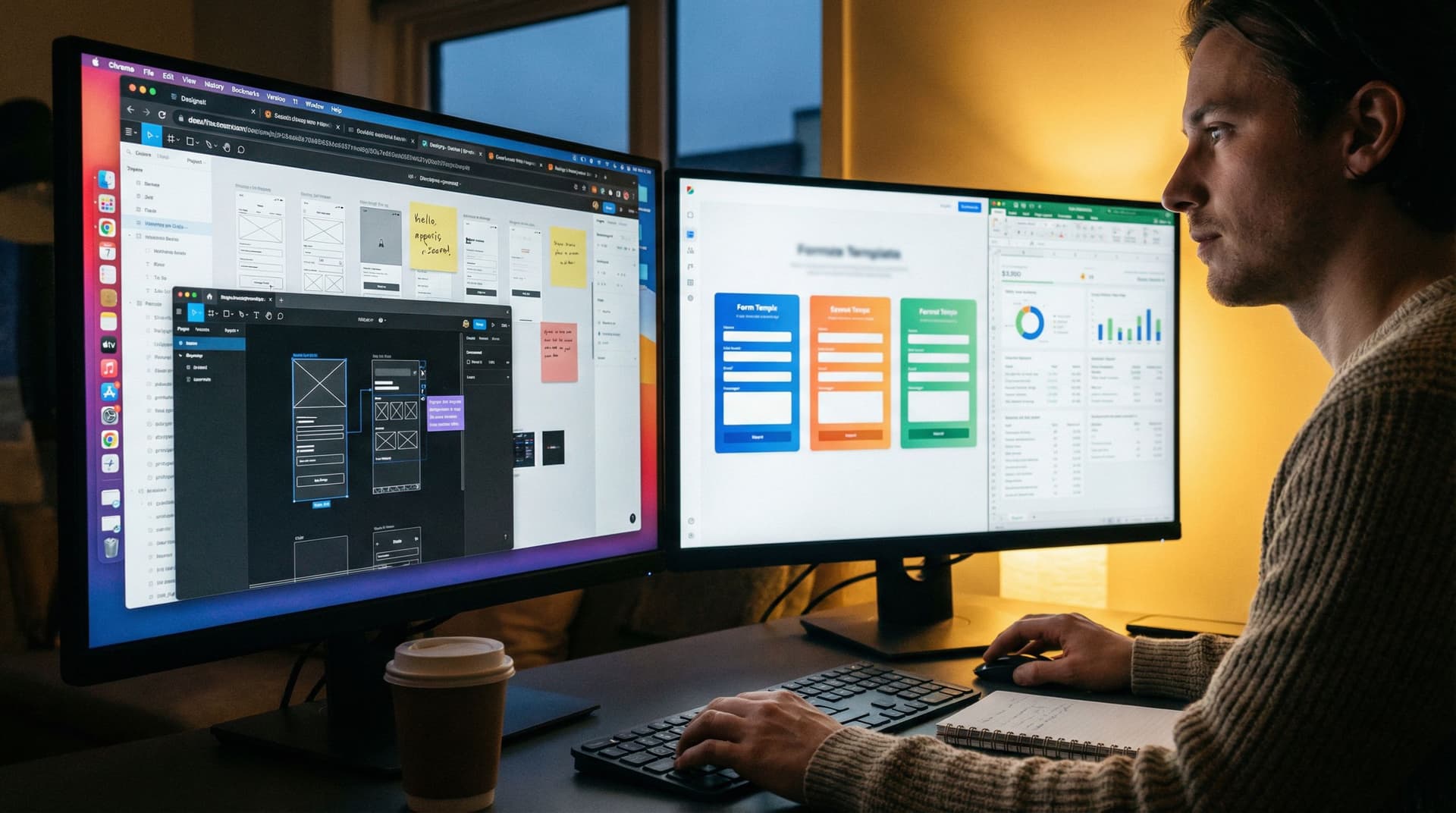
With tools like Ezpa.ge, where you can ship fully themed forms with custom URLs and real-time Google Sheets syncing, you can turn themes into a strategic lever instead of a cosmetic layer.
Why Theme-First Onboarding Matters
Onboarding is a trust-building exercise. The way your form looks, reads, and behaves tells people what to expect from working with you.
When themes are only about brand colors, you miss three big opportunities:
-
Signaling fit and safety
A security questionnaire should feel different from a newsletter signup. A VIP support lane should feel different from a generic contact form. The visual language of the form should say, “You’re in the right place, and we know why you’re here.” -
Reducing friction by matching intent
Someone booking a quick intro call wants speed and clarity. Someone scoping a six-figure implementation wants depth and reassurance. If both experiences use the same visual skin, you’re sending mixed signals. -
Creating a repeatable, testable system
Theme-first onboarding lets you treat themes like templates for intent:- "High-stakes, high-trust" skin for legal, finance, or compliance flows.
- "Fast lane" skin for existing customers and warm referrals.
- "Exploratory" skin for early-funnel education or discovery.
Instead of tweaking each form from scratch, you pick the intent pattern first, then customize within it.
If you’ve read our post on themes as live brand labs, this will feel familiar. Theme-first onboarding is the same idea, applied specifically to how new users, customers, or partners experience their first serious interaction with you.
From Brand-First to Intent-First: The Mental Shift
A brand-first approach starts with questions like:
- Does this match our primary color palette?
- Is the logo placement consistent with the site?
- Are we using our standard button styles?
An intent-first approach starts somewhere else:
- What is this person trying to accomplish right now?
- How confident or anxious are they likely to feel?
- How much time and attention do they realistically have?
- What’s at stake if they get this wrong—or if we do?
Once you answer those, you design a theme that:
- Sets the right emotional tone (calming vs. energetic, serious vs. playful).
- Reinforces the type of relationship (peer partner vs. vendor, advisor vs. approver).
- Guides attention to the most important actions and information.
Color is part of that, but so are:
- Layout and spacing
- Typography and hierarchy
- Use of imagery or iconography
- Microcopy and helper text
- Progress indicators and step structure
Theme-first onboarding means you lock in those patterns for each type of intent—and then re-use them across products, teams, and campaigns.
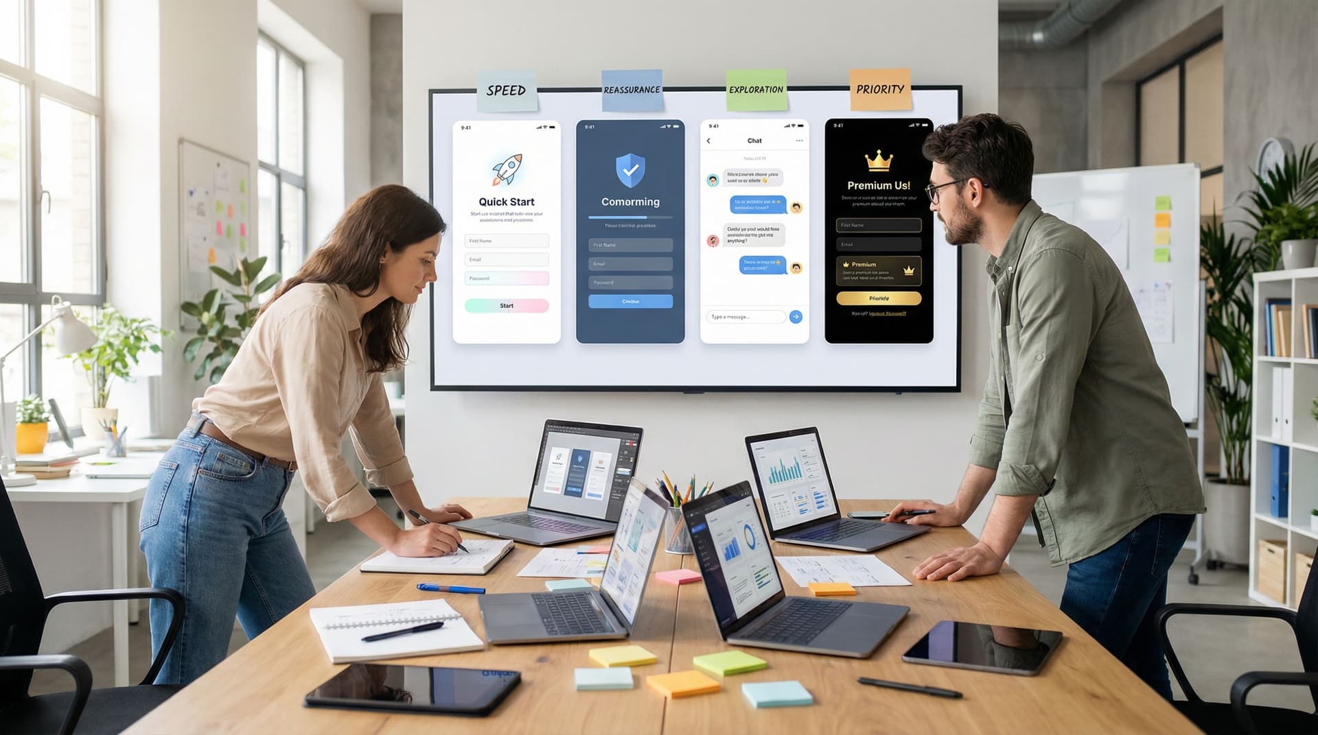
Common Onboarding Intents (and How Themes Should Adapt)
Here are four onboarding intents you probably see all the time, and how their form skins should differ.
1. "Quick Start" – Low Friction, High Momentum
Examples:
- Free trial signup
- Newsletter or content subscription
- Simple beta waitlist
Theme characteristics:
- Bright, energetic accents that make the primary action obvious.
- Minimal chrome—no heavy borders, no dense backgrounds.
- Short, scannable copy; labels and helper text are concise.
- Clear progress cues if multi-step: “Step 1 of 2,” micro-steps, or a simple bar.
Why it works: You’re trying to get people from interest to action before life distracts them. The theme should feel fast and lightweight—like this won’t be a big commitment.
2. "High-Stakes Setup" – Calm, Credible, Thorough
Examples:
- Security or compliance onboarding
- Financial account setup
- Enterprise implementation intake
Theme characteristics:
- Muted, stable color palette (neutrals, deep blues/greens) that signals seriousness.
- Generous spacing and clear sectioning to avoid overwhelm.
- Inline explanations and tooltips that reassure and clarify.
- Subtle progress indicators that show you’re moving forward, not stuck.
Why it works: Users here are often anxious: they’re sharing sensitive data or making commitments that affect their team. The theme should feel like a calm, competent guide, not a flashy campaign.
3. "Service Discovery" – Teaching While You Collect
Examples:
- Agency or consultancy intake
- Custom services scoping
- Solution fit assessments
Theme characteristics:
- Balanced contrast: enough visual interest to keep people engaged, but not overwhelming.
- Contextual helper blocks that explain options in friendly language.
- Micro-illustrations or icons that differentiate choices.
- Multi-step layout that mirrors a conversation.
If this resonates, you’ll find more patterns in our post on forms as lightweight onboarding academies.
4. "VIP or Priority Lane" – Fast, Clear, Respectful
Examples:
- Priority support for enterprise customers
- Fast-track sales path for warm referrals
- Executive or partner onboarding
Theme characteristics:
- Clean, high-contrast layout with minimal distractions.
- Short, direct copy that respects time: “We’ll respond within X hours,” “This goes straight to…”.
- Prominent reassurance elements (SLA badges, named owner, etc.).
- Subtle premium cues (refined typography, restrained color usage).
Why it works: These users are high value and short on time. The theme should signal, “You’re important, and we’ve built a lane just for you.”
Designing an Intent-Driven Theme System
Let’s translate this into a concrete system you can actually maintain.
Step 1: Map Your Core Onboarding Moments
Start by listing your key onboarding flows. For most teams, these include:
- New product signup or trial
- Demo / discovery request
- Implementation or onboarding intake
- Partner application and activation
- Support or success onboarding (e.g., new customer checklist)
For each flow, answer:
- What is the primary intent? (Quick start, high-stakes setup, discovery, VIP, etc.)
- What is the emotional baseline? (Curious, skeptical, anxious, excited.)
- What is the time expectation? (90 seconds vs. 10–15 minutes.)
- What is the risk of abandonment or bad data?
This gives you a small set of intent archetypes that your themes need to support.
Step 2: Define Theme Attributes Per Intent
For each archetype, define a simple spec. For example:
Quick Start Theme Spec
- Primary color: brighter accent from brand palette
- Background: clean, mostly white or very light
- Typography: bold headings, slightly larger primary CTA text
- Components: large primary button, minimal secondary actions
- Copy tone: energetic, encouraging, minimal qualifiers
High-Stakes Theme Spec
- Primary color: deeper, more muted brand color
- Background: soft neutral, subtle dividers between sections
- Typography: highly legible, slightly smaller but with strong hierarchy
- Components: clear section headers, discreet but visible help icons
- Copy tone: calm, precise, explicit about what happens next
Document these in whatever tool your team uses (Notion, Confluence, internal design system docs). The goal is to make it trivial for anyone spinning up a new Ezpa.ge form to pick the right intent theme from a short menu.
Step 3: Turn Themes into Reusable Skins in Ezpa.ge
In Ezpa.ge, you can:
- Create base themes that lock in colors, typography, and general layout.
- Clone and adapt those themes for specific teams or campaigns.
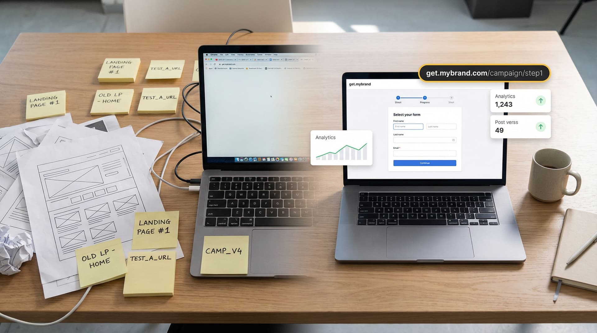
- Pair each theme with custom URLs that reflect the context (e.g.,
/vip-support,/security-onboarding,/partner-fast-track).
Treat each intent theme as a skin you can apply to multiple forms, not a one-off design:
- "Quick Start – Marketing"
- "Quick Start – Product-led trial"
- "High-Stakes – Security & Compliance"
- "VIP Lane – Enterprise"
This is the same pattern we explored in brand-consistent forms at scale: a small, governed set of themes that everyone can use safely.
Step 4: Align Form Flow to the Theme
A theme can’t fix a mismatched flow. If you’re running a 35-field wall of inputs with a "Quick Start" skin, users will feel the disconnect.
Pair each intent theme with a recommended flow pattern:
- Quick Start → usually single-page or very short multi-step (2–3 steps).
- High-Stakes Setup → often multi-step, with clear sections and save/resume where possible.
- Service Discovery → multi-step conversational flow.
- VIP / Priority → shortest possible path, with optional follow-up questions later.
If you’re not sure which flow pattern fits a use case, our guide on multi-step vs. single-page forms goes deeper into that decision.
Practical Examples of Theme-First Onboarding
Let’s walk through a few concrete scenarios.
Scenario 1: Product-Led Trial vs. Sales-Led Demo
You offer both:
- A self-serve trial where users can start immediately.
- A guided demo for teams that want a deeper walkthrough.
Old way:
- Both flows use the same "Request Access" form theme.
- The trial form feels heavier than it should; the demo form feels too lightweight.
Theme-first way:
-
Trial form skin
- Bright, energetic theme.
- Minimal inputs: name, work email, basic role.
- Copy: “Start your trial in under 60 seconds.”
- Single-page or 2-step flow.
-
Demo request skin
- More neutral, consultative theme.
- A few more fields: team size, primary use case, timeline.
- Copy: “Tell us a bit about your team so we can tailor the walkthrough.”
- 2–3 step flow with small progress bar.
Visually, these forms now feel like different experiences—because they are.
Scenario 2: General Support vs. VIP Success Lane
You run:
- A general support form for all customers.
- A priority lane for enterprise accounts with SLAs.
Theme-first setup:
-
General support theme
- Friendly, approachable colors.
- Clear categories, tooltips, and links to self-serve FAQs.
- Emphasis on helping users route themselves well.
-
VIP lane theme
- Clean, minimal, high-contrast design.
- Prominent SLA note: “We respond within 2 business hours.”
- Shorter required fields, with optional detail fields.
Under the hood, both can still feed into the same triage system (for example, using Ezpa.ge + Google Sheets as described in our post on real-time triage queues). But the themes make the experience match the user’s expectations.
Scenario 3: Partner Application vs. Co-Marketing Request
Your partner ecosystem has two very different intents:
- New partners applying to join the program.
- Existing partners requesting co-marketing support.
Theme-first approach:
-
Application theme
- More serious, evaluative tone.
- Copy that explains criteria and sets expectations.
- Multi-step with sections like “About your company,” “Go-to-market focus,” etc.
-
Co-marketing theme
- More energetic, collaborative tone.
- Color accents that match your campaign branding.
- Copy that says, “Let’s build something together,” with examples.
Again, the theme does as much work as the fields in signaling what kind of relationship this is.
Guardrails: Keeping Theme-First Onboarding Manageable
The risk with any theming system is sprawl. If every marketer, PM, or CSM can create a new theme on a whim, you’ll quickly end up with:
- Inconsistent experiences
- Confusing reporting
- A brand that feels fragmented instead of flexible
Here’s how to keep theme-first onboarding under control:
1. Limit the Number of Base Themes
Aim for 3–6 base themes, each tied to a clear intent archetype. For example:
- Quick Start
- High-Stakes Setup
- Service Discovery
- VIP Lane
- Internal Ops (for internal forms only)
Everything else should be a variation on those themes, not a brand-new skin.
2. Document When to Use Which Theme
Create a simple decision guide:
- If the form is under 5 fields and leads to an immediate experience → Quick Start.
- If the form collects sensitive info or legal consents → High-Stakes Setup.
- If the form is about scoping, diagnosis, or recommendations → Service Discovery.
- If the form is for existing high-value customers or partners → VIP Lane.
Make this guide visible wherever people create forms.
3. Pair Themes with URL Conventions
Use custom URLs that reinforce intent and make it easier to manage routing and analytics. For example:
/start-trial→ Quick Start theme/security-onboarding→ High-Stakes theme/agency-discovery→ Service Discovery theme/enterprise-support→ VIP theme
This is the same pattern we’ve seen work in posts like URL-driven ops and forms as microsites: the URL, theme, and routing rules all tell the same story.
4. Review Once, Reuse Often
Instead of reviewing every new form from scratch, review new themes carefully once:
- Accessibility (contrast, font sizes, focus states)
- Responsiveness on mobile and tablet
- Alignment with brand and tone
Once a theme passes review, treat it as a trusted building block. Teams can ship new forms quickly by:
- Choosing the right intent theme
- Adjusting fields and copy
- Re-using the same routing and data mapping patterns
Summary: Onboarding That Feels Designed for This Moment
Theme-first onboarding is about more than pretty forms. It’s about:
- Starting with user intent, not brand colors.
- Designing a small set of reusable themes that match common emotional and operational contexts.
- Pairing each theme with the right flow pattern, URL, and routing rules.
- Giving teams guardrails so they can ship fast without breaking brand or ops.
When you do this well, your forms stop feeling like generic gates and start feeling like tailored experiences:
- Trials feel light and fast.
- Security onboarding feels calm and trustworthy.
- Discovery flows feel like a real conversation.
- VIP lanes feel genuinely prioritized.
And because you’re doing this with themes and skins—not net-new builds—you can evolve and experiment without rebuilding your entire site.
Your Next Step: Pick One Onboarding Moment and Re-Skin It
You don’t need to redesign every form to get value from theme-first onboarding.
Start small:
-
Choose one high-impact onboarding flow.
Maybe it’s your trial signup, your main demo request, or your VIP support lane. -
Name the primary intent and emotional state.
Is this about speed, reassurance, exploration, or priority? -
Create or select a matching theme in Ezpa.ge.
Adjust colors, spacing, typography, and microcopy to reflect that intent. -
Align the flow pattern.
If needed, break a long wall of fields into steps, or collapse an overbuilt flow into a single page. -
Ship, measure, and iterate.
Track completion rates, time to complete, and qualitative feedback. Then refine the theme—not just the fields.
If you’re already using Ezpa.ge, log in and turn one of your existing forms into a theme-first onboarding experience. If you’re not, this is the perfect excuse to try building a fully themed, intent-driven form that syncs straight into Google Sheets and can ship in minutes—not weeks.
Your users are already telling you what they want through their behavior. Theme-first onboarding is how you show them you’re listening.